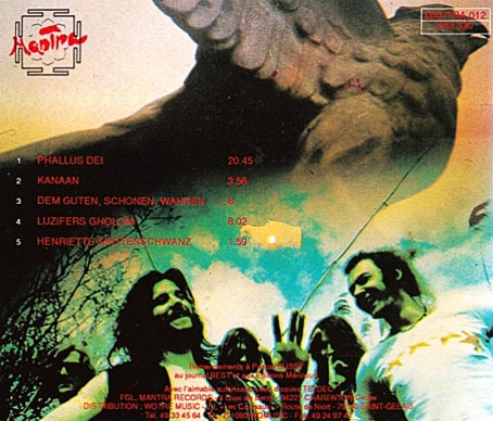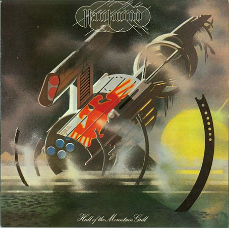
Design and illustration by Barney Bubbles.
The past week’s music listening has alternated between the back catalogue of Seattle band, Earth (who I recommend highly), and the early recordings of my erstwhile employers, Hawkwind. The latter were reissued recently in a 10-CD box, This Is Your Captain Speaking…Your Captain Is Dead (The Albums And Singles 1970–1974) which I also recommend, it’s very good value, and packages the albums in those facsimile card sleeves that now seem de rigueur for album reissues. A swathe of my rare Hawkwind vinyl got sold off circa 1990, and I’ve never replaced any of the albums or singles so this was a good opportunity to catch up. If you like this period of the band there’s the added bonus of the complete Greasy Truckers concert from the Roundhouse in 1972, a ramshackle performance that nonetheless sounds pristine (my Greasy Truckers vinyl—which I do still own—was ruined by a previous owner with a spillage of tea on the Hawkwind side); there’s also the entirety of the 1999 Party concert from Chicago which I’d not heard before.
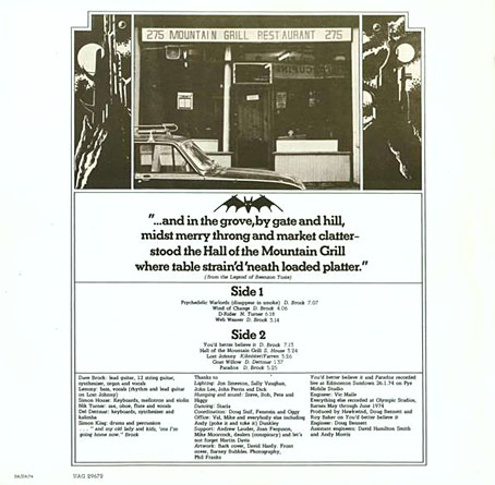
Listening again to Hall Of The Mountain Grill (1974) had me thinking about the origin of the album’s title. Hawkwind never took themselves as seriously as many of their contemporaries, but naming an album of ostensible space rock after a very mundane café in the Portobello Road was one of their more eccentric moments. The humour is compounded by Barney Bubbles’ cover design which for the title uses the kind of typeface (Palace Script) that you see on menus; on the inner sleeve there’s a photo of the fabled restaurant flanked by a pair of Barney’s futuristic towers. The verse beneath the photo (“from the Legend of Beenzon Toste”) refers to nearby Ladbroke Grove, and, of course, to Notting Hill Gate which in 1974 was still a haven for counterculture freaks, the very antithesis of that film. The verse was probably the work of Robert Calvert who explained the attraction of the restaurant in Pete Frame’s Hawkwind family tree:
The Mountain Grill was a working man’s café in Portobello Road—frequented by all the dross and dregs of humanity. Dave Brock always used to go and eat there—which is how I first met him…because I used to eat there too, when I worked on Frendz magazine. It was a kind of Left Bank café/meeting place for Notting Hill longhairs—a true artists’ hangout…but it never became chic, even though Marc Bolan, David Bowie and people like that often went there to eat lunch.
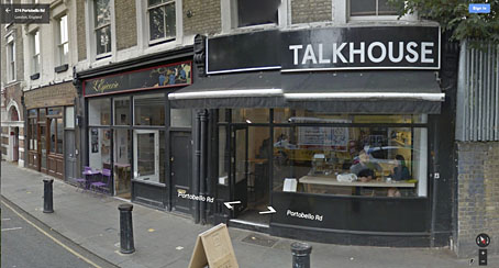
Photos on Flickr show how the place looked in 1977 when the sign from the album sleeve was still intact, and also in 2003 shortly before the restaurant closed down. The premises are a very different kind of eaterie today, remodelled and upmarket as befits a gentrified area.
Previously on { feuilleton }
• Void City
• Hawk things
• The Sonic Assassins
• New things for July
• Barney Bubbles: artist and designer