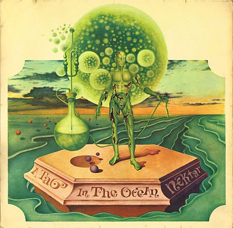
A Tab in the Ocean (1972) by Nektar.
This is another post in which I refer to Franz Rottensteiner’s The Fantasy Book: The Ghostly, the Gothic, the Magical, the Unreal (Thames & Hudson, 1978) as a source of discovery. Rottensteiner is Austrian which no doubt explains why his study of fantasy and horror in art and fiction had a broader reach than you would have found in a similar study from a British or American editor. Some of the writers whose work he discusses—Stefan Grabiński, for example—hadn’t been translated into English at that time. Among the artists whose work appeared as illustration Helmut Wenske was one of several whose paintings were seldom seen in Anglophone publications, although a few album covers that featured Wenske art—those for Nektar in particular—were a common sight in British record shops in the 1970s.
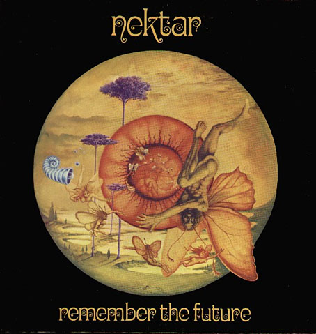
Remember The Future (1973) by Nektar.
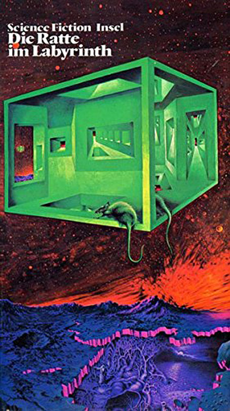
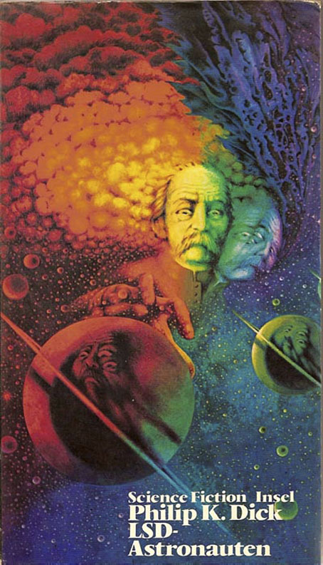
Wenske is a German artist with a penchant for Dalí-like Surrealism that might have been strained through a psychotropic filter. Most of his work in the 1970s was as an album cover designer for the Bellaphon label, and most of those covers are designs rather than paintings. There are a number of book covers, however, some of which are recycled from his album covers. From 1971 to 1975 Wenske painted the covers for a series from Insel Verlag, “Phantastische Wirklichkeit: Science Fiction der Welt”, a collection of reprints edited by Franz Rottensteiner. Wenske’s ISFDB credits list a few horror covers along with these, a small percentage of which are Lovecraft-related. In the past I’ve drawn attention to many different Lovecraft illustrators but Wenkse is one of a small number of these to have also written Lovecraftian fiction of his own (Die Krypta von Shaggay’h, 1974). He enjoys the work he’s being asked to illustrate, in other words, which isn’t something you can always expect from illustrators.
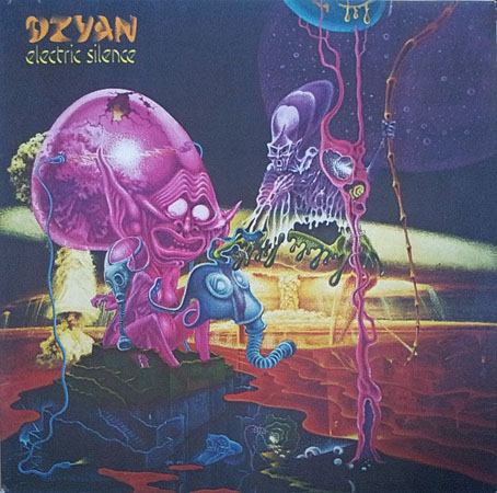
Electric Silence (1974) by Dzyan.
The covers below aren’t the best quality but better copies have proved hard to find. For those who’d like to see more Wenske art there’s at least one German catalogue that collects his work from the early 70s on.
• Related reading: View From Another Shore: An Interview with Franz Rottensteiner.
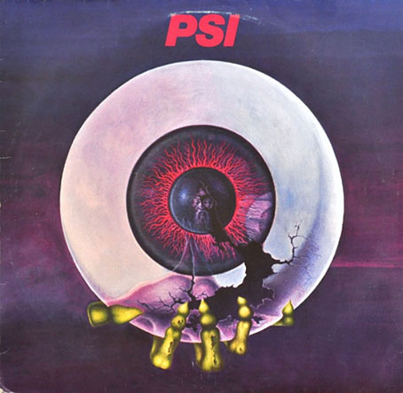
Horizonte (1977) by PSI.