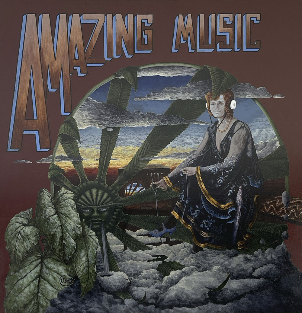
Weekend links 722

robinson.jpg

Desert Sunrise (no date) by Kay Robinson.

• RIP Richard Horowitz, a composer and musician whose soundtrack work makes the headlines but who I’ve always known best via his appearances on albums by Jon Hassell and others, and his collaborations with his partner, Sussan Deyhim. Majoun (1996) is my favourite among the Horowitz and Deyhim albums but it’s one of those releases that received little attention at the time and hasn’t been reissued since. Related: Revisiting Morocco, Magic, Majoun, Horowitz and Deyhim: Robert Phoenix talks to Horowitz and Deyhim for the final issue of Mondo 2000. | Desert Equations (For Brion Gysin) (1986).

• “A typeface is like an orchestra, and the type designer is its conductor.” Dr Nadine Chahine on the music of type design.

• At Colossal: Flip through more than 5,000 pages of this sprawling 19th-century atlas of natural history.

• At Unquiet Things: Become one with the moss, mushrooms, and magic in the art of Brett Manning.

• At Public Domain Review: Annie Besant and Charles Leadbeater’s Occult Chemistry (1908).

• New music: Reality Engine by 36, and Transformation Sonor by Hannes Strobl.

Photos of undersea life for the Smithsonian Magazine Photo Contest.

• Mix of the week: DreamScenes – April 2024 at Ambientblog.

• At Dennis Cooper’s: Book.

The Blue Flame (1981) by David Byrne (with Richard Horowitz) | Ravinia/Vancouver (1987) by Jon Hassell (with Richard Horowitz) | Bade Saba (The Wind Of Saba) (2000) by Sussan Deyhim (with Richard Horowitz)

Weekend links 721

reigl.jpg

Incomparable Pleasure (1952–3) by Judit Reigl.

• Steven Heller’s Font of the Month is Atol. Heller’s other haunt, The Daily Heller, looked this week at the incredible calligraphy and illuminated graphics of Arthur Szyk.

Okashi, an exhibition of Japanese art and photography at the Michael Hoppen Gallery in London. Hoppen talks about the exhibition here.

• At Unquiet Things: A Vibrant Rascality of Shenanigans: The Fantasticalicizm of Anna Mond.

• At Public Domain Review: Signs and Wonders: Celestial Phenomena in 16th-Century Germany.

• New music: Alchemia by Scanner, and Disconnect by KRM And KMRU.

• Mix of the week: Artificial Owl Recordings Mix by Niko Dalagelis.

• At Bandcamp: Jóhann Jóhannsson’s Luminous Sounds.

• DJ Food found some Victor Moscoso poster originals.

• At Dennis Cooper’s: Luis Buñuel Day.

Meow.camera

Alchemistry (1991) by Jon Hassell | Surrealchemist (1992) by Stereolab | Alchemagenta (1996) by Zoviet France

Liber Artificiosus Alphabeti Maioris

merken01.jpg

The previous post reminded me of this, one of my favourite examples of ornamented alphabets from the 18th century. Liber Artificiosus Alphabeti Maioris (“Artistic Book of the Major Alphabet”, 1782) was written and designed by Johann Merken, with the book’s 56 plates being engraved on copper by Heinrich H. Coentgen. I first saw these in a post at the now-defunct (and much missed) BibliOdyssey where Mr Peacay had found copies of the alphabet plates at some library archive or other. Happily, the Getty Research Institute made a scan of their own copy of the book a few years ago which includes all of the plates plus the accompanying German text.

merken02.jpg

The first part of Merken’s volume is unique in its combination of abecedarium with a variety of objects, emblems, symbols and other designs: silhouette figures, plants and flowers, ornamental gardens, coats of arms, calligraphic doodles, trophies (those accumulations of military paraphernalia), birds and animals (eg: a pair of monkeys playing the drums), monograms, mathematical figures, etc, etc, all festooned with the familiar swags and foliage of baroque decoration. In the second part of the book there’s more emphasis on science and technology, with plates devoted to astronomy, alchemy/chemistry, the orders of Classical architecture, and so on. The later pages are interesting but it’s those in the first section that really stand out. Many of the alphabet designs push their elaboration and embellishments to such a degree that the letters appear to be mutating to resemble their own decorations. The book as a whole is a curious blend of the 18th-century enthusiasm for taxonomy and categorisation combined with the baroque love of the grotesque and the arabesque. I wish there was more like it.

merken03.jpg

merken04.jpg

merken05.jpg

Continue reading “Liber Artificiosus Alphabeti Maioris”

Michael Baurenfeind’s extravagant calligraphy

baurenfeind01.jpg

I like extravagant calligraphy, the more extravagant the better, as with these examples from Schreib-Kunst (1716) by Michael Baurenfeind (1680–1753). The book is a recent scan by the Getty Research Institute whose art and design collection includes many similar volumes, although finding the good ones usually means clicking hopefully on blank covers with promising titles. Baurenfeind’s book was published in the middle of the period that extends from the mid-1600s to the mid-1700s when this kind of maximal elaboration of lettering was at its height. Books published later in the 18th century are more devoted to the mastery of careful penmanship, although you still find depictions of calligraphic excess mixed with baroque decoration. These later studies can be very impressive but I prefer the books like Baurenfeind’s which is a demonstration of the calligraphic art pushed to extremes of elaboration and ornamentation. Some of the capitals in this volume are the most excessive examples I’ve seen outside Paul Franck’s Kunstrichtige Schreibart (1655), a book filled with elaborate letterforms which yet seems crude in comparison to many of Baurenfeind’s pages. Baurenfeind goes beyond Franck’s solid black curves to create shaded interlacings that are less examples of calligraphic formation than intricate knotworks that just happen to resemble capital letters.

baurenfeind02.jpg

There’s more of the same in a Baurenfeind book from 1736, also called Schreib-Kunst, which includes several plates that show the construction of the letterforms. Volumes like these are usually showcases rather than instruction guides so this is unusual; Baurenfeind even has a guide to cutting your goose quill before you begin. Having tried writing with a bird’s feather once or twice I wouldn’t recommend it unless you have no other choice. Metal nibs are always better.

baurenfeind03.jpg

baurenfeind04.jpg

baurenfeind05.jpg

Continue reading “Michael Baurenfeind’s extravagant calligraphy”

Weekend links 716

poynter.jpg

The Vision of Endymion (1902) by Edward John Poynter.

The Art and History of Lettering Comics by Todd Klein. Eight of the pages in the forthcoming Moon & Serpent book have been lettered by Todd.

• At Igloomag: Chang Terhune looks for music to help you sleep. No mention of an obvious (and superior) candidate, Sleep by Max Richter.

• New music: Ghosted II by Oren Ambarchi, Johan Berthling and Andreas Werliin; and The Ship by David Shea.

But unlike macroscopic drugs like cannabis, LSD is so small and so powerful that its consumption almost always requires an inert housing—the water, tablets, sugar cubes, bits of string, or pieces of paper that transport the drug from manufacturer to tripper. In the law, this vehicle is described as the “carrier medium,” an object impregnated with drugs, one that can be sold, seized, presented as evidence, and dissolved into the hearts, minds, and guts of consumers.

When you print images onto a paper carrier medium, you are adding another layer of mediation to an already loopy transmission. Hence, a meta medium, a liminal genre of print culture that dissolves the boundaries between a postage stamp, a ticket, a bubble gum card, and the communion host. This makes blotter a central if barely recognized artifact of psychedelic print culture, alongside rock posters and underground newspapers and comix, but with the extra ouroboric weirdness that it is designed to be ingested, to disappear. Blotter is the most ephemeral of all psychedelic ephemera. It is produced to be eaten, to blur the divide between object and subject, dissolving material signs and molecules into a phenomenological upsurge of sensory, poetic, and cognitive immediacy.

Erik Davis, in an extract from Blotter: The Untold Story of an Acid Medium

• At Wormwoodiana: John Howard on The London Adventure, or, The Art of Wandering by Arthur Machen.

• At Unquiet Things: Hidden Marvels on Your Bookshelf: The Artistic Legacy of Laurence Schwinger.

• “Some intelligent civilizations will be trapped on their worlds”. Evan Gough explains.

• At Vinyl Factory: The Latin-American women of 20th-century electronic music.

• At Dennis Cooper’s: Steve Erickson presents A Black Psychedelia Primer Day.

• At Public Domain Review: Animated Putty by Walter R. Booth.

Vinita Joshi’s favourite music.

Sleepy Theory (1982) by Weekend | Sleep 3 (1995) by Paul Schütze | Sleep Games (2012) by Pye Corner Audio