Weekend links 826

vasarely.jpg

Hexa (1971) by Victor Vasarely.

• New music of the week is Tape 05, three minutes from Boards Of Canada following their thirteen-year silence, which was released on Thursday after several days of the group and their record label teasing a comeback with mysterious VHS cassettes and cryptic posters. I’ve been listening to the Sandison brothers’ discography for most of the week while trying to get a major illustration commission finished; this revelation has been the icing on a deteriorated, over-processed cake. I’m now looking forward to whatever emerges next.

The Long London Uncovered: Alan Moore (again) and Iain Sinclair (again) in conversation. Alan’s second novel in the Long London cycle, I Hear A New World, will be published next month.

• RIP Chris Mullen. Not a name that most will recognise but Mullen’s sprawling website, The Visual Telling of Stories, has been linked here on many occasions. A remarkable resource.

• More new music: Boots On The Ground by Massive Attack, Tom Waits; Angel Lost by Luca Formentini; Phaser For The Ocean, Chorus For The Moon by Hatchback.

• Coming soon from Strange Attractor: Sensual Laboratories, Light Shows, Experimental, Film and Psychedelic Art by Sophia Satchell-Baeza.

• At Public Domain Review: “A beautiful purplish hue”: Frank Dudley Beane’s experience with ergot and Cannabis Indica (1884).

• Mixes of the week: An Invisible Jukebox mix for Irmin Schmidt at The Wire; and DreamScenes – April 2026 at Ambientblog.

• At The Quietus: Greg Anderson and Stephen O’Malley of Sunn O))) discuss their love of hiking.

• At Film Quarterly: Elinor Dolliver on the surprising folklore of analogue horror.

• Steven Heller’s font of the month is Gilway Paradox.

• The Strange World of…Spacemen 3.

Tape Kebab (1974) by Can | The Attic Tapes (1975/6) by Cabaret Voltaire | The Black Mill Video Tape (2012) by Pye Corner Audio

Weekend links 820

davent.jpg

Lust, from the Seven Deadly Sins (circa 1550–55) by Léon Davent, after Luca Penni.

• At Dennis Cooper’s: Bill Hsu presents…High Anxiety: tense, dark films from 2010–2019 (for fans of Robert Aickman and Brian Evenson) (restored).

• New music: Ever No Way by Seefeel; In A Few Places Along The River by Abul Mogard; Displaces by Francesco Fabris.

• At Inconspicuous Consumption: Paul Lukas investigates a Frank Lloyd Wright typographic mystery.

In the late 19th century, Rops created a vast oeuvre of drawings, etchings, prints and paintings of such breathtaking fruitiness—often laced with satanic elements—that even Picasso responded to him in awe (in homage, the Spaniard drew a cartoon of a man in the form of a pig performing cunnilingus on a woman). Rops’ works depicted naked witches riding brooms, voyeurs in top hats and courtesans riding penis-shaped bicycles. The French art critic Félix Fénéon called him an artist “who paints phalluses the way others paint landscapes”.

Christian House on a new exhibition, Laboratory of Lust, showcasing the erotic art of Félicien Rops

• At Public Domain Review: Wayang Kulit: Raden Soelardi’s Illustrations of Javanese Puppets (1919).

• At Criterion Current: David Hudson explores the fantastic realism of Georges Franju.

• At Unquiet Things: The Nocturnal Visions of Nona Limmen.

• Steven Heller’s font of the month is Curve Display.

• RIP TV producer Kenith Trodd.

Exploratorium

Lust (1954) by Les Baxter Featuring Bas Sheva | Monster Lust (1989) by Helios Creed | Keine Lust (2004) by Rammstein

Weekend links 816

rossignol.jpg

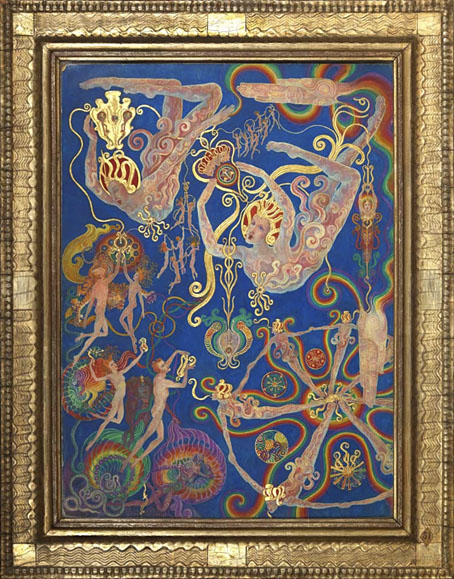
The Creative Power of the Spirit, No. 31 of A Goodly Company series, 1920–1933 by Ethel le Rossignol.

• “One moment it was a little blip. The next, our friends are dying”: the gay porn soundtrack composers lost to the Aids crisis. More gay porn: Pink Narcissus, James Bidgood’s micro-budget homoerotic fantasy, will receive a UK blu-ray release later this year.

• Old music: Thirst by Clock DVA gets a very welcome reissue later this year, having been unavailable in any form since 1992. I’m not so happy about the changes to Neville Brody’s original cover design but the album itself is a major post-punk statement.

• “Graphic design was thought to be a man’s discipline,” she says. “So I think it was quite a surprise for people to find me there.” A profile of Margaret Calvert, designer of (among other things) Britain’s road signs.

• At Colossal: A major survey in Paris chronicles Leonora Carrington’s esoteric Surrealism.

• At Public Domain Review: Sara Weiss’ Journeys to the Planet Mars (1903).

• At the BFI: The mystery music video for The Beatles’ Penny Lane.

Winners and entrants for Close-up Photographer of the Year 7.

• “Cats to blame for octopus deity enshrinement delay.”

• Steven Heller’s font of the month is Cattivo.

• At Dennis Cooper’s it’s Jack Arnold’s Day.

Pink Noir (1996) by David Toop | Pink Dust (2013) by Sqürl | The Pink Room 2 (2024) by Seigen Ono

The Elegant and Useful Book of Urban Wyss

wyss01.jpg

Work-related research over the past week has had me looking for interesting 14th-century alphabets. This is a period I usually ignore in favour of the designs of the following century which tend to be a lot more florid, often to the point of illegibility. (Michael Baurenfeind’s books offer prime examples.) Medieval alphabets are more readable on the whole, once you attune yourself to the missing letters (“j”, “u” and sometimes “w”), also the common occurrence of the long “s”, the bar that crosses the “x”, and the way that “z” will resemble a number 3.

wyss02.jpg

The examples below are the more eccentric samples given in Libellus Valde Doctus Elegans, et Utilis, Multa et Varia Scribendarum (Elegant and Useful Book on the Learned Art of Writing), a collection by Urban Wyss published in Switzerland in 1564. Wyss presents the Gothic scripts that are common to the period before showing the reader a number of pages unlike any I’ve seen elsewhere, including one with the text running in reverse across the page. (This may be a printing error but I’m assuming not.) The book has an obvious pedagogic intent: the first page shows the student the best way to hold a pen when writing, while the second page depicts a classroom where a group of infants are learning to read and write.

wyss03.jpg

The passages of text that separate the alphabets are mostly aphoristic rather than referring to the stylistic variations on display. I was hoping the text might be more technical, and that the changes of style would be there to emphasise some point being made. This would have made the book a very early example of graphic design in which the form of the text was used to reinforce an argument. An article in a 1945 issue of Graphis refutes this:

Unlike other books on calligraphy the Libellus valde doctus is for the most part composed in Latin and intended for pupils of academic schools. The texts chosen for the models are drawn from the works of Cicero, the most read Latin writer at that time. They are meant to serve not only for the mechanical training of the copyist but further for his schooling in good Latin expression, not to speak of the beneficial influence on the pupil of their content in wisdom.

This does at least give us a very minor connection to graphic design beyond the letterforms themselves. Cicero may not be quoted so often today but some of his writing is put to use whenever a designer fills a column with Lorem ipsum placeholder text, the words of which are extracted from De finibus bonorum et malorum. Posthumous recognition of a sort, although I expect the Roman senator would prefer to be remembered for the meaning of his statements rather than the individual words used to compose them.

wyss04.jpg

wyss05.jpg

Continue reading “The Elegant and Useful Book of Urban Wyss”

Weekend links 807

kouninos.jpg

Poster art by Nicholas Kouninos for Procol Harum / Pink Floyd / HP Lovecraft at the Fillmore, San Francisco, 1967.

• Take a break from so-called reality with Gruesome Shrewd, more queasy psychedelia by Moon Wiring Club. MWC’s Ian Hodgson described his intentions to Simon Reynolds in a Reynolds roundup which notes the 20th anniversary of the Ghost Box project. The label is apparently on hold for the moment but I have to admit that my interest waned some time after the 10th anniversary, when it became increasingly apparent that the ghost had fled the box. Reynolds ends his piece with a list of favourite GB recordings which I mostly agree with, although I’d shuffle the order and swap some entries with Pye Corner Audio.

• “‘You know that feeling you get when you’ve just gotten back from the dry cleaners a pair of slacks, Dacron slacks, and you reach your hand in a pocket and you feel those fuzzy sandwiches with your fingers? Well, that’s the feeling I’m looking for.’ I just nodded and replied, ‘OK, Dave, I know exactly what you mean.’” Barry Gifford remembers David Lynch.

Aschenbach’s Last Journey: Lesley Chamberlain, the most recent translator of Thomas Mann’s Death in Venice, approaches the text by following the progress of its doomed protagonist from Brioni to the Venetian Lido. Related: Polly Barton describes to Katy Whimhurst some of the difficulties involved in translating Japanese fiction to English.

• From The Shout to Bait: Darran Anderson on the uses of sound in cinema. Rupert Hines’ soundtrack to The Shout has just been released by Buried Treasure.

• Video footage of modular synthesists Arc (Ian Boddy & Mark Shreeve) performing Arcturus live in 2004: part one | part two.

• At Aeon: “Black holes may be hiding something that changes everything,” says Gideon Koekoek.

• At the BFI: Michael Brooke selects 10 great Hungarian films.

• Steven Heller’s font of the year is Fillmore.

Shout The Storm (1984) by :Zoviet:France: | Shout At The Devil (2002) by Jah Wobble & Temple Of Sound | Shout (2005) by Tod Dockstader