Comets from Meyers Konversationslexikon (1885–90).
• At The Daily Heller: Steven Heller reviews A Life in Ink, a new monograph about the art of Ralph Steadman. Heller is full of praise for Steadman, and discusses commissioning his work for The New York Times. But in his bewilderment at Steadman’s lack of a knighthood he seems unaware of the degree to which state honours are frequently refused by Britons, especially those who position themselves in opposition to the established order. Americans are obsessed with awards and “halls of fame”, and appear to regard Britain’s state honours as something like the Oscars with a royal seal, rather than what JG Ballard once described as “a Ruritanian charade that helps to prop up the top-heavy monarchy.” If Steadman has deliberately shunned the honours list he’d be joining a venerable company.
• “In mid-19th century Italy, two eccentric aristocrats set forth on parallel projects: constructing ostentatious castles in a Moorish Revival style. Iván Moure Pazos tours the psychedelic chambers of Rochetta Mattei, optimised for electrohomeopathic healing, and Castello di Sammezzano, an immersive, orientalist fever dream.”
• New music: Ithaqua by Cryo Chamber Collaboration is this year’s installment in the Lovecraft-themed album series (previously) from Cryo Chamber. Also this week: Analog 2025 by Various Artists; and Flux (music for a performance by still still / Marta & Kim) by Rutger Zuydervelt and Lucija Gregov.
For all their bravura and maximalism, Powell and Pressburger understood the power of leaving things out, building into their films chasms that the mind must leap, gaps that the imagination must fill. Like Joan Webster, we discover that we don’t want things to be made too easy. We want to catch our own fish rather than have them delivered, to swim in the ocean rather than in a pool.
Imogen Sara Smith on I Know Where I’m Going, one of the films from Michael Powell and Emeric Pressburger’s golden decade, the 1940s
• Among the new titles at Standard Ebooks, the home of free, high-quality, public-domain texts: In the Days of the Comet by HG Wells.
• At the BFI: David Parkinson selects 10 great Sherlock Holmes films and TV adaptations.
• Winning entries for the Capture The Atlas Northern Lights Photographer of the Year.
• Books and original drawings by Austin Osman Spare on sale at Gerrish Fine Art.
• At Unquiet Things: The art of Chie Yoshii.
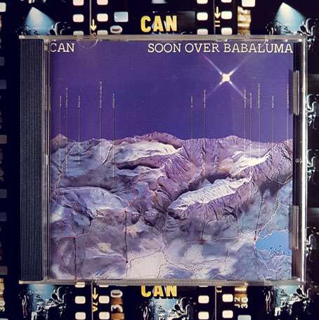
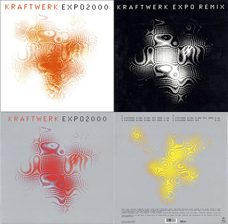
• Kohoutek-Kometenmelodie (1973) by Kraftwerk | Cometary Wailing (1981) by Bernard Xolotl | Kometenmelodie Part 1 (1994) by 300,000 VK