On Babaluma

babaluma.jpg

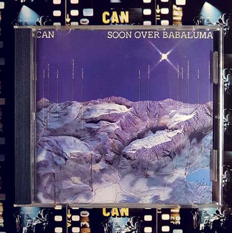
It’s never the same without the foil sleeve.

Since the death of Damo Suzuki I’ve been reading the Rob Young and Irmin Schmidt book about Can, All Gates Open. Can’s history isn’t exactly unfamiliar so it’s taken me a while to get round to it. I’ve been listening to their music for over 40 years, and bought the Can Box when it came out, a release which includes the Can Book, a substantial volume by Hildegard Schmidt and Wolf Kampmann containing career-spanning interviews with the core members of the group. Mysteries persist, however, so it’s been satisfying to have some of them resolved in the newer book, like the question of what exactly the title of the group’s sixth album, Soon Over Babaluma (1974) refers to. I’ve always liked this album, it was the second or third one I bought in 1981 when I found a secondhand copy of the original release in its shiny foil sleeve. Irmin Schmidt sings the words “Soon over Babaluma” on the second track, Come Sta, La Luna, a title which Young reveals as originating with Leonardo da Vinci. Then he has this to say:

Playfully extemporising from this text, Irmin cast his eyes across the studio to where Jaki’s girlfriend of the time, a woman called Christine, was perched on a sofa with accustomed stillness. “She had this really mysterious aura around her… She could sit there for hours like a cat not moving, or just drawing, or maybe doing nothing,” Irmin recalls. “So ‘Come sta, la luna’ was about Christine in a way. I’m talking about this girl who is going through walls. I don’t remember the words any more and I have never written it down. But there is something very spacey in the words—’Dancer on the rope, in the space’ or something. But when I wrote that, she was sitting in the studio and I was looking at her… I found her very mysterious and very beautiful.”

Almost by accident, the phrase “soon over Babaluma” emerged out of this stream of consciousness. “The word ‘Babaluma’ came out of a conversation with Jaki about the words. He maybe thought I had another word before, and he said, ‘What did you say? Babaluma?’ And because it rhymed with ‘luna’, it was a kind of playing with words—it didn’t mean anything. And it’s true surrealism. But the whole text is about something happening in space, out there. Seeing the moon and, from there, soon being over Babaluma—which must be another star or something. So it has another story behind it.”

So it was automatic writing after all. For a group whose compositions evolved out of endless improvisation this almost seems inevitable. Young makes a good argument for Soon Over Babaluma being Can’s cosmic album, made at a time when the kosmische idiom was peaking in Germany; even Kraftwerk were a little cosmic in 1973/74, with their Kohoutek-Kometenmelodie single being reworked for side 2 of Autobahn. There’s a lot of enlightening detail in All Gates Open, I recommend it. (Although I’m sure that’s a Stylophone solo on Moonshake, not a melodica as he seems to think.)

Meanwhile, Damo returns to the world this month with an official release for the Paris, 1973 concert. This one has circulated for years as a bootleg, and it’s a better showing by the band than some of the other recordings in the recent live series. More, please.

Previously on { feuilleton }
Holger’s Radio Pictures
Jaki Liebezeit times ten
Can esoterics
Can soundtracks
Can’s Lost Tapes

Robot Artists and Black Swans

robotartists.jpg

Four years ago I designed and illustrated a book for Tachyon written by Bruce Sterling, Pirate Utopia. Robot Artists and Black Swans is a kind of sequel, being the work of the same author for the same publisher, and with a similar geographical focus on southern Europe. The new book differs from the earlier one by being a collection of stories rather than a single piece, many of which are set in or near the city of Turin where Sterling and his wife, Jasmina Tesanovic, spend much of their time. Sterling has been living in Europe for many years, long enough to have cultivated an alter-ego, Bruno Argento, an Italian science-fiction writer who is offered as the real author of the stories in Robot Artists and Black Swans.

Pirate Utopia was an easy book to design because of the Futurist theme which I illustrated by adapting graphics by artist and designer Fortunato Depero. For the cover of the new volume I considered trying something similar with another Italian artist/designer, Franco Grignani (1980–1999). In addition to having studied in Turin, Grignani was commissioned by David Pelham to create cover art for a handful of Penguin science fiction titles in the late 1960s. Much of Grignani’s artwork is heavily indebted to the Op Art style popularised by Bridget Riley and Victor Vasarely, especially the early Riley formula of dazzling arrangements of parallel lines, a formula he made his own after Riley’s work evolved in other directions. Despite these favourable qualities, Grignani’s art proved too abstract for my purposes, and for Tachyon’s who wanted something more illustrative, so I ended up co-opting a very different Italian artist/designer, Leonardo da Vinci. The figure of Da Vinci’s Vitruvian Man has been parodied and pastiched many times so this isn’t remotely original (I’ve also used the original drawing on a pastiche book cover I designed for the Lambshead Disease Guide), but making the figure a robot was a convenient way of combining the title with Italian history. One of the stories in the collection, Pilgrims of the Round World, concerns the inhabitants of Turin during the Renaissance years, and mentions Leonardo (or “the Vinci boy”) several times, so the figure does have some actual relevance beyond being recognisably Italian. The background is, of course, the city of Turin given a slightly futuristic tweak, although it’s more Turinesque than a match for the place itself.

As usual, I’ll save discussion of the book’s interior until after publication which will be in March, 2021. Watch this spacetime.

Previously on { feuilleton }
Pirate Utopia by Bruce Sterling
Futurismo!

Max Ernst’s favourites

ernst1.jpg

The cover for the Max Ernst number of View magazine (April, 1942) that appears in Charles Henri Ford’s View: Parade of the Avant-Garde was one I didn’t recall seeing before. This was a surprise when I’d spent some time searching for back issues of the magazine. The conjunction of Ernst with Buer, one of the perennially popular demons drawn by Louis Le Breton for De Plancy’s Dictionnaire Infernal, doubles the issue’s cult value in my eyes. I don’t know whether the demon was Ernst’s choice but I’d guess so when many of the De Plancy illustrations resemble the hybrid creatures rampaging through Ernst’s collages. Missing from the Ford book is the spread below which uses more De Plancy demons to decorate lists of the artist’s favourite poets and painters. I’d have preferred a selection of favourite novelists but Ford was a poet himself (he also co-wrote an early gay novel with Parker Tyler, The Young and Evil), and the list is still worth seeing.

ernst2.jpg

Poets: Charles Baudelaire, Friedrich Hölderlin, Alfred Jarry, Edgar Allan Poe, George Crabbe, Guillaume Apollinaire, Walt Whitman, Comte de Lautréamont, Robert Browning, Arthur Rimbaud, William Blake, Achim von Arnim, Victor Hugo, Johann Wolfgang von Goethe, William Shakespeare, Samuel Taylor Coleridge, Lewis Carroll, Novalis, Heinrich Heine, Solomon (presumably the author of the Song of Solomon).

Painters: Pieter Bruegel the Elder, Giovanni Bellini, Hieronymus Bosch, Matthias Grünewald, Albrecht Altdorfer, Georges Seurat, Piero della Francesca, Paolo Uccello, Lucas Cranach the Elder, Hans Baldung, Vittore Carpaccio, Leonardo Da Vinci, Cosimo Tura, Carlo Crivelli, Giorgio de Chirico, Henri Rousseau, Francesco del Cossa, Piero di Cosimo, NM Deutsch (Niklaus Manuel), Vincent van Gogh.

I’ve filled out the names since some of the typography isn’t easy to read. Some of the choices are also uncommon, while one of them—NM Deutsch—is not only a difficult name to search for but the attribution has changed in recent years. The list of poets contains few surprises but it’s good to see that Poe made an impression on Ernst; the choice of painters is less predictable. Bruegel, Bosch and Rousseau are to be expected, and the same goes for the German artists—Grünewald, Baldung—whose work is frequently grotesque or erotic. But I wouldn’t have expected so many names from the Italian Renaissance, and Seurat is a genuine surprise. As for Ernst’s only living contemporary, Giorgio de Chirico, this isn’t a surprise at all but it reinforces de Chirico’s importance. If you removed Picasso from art history de Chirico might be the most influential painter of the 20th century; his Metaphysical works had a huge impact on the Dada generation, writers as well as artists, and also on René Magritte who was never a Dadaist but who lost interest in Futurism when he saw a reproduction of The Song of Love (1914). Picasso’s influence remains rooted in the art world while de Chirico’s disquieting dreams extend their shadows into film and literature, so it’s all the more surprising that this phase of his work was so short lived. But that’s a discussion for another time.

Previously on { feuilleton }
Viewing View
De Plancy’s Dictionnaire Infernal
Max Ernst album covers
Maximiliana oder die widerrechtliche Ausübung der Astronomie
Max and Dorothea
Dreams That Money Can Buy
La femme 100 têtes by Eric Duvivier

Fabulous harbours

leonardo1.jpg

The Annunciation (c. 1472).

One pleasure of seeing paintings in an art gallery is the ability to scrutinise details. I like to be able to see that, yes, Picasso did indeed use a single stroke of the brush beginning here and ending here. Backgrounds are a recurrent source of interest if you’ve ever tried any kind of pictorial painting yourself. I always have a greater sense of the artist’s presence in the background details since that’s the area of a picture which few viewers will pay any attention to. In the foreground the artist is always aware of the viewer’s gaze; in the background the artist has a sense of being left alone. It’s there that the mind is most liable to wander when you’re at work.

leonardo2.jpg

The trouble with very famous paintings is that they’re almost always preserved from this kind of close scrutiny either because they’re too popular—so you have a few seconds to stand there before having to make room for others—or they’re being monitored by gallery staff who don’t want you getting too close, or—as in the case of Leonardo da Vinci’s few paintings—they’re imprisoned behind sheets of glass. Few art books outside the weighty monographs ever show you actual brushstrokes or give you a close view of the background details, so once again it’s thanks to the Google Art Project that we can examine two of Leonardo’s paintings in a manner that wouldn’t be allowed unless you were an art historian.

leonardo3.jpg

The Annunciation originated in Andrea del Verrocchio’s studio where Leonardo was apprenticed. Leonardo is believed to have painted the angel—which certainly looks like his work—and the background which includes a fantastic harbour and, in the vaporous distance, some colossal mountain peaks. I’ve always liked this painting for the composition and sense of stillness, those trees standing outside the garden like vertical plumes of smoke. We’re told that a later hand extended the angel’s wings which I can easily believe since their termination clashes with the disposition of the trees; you’d never do that deliberately when everything else in the picture is so carefully arranged.

leonardo4.jpg

Continue reading “Fabulous harbours”

A Picture to Dream Over: The Isle of the Dead

iod_basle.jpg

The Isle of the Dead (second version, 1880), Kunstmuseum, Basel.

In the sudden flares of light over the water, reflected off the sharp points of his cheeks and jaw, a harder profile for a moment showed itself. Conscious of Sanders’s critical eye, Father Balthus added as an afterthought, to reassure the doctor: “The light at Port Matarre is always like this, very heavy and penumbral – do you know Böcklin’s painting, ‘Island of the Dead’, where the cypresses stand guard above a cliff pierced by a hypogeum, while a storm hovers over the sea? It’s in the Kunstmuseum in my native Basel –”

The Crystal World (1966) by JG Ballard.

rachmaninov.jpg

A 1982 recording.

Today’s post is another guest piece over at Tor.com where I run through a history of some of the works in different media inspired by Arnold Böcklin’s The Isle of the Dead (1880–1886). The four versions of Böcklin’s painting are favourites of mine so I’ve touched on this subject a couple of times before but this is the first time I’ve gone into any detail examining their influence. Many artworks have become highly visible in the past century via copies, parodies and imitations: think of Leonardo’s Mona Lisa and The Last Supper, or Michelangelo’s David and The Creation of Adam. What’s fascinating about The Isle of the Dead is that it’s not one picture but four versions of the same scene, and they’ve all been very influential not as parodies but as direct inspirations for other artworks—musical compositions, feature films, a novel—yet few people would recognise the artist’s name. My post only scratches the surface by running through some of the more well-known works but there’s a whole website devoted to the subject for anyone wishing to investigate further.

coc.jpg

The Call of Cthulhu (1988).

Modesty prevented me from mentioning my own work in the Tor post but I’ll do so here. Among the many references ladled into my adaptation of The Call of Cthulhu there’s the 1886 Leipzig version of Böcklin’s painting in the background of a panel. A prefiguring of the end of the story and also an excuse to add to the list of works acknowledging one of the great Symbolist paintings.

Previously on { feuilleton }
The Isle of the Dead in detail
Arnold Böcklin and The Isle of the Dead