Art on film: Pandora and the Flying Dutchman

pandora1.jpg

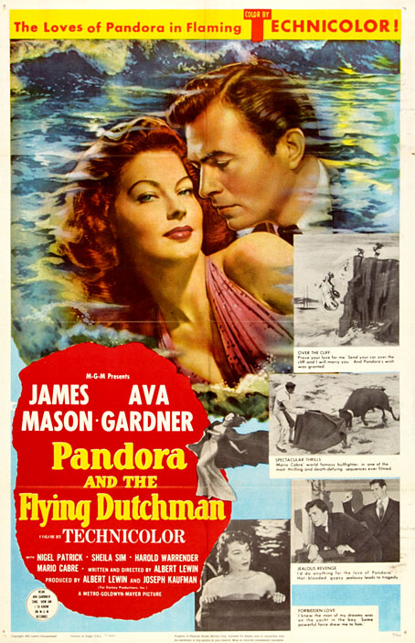
Continuing an occasional series about artworks in feature films. This is a minor entry but a worthwhile one if only to draw some attention to an unusual fantasy film by Albert Lewin, an equally unusual director. Pandora and the Flying Dutchman was made in 1951, a British film with an American star (Ava Gardner) and a Spanish setting. Gardner plays Pandora Reynolds, an American nightclub singer living in the coastal town of Esperanza where she’s the centre of attention for the small colony of stuffy middle-class Brits who also live there. Like her mythical namesake, Pandora is a source of endless trouble, only in this case the evils are the result of the romantic chaos she provokes. Her own romantic desires are upset when a mysterious yacht anchors off the coast, its sole occupant being Hendrik van der Zee (James Mason) who we soon learn is the Flying Dutchman of legend, doomed to sail the seas until he can find salvation in the love of a woman who will die for him.

pandora6.jpg

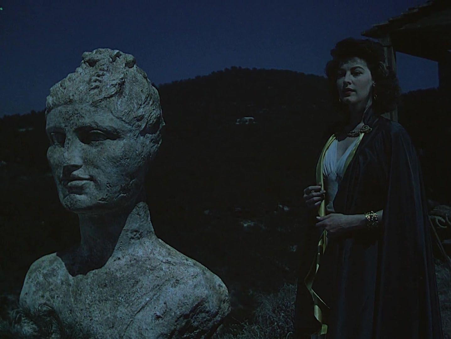
Pandora with one of the many statues that surround the home of Fielding the archaeologist.

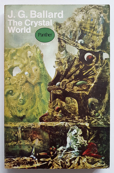
Lewin’s film was restored recently after having been out of circulation for many years. I’d been intending to see it again after reading about the restoration which could only be an improvement on the terrible copy that used to turn up late at night on British TV. Further impetus was prompted by a book review for The Spectator in which Michael Moorcock notes similarities between the film and the stories by JG Ballard which were collected as Vermilion Sands. I’ve never seen Ballard mention the film but the Vermilion Sands stories have long been favourites of mine. The film moved to the top of the viewing list.

pandora7.jpg

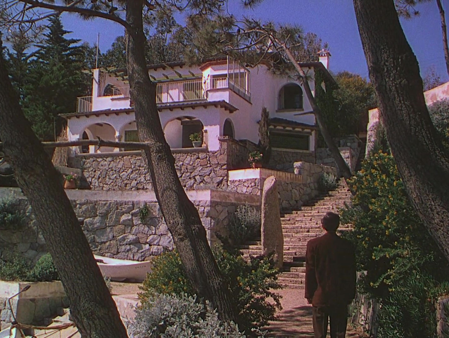
Esperanza or Vermilion Sands? Hendrik is lured by Pandora’s piano-playing.

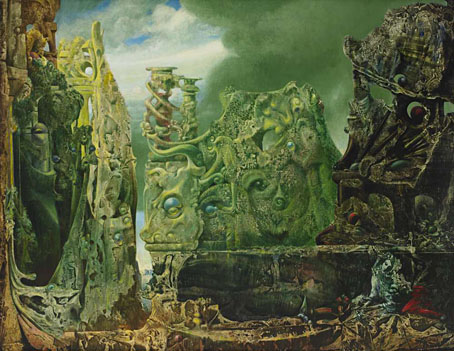
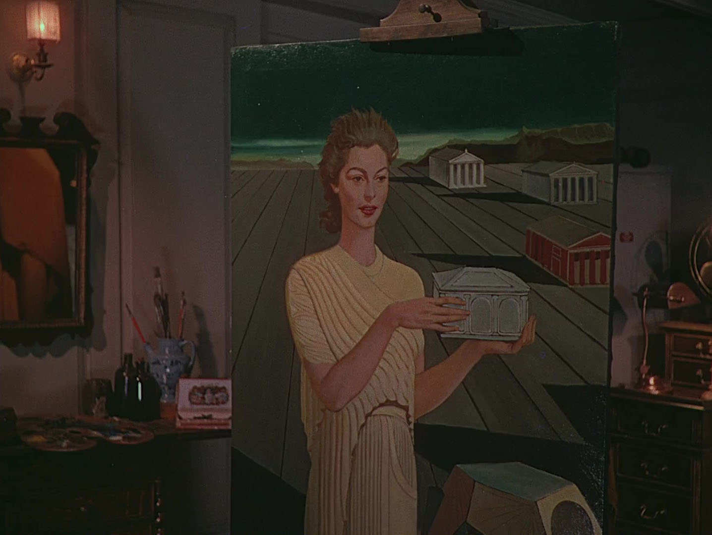
The key connection to Ballard is Surrealist (or-pre-Surrealist) painting, a detail of Pandora and the Flying Dutchman that I’d forgotten all about. Albert Lewin only directed six films; he also wrote each one, and was very determined in his attempts to bring a touch of artistic class to Anglophone cinema. Pandora and the Flying Dutchman was his fourth feature after The Moon and Sixpence and The Picture of Dorian Gray—each an adaptation of a novel where painting is an important element of the story—and The Private Affairs of Bel Ami, a film that was promoted with a Surrealist painting competition on the theme of the temptation of St Anthony. Max Ernst won the competition, and his picture appears at the end of the film, a colour insert in an otherwise black-and-white feature. Lewin did the same for The Picture of Dorian Gray, another black-and-white film where the portrait paintings (including Ivan Albright’s unforgettably corrupted canvas) are shown in colour inserts.

pandora2.jpg

Continue reading “Art on film: Pandora and the Flying Dutchman”

The art of Jean Ransy, 1910–1991

ransy12.jpg

La ville de bas en haut (1961).

Back in January I had a vague intention to write about new areas of Surrealist interest in the months leading up to Surrealism’s 100th anniversary, an impulse that didn’t really sustain itself. That’s okay, almost everything I add to these pages is the result of a whim of some sort, and whims are often short-lived and erratic. All the same, Jean Ransy may fit the Surrealist bill even if he doesn’t seem to have had any lasting connections with those groups who regarded themselves as the official guardians of the Surrealist flame. Ransy was Belgian artist which makes him Surrealist by default if you subscribe to Jonathan Meades’ proposition that Belgium is a Surrealist nation at heart. (Magritte wasn’t a Surrealist, says Meades, he was a social realist.)

ransy03.jpg

Composition surréaliste au coquillage (1962).

Ransy’s paintings appear at first glance like a Belgian equivalent of Rex Whistler in their pictorial realism and refusal to jump on the Modernist bandwagon. Whistler and Ransy were contemporaries (Whistler was born in 1905) but Whistler’s paintings were much more restrained even when outright fantasy entered his baroque pastiches. The “metaphysical” vistas of Giorgio de Chirico are mentioned as an influence on Ransy’s work so he was at least looking at living artists, something you never sense with Whistler. There’s a de Chirico quality in the tilted perspectives and accumulations of disparate objects, also a hint of Max Ernst in one or two paintings. Most of the pictures here have been hoovered from various auction websites but the artist’s official website has the best copies plus biographical information. (Ransy tip via Anne Billson. Thanks!)

ransy13.jpg

Le chant du printemps (1968).

ransy07.jpg

Diane (1969).

ransy06.jpg

La nuit silencieuse (1970).

Continue reading “The art of Jean Ransy, 1910–1991”

Ballard’s sextet

nw164.jpg

Cover artist unknown.

A selection by JG Ballard of six favourite Surrealist paintings, or five Surrealist ones and a Metaphysical picture if you want to be strict about the definitions. These were described but not shown in an essay, “The Coming of the Unconscious”, that Ballard wrote for issue 164 of New Worlds magazine in 1966, something I was re-reading yesterday. I have quite a few of the Moorcock-edited Compact editions of New Worlds, being paperback-sized they used to be a common sight in secondhand bookshops. Issue 164 also includes a guest editorial from Ballard which he fills with a report from his recent viewing of La Jetée, the influential time-travel short by Chris Marker which was receiving its first London screenings.

Ballard’s essay is ostensibly a review of two books about Surrealist art but he doesn’t really bother with these, being more concerned with exploring his own thoughts about the paintings which inform so much of his early fiction. It’s a very good piece, especially for the way it interleaves Surrealist theory with the Ballardian concerns found in the “condensed novels” that were eventually published together (with Dalí cover art) as The Atrocity Exhibition in 1970. The following list comes near the end of the piece, and shouldn’t be taken as a definitive selection on Ballard’s part. There’s no Yves Tanguy, for example, even though Tanguy’s art is referred to in The Drought. And no Paul Delvaux either, an artist who Ballard liked enough to commission Brigid Marlin to recreate the two Delvaux paintings that were destroyed in the Second World War. A still-extant Delvaux painting, The Echo, is mentioned in The Day of Forever, a story that Ballard was probably writing around this time and which was published in New Worlds 170.

“The Coming of the Unconscious” was reprinted several times after this: in a story collection, The Overloaded Man (1967), in the first RE/Search Ballard book in 1984, and in the essay and reviews collection A User’s Guide to the Millennium (1996).


The Disquieting Muses (1916–1918) by Giorgio de Chirico

dechirico.jpg

“These mannequins are human beings from whom all transitional time has been eroded, they have been reduced to the essence of their own geometries.”

I’m guessing that this is the original painting. De Chirico was perpetually frustrated that everyone preferred his “Metaphysical” paintings of the 1910s to the endless self-portraits and other dull works he insisted on producing in his later years. In order to keep the income flowing he painted many copies of his older pictures, at least 18 of which are versions of this one, with several backdated to the time of the original. As Robert Hughes put it: “Italian art dealers used to say the Maestro’s bed was six feet off the ground, to hold all the ‘early work’ he kept ‘discovering’ beneath it.”


The Elephant Celebes (1921) by Max Ernst

ernst1.jpg

“Ernst’s wise machine, hot cauldron of time and myth, is the tutelary deity of inner space, the benign minotaur of the labyrinth.”


The Annunciation (1930) by René Magritte

magritte.jpg

“This terrifying structure is a neuronic totem, its rounded and connected forms are a fragment of our own nervous systems, perhaps an insoluble code that contains the operating formulae for our own passage through time and space.”

An interesting choice mainly because Ballard didn’t usually mention Magritte; Dalí, Delvaux and Ernst were the painters he returned to the most. It’s typical, however, for him to choose a landscape.


The Persistence of Memory (1931) by Salvador Dalí

dali.jpg

“The empty beach with its fused sand is a symbol of utter psychic alienation, of a final stasis of the soul.”

The one painting that even Dalí’s many detractors tend to like. Ballard, like Dawn Ades and a handful of others, developed his own opinions about Dalí’s oeuvre instead of following the consensus opinion (which often seems more like an unexamined prejudice) that everything the artist did after the 1930s was of little value.


Decalcomania by Óscar Domínguez

dominguez.jpg

“These coded terrains are models of the organic landscapes enshrined in our nervous systems.”

Decalcomania is a process, not a picture, an addition by Domínguez to the many techniques of pictorial automatism (frottage, grattage, fumage, etc) developed by the Surrealists. With this entry you can make your own selection from the Domínguez paintings that use the technique. I chose Untitled (1936).


The Eye of Silence (1943–44) by Max Ernst

ernst2.jpg

“The real landscapes of our world are seen for what they are—the palaces of flesh and bone that are the living façades enclosing our own subliminal consciousness.”

My favourite Max Ernst painting, and also a definite Ballard favourite. The Crystal World had just been published when this essay appeared, and both the UK and US editions used this painting on their dustjackets. Panther books followed suit when the UK paperback appeared two years later.

crystal.jpg

Elsewhere on { feuilleton }
The Surrealism archive

Previously on { feuilleton }
Echoes of de Chirico
Max Ernst’s favourites
Ballard and the painters

The groovy video look

strfkr1.jpg

Under Water/In Air.

This recently-released video for Under Water/In Air by Starfucker (or STRFKR, as they often have to style themselves) is an animated production by Edward Carvalho-Monaghan, an artist whose visuals may be seen to similar effect in an earlier animation for Starfucker’s Armatron. Carvalho-Monaghan’s artwork has appeared on a number of the group’s record sleeves, including the latest album, Parallel Realms, which combines a Surrealist dose of the visual style that I refer to as the groovy look with the kind of impossible architecture popularised by MC Escher. Armatron, meanwhile, features more architecture in what may be borrowings from Giorgio de Chirico.

strfkr2.jpg

Armatron.

I lost interest in music videos years ago, I’d much rather listen to the music than have to experience it as a soundtrack to some director’s attempt to illustrate a song with visual novelty. But animated music videos are easier to take, in part because the pairing of animation with music goes back to the earliest days of the medium. The Starfucker videos have had me wondering how much video or animation might suit the “groovy” definition if you went looking for it. And by this I mean following the limits defined by my earlier post which is predominantly concerned with heavy outlines and flat, bold colours rather than quasi-psychedelic effects. I don’t have the time just now to start searching for other examples but The Beatles’ Yellow Submarine is the Ur-text in this department, and the film’s influence may be found in both Carvalho-Monaghan animations.

air.jpg

Sing, Sang, Sung.

One other music video that does come to mind is for Sing, Sang, Sung by Air, directed by Mrzyk & Moriceau. The colour palette is desaturated but the rest of the graphics are definitely in the groovy zone, with the video as a whole coming across like a Surrealist take on those endlessly scrolling, mutating computer games. When the black ball reaches its destination you’re tempted to watch it all again.

(Under Water/In Air tip via Scotto Moore’s This Newsletter Cannot Save You.)

Previously on { feuilleton }
The groovy look
Tadanori Yokoo animations

Chirico by Tanaami and Aihara

chirico.jpg

If I’d have seen it earlier I would have included this animated film in my Echoes of de Chirico post. Chirico (2008) is a wordless 4-minute homage to the maestro of pittura metafisica directed by Keiichi Tanaami with Nobuhiro Aihama. In addition to being a celebrated artist and designer, Keiichi Tanaami has been making short animations since the 1960s, usually with the assistance of other artists. This one puts familiar de Chirico motifs through a metamorphic Surrealist wringer in a manner that could easily have been extended into a much longer film. De Chirico has evidently been a preoccupation for Tanaami in recent years, providing a landscape he can appropriate for his bad-trip take on psychedelic art.

Elsewhere on { feuilleton }
The Surrealism archive

Previously on { feuilleton }
Echoes of de Chirico
Sweet Friday, a film by Keiichi Tanaami
Keiichi Tanaami record covers