Baurenfeind’s capitals

capitals.jpg

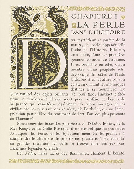
Six of the enigmatic capitals.

After writing about my occasional and not very diligent search for the origin of an unidentified set of calligraphic capitals, Jacob Filipp resolved the whole matter for me very quickly. The mystery dates back to 1997 when I bought a Pepin Press book, Ornamental Type, a substantial overview of historic lettering which contains many quality reproductions but no information at all as to the origin of the alphabets. One set of calligraphic capitals were immediately attractive even though many of them had their flourishes cropped by their containing frames. I’ve since used these letters a number of times in print designs, and also used them as page backgrounds for the very first version of my website. In 2002 there was still a tendency in web design for things to look streamlined, cybernetic or futuristic, qualities I was happy to ignore. After ten years or so of using and reusing the letters the question of their origin began to nag at me, hence my recent attempts to resolve the mystery.

capitals2.jpg

From Baurenfeind’s Schreib-Kunst at the Letterform Archive.

It turns out that the capitals were the work of Michael Baurenfeind (1680–1753), a German calligrapher whose exceptional work appeared on these pages just over a year ago. Had I been more observant I would have noticed that one of the pages in the 1716 edition of Baurenfeind’s Schreib-Kunst is the alphabet in question (I even posted the page here!) but the copy of the book at the Internet Archive is missing the page that shows the first half of the alphabet. Every time I’d gone searching for the capitals I’d been using the letter A as a guide, looking for the reflected flourishes at the foot of the letter in other alphabets. The obvious thing to do would have been to look for more of the letters using image searches, which is what Jacob did, eventually locating a capital D on a deleted post at Design Observer.

I’m pleased to have Michael Baurenfeind revealed as the creator of the capitals, his work stands out even among his equally talented contemporaries. The cropped flourishes mean they aren’t ideal for print purposes—in the past I’ve used them in backgrounds where the cropping goes unnoticed—but I’ve thought a few times of making a new set with the cropped sections restored. Now that I know Baurenfeind is the designer this would be easier to do. Any hesitation about how to properly complete a flourish or fill in a missing area could be resolved by consulting Baurenfeind’s other lettering designs. My thanks again to Jacob for resolving the mystery!

Previously on { feuilleton }
Mira Calligraphiae Monumenta
Liber Artificiosus Alphabeti Maioris
Michael Baurenfeind’s extravagant calligraphy
Bergling’s Art Alphabets
Grand capitals
Costume capitals
Paulini’s mythological alphabet
Joseph Balthazar Silvestre’s Alphabet-album
Johann Theodor de Bry’s Neiw Kunstliches Alphabet
The Book of Ornamental Alphabets
Paul Franck’s calligraphy
Gramato-graphices
John Bickham’s Fables and other short poems
Letters and Lettering
Studies in Pen Art
Flourishes

Weekend links 773

kircher.jpg

The Tower of Babel from Turris Babel (1679) by Athanasius Kircher, showing how wide the Tower would have to be at its base to reach the Moon.

• The week’s literary resurrection: Penguin announced Shadow Ticket, a new novel by Thomas Pynchon. “Hicks McTaggart, a one-time strikebreaker turned private eye, thinks he’s found job security until he gets sent out on what should be a routine case, locating and bringing back the heiress of a Wisconsin cheese fortune who’s taken a mind to go wandering…”

• The week’s musical resurrection: Stereolab announced Instant Holograms On Metal Film, their first new album since Not Music in 2010. Aerial Troubles is the new single with a video which has prompted complaints in the comments about the use of AI treatments for the visuals.

• At Public Domain Review: Modern Babylon: Ziggurat Skyscrapers and Hugh Ferriss’ Retrofuturism, a long read by Eva Miller. Previously: The Metropolis of Tomorrow by Hugh Ferriss.

• This week in the Bumper Book of Magic: Ben Wickey is selling some of the original art from his Lives of the Great Enchanters pages.

• At Wormwoodiana: The Golden Age of Second-Hand Bookshops is now. Mark Valentine explains.

• “Alvin Lucier is still making music four years after his death – thanks to an artificial brain.”

• At Colossal: Hundreds of fantastic creatures inhabit a sprawling universe by Vorja Sánchez.

• Coming soon from Radiance Films: A blu-ray disc of Essential Polish Animation.

• Pattern design and illustration by Gail Myerscough.

• Steven Heller’s font of the month is Homage Script.

• New music: Sabi by Odalie.

• RIP Max Romeo.

Babylon (1968) by Dr John | War In A Babylon It Sipple Out Deh (1976) by Max Romeo | Babylonian Tower (1982) by Minimal Compact

Weekend links 772

barbarella.jpg

Barbarella (1968) by Robert McGinnis. Not one of his best (see below) but the film is a cult item round here.

• At the Bureau of Lost Culture: Alan Moore on Magic, a recording of the three-way talk between Alan Moore, Gary Lachman and myself for last year’s launch of the Moon and Serpent Bumper Book of Magic.

• At Colossal: “Daniel Martin Diaz encodes cosmic questions into geometric paintings and prints.” And is heavily influenced by Paul Laffoley by the looks of things.

• RIP Robert McGinnis, illustrator and poster artist. Related: The Artwork Of Robert McGinnis, Part 1 | The Artwork Of Robert McGinnis, Part 2.

• At Public Domain Review: “The Form of a Demon and the Heart of a Person”: Kitagawa Utamaro’s Prints of Yamauba and Kintaro (ca. 1800).

• Coming soon from Ten Acre Films: The Quatermass Experiment: The Making of TV’s First Sci-Fi Classic by Toby Hadoke.

• New music: Lost Communications by An-Ting; UPIC Diffusion Session #23 by Haswell & Hecker.

Anti-Gravity Holiday Every Month by Robert Beatty.

Barbarella (Extended Main Title) (1968) by Bob Crewe And The Glitterhouse | Barbarella (1991) by The 69 Eyes | My Name Is Barbarella (1992) by Barbarella

Mira Calligraphiae Monumenta

mira16.jpg

These pages turned up when I was searching for (and failing to find) a specific set of calligraphy capitals. Sixteenth-century calligraphy books commonly present their texts and alphabets in collections of engraved plates. Mira Calligraphiae Monumenta stands apart from its peers with coloured inscriptions and page after page of illuminated embellishments—fruits, flowers, insects and other animals that have nothing to at all do with the calligraphic exercises. The reason for the illustrations is explained in a note on the Getty website: the calligraphy by Georg Bocskay came first (in 1561–1562), the book being intended as a showcase of calligraphic styles which demonstrated Bocskay’s incredible skill and mastery of a wide range of lettering. The illuminations were added thirty years later (from 1591–1596) by Joris Hoefnagel at the request of Rudolf II, Holy Roman Emperor, and an art patron with a celebrated taste for the unusual. Rudolf’s court was filled with alchemists, John Dee and Edward Kelly among them; he commissioned paintings from Giuseppe Arcimboldo, had his own zoo, and his Kunstkammer was one of the largest ever assembled. Hoefnagel’s embellishments have nothing to do with penmanship but the book was only one of a vast number of exquisite or curious objects that Rudolf either commissioned or collected.

mira14.jpg

Looking through the book I wonder what Georg Bocskay would have thought about all the superfluous additions to his meticulous work. I’m also reminded of a pair of equally odd volumes: the Voynich Manuscript (which Rudolf II was reputed to have owned, although there’s no evidence for this), and Luigi Serafini’s Codex Serafinianus, both of them books which combine their pictures of plants (and many other things in Serafini’s case) with unusual scripts. Mira Calligraphiae Monumenta is available today in facsimile reprints but most people will see the pages via the Getty’s scans. The Getty website isn’t the best place to browse the pages, however. You’re better off going here where the entire book may be seen on a single page.

mira18.jpg

As for my calligraphic quest, the search continues to be a fruitless one although in this case it did turn up a quantity of painted fruit. The capitals I’ve been looking for are in a book I bought in the 1990s, a guide to alphabet design through the ages whose pages offer little information as to the source of their lettering designs. It’s not a great problem by any means but things like this often nag at me. In the past I’ve borrowed letters from the enigmatic alphabet for my own designs. I like to know the origin of a thing when I’m using it myself. The search will continue…

mira01.jpg

mira02.jpg

Continue reading “Mira Calligraphiae Monumenta”

Weekend links 771

druillet.jpg

A page by Philippe Druillet from Salammbo (1980).

• At the BFI: Alex Ramon suggests 10 great British films of 1975 (the Britishness of Barry Lyndon seems a little debatable), while Jonathan Romney talks to the Quay Brothers about their latest exhibition and Sanatorium Under the Sign of the Hourglass.

• At Public Domain Review: The Cameraman’s Revenge (1912), an early animated film by Wladyslaw Starewicz concerning the domestic affairs of a pair of beetles.

Saga de Xam (previously), the science-fictional bande dessinée by Nicolas Devil and Jean Rollin, will be published in English for the first time in June.

When I first came across Ernest Berk, I assumed he was somebody’s Ursula Bogner style joke. An anti-Nazi exile turned fearless electronic pioneer, who had been a dancer in the Weimar Republic and worked both with Max Reinhardt and with Peter Zinovieff? Who nobody had ever heard of? I smelled a rat, but was wrong: Berk was very real. He was one of many dancers who fled Nazism and ended up at Dartington Hall, a school founded by wealthy hobbyists in Devon which has been slightly fancifully described as the ‘English Bauhaus’; he danced and choreographed at Glyndebourne and Covent Garden, and in the 1950s, became interested in the electronic music that was emerging out of his native Cologne. Berk gradually built a studio in Camden where he would be able to compose music for his own ballets…

Owen Hatherley on the legacy of the emigré composers who found refuge in Britain from the 1930s on

• “…distant and unrelated juxtapositions are at the very heart of Surrealism—both in France and in Japan.” Leanne Ogasawara on Surrealism in Japan.

• “What’s happening? Where are we? What about the investigation?” Mark Harris on Alan Sharp and Arthur Penn’s Night Moves.

• At Bandcamp: Dark Dreams and Bright Nightmares: Jim Allen‘s artist guide to Coil.

• At Colossal: Winners of the 2025 British Wildlife Photography Awards.

• DJ Food found more psychedelic posters from the web.

Wildlife (1987) by Penguin Cafe Orchestra | Night Moves/Fear (1988) by Jon Hassell/Farafina | Dark Dreams (1989) by Brian Eno