Percy Billinghurst’s fables

billinghurst02.jpg

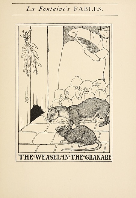
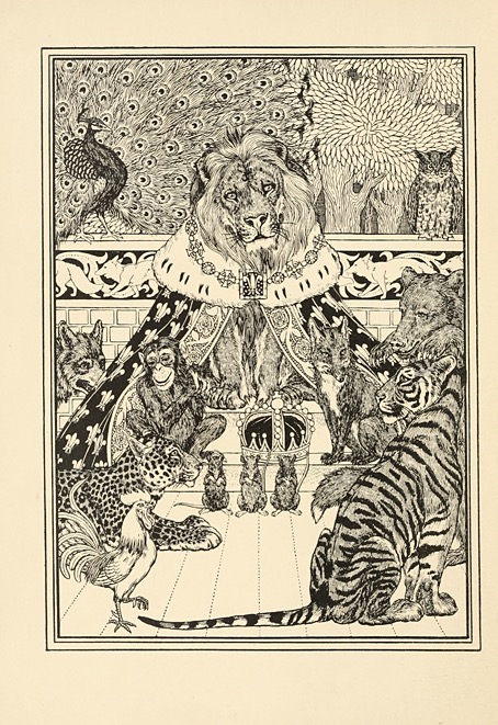
These are actually La Fontaine’s fables illustrated by a British artist, Percy J. Billinghurst, but I try to avoid unwieldly post titles that mix artist and writer. There isn’t much of a biographical record for Percy Billinghurst, and what records there are don’t agree about his birth and death dates which are generally given as 1871—1933. One thing that is certain is Billinghurst’s fondness for drawing animals. In addition to this volume he illustrated a book of his own, A Hundred Anecdotes of Animals in 1901, and an edition of Aesop’s fables in 1910.
billinghurst03.jpg

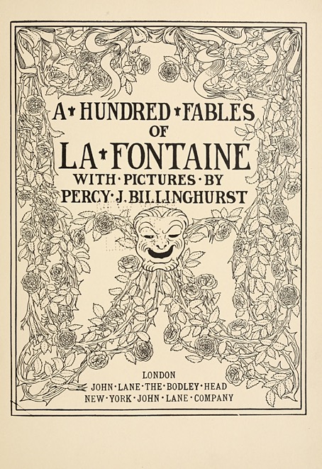
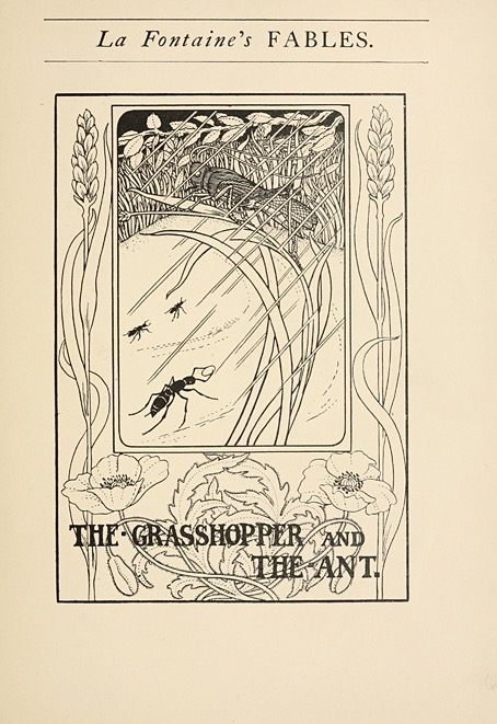
The La Fontaine book dates from 1900, and has the French text translated into clumsy English verse. Whoever did this isn’t credited but the translations by Walter Thornbury for one of the Doré editions are far better. Billinghurst’s illustrations are typical of a graphic style much favoured at the time by The Studio magazine: clear lines with heavy outlines and little shading, and with the captions hand-lettered and incorporated into the drawing itself. Those dots separating the words are another Studio hallmark. A bookplate by Billinghurst was featured in an ex libris collection published by The Studio in 1898 which suggests there may be more of his early drawings to be found inside the magazine.
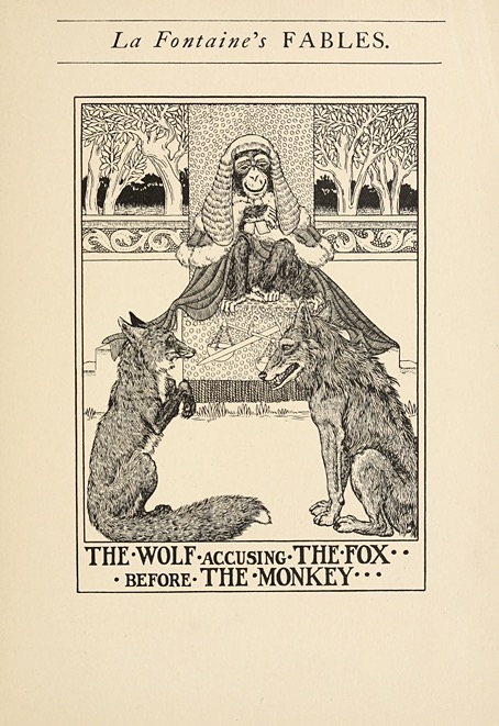
billinghurst04.jpg

billinghurst05.jpg

billinghurst06.jpg

Continue reading “Percy Billinghurst’s fables”

Cthulhu’s new labyrinth

labyrinth.jpg

Here in The North the weather is slowly turning against the wearing of T-shirts outdoors but this week I’ve made a new shirt available based on an old design. The first Cthulhu Labyrinth came about when I was putting together pages for a Cthulhu calendar in 2012. In the end it didn’t get used for the calendar but the design stuck around even though I was never entirely satisfied with it. My recent work on the new edition of The Haunter of the Dark has had me going back through all my Lovecraft-related art which prompted me to finally rework the old design into a more satisfying appearance. I’ve come to think of this as a distillation of The Call of Cthulhu into a single graphic: the globe-spanning investigation leads inexorably to the monster sitting spider-like at the centre of its convoluted path. As before, other shirt designs are available, and I can prepare new shirts from old artwork on request.

armitage.jpg

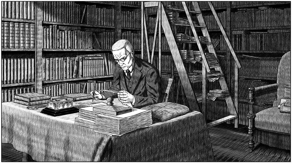
And since I’ve mentioned the work-in-progress, I thought another progress report was in order. After spending spare moments over the past 18 months reworking pages for The Great Old Ones while also designing new page layouts I’m now fully immersed in the completion of The Dunwich Horror, and very pleased with the way the story is proceeding. I’m still having to work on this as a side project but I feel properly engaged with the story now that I’m working on new pages rather than redrawing parts of old ones. I’ve just finished drawing page 27 which brings the narrative up to the place where the story reveals its apocalyptic scope, when Dr Henry Armitage reads for the first time a portion of Wilbur Whateley’s decrypted diary. I’ve roughed out the next few pages which will bring the story to the beginning of part 9 where I’m hoping the drawing will go more quickly once I’m back in the wilds of Dunwich. The pace is kept to a crawl by my having to match all the fine shading I was doing in the 1980s but shading rural scenes is generally less time-consuming than shading detailed interiors like the one above. The long march to Sentinel Hill continues.

Elsewhere on { feuilleton }
• The Lovecraft archive

Previously on { feuilleton }
• The Father of Serpents
• The Black Goat
• Tsathoggua rising
• H.P.L.
• The return of the Crawling Chaos
• Lettering Lovecraft
• Weird ekphrasis and the Dunwich Horrors
• Kadath and Yog-Sothoth
• Another view over Yuggoth
• Nyarlathotep: the Crawling Chaos

Boris Artzybasheff’s Myths of the World

artzybasheff01.jpg

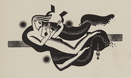
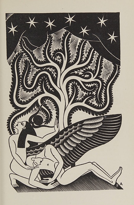
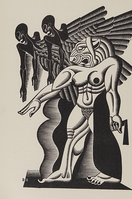
Boris Artzybasheff’s art was rediscovered in the 1980s by a new generation of American cartoonists who were delighted by his illustrations of anthropomorphic machinery and other technological artefacts. These were the illustrations which made Artzybasheff popular with advertisers and the commissioners of magazine covers in the 1940s and 50s, and their continued popularity today has tended to overshadow his earlier book illustrations, in the same way that W. Heath Robinson’s drawings of improbable inventions overshadow his own illustrated books.

artzybasheff02.jpg

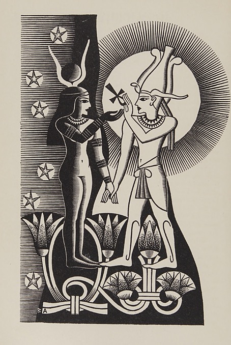
Anthropomorphic machines were still in Artzybasheff’s future when he produced twenty wood engravings for Orpheus: Myths of the World in 1930, one of several books by Padraic Colum which retell mythological stories. In the introduction Colum explains why he named a book about world mythology after a Greek icon:

I have called the collection “Orpheus,” naming it after the minstrel who, according to the poet of the Argonautica, sang “how the earth, the heaven, and the sea once mingled together in one form, after deadly strife were separated each from the other; and how the stars and the moon and the paths of the sun ever keep their fixed place in the sky; and how the mountains rose, and how the resounding rivers with their nymphs came into being, and all creeping things.”

The art from Artzybasheff’s first decade of published illustration is so different to his later humourous drawings that it might be the work of another artist altogether. The Colum engravings are all very Deco-styled: bold, stylised, and generally flat, reminding me of some of the illustrations the Radio Times used to run. They’re also almost entirely serious until you spot the expression on Eve’s face when the Serpent offers her the forbidden apple. As with Heath Robinson, the humour crept in slowly until it became the dominant mode.

artzybasheff03.jpg

artzybasheff04.jpg

Continue reading “Boris Artzybasheff’s Myths of the World”

Weekend links 848

max.jpg

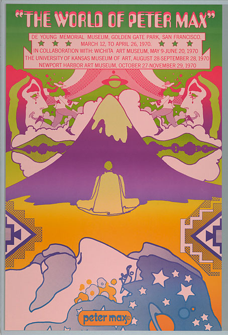
Exhibition poster, 1970.

• RIP Peter Max, an artist who made the popular manifestations of psychedelic graphics near-synonymous with his own name which was always typeset and prominently displayed with a copyright symbol on his printed creations. Max’s formulation of the artist-as-brand was so extensive he makes those who attempted similar things look like slackers. Even Salvador Dalí didn’t have his own breakfast cereal. Hippy transcendence fused with naked commercialism. More Max: The 1971 Peter Max Astrologicalendar; Riverside Drive, a Max-designed typeface; Max on TV: The Fifth Dimension Special: An Odyssey in the Cosmic Universe of Peter Max (1970); Peter Max book covers, puzzles and more.

• “Film is a very unusual combination of things because it has an incredible financial commitment of spending, yet it has to be free and creative. To be any good, the cinema that I do has to be free and yet there are many constraints on it now and my best films were made in an era of wildness…” The late Jeremy Thomas talking to Nick James in 2014 about his long career in cinema.

• At Nautilus: The Promise and Peril of Toad Smoking, the Everest of Psychedelics. Kristen French talks to Kimon de Greef about his new book, The Ego Trip: Psychedelic Toads, a Trail of Deaths and the Guru Who Peddled Transcendence.

• At Smithsonian Mag: Thomas Waters on six ways that people of the past used magic to protect their homes, from witch bottles to mystical symbols.

• New music: September Nineteen Sixty Nine by Adam Wiltzie / Jóhann Jóhannsson; Now We Can Sing by Max Richter; Norfolk by Richard Sage.

• At CDM: Adam Wiltzie talks to Peter Kirn about his posthumous collaboration with Jóhann Jóhannsson.

• At Public Domain Review: Thomas W. Laqueur on dogs in the paintings of Paolo Veronese.

• At Dennis Cooper’s: Spotlight on Leonora Carrington The Hearing Trumpet (1977).

• At the BFI: Kim Newman chooses 10 great sci-fi B-movies.

• Old music: King Crimson on German TV in 1969.

• 1969 (1969) by The Stooges | 1969 (1983) by The Sisters Of Mercy | 1969 (2002) by Boards Of Canada

Harry Clarke’s Fairy Tales by Hans Christian Andersen

clarke01.jpg

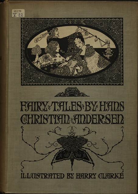
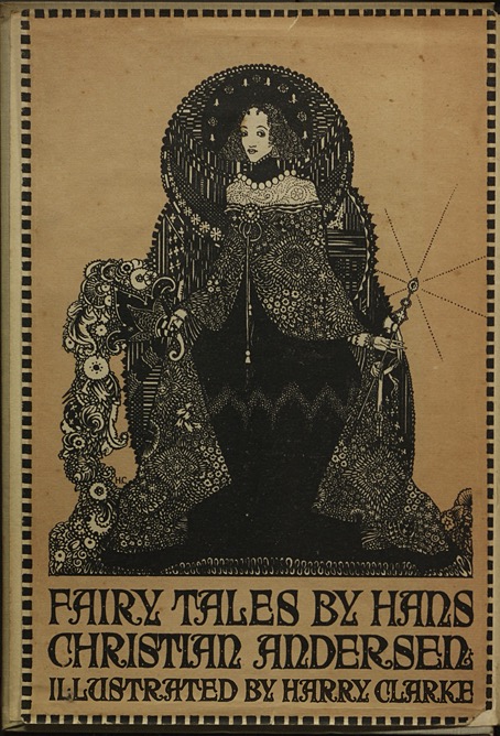
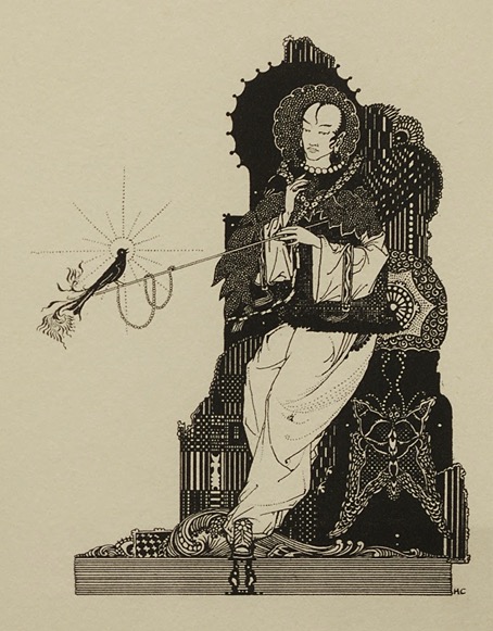
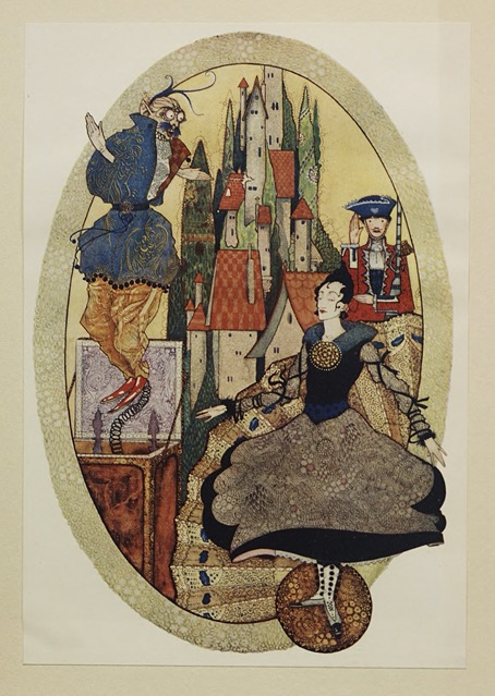
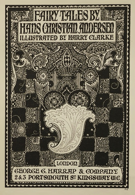
Six years ago I put together a post of links to online sources for all of Harry Clarke’s major works of illustration. His first illustrated book, Fairy Tales of Hans Christian Andersen, was among these but the best link I could find at the time was to a set of scans at Flickr which didn’t include things like the board illustrations. (And Flickr is a generally unstable host for anything.) The images here are from this page which was added recently to Wikimedia Commons, and are taken in turn from a collection of book scans at Maastricht University.

clarke02.jpg

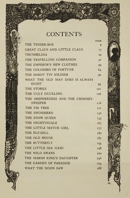
Clarke’s book of fairy tales was published by Harrap in 1916 but wasn’t intended to be his first illustrated edition. Harrap’s first commission had been for an edition of Coleridge’s Rime of the Ancient Mariner but the project was abandoned when most of the art was destroyed during Ireland’s Easter Uprising. Further plans for an edition of Pope’s The Rape of the Lock were also abandoned. Harrap’s decision to launch a new artist with yet another collection of Hans Christian Andersen stories seems surprising when there were already many fine editions for British book-buyers to choose from. The Robinson brothers—Thomas, Charles and William—had collaborated on a huge story collection published in 1899, with their individual contributions being subsequently repackaged as separate volumes. The same year saw another edition for which Helen Stratton provided over 400 illustrations. Edmund Dulac and Dugald Stewart Walker had produced books of their own by the time Clarke’s edition was being prepared, and there were others besides these.

clarke03.jpg

Clarke’s collection has more stories than some of those illustrated by his contemporaries but his art is also a little less assured than it would be in his later books. As a fairy-tale collection it lacks the delicate touch he brought to his illustrated edition of Perrault’s tales. There are many excellent compositions, especially among the black and white drawings but also a few pieces which aren’t so much composed as filled with competing areas of decoration that overwhelm the subject of the picture. Clarke never abandoned his fondness for minute details but in his later books his arrangements of tiny circles and baroque curlicues are much more successful.

clarke04.jpg

clarke05.jpg

clarke06.jpg

Continue reading “Harry Clarke’s Fairy Tales by Hans Christian Andersen”