
Japan, 1998.
I’m currently in the middle of a Nicolas Roeg rewatch season after acquiring a blu-ray of the recently reissued Castaway, Roeg’s 1986 adaptation of Lucy Irvine’s memoir (which shouldn’t be confused with 2000’s Cast Away). In the early 1980s when I was becoming more acquainted with his films I went through a phase of buying film posters, and managed to pick up copies of the UK quad sheets for Don’t Look Now and Bad Timing. I would have preferred the one for The Man Who Fell to Earth but Bowie-obsessives have made that particular item very collectible, and it never crossed my path. Foreign posters for Roeg films also tend to be uncommon since his films have never been really popular, and some, like Eureka, were plagued with distribution difficulties which made them difficult to see at all. Eureka is missing from this small collection of foreign posters due to a lack of suitable candidates.
Performance
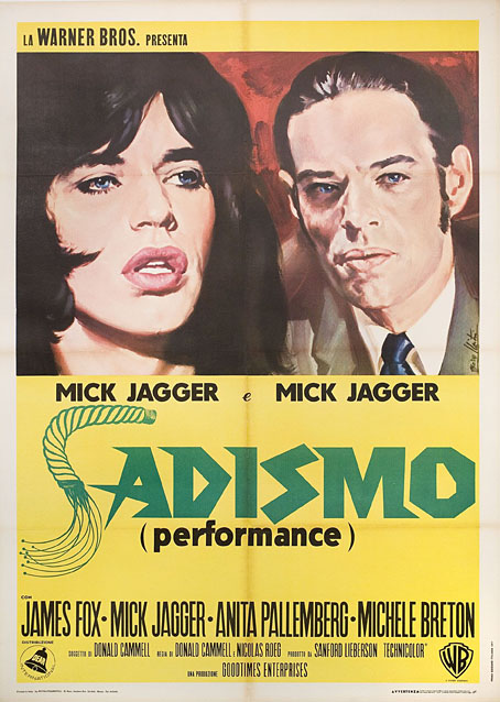
Italy, 1971.
One thing you notice when you look for details of foreign releases is how often a film title is changed to suit local tastes. The Italians changing Performance to Sadismo is one of the more ridiculous examples, picking out a minor detail—Joey’s whipping of Chas at the beginning of the film—while ignoring the rest of the film’s kaleidoscope of images and references.
Walkabout
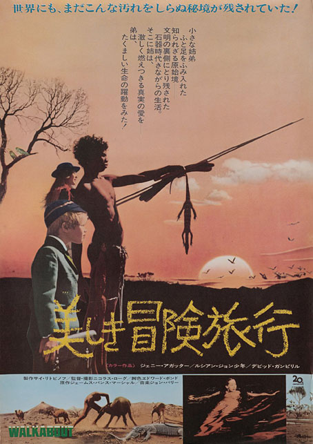
Japan, 1971.
Similar changes occur in poster art, when the movement to another country prompts the local designers to over-emphasise a film’s sensational elements. In the UK and US the posters for Walkabout stressed the story as being one about survival in a wilderness, and the differences between the Indigenous boy and the English girl and her brother. Elsewhere the posters were more concerned with Jenny Agutter’s skinny-dipping scene while telling you little else about the rest of the film.
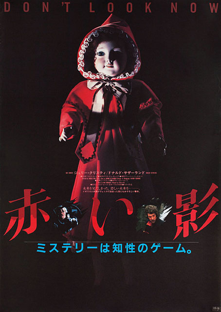
Don’t Look Now
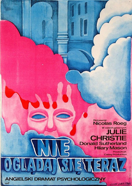
Poland, 1973. Art by Maria Mucha Ihnatowicz.
I was hoping there might be more Polish posters for Roeg’s films but this was the only one which turned up. Japanese posters can at times be as elusive as the celebrated Polish designs, with an approach to design that’s very different to the Western standard. The Japanese poster for a reissue of Don’t Look Now is one of the best I’ve seen for that particular film, condensing into a single image the two threads of the story—the dead girl and the murder mystery—while emphasising the film’s persistent use of the colour red.
Japan, 1983.
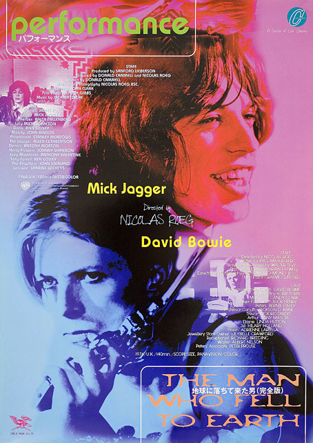
The Man Who Fell to Earth
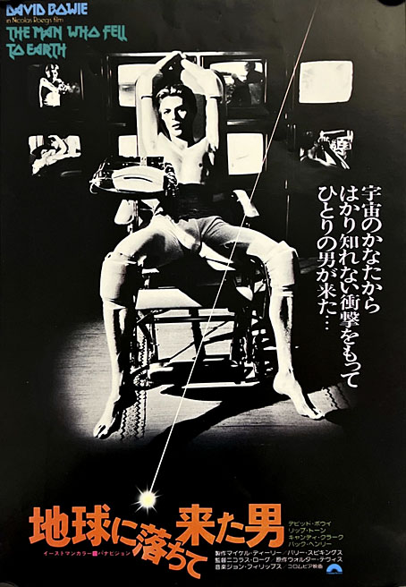
Japan, 1976.
When The Man Who Fell to Earth was reissued for its fortieth anniversary ten years ago it was promoted with new posters, one of which reused the promo shot of David Bowie in the medical chair with the bank of TV screens behind him. The TV screens were removed, however, thus deleting one of the signifiers of Newton’s alien psychology. The other poster was a monochrome picture of Bowie’s face with dyed hair and irises and no further information about the film. I dislike over-emphatic film posters but I dislike even more the ultra-minimal approach which communicates as little as possible. There was an annoying trend a few years ago of amateur designers creating minimal film posters, too many of which only made sense if you were already familiar with the film itself. With a change of typography, the Bowie-face poster could just have easily been used on the cover of a Bowie compilation album.
Bad Timing
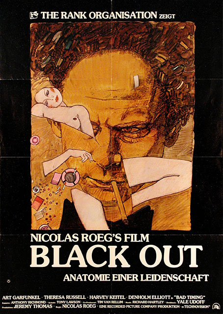
Germany, 1980.
Bad Timing is another film with variant titles such as Black Out and (bizarrely) Il Lenzuolo Viola (The Purple Sheet). It’s also a film with enough art reference to perhaps be added to my Art on film posts, with a Viennese setting that opens in an art gallery filled with Secessionist paintings.
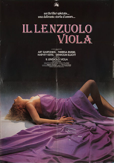
Italy, 1980.
Japan, 1981.
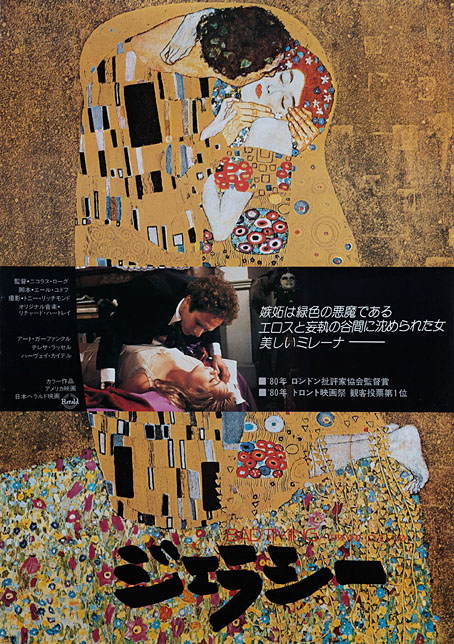
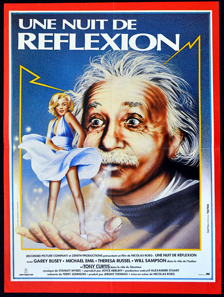
Insignificance
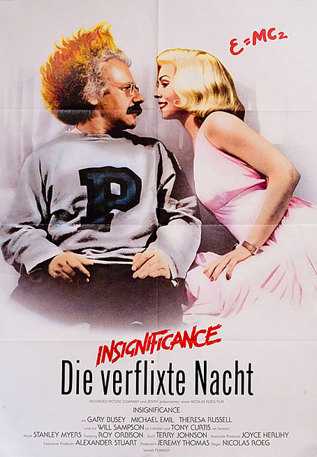
More retitlings, with the German public being offered (according to auto-translation) The Fucking Night. Am I missing a pun or is this another example of Teutonic vulgarity? (Update: I think the translation may have been off. Trying it again yields the more acceptable The Damned Night.) The French preferred the more subtle A Night of Reflection. The film concerns the interactions of four very different characters—the Actress, the Professor, the Senator and the Ball Player—all of whom are never named despite their obvious similarity to real people. Despite wishful thinking on the part of the French, it isn’t Albert Einstein’s breath that elevates Marilyn Monroe’s skirt.
The Witches
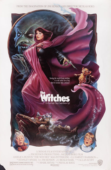
USA, 1990. Art by Greg Winters.
I’ve only seen this once, and didn’t enjoy it very much, the direction and editing seemed very anonymous, nothing like a Roeg film at all. The poster is included here so I can point out a swipe I noticed recently, the cloaked figure being purloined from a painting by Michael Whelan, his cover art for Bearing An Hourglass by Piers Anthony.
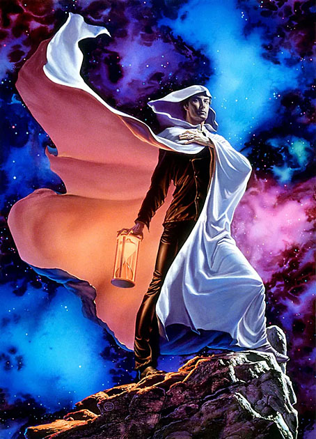
Art by Michael Whelan, 1984.
Previously on { feuilleton }
• Landscape with the Fall of Icarus
• The Nicolas Roeg Guardian Lecture, 1983
• Beyond the Fragile Geometry of Space
• Canal view
Great post! The androgynous Mick Jagger art is fantastic, even if the retitling is downright deceitful. I love the Japanese “Man Who Fell to Earth” poster; I could be tempted to put that on the wall, and I’m usually hesitant about hanging posters. The Austrian Secession showing up at the early stages of the huge revival/boom in Klimt and Schiele is quite interesting too. And that red bordered “Une Nuit…” poster looks like an era “Time” magazine cover.
I used to have a rule for hanging posters that they had to fill two criteria: the film had to be a cult favourite of mine and it had to be a great design. The two things don’t always coincide. That’s one reason I hoped I might find a poster for The Man Who Fell to Earth, Vic Fair’s UK poster fills both requirements. I wouldn’t mind one of the Japanese ones either.
Posters are a problem for decoration since they’re so damned big. You need a lot of empty wall and a very large frame as well. I spoiled some of my old purchases by carelessly tacking them to walls in rooms I was sharing with people who smoked incessantly.
Not only did the Italians re-title Performance badly, they couldn’t even spell Anita Pallenberg’s name right.
An amazing collection. I went through a Roeg phase or two. His films are always challenging and often messy… so it makes sense that the posters reflect this.
I’m a big fan of the Japanese Track 29 poster: https://posteritati.com/poster/29403/track-29-original-1987-japanese-b2-movie-poster
I always think it looks like the box art for a Nintendo RPG.