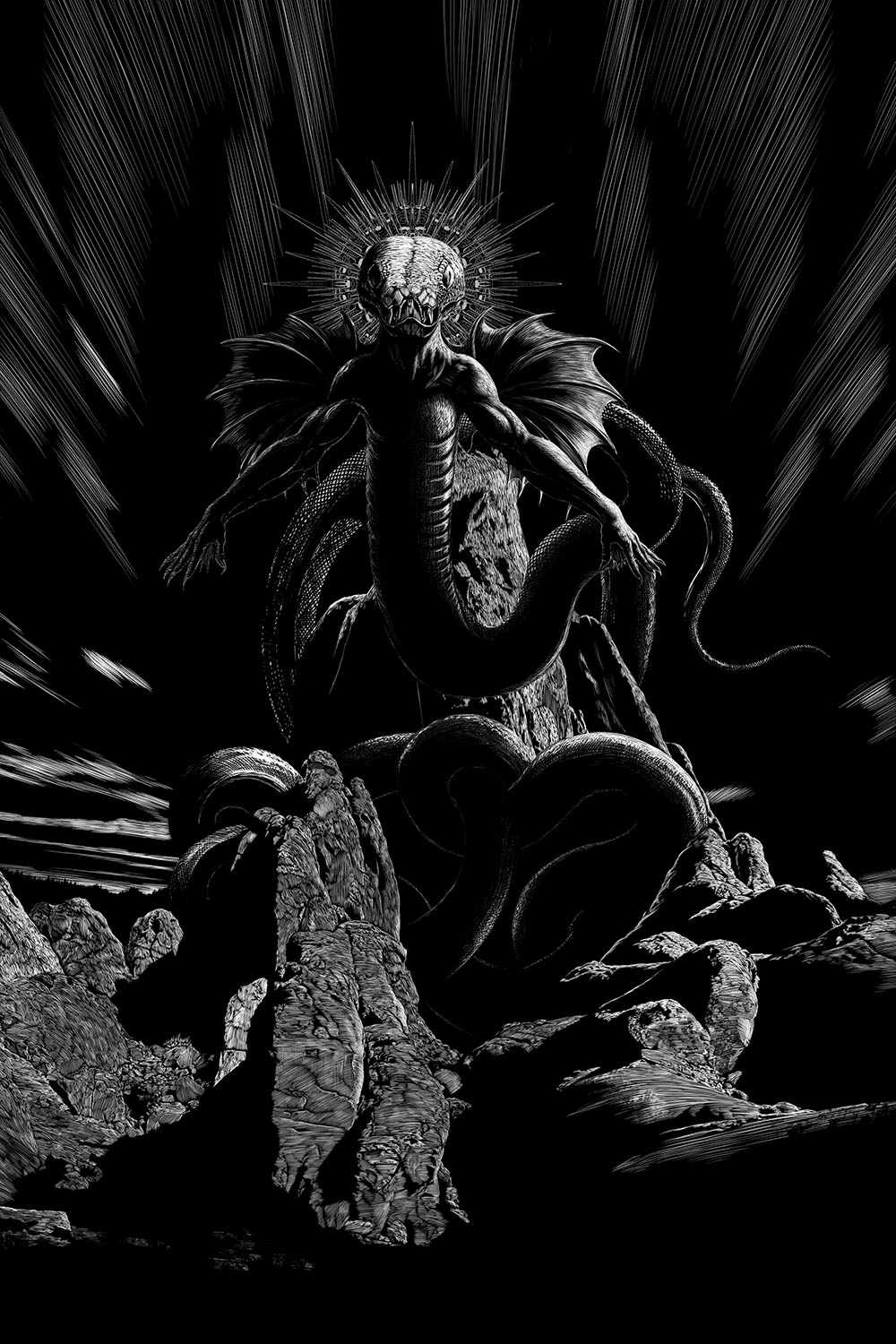
The legend of Yig, Father of Serpents, remained figurative no longer, and I started with loathing when told of the monstrous nuclear chaos beyond angled space which the Necronomicon had mercifully cloaked under the name of Azathoth. — The Whisperer in Darkness
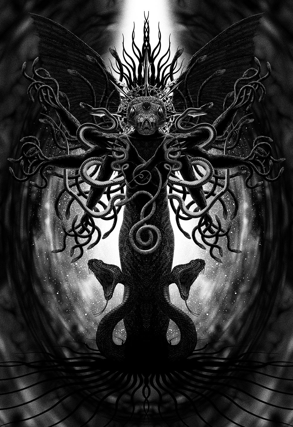
Another month, another Lovecraftian portrait. Yig was the last of the Photoshop melanges from 1999 that I felt a need to replace for the new edition of The Haunter of the Dark, which means that the whole of the Great Old Ones section of the book is now complete. Back in 1999 I wasn’t really sure what to do with Yig. The snake god described as “the Father of Serpents” was partly an invention of Zealia Bishop who paid HP Lovecraft to flesh out a trio of outlines which were subsequently sold as stories to Weird Tales.
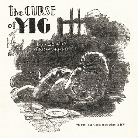
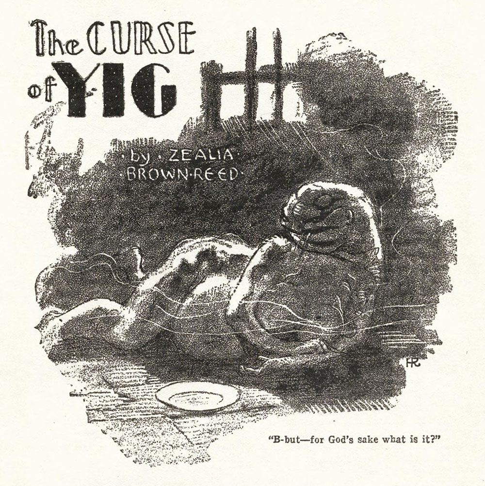
Illustration by Hugh Rankin, 1929.
The first of these, The Curse of Yig, was published in November 1929, and credited to Zealia Brown Reed as Bishop was then known. The piece is essentially a revenge scenario in which a woman in the wilds of 19th-century Oklahoma has to suffer the supernatural consequences when she kills a nest of rattlesnakes, consequences which, as in The Dunwich Horror, result in monstrous births. The god that protects the snakes is described in Native American tellings as “an odd half-anthropomorphic devil of highly arbitrary and capricious nature”. Lovecraft typically expands the scope of the tale with suggestions that Yig is connected to the Aztec and Mayan myths of Quetzalcōātl and Kukulkan. The “Father of Serpents” is more corporeal than Lovecraft’s nebulous interdimensional entities but Yig was quickly added to the Mythos pantheon, being named along with Cthulhu and Shub-Niggurath in another Bishop/Lovecraft story, The Mound.
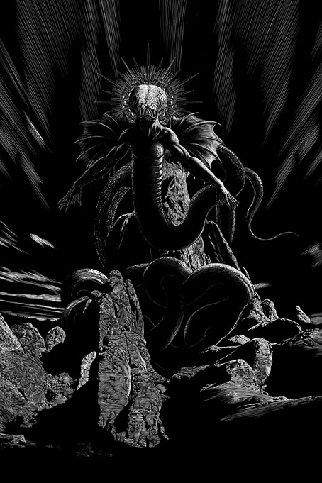
My 2015 illustration for Rattled by Douglas Wynne.
For my 1999 portrait I used a number of old snake illustrations that I collaged and mutated until they formed an appropriate composition. As with some of the other portraits in this section of the book, the final piece looked okay for the time but my satisfaction with it didn’t last. The new version is based in part on an earlier portrait of Yig that I drew in 2015 for Rattled, a story by Douglas Wynne that was published in The Gods of HP Lovecraft. Wynne’s story is closer to The Curse of Yig than to Lovecraft’s more cosmic excursions, and required a suitably earthbound illustration.
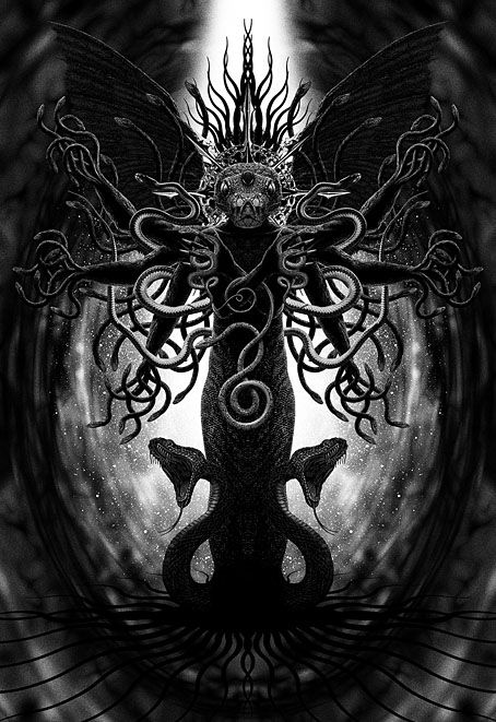
The new portrait follows the form of several of the other Great Old Ones pieces by being hieratic and almost completely symmetrical. Our bodies are generally symmetrical but absolute symmetry is a rare thing in nature, which may explain why you see it so often in religious art. Perfect symmetry suggests a supernatural purity that can’t be achieved outside mathematics, thus an ideal quality for the depiction of supernatural entities.
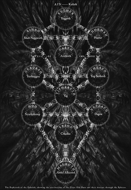
The Sephiroth chart from the second edition of the book, 2006.
If you’re a regular reader you’ll know by now that The Great Old Ones was a collaboration with Alan Moore in which Alan mapped the Mythos gods across the Kabbalistic Tree of Life, while also writing an occult evocation for each. Yig is placed at Tiphereth, the sphere of beauty, which occupies an important central position on the Kabbalistic Tree. I remember Alan being surprised and pleased when I sent him a print of the artwork which had a radiant halo of snake tails positioned at the top of the picture. I didn’t know that Yig was going to be assigned to Tiphereth but the snake halo is a fitting symbol for a sphere associated with the Sun, and whose corporeal symbol is a splendid king. My new portrait acknowledges these aspects while bearing in mind that the Great Old Ones are closer to the demonic entities of the Qliphoth than to the traditional god forms of the Kabbalah. The new Yig has a spiky crown and a multitude of arms that correspond with the position of Tiphereth at the intersection of multiple Kabbalistic paths. (The arms also refer to the multi-armed Christ-like figure that I drew for the Tiphereth page in the Bumper Book of Magic.) As for the wings, these may be taken as a nod to Quetzalcōātl, the Feathered Serpent who happens to be named in Alan’s accompanying text. It’s not necessary for a reader to catch any of these references to appreciate either the text or the artwork but the details add a layer of additional meaning for the initiated.
Elsewhere on { feuilleton }
• The Lovecraft archive
Previously on { feuilleton }
• The Black Goat
• Tsathoggua rising
• H.P.L.
• The return of the Crawling Chaos
• Lettering Lovecraft
• Weird ekphrasis and the Dunwich Horrors
• Kadath and Yog-Sothoth
• Another view over Yuggoth
• Nyarlathotep: the Crawling Chaos