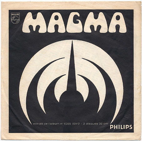
Kobaïa / Müh (1970), a single by Magma.
1: Zeuhl definitions
Zeuhl is an adjective in Kobaïan, the language written by Christian Vander, drummer and founder of the French band Magma.
Pronunciation: zEU(h)l, while the EU are like a French E with a slight U, and the (h) is a semi-silent letter which is an integrated part of the EU, totalling in a “syllable and a half”. (Prog Archives)
Zeuhl (pronounced [zœl]; lit. ’celestial’) is a music genre that is a hybrid of jazz fusion, symphonic rock and neoclassical music, established in 1969 by the French band Magma. The term comes from Kobaïan, the fictional language created by Magma’s Christian Vander and Klaus Blasquiz for Magma, in which Zeuhl Ẁortz means approximately ‘celestial force’.
[…]
Zeuhl is determined by several characteristic elements. Especially important are dominant rhythm fractions, usually in the form of a pumping bass guitar and sometimes sluggish or flexibly playing drum kits. Slow repetitive structures that serve to build a hypnotic atmosphere are just as prominent as solo passages of high technical finesse. Vocals are often widely present and can consist of polyphonic choral movements, such as Carl Orff’s Carmina Burana, or soloistically performed passages with shrill intonation. Zeuhl bands also often have solo guitarists or pianists that usually have a more than accompanying function, especially to emphasize the repetitive patterns. (Wikipedia)
2: The Birth of the Zeuhl
“1967,” he says. “The year John Coltrane died. It seemed to me that afterwards, it was as though music had to try to start all over again. Someone had to pick up the pieces, go on searching in the way that he had. Nobody could match him, but people could pick up the flame. It was almost impossible for anyone to do anything new after Coltrane, but you had to try, try to find other new directions. So that’s what I tried to do with Magma. I was a bit young at the time, but…”
Christian Vander describing the birth of Magma to Paul Stump, The Wire, July 1995
3: Zeuhl lists
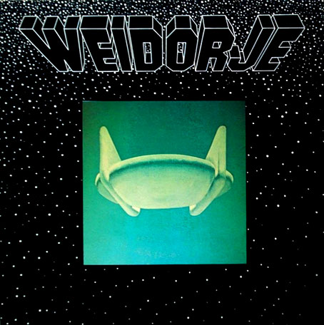
Weidorje (1978) by Weidorje. Cover art by Klaus Blasquiz.
• Shindig! Magazine: Magma in seven records, and Deeper Underground: the best albums by the Magma family by Warren Hatter.
• Prog Is Alive and Well in the 21st Century: My Favourite Zeuhl Albums of All-Time by Drew Fisher.
• Bandcamp: There is No Prog, Only Zeuhl: A Guide to One of Rock’s Most Imaginative Subgenres by Jim Allen.
• Discogs: Zeuhl lists by Neit and ultimathulerecords.
• Prog Archives: Top 100 Zeuhl.
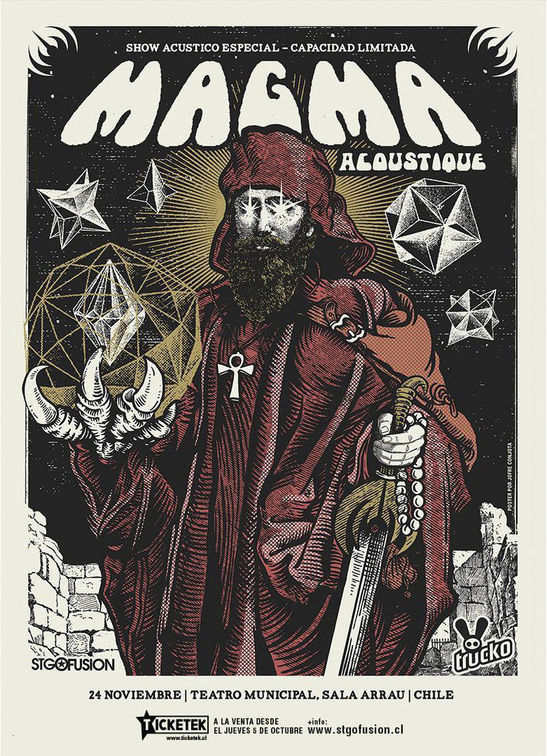
4: Live Zeuhl
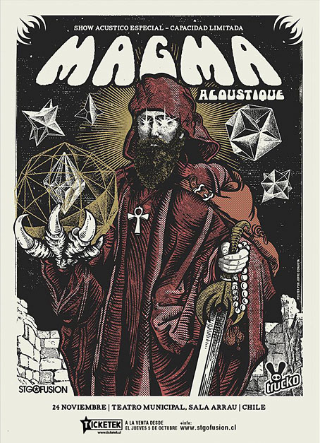
A poster by Jofre Conjota for a concert in Chile demonstrating that Zeuhl can exist without electricity.
• Magma, Hippodrome du Pantin, Paris, 1977 (46 mins; a French TV film that captures one of the 70s lineups in peak form. Includes an almost complete performance of Mekanïk Destruktïẁ Kommandöh.)
• Weidorje, French TV, 1979 (11 mins; Magma offshoot Weidorje were only active for a couple of years, this may be their only TV appearance.)
• Magma, Théâtre Bobino, Paris, 1981 (A complete concert—1 hr 53 mins—from the group’s weird-funk period: Christian Vander leaves his drumkit to sing and rant at the audience, everyone is dressed in spacey glitter outfits, and some of the songs from the Merci album can’t be classed as Zeuhl at all. The musicians are all first rate, however.)
• Magma play Köhntarkösz, 2005 (A fantastic 32-minute performance in a very cramped venue.)
• Collectif PTÄH interprète Magma (12 mins; a Magma covers band playing in a village square.)
5: Cinematic Zeuhl
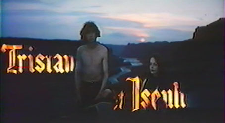
• Tristan et Iseult (1972): a French feature film with a score by Christian Vander and three members of Magma. The soundtrack album was later incorporated into the Magma official discography as Ẁurdah Ïtah.
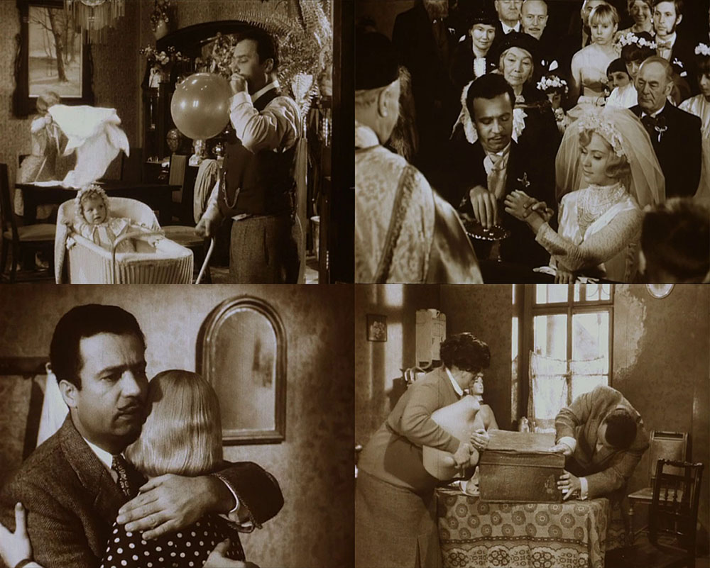
• Moi y’en a vouloir des sous (1973): a French satire in which Magma make a brief appearance as a way-out rock group.
6: Lovecraftian Zeuhl
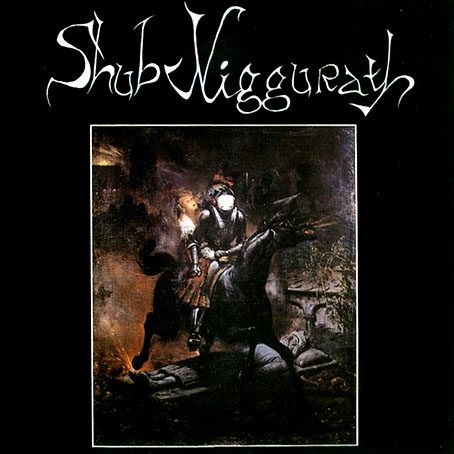
Les Morts Vont Vite (1986) by Shub Niggurath. Cover art: La Ballade de Lénore (1839) by Horace Vernet.
• Liriïk Necronomicus Kanht (1978) by Magma.
• Dagon (1980) by Eskaton.
• La musique d’Erich Zann (1981) by Univers Zero (a Belgian group, originally named Necronomicon, which included former members of an earlier group named Arkham).
• Yog-Sothoth (1986) by Shub Niggurath.
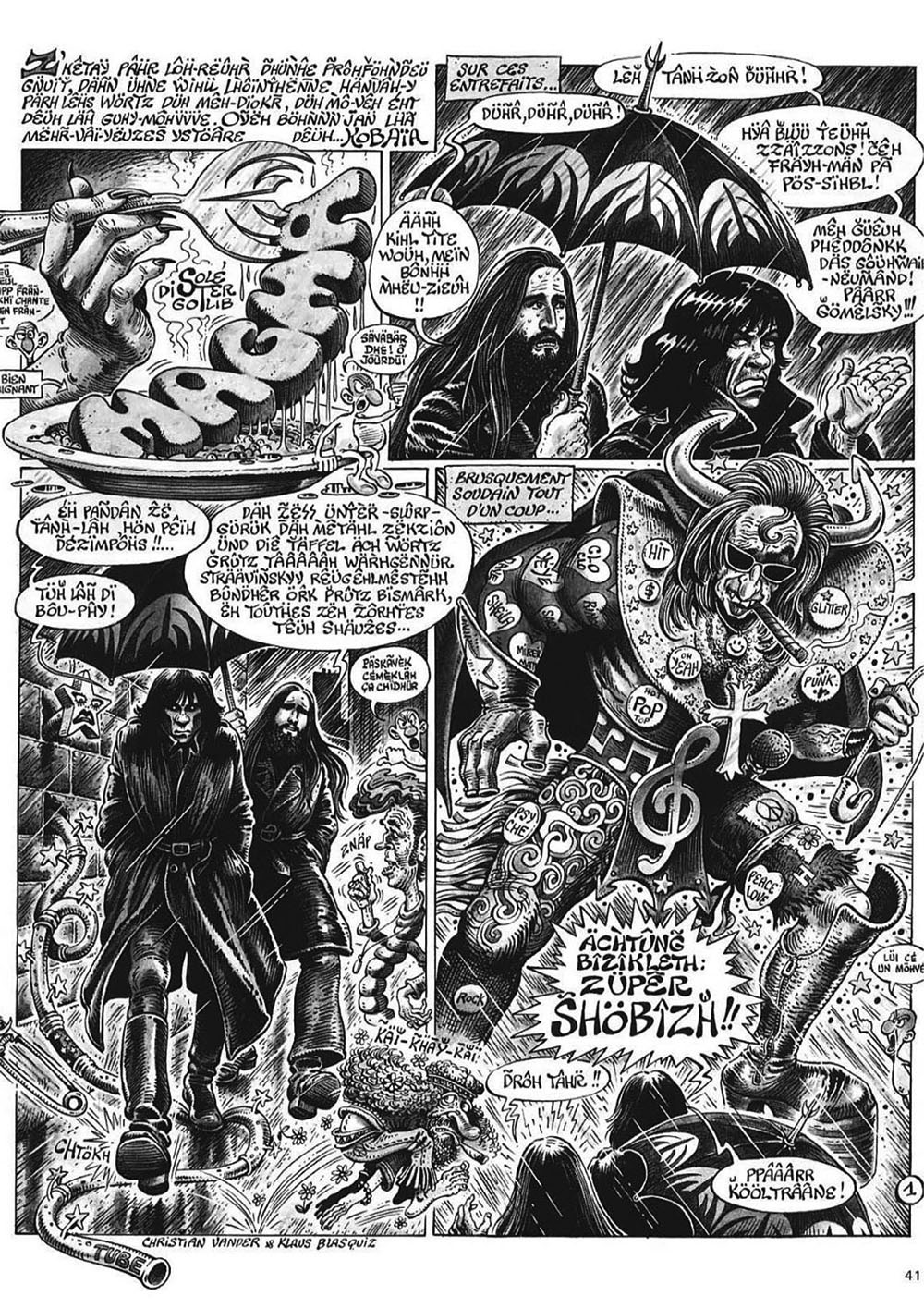
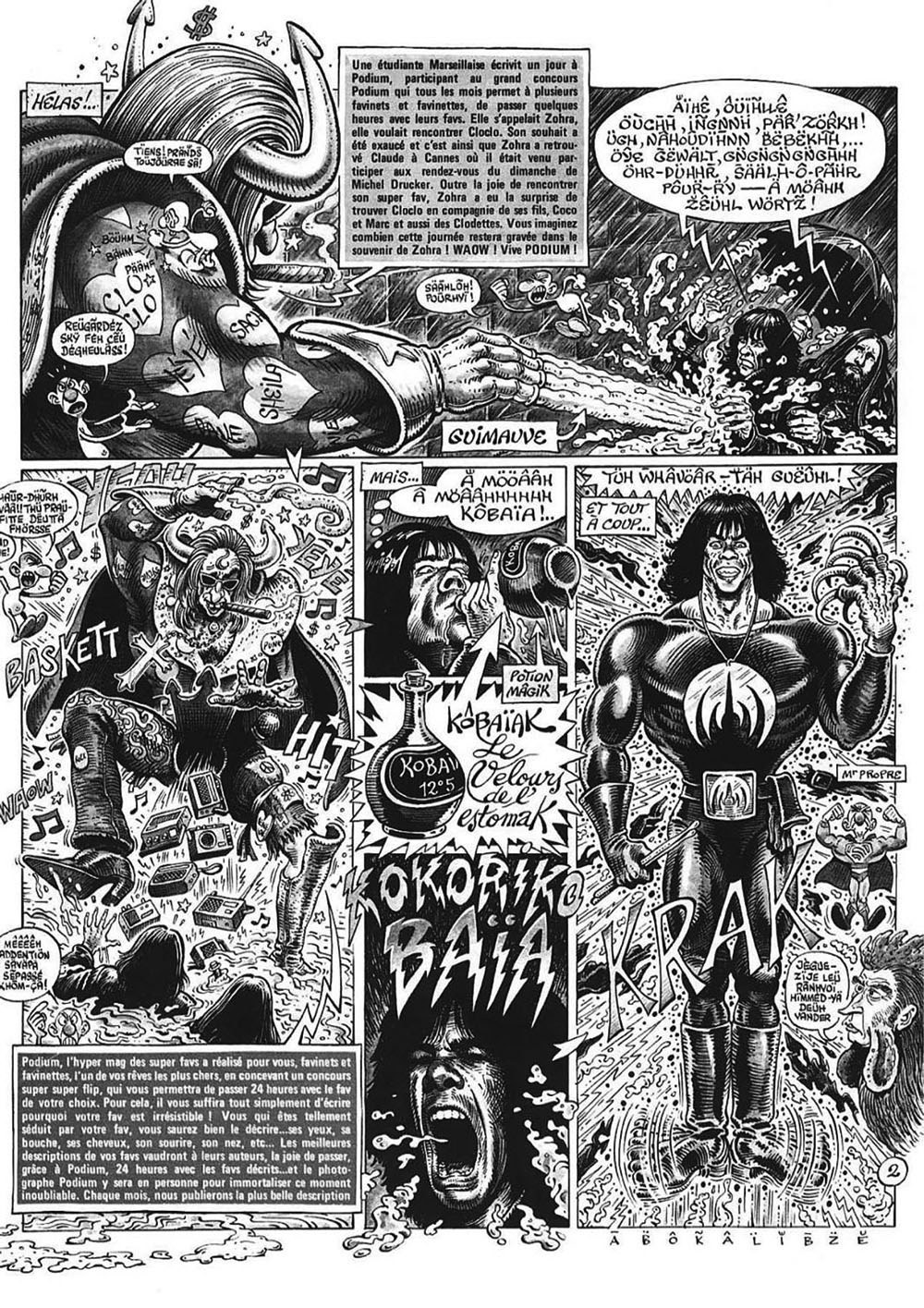
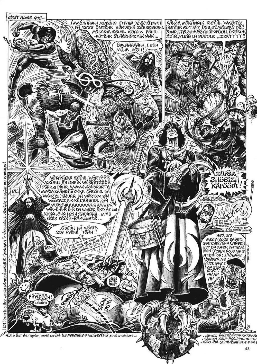
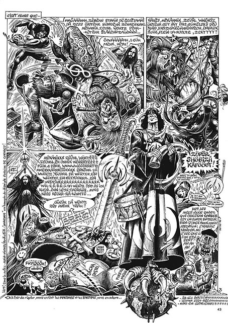
7: Comic Zeuhl
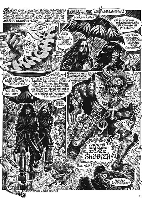
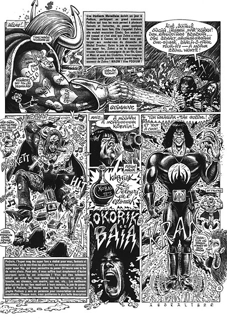
Magma’s Christian Vander and Klaus Blasquiz in a three-page comic strip from Pop & Rock & Colégram (1978), a collection of satirical music-themed pieces by Jean Solé, Alain Dister & Marcel Gotlib.
Previously on { feuilleton }
• Dune: some French connections
• HR Giger album covers