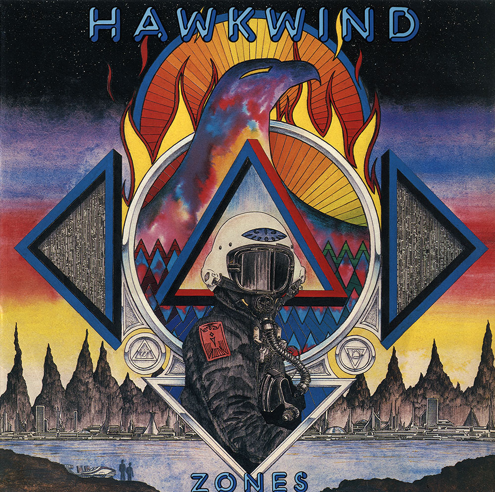
Zones (1983).
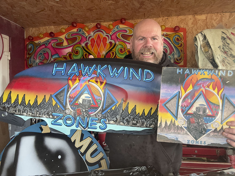
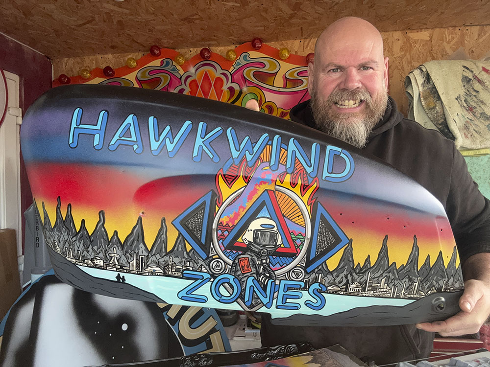
My thanks to Nigel Day for sending me the following photos of the rear end of a Lambretta scooter that he was recently asked to decorate with art based on my cover for Zones by Hawkwind. He’s done a marvellous job, and even improved a little on the colour gradations behind the hawk’s head which in my painting don’t evolve as smoothly as they should. Nigel trades under the name Harry’s Hotrod Shop; there’s a website here as well as pages under the same name at Facebook, Instagram and TikTok.
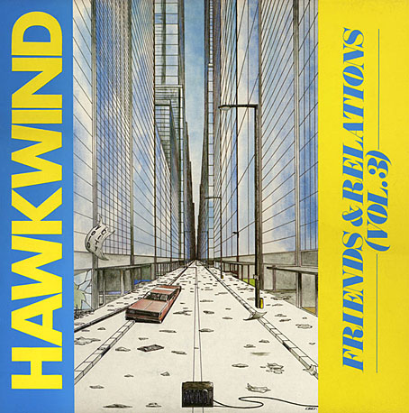
As I’ve no doubt said before, the Zones sleeve is one of the few Hawkwind covers I don’t feel abjectly embarrassed by. The album was released in October 1983, and was my second cover for Hawkwind, following an album released the month before whose terrible artwork was something I sent to Dave Brock that I never intended to have used anywhere. The Zones art was something I’d created on spec the year before, shortly after what would have been my cover for the Church Of Hawkwind album was forced onto the album’s lyric book by an art director at RCA who hated the material he’d been given to work with. This wasn’t the only unpleasant incident from the group’s short tenure at RCA. Zones was released on Flicknife Records, an independent label that proved to be a much better home for the band.
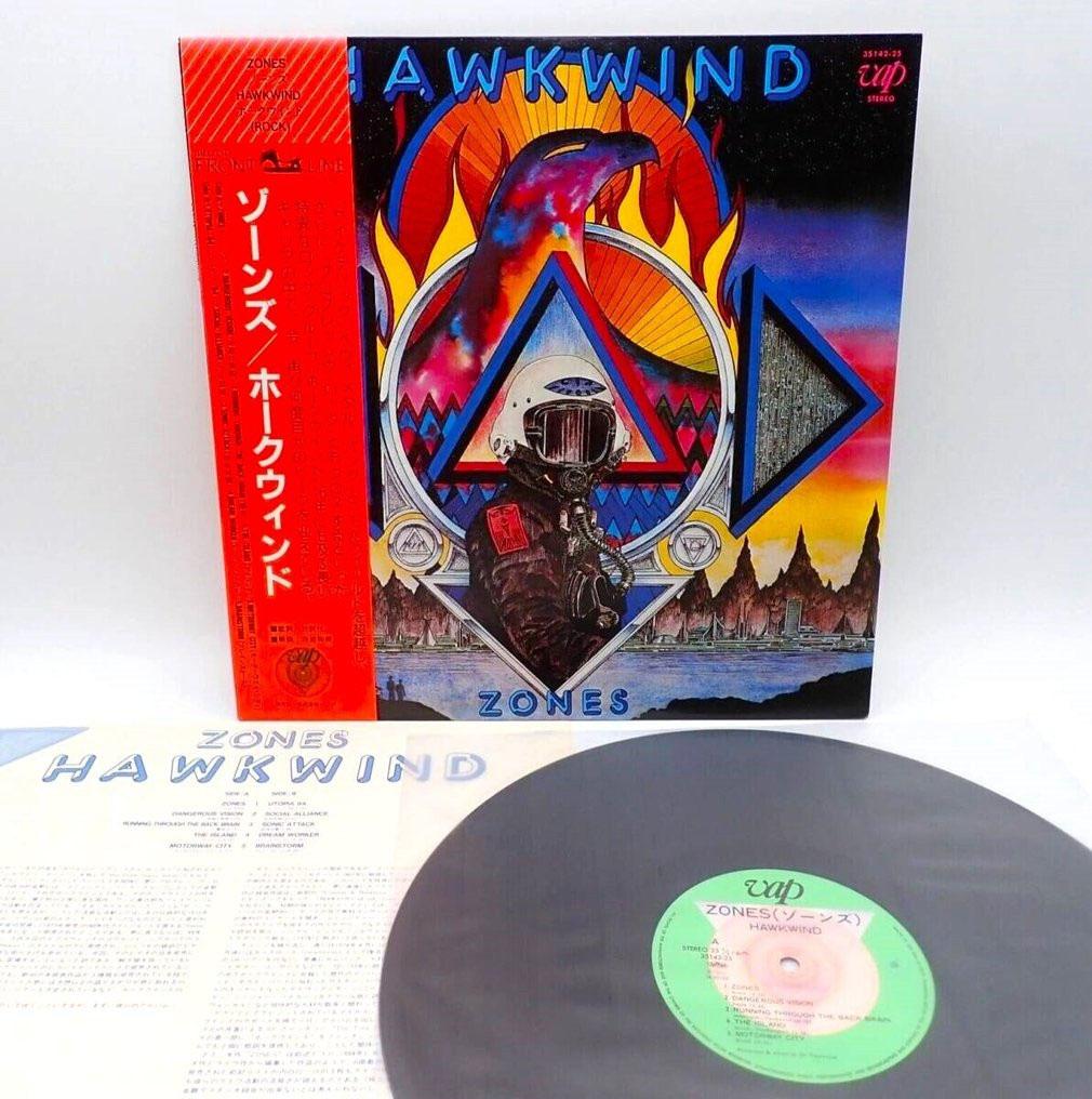
A rare Japanese vinyl release.
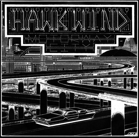
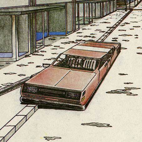
The album itself is a pretty good collection of live recordings from 1980 to 1982, with highlights that include a Michael Moorcock song, Running Through The Backbrain, with Moorcock himself on vocal. This was an exclusive piece until the entire concert (Lewisham, 1980) was released as part of the Levitation box set in 2009. Zones also contains several songs featuring Nik Turner, from the brief period when he returned to the group he’d been expelled from in 1976. And there’s also another live version of Motorway City, a song that first appeared on the Live Seventy Nine album. Having always liked Motorway City I was pleased when the Zones version was released as a single that used another spec piece of mine as the cover art (see this post).
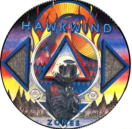
And a picture-disc.
As I said in the post about the single artwork, I was 18 when I did that drawing. I was only 20 when I painted the Zones cover. Imagine something you’d created when you were 20 years old continually turning up again decades later. It’s gratifying, of course, but it can also be disconcerting. People seem to like it anyway, which is more than can be said for some of my other album covers. The weather here is finally getting warmer; prepare for the summer with a Zones T-shirt!
Previously on { feuilleton }
• Space is one trip: the Hawkwind takes off
• New Wave Strangeness: Hawkwind’s Calvert years
• Twinkle, twinkle little stars
• Motorway cities
• Reality you can rely on
• Silver machines
• Notes from the Underground
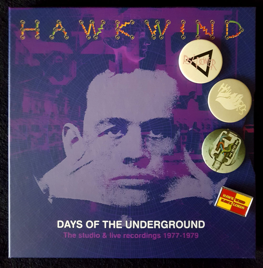
• Hawkwind: Days of the Underground
• The Chronicle of the Cursed Sleeve
• Rock shirts
• The Cosmic Grill
• Void City
• Hawk things
• The Sonic Assassins
• Barney Bubbles: artist and designer