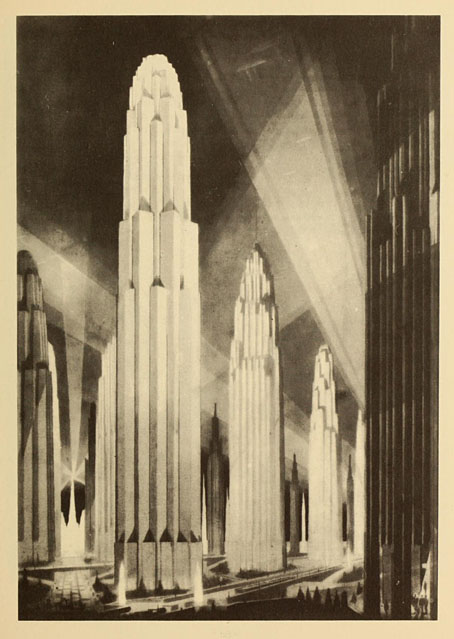
Verticals on Wide Avenues from The Metropolis of Tomorrow (1929) by Hugh Ferriss.
• Megalopolis, the futuristic epic written and directed by Francis Ford Coppola, now has a trailer and a handful of mixed reviews. I recall Coppola saying years ago that he was the kind of director who would happily make films in any genre, science fiction included. I’ve wondered ever since what a full-on Coppola SF film might look like. (Captain EO and Peggy Sue Got Married don’t count). Now it seems we’re about to find out. Given his previous missteps I remain sceptical yet curious about this one. I’ve avoided his output since Bram Stoker’s Dracula but I’m still happy to see him being so ambitious while retaining his independence.
• And RIP Roger Corman who Coppola remembered as “my first boss, task-master, teacher, mentor, and role model. There is nothing about the practical matter of making movies I didn’t learn by being his assistant.” Related: It rained on the Sunday: a career interview with Roger Corman by Matthew Thrift.
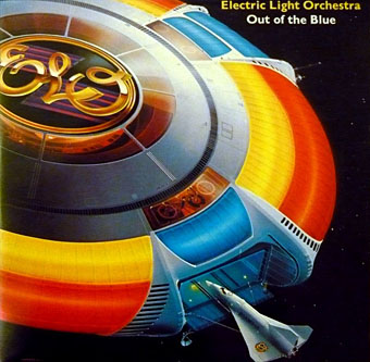
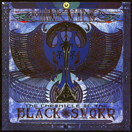
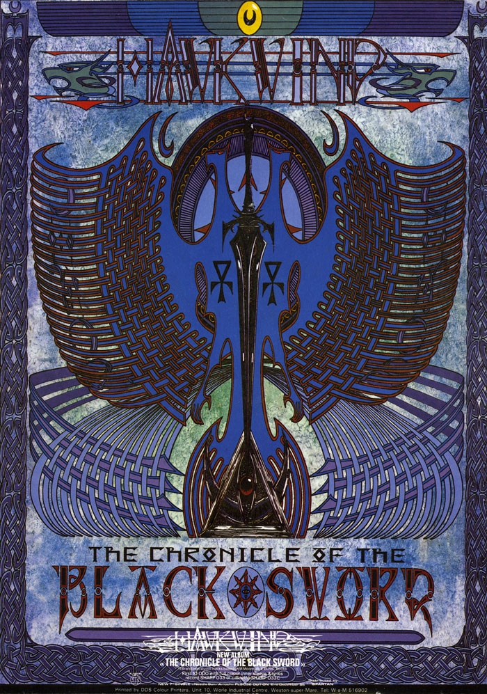
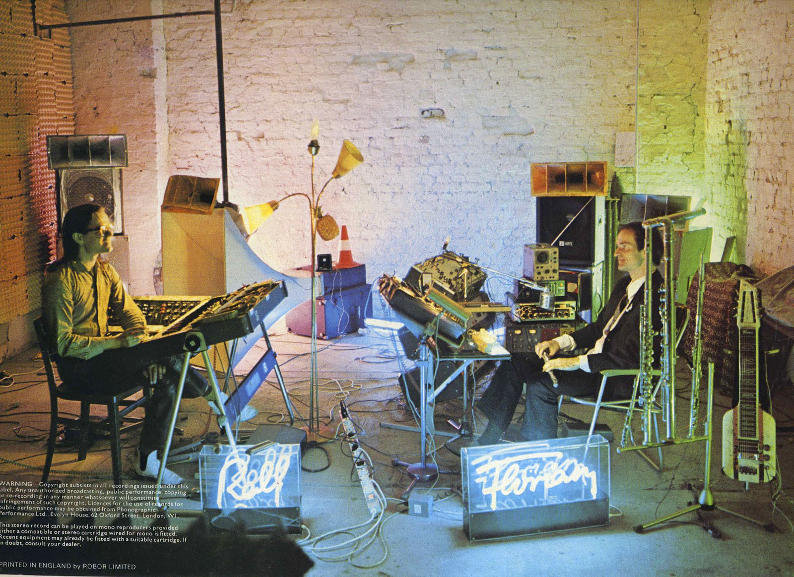
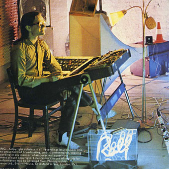
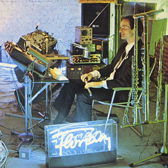
• At Retro-Forteana: Fortean-themed music, from opera to metal. A difficult subject for a such short post, as the author admits. I’m amused to see one of my Hawkwind album covers in the list although the album itself doesn’t seem very Fortean to me.
• “Did you know that, if things had gone differently, the Pompidou Centre could have been an egg?” Oliver Wainwright on architecture that might have been.
• At Cartoon Brew: A closer look at great animated title sequences. I deplore the omission of Richard Williams’ titles for The Charge of the Light Brigade (1968).
• At Public Domain Review: Love Spells and Deadly Shrieks: Illustrations of Mandrakes (ca. 650–1927).
• At Wormwoodiana: “That Strange Little Book”: Ding Dong Bell by Walter de la Mare.
• At Unquiet Things: The latest collection of Intermittent Eyeball Fodder.
• Mix of the week: DreamScenes – May 2024 by Ambientblog.
• Mandrake Root (1968) by Deep Purple | Mandrake (1975) by Gong | The Mandrake’s Hymn (2019) by Earth