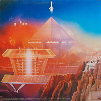
Green Castle (1975) by Roger Dean.
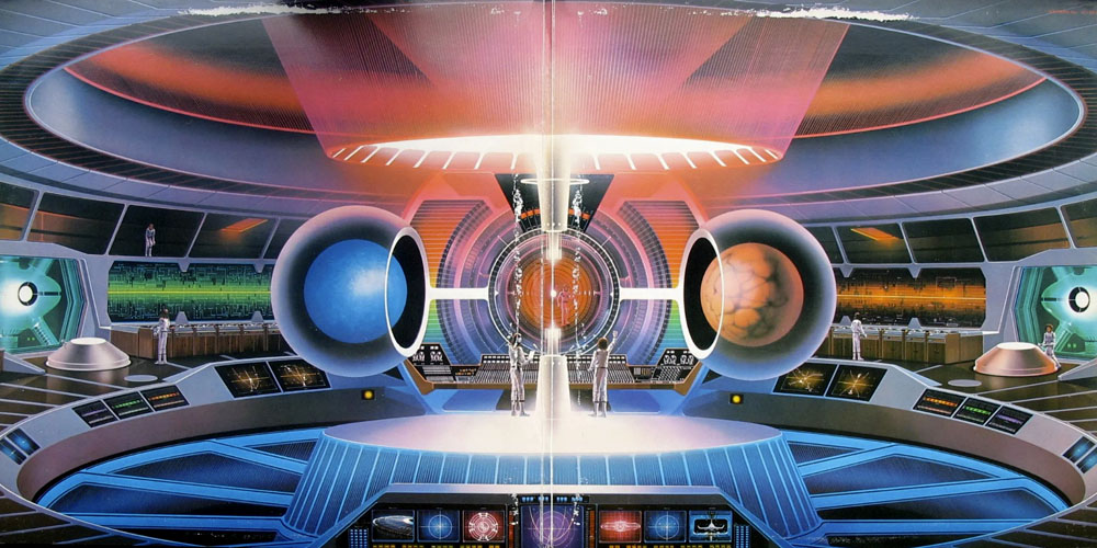
• Roger Dean’s first book, Views, was published 50 years ago this month. The book sold 60,000 copies in its initial run, and was reprinted twice the following year. This extraordinary success gave Dean and his associates at the newly-formed Dragon’s Dream the resources to publish a line of art books by other imaginative artists such as Chris Foss, Ian Miller and Syd Mead. Without Views there wouldn’t have been a Dragon’s Dream, and without Dragon’s Dream there wouldn’t have been Paper Tiger, a publishing house launched by Roger Dean, Martyn Dean and Hubert Schaafsma in 1976. All this activity made a huge impression on me at the time, with books that provided a showcase for artists whose work would otherwise only be seen on the covers of paperbacks or vinyl records.
• At Alan Moore World: 3 novels and The Great When, an extract from a new video interview in which Alan talks about three of the books that have influenced his novels.
• At the BFI: “Dead of Night: 80 years on, Ealing’s anthology horror is still a waking nightmare,” says Edward Parnell.
…Drexler’s vision of nanotechnology was a chimera. It was like the philosophers’ stone of the alchemists: magic dressed in the science of its time, by means of which almost anything becomes possible. I call these oneiric technologies: they do not and quite probably cannot exist, but they fulfil a deep-rooted dream, or a nightmare, or both.
These are not simply technologies of the future that we don’t yet have the means to realise, like the super-advanced technologies that Arthur C Clarke said we would be unable to distinguish from magic. Rather, oneiric technology takes a wish (or a terror) and clothes it in what looks like scientific raiment so that the uninitiated onlooker, and perhaps the dreamer, can no longer tell it apart from what is genuinely on the verge of the possible. Perpetual motion is one of the oldest oneiric technologies, although only since the 19th century have we known why it won’t work (this knowledge doesn’t discourage modern attempts, for example by allegedly exploiting the ‘quantum vacuum’); anti-gravity shielding is probably another.
Philip Ball on unrealistic prognostications in science, from nanotechnology to artificial intelligence
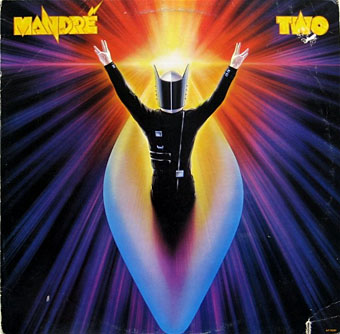
• New music: Rún by Rún; Other Sides Of Nowhere by Underwater Sleep Orchestra; I Believe In You by Ladytron.
• At Dennis Cooper’s it’s Curtis Harrington‘s Day.
• Steven Heller’s font of the month is Ritualist.
• A View From Her Room (1982) by Weekend | A Private View (1982) by Bill Nelson | Aerial View (2014) by Jon Hassell