Weekend links 647

oneill.jpg

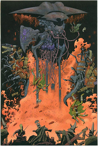
A local dispute on the planet Mars. Art by Kevin O’Neill from The League of Extraordinary Gentlemen.

• “…this image has puzzled enthusiasts of the scientific mystic’s works, both for its obscure provenance and cryptic symbolism. With its pastiche of Renaissance visual style and medieval caption — “A missionary of the Middle Ages tells that he had found the point where the sky and the Earth touch” — the illustration was once thought to have originated centuries before Flammarion published his text.” Hunter Dukes on the enduring mystery of the “Flammarion Engraving”.

• “For Spare, radio, and the waves that carried the music he loved to listen to, were more than just a metaphor for the spirit world. They were an active mode of conveyance for occult energies and vibrations – the swirling, ectoplasmic tendrils from which odd figures emerge in some of his most dense and haunting work.” Mark Pilkington explores Austin Osman Spare’s influence on the world of music.

• At Spine: Design studio Milk & Bone’s designer Alicia Raitt re-imagines all 14 of Kurt Vonnegut’s book covers to celebrate his 100th birthday.

• Farewell to Kevin O’Neill and Nik Turner, both of whom headed to the Western Lands this week.

Mean, moody and magnificent: film noir studio portraits – in pictures.

• Mix of the week: XLR8R Podcast 773 by Roméo Poirier.

• New music: Evergreen by Patrick Shiroishi.

Brainstorm (1972) by Hawkwind | Hurricane Fighter Plane (1985) by Inner City Unit | Brainstorm (1993) by Monster Magnet

Twinkle, twinkle little stars

turner1.jpg

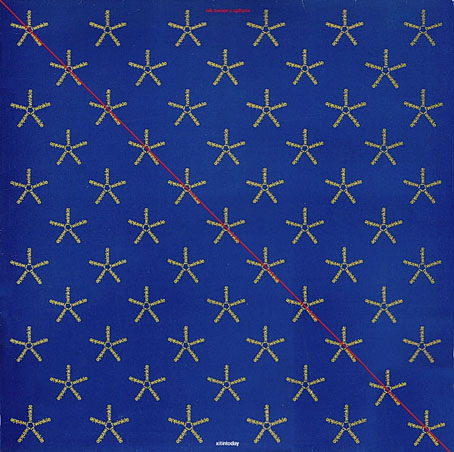
Xitintoday (1978) by Nik Turner’s Sphynx.

It’s been a long time since I’ve had a reason to write about Barney Bubbles but I’ve finally worked out why one of his more mysterious album covers looks the way it does.

When Nik Turner was unceremoniously kicked out of Hawkwind in 1976 he headed to Cairo to consider his next move. While there he recorded an hour or two of flute improvisations inside the sarcophagus in the King’s Chamber of the Great Pyramid of Cheops. The resulting tapes provided the basis for his first solo album, Xitintoday, which was released in 1978 on the Charisma label, and credited to Nik Turner’s Sphynx. Steve Hillage produced the album, helping to craft the meandering solos into a suite of songs based on passages from The Egyptian Book of the Dead. Xitintoday is one of the more unusual concept albums from a decade filled with such things. I’ve always liked it, in many ways it’s closer to Hillage’s oeuvre than Turner’s, as well as being very different to anything else in the Hawk-sphere.

turner2.jpg

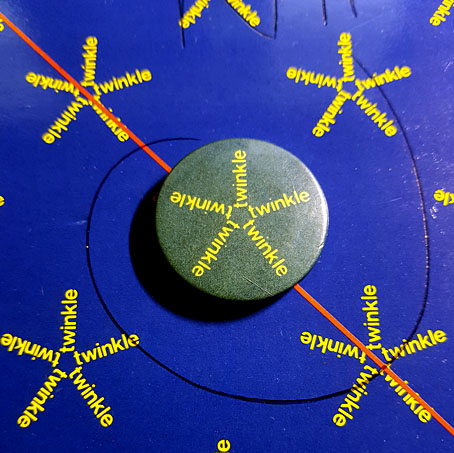
A faded promo badge. The ballpoint scrawl is Mr Turner’s autograph.

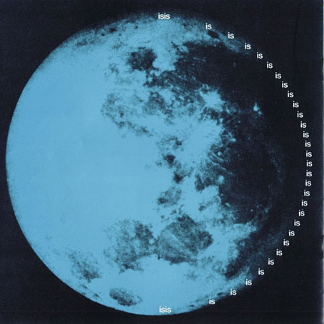
Barney Bubbles’ design for the album is also very different to anything else in the Hawk-sphere, an example of what might be called his High Modernist period, when the hippy motifs and decorative pastiches of his earlier work were replaced with bold, flat colours and playful graphic designs. Xitintoday was released with a square booklet containing lyrics, notes about the mythological theme, and a series of pictures which combine diagrams and Ancient Egyptian reliefs with calligram-like wordplay. The back cover of the album exemplifies the latter, with the word “Day” spelled out in much smaller words reading “Night”; inside the booklet there’s a page for Isis the Moon Goddess where the words “Isis is is is is…” form a curve around a photograph of the Moon. The cover design continues the cosmic theme with a field of star shapes in which each star is created by the word “Twinkle”. The star field makes sense in the context of the booklet but I’ve wondered for a long time why Barney Bubbles thought it was a suitable cover design rather than simply being another booklet page.

turner3.jpg

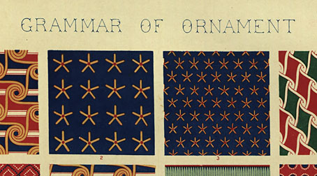
The solution arrived last week when work-related research had me looking through old design books for examples of Ancient Egyptian ornamentation. One of these, The Grammar of Ornament (1856) by Owen Jones, contains several pages of full-colour plates filled with Egyptian pattern samples.

egypt1.jpg

And on one of those pages there are these two squares which made me think immediately of the Xitintoday cover. This might seem tenuous when the cover design doesn’t feature any red dots but Barney Bubbles was an avid Egyptophile, avid enough to name his son after one of the Egyptian gods. A quick search revealed many more examples of this pattern which are closer matches for the cover design.

egypt2.jpg

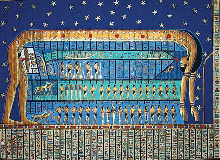
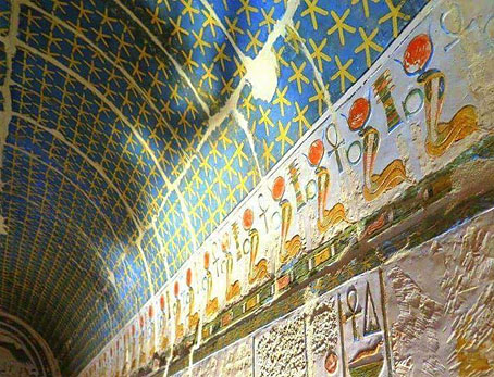
It turns out that the yellow star on a blue background was a common way of representing the night sky in Egyptian art, you’ll find the same stars in wall paintings and on the ceilings inside royal tombs.

egypt3.jpg

For years I’ve regarded the Xitintoday cover as being uncharacteristically random and abstract, surprisingly so when Bubbles designs from the same period are all so smart and well-considered. This discovery puts the Sphynx album in the same category, a design which avoids many more obvious solutions for a combination of the very old and the very new. Another feature of Barney Bubbles design is a kind of “Aha!” moment, when your appreciation of the design catches up with the thinking behind it. The appreciation this time has taken an outrageously long time to arrive but I’m pleased to have got there in the end.

Previously on { feuilleton }
Led Zeppelin IV: Jimmy Page versus Little Bo-Peep
The Grammar of Ornament revisited
On the pyramid

Weekend links 646

wallpaper.jpg

It’s that lethal book again. A sample of wallpaper impregnated with arsenic, one of many such pages in Shadows from the Walls of Death: Facts and Inferences Prefacing a Book of Specimens of Arsenical Wall Papers (1874) by RC Kedzie.

• “I like to spend time in the now because there I can create something new but in the past I cannot.” Damo Suzuki, former vocalist in Can, on creativity and his resilience in the face of long-term illness. Related: a trailer for Energy: A Documentary about Damo Suzuki.

• “I enjoy Carnival of Souls, but it is a dark form of enjoyment, with high stakes, because the enjoyment is predicated on me being able to shake myself free of the film after it is over, and that can be a struggle.” Colin Fleming on fear as entertainment.

• “Some people like fantasy epics or Regency romance or Sudoku or science-fiction world-building or the gentle challenge of cozy mysteries; I like the undead.” Sadie Stein on encounters with ghosts.

• “You’re now standing on the blocks of the Great Pyramid at Giza. For the first time ever you can explore the entire pyramid interior.” The Giza Project.

• “What do we think about when we watch films set in vanished decades that many of us experienced at first hand?” asks Anne Billson.

• At Bandcamp: Touch celebrates forty years of not being a record label.

• “Why scientists are sending radio signals to the Moon and Jupiter.”

• At DJ Food’s: Retinal Circus gig posters 1966–68.

• Steven Heller’s font of the month is Feneon.

The Pyramid Spell (1978) by Nik Turner | I Am Damo Suzuki (1985) by The Fall | Carnival Of Souls Goes To Rio (2001) by Pram

Hawkwind: Days of the Underground

hawkwind.jpg

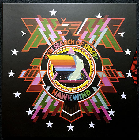
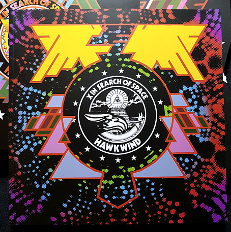
As mentioned at the weekend, Joe Banks’ account of the first ten years of Hawkwind will be published by Strange Attractor Press later this year with a wraparound cover of my design. I never expected to be doing anything else for Hawkwind after moving on to other things in 1985, but it was the group’s first decade of music that fuelled the drawings which brought me to their attention, so this cover design brings everything full circle. The earliest of my Hawkwind drawings dates to 1979 which means this cover is also an anniversary piece.

The design combines Barney Bubbles’ Space Ritual template with elements of the art he created before and afterwards, notably the inner and outer sleeve of Doremi Fasol Latido, and the futuristic Art Deco of his tour poster for The “1999” Party. All the Bubbles Hawk-art up to and including Space Ritual is a blend of the ancient (Egypt, tribal motifs, characters that resemble pirates or barbarians), the previous century (Art Nouveau in particular), and the far future as depicted in comics and pulp magazines. I wanted to reflect this blend without being too imitative of the details, so the cover works a variation on Space Ritual, with a similar hieratic woman as the focus, and a margin of stylised flames separating the foreground from Laurie Lewis’s photos of the band (the latter are unused shots from the same session used for Space Ritual).

haberfield.jpg

Art by Bob Haberfield, 1970.

All the background elements run across the wrap but this hasn’t been revealed yet so you’ll have to wait a while to see the full design. The flames are based on Tibetan designs in a nod to the ancient side of the equation, as well as Bob Haberfield’s covers for the Moorcock novels published by Mayflower in the early 70s, many of which featured art derived from Tibetan Buddhism. (And one of the Mayflower Moorcocks, The Black Corridor, is the origin of the monologue of the same name on Space Ritual.) The full wrap shows a futuristic city whose Frank R. Paul-derived architecture is either on fire or menaced by a wall of encroaching flames. Many of Hawkwind’s songs of the period concern flight from cities or from the Earth itself—Born To Go, Time We Left (This World Today)—so the back cover also has a number of vehicles fleeing the scene: the radical escapism of the book’s subtitle in literal form. “Sign my release from this planet’s erosion,” as Nik Turner sings in Brainstorm.

Continue reading “Hawkwind: Days of the Underground”

The Chronicle of the Cursed Sleeve

blacksword7.jpg

A copy of the cover art that I attempted to colour-correct some years ago to compensate for the poor print reproduction.

This month I’m in Record Collector magazine talking in a sidebar feature about my work on the Hawkwind album The Chronicle of the Black Sword. The issue is Hawkwind-heavy, with a Nik Turner interview, a history of Flicknife Records (the label that released COTBS), and a retrospective feature on the Black Sword album which was released in December 1985. My words were slightly cut to fit the allotted space but I can run the full text here in which I describe my ambivalent feelings towards this particular cover.

blacksword8.jpg

The Black Sword album for me has always been a combination of pleasure and disappointment. I was very pleased initially to hear that Hawkwind were writing a concept based on the Elric books, a series I’d enjoyed for many years. Cover discussions were a little more detailed than usual since this design was sketched out beforehand then approved by the Dave Brock and co. Prior to this I’d been creating something vague after equally vague requests; communication back then was all done via post and call box as I didn’t own a phone.

This was the first album where I was able to create an integrated front and back cover design. A friend had recently found me a copy of George Bain’s Celtic Art: Its Methods of Construction (1951), a study of the creation of Celtic knotwork, and I was keen to use this somehow. Rather than do a cover that looked like a fantasy paperback the idea was to use the knotwork style to create something that was suitably Hawkish whilst also fitting the Elric theme. The front cover has some nods back to earlier Hawkart in the winged sphere—which goes back to Barney Bubbles and his obsession with Ancient Egypt—and the eye-in-a-triangle, a symbol which first appeared on the cover of the Hawklog booklet in the In Search of Space album, and which I scattered throughout many of my Hawkwind designs.

All the lettering on the album was hand-drawn (not very well in places) using letterforms based on Bain’s examples from the books of Kells and Lindisfarne. I drew the track listing onto the artwork for the back cover, a decision that later proved to be a bad one when the band decided to change the running order of the songs, hence the large purple square that spoils the design. My lack of any direct contact with the record company made problems like this inevitable; I was trying to do graphic design at a distance without having any communication at all with the printers responsible for the sleeve. Before digital design, the creation of an album cover could be a complicated business involving photo-mechanical transfers, knockout areas, overlays, typesetters and more; if you weren’t in direct contact with the printer (or somebody who was) then you simply had to hope for the best.

This process of design-at-a-distance led to the disaster with the cover printing, the front of which has an unwarranted blue cast that dulled the impact of the sleeve and, for me, ruined the whole thing. You can see how the cover should have looked by comparing the background colours of front and back; the front was also printed in its true colours on the back page of the 1985 tour programme. It was this, and the messy appearance of the lettering on the back, that pushed me further towards ending my involvement with Hawkwind and doing something of my own over which I’d have complete control.

blacksword1.jpg

The retrospective feature in the magazine includes a picture of the back cover of the tour programme (above) so those familiar with the album can see the difference in reproduction. The difference isn’t so noticeable on the copies posted here after I tried altering the tones of the cover. Over the years I’ve grown used to the blueness but the back cover remains blighted by its purple boxes.

Continue reading “The Chronicle of the Cursed Sleeve”