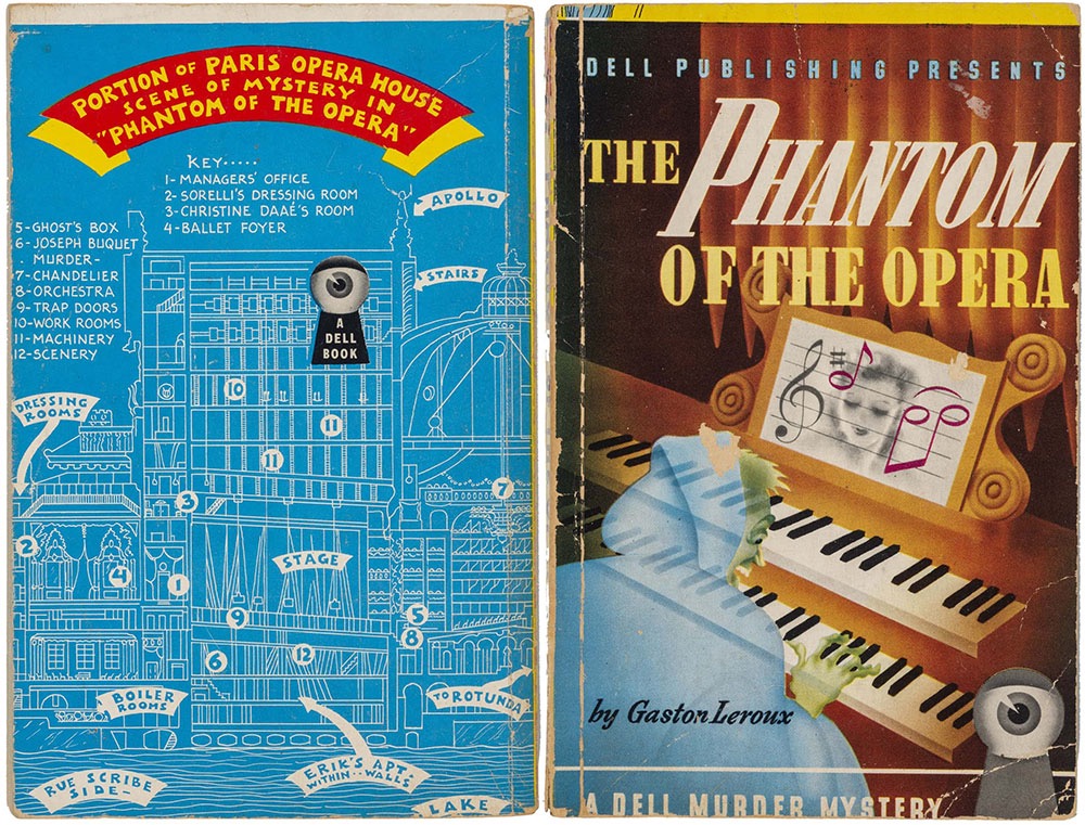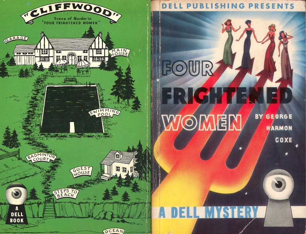
Dell 5, Four Frightened Women by George Harmon Coxe, was the first of the mapbacks. On the back cover of each of these books is, naturally, a map—a cutaway bird’s-eye view of the apartment building, house, hotel or city-section in which the events of the book take place. These drawings were generally quite faithful to the books; the most careful one was probably the map sketched by author Hake Talbot for his own book, Rim of the Pit (Dell 173), and executed, as were most of the mapbacks, by Ruth Belew.
Almost all Dell Books published until 1951 were provided with a mapback; beginning in that year, the practice was gradually abandoned. Dell’s sales department hated the idea; they found the maps unnecessary and noncommercial, and felt that back covers could better be reserved for advertising blurbs.
The Book of the Paperback: A Visual History of the Paperback Book (1982) by Piet Schreuders
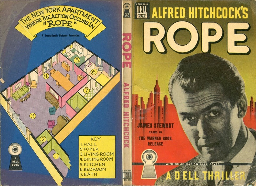
I’ve long been fascinated by the Dell Mapbacks even though I’ve only ever seen pictures of them. (And to stave off the inevitable emails: no, I don’t want to buy any.) They form a truncated path in the evolution of the paperback book, one where the gimmick of creating a map for each title was globally applied, regardless of whether the contents warranted such a thing. Dell began life as a publisher of mysteries, hence the logo of an eye peeping through a keyhole. Maps are more justifiable if applied to a detective story, where a map may help the reader picture the layout of a location or trace the movements of a character. But once Dell branched out into other areas of fiction the maps seemed increasingly superfluous, especially those that limit themselves to the plan of an office or apartment. For some there’s also the question of accuracy. The novelisation of Alfred Hitchcock’s Rope shows a map of the apartment that doesn’t correspond to the layout of the rooms as they’re seen on the screen, something that readers who’d seen the film would have been quick to recognise.
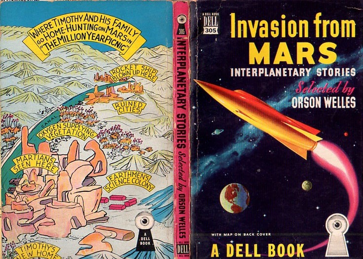
For this post I went looking for a few of the more unusual mapbacks, prompted by the discovery of Invasion from Mars. I’d been watching an Orson Welles’ question-and-answer session from 1982 which was recorded after a screening of Welles’ adaptation of The Trial. Welles declares at one point that he “used to write for the pulps, as we called them then”. The claim surprised me. I knew that Welles had been writing newspaper columns in the 1940s; he’s also credited as the author of a novel, Mr Arkadin (1955), which was actually written by a Frenchman, Maurice Bessy, whose serialised adaptation of Welles’ Mr Arkadin screen story was published in novel form. Invasion from Mars seems to be Welles’ sole encounter with pulp-land unless you include the pulpy origins of The Lady from Shanghai and Touch of Evil. Invasion from Mars collects a handful of Mars-related SF stories, together with the Howard Koch script for the Mercury Theatre radio broadcast of The War of the Worlds. The superfluous map on this occasion is for The Million Year Picnic, one of Ray Bradbury’s Martian Chronicles stories. Dell didn’t publish very much science fiction so the Mars book and First Men in the Moon are the only titles I’ve seen with maps showing extraterrestrial locations. Would-be collectors may like to know that after writing a history of the paperback book Piet Schreuders put together a short guide to collecting this series, The Dell “Mapbacks”, which was published in 1997.
• Further reading: Dell Mapbacks: A History.
• Dell Mapbacks (sorted). An extensive cover collection at Flickr.
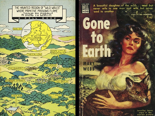
Another film tie-in, published for the US release of Powell & Pressburger’s Gone To Earth (1950).