Steal Me

stealme.jpg

Coming soon from Absinthe Books, the novella imprint of PS Publishing, is Steal Me by Helen Grant, a book for which I created the wraparound cover art:

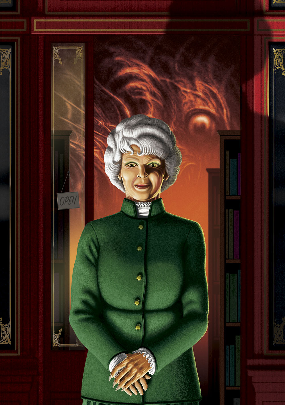
Rowan Byrne hasn’t stolen anything for ages—not since she started to straighten her life out after a personal tragedy. But the volume she’s just picked up in the new bookshop in town seems to want her to steal it. The text is very persuasive. There’s a book for everyone in Legends—a book that will encourage their worst impulses. Steal. Fear. Burn. Kill. It’s not long before Rowan’s small town, isolated from the outside world, is descending into mayhem. Assailed by her own demons, Rowan could try to cut and run. Or she could make a stand, and try to save the community she loves…

stealme2.jpg

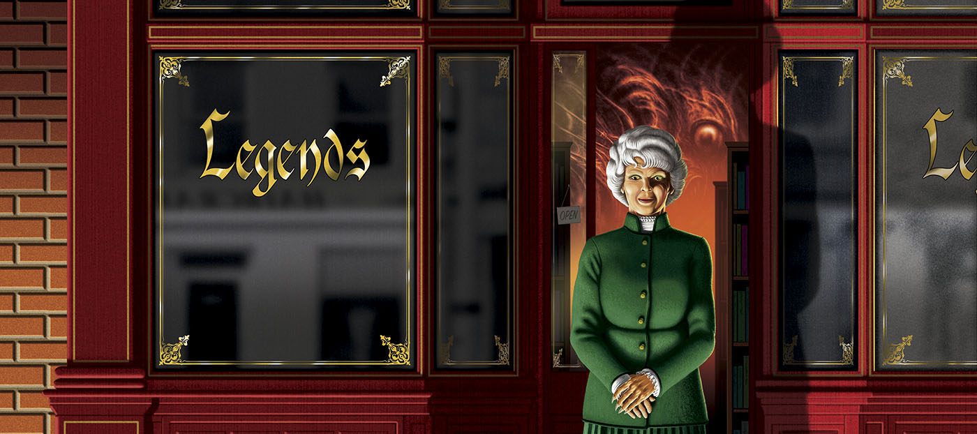
This was a good book to work on. I’d not worked for PS for a while, and very much enjoyed Helen’s collection of stories for Swan River Press, Atmospheric Disturbances, whose cover and boards I also designed. “Legends”, the mysterious shop with the darkened windows, is staffed by a pair of elderly women who seem vaguely unreal—pleasant and helpful but not quite human, and with an undefined aura of menace. By coincidence, the previous book I worked on for PS Publishing was a fully illustrated edition of Needful Things by Stephen King, a much longer novel about a mysterious shop in a small town whose sinister/unreal proprietor and wares cause mayhem among the populace. Helen says she wasn’t imitating the King novel, and the similarities are superficial in any case. I feel she did more with the concept, and with greater economy, than the world’s most popular horror novelist (and I say this after the world’s most popular horror novelist sent his compliments for my work on his book); but then I’ve never been keen on the tendency favoured by King and others to fill out hundreds of pages with background detail and character biographies at the expense of the horror. In the past I’ve thrown the occasional barb at Mies van der Rohe’s overused quote, but sometimes less really does mean more.

Steal Me will be published in June. Don’t steal it.

Previously on { feuilleton }
Atmospheric Disturbances
The Needful Thing
All the Things
Needful Things

Weekend links 743

whale.jpg

Icebergs and the aurora borealis in the Arctic. From the Illustrated London News, 13 October 1849.

• The week in award-winning photographs: Winners and finalists from the Ocean Photographer of the Year Awards; and winners and finalists from the Astronomy Photographer of the Year.

• A new layer of mystery is added to The Voynich Manuscript with the discovery of additional writings revealed by multispectral imaging. Lisa Fagin Davis explains.

• At Swan River Press: Helen Grant talks to John Kenny about her new collection of stories, Atmospheric Disturbances, a book whose cover design I discussed here.

Some in Hollywood were taken aback by Huston’s screenwriting choice to bring Melville to the big screen. After all, to adapt a profoundly complex literary novel, he had given the nod to a man known for writing science fiction. Perhaps no one was more surprised by Huston’s choice than Bradbury himself. Huston had read the most recent book Bradbury had sent him, The Golden Apples of the Sun, and the lead story was all it took.

“The Fog Horn” is a tale about two lighthouse keepers who, late one November night, are paid a visit by a beast that has surfaced from the depths after hearing the lonely call of the lighthouse’s foghorn. Bradbury’s love of dinosaurs had led him to write the story, and it was this love that led Huston to believe he was the right man to adapt Moby-Dick. In reading “The Fog Horn,” Huston stated in his 1980 autobiography An Open Book, he “saw something of Melville’s elusive quality.”

Sam Weller on how Ray Bradbury came to write the screenplay for John Huston’s adaptation of Moby-Dick

• At Public Domain Review: Kirsten Tambling on the life and art of Gottfried Mind (1768–1814), a Swiss artist known as “The Raphael of Cats”.

• At Spoon & Tamago: Tentacle-inspired leather accessories handcrafted by Cokeco.

• Mix of the week: DreamScenes – September 2024 at AmbientBlog.

• Steven Heller’s font of the month is Rig Solid.

Solid State Survivor (1979) by Yellow Magic Orchestra | All That Was Solid (1996) by Paul Schütze | From A Solid To A Liquid (2006) by Biosphere

Atmospheric Disturbances

atmospheric1.jpg

My latest cover for Swan River Press was made public last week so here it is. Atmospheric Disturbances is a collection of short horror stories by Helen Grant, a British writer with a finely-tuned sense of the sinister:

A glimpse of a grotesque illustration combined with the onset of fever instigate a descent into a hellish nightmare. In the wine cellar of an abandoned mansion, something alluring yet ominous is sealed inside a vintage bottle. At the end of a claustrophobically narrow alley lies a gilded façade opulent enough to tempt a thief. And forty miles out to sea, a naturalist on a lonely island hears voices through the radio telling stories of unimaginable disaster—and hope. In her second collection, award-winning author Helen Grant visits Flanders, Paris, and the remotest parts of Scotland, examining themes of transgression, repercussion, and revenge.

The design for this one breaks with the usual form for story collections where you’re often trying to find a single image or pictorial arrangement that can summarise the book as a whole. The title suggested a meteorological chart but this alone wouldn’t communicate anything of the book’s contents so the full wrap features thirteen squares, each of which contains a pictorial detail related to one of the stories. None of the squares are spoilerish, a couple of them could even refer to more than one story. Taken together they’re like a dark advent calendar mapped across a chart that shows an Atlantic storm approaching the British Isles.

atmospheric2.jpg

On a technical level the design was a tricky one to work out. It’s easy to think “Atlantic map”, “isobar chart” but when you go looking for suitable reference material you discover that a) all the meteorological charts are very small things, you can’t simply resize a pre-existing chart to fill the space. And b) navigation maps of the North Atlantic only show small areas in the detail that I required. Once I’d accumulated all the relevant material, which included four different navigation maps extending from Nova Scotia to the Baltic Sea, I had to piece everything together then trace new vector outlines. The same with the meteorological chart which was redrawn from scratch over a very crude map of the same region. The colours in the background suggest the tones of the Aurora Borealis which is one of the atmospheric disturbances referred to by the title.

atmospheric3.jpg

The printed paper case continues the theme with a different isobar map showing stormier conditions. The book itself will be out in mid-October, the time when the atmosphere in this part of the world grows increasingly restless.

Previously on { feuilleton }
Now It’s Dark

Der Orchideengarten translated

derorchideengarten.jpg

Via the latest mailing from Side Real Press, news that the world’s first magazine devoted to fantastic art and literature, Der Orchideengarten (1919–1921), is being translated into English. This isn’t the first time the magazine’s contents have been translated—Zagava printed a facsimile edition of the first issue in 2017 that included translated inserts by Helen Grant—but the latest efforts by Joe E. Bandel are going beyond the first issue with the intention of translating the entire run. Each issue will be available for purchase at Lulu.

It’s been a pleasure watching Der Orchideengarten creep out of the shadows over the past few years. When Will at A Journey Round My Skull posted interior illustrations from back issues of the magazine in 2009 the title was barely mentioned outside German genre histories or the tantalising feature in Franz Rottensteiner’s The Fantasy Book (1978). Since then, the entire run of the magazine has been made available for free by the University of Heidelberg’s invaluable scanning programme, after which we had the Zagava facsimile. If the new translations are successful then the next stage may be the publication of an introductory collection that gathers the best work from the magazine.

Previously on { feuilleton }
• An unseasonable bloom
• Covers for Der Orchideengarten
• Der Orchideengarten illustrated
• Der Orchideengarten

An unseasonable bloom

orchid1.jpg

It’s a strange thing to compare the covers of Der Orchideengarten in Franz Rottensteiner’s The Fantasy Book (1978) with the facsimile of the first issue which has just been published by Zagava. For years the two covers and Rottensteiner’s laudatory description were all I knew of a magazine that nobody else seemed to write about. As with all such enigmas, this made the magazine all the more intriguing. Der Orchideengarten was short-lived, running from 1919 to 1921, and German, which no doubt did little to aid its post-war reputation. Whatever reputation it may have had was quickly eclipsed by Weird Tales and a host of other Anglophone publications some of whose creations still dominate the fantasy landscape today. One of the many services Rottensteiner’s study provided was to treat fantasy as a genre with manifestations all over the world, not only in Britain and America.

orchid2.jpg

The visibility of Der Orchideengarten began to change in 2009 when Will at the now-defunct A Journey Round My Skull, having also had his curiosity piqued by Rottensteiner’s book, acquired a few copies of the magazine. I ran some of the interior illustrations here, the sight of which was genuinely revelatory since these weird and macabre drawings had been buried for 90 years. The situation changed again late last year when the entire run of the magazine was made available at the University of Heidelberg’s remarkable online archive.

What struck me in 2009—and what continues to strike me today—is the difference in tone between the illustrations, covers included, of Der Orchideengarten with its later Anglophone counterparts, especially Weird Tales. The latter presented itself very much in the pulp tradition, and many of the illustrators of the early issues were just as happy working with adventure or detective titles as they were with fantasy or horror. The German artists are less illustrational and much more grotesque, closer at times to Expressionist painting than anything you’d find in an American magazine. I continue to wonder how fantasy as a genre might have developed if it had owed less to Britain’s ghost stories and America’s adventure idioms.

orchid3.jpg

Any speculation is easier now we have this facsimile of the first issue which (as I mentioned in a weekend post) contains a translation into English by Helen Grant of the complete contents of the magazine. This has been cleverly achieved by interleaving narrower pages of translated text with the originals so the integrity of the magazine is maintained. The facsimile is a quality production with superb printing of all the illustrations and graphics. One of the ironies of our connected world is that contemporary magazines continue to be killed off while the easier accessibility of so much culture from the past makes resurrections like this one more likely.

orchid4.jpg

Whether we see more facsimile issues will no doubt depend on the success of this first number which may be ordered here. A few more page samples follow.

Continue reading “An unseasonable bloom”