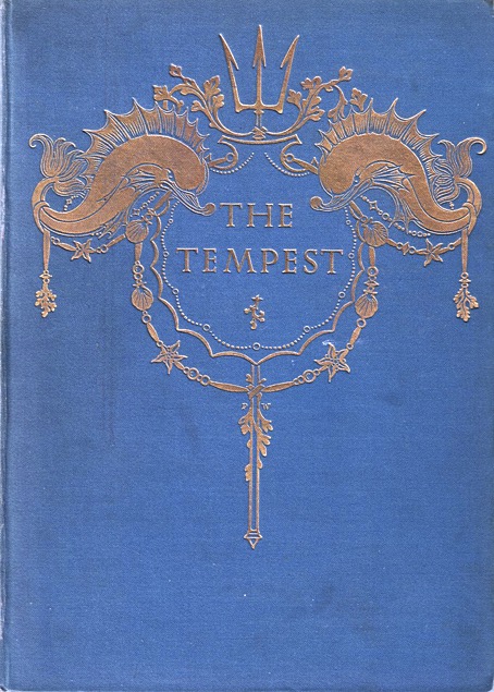
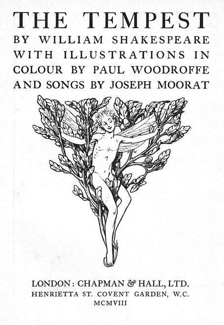
Paul Woodroffe’s Tempest

woodroffe12.jpg

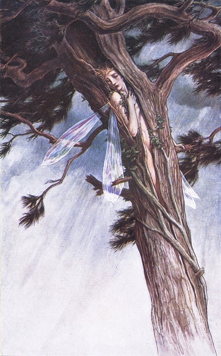
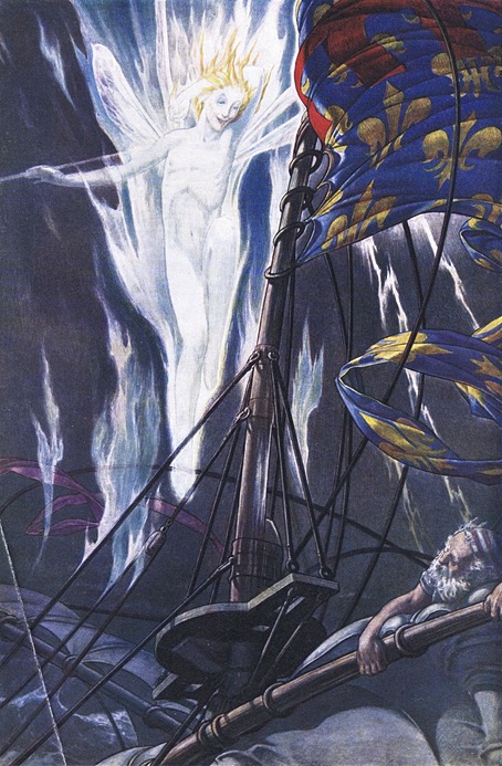
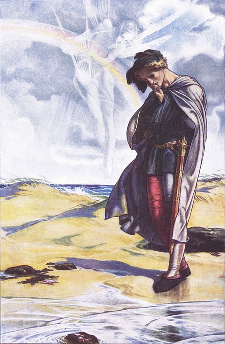
Paul Vincent Woodroffe (1875–1954) was a British illustrator and stained-glass artist, a kind of British equivalent of Harry Clarke in that he seems to have spent more time creating stained glass than he did illustrating books. Woodroffe was also an exact contemporary of Aubrey Beardsley, and both artists provided illustrations in 1897 for The Parade, a heavily-illustrated gift book of stories for children. I’ve known about Woodroffe’s illustrated Tempest for some time but I’ve had to wait to find a decent collection of all the colour plates. Woodroffe was an excellent watercolourist whose nebulous effects are so delicate they might easily be spoiled by poor reproduction. I’m at a loss to say exactly how some of these effects were achieved. He evidently used washes to fill in the sky, a technique where the paint can’t be manipulated before it dries, yet he still has the translucent figures of Ariel and Prospero hovering over some of the scenes. What he seems to have done is painted the transparent figures in very diluted white tones over the backgrounds, a difficult process when you don’t want any pencil outlines showing underneath.

woodroffe20.jpg

Where the subtance of the text is concerned, Woodroffe adds more to some of the familiar scenes than you find with other artists. For the scene where Ariel is transformed into a harpy Edmund Dulac shows the spirit as an eagle-sized bird; Woodroffe’s Ariel is a larger creature with a fearsome pair of claws. For Ariel’s Song he shows a cowled and enthroned skeletal figure sitting at the bottom of the sea, like Death waiting to make an appearance in The Rime of the Ancient Mariner. Woodroffe’s human figures are less interesting although still well-drawn, a parade of statuesque types with similar faces and a distinctly Pre-Raphaelite appearance. His book also features three double-page scenes, something you don’t find so often in these coloured editions.

woodroffe17.jpg

woodroffe16.jpg

woodroffe09.jpg

Continue reading “Paul Woodroffe’s Tempest”

Home of the Brave

hotb1.jpg

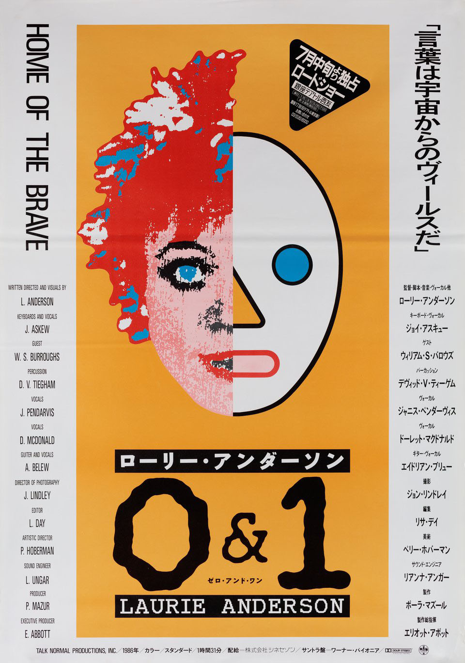
A Japanese poster.

Home of the Brave is a Laurie Anderson concert film from 1986 that more people might know about if it hadn’t been out of circulation for the past thirty years. The reason for the unavailability remains a mystery; Anderson announced a DVD release in 2007 but so far nothing has materialised. Whatever the explanation may be, this copy (which appears to be a Laserdisc rip) is better than the VHS transfers that circulate elsewhere.

hotb2.jpg

The concert itself is a 90-minute multimedia stage show built around the songs from Anderson’s second album, Mister Heartbreak. Between the album songs there are quirky, sketch-like interludes together with a reworked version of Language Is A Virus from her United States show, which was later reworked again for a single release. The album transcription extends to the projected visuals which incorporates graphics from Anderson’s design for the album cover, elements which show her to have been an early user of Macintosh computers. The Chicago font which was the default for the original Mac OS is a recurrent presence here, even being used for the title of the film on the posters and the cover of the soundtrack album. Another recurrent presence is William Burroughs, a friend of Anderson’s whose inimitable voice turns up on the last song on Mister Heartbreak, Sharkey’s Night. Burroughs’ first appearance in the film occurs when he and Laurie Anderson waltz across the stage, probably the first and last time that Burroughs was ever persuaded to dance in public.

hotb3.jpg

As for the music, if you’re as familiar as I am with Mister Heartbreak it’s good to see the songs from the album presented in live versions by some of the album’s musicians: Adrian Belew (playing guitar between stints in King Crimson), David Van Tieghem (percussion), and Dolette McDonald (backing vocals). This was Laurie Anderson’s first overtly pop-oriented outing (if you can call something “pop” that features William Burroughs and a song dedicated to Thomas Pynchon), but the stage show is filled with moments that aren’t so different to her earlier performances: solo keyboard spots, textual projections (one of which has her handwritten musings about the title of the show), unusual instruments (the tape-loop violin, body percussion, a keyboard tie), processed voices, and so on. The overall effect is simultaneously weird and playful, with the songs and general activity preventing the show from coming across like a low-key comedy act, the way United States often does. A proper reissue would be preferable but for now this is about the best you can get.

Previously on { feuilleton }
• Going beyond the zero
• Ear to the Ground

Snowbound by Bram Stoker

snowbound00.jpg

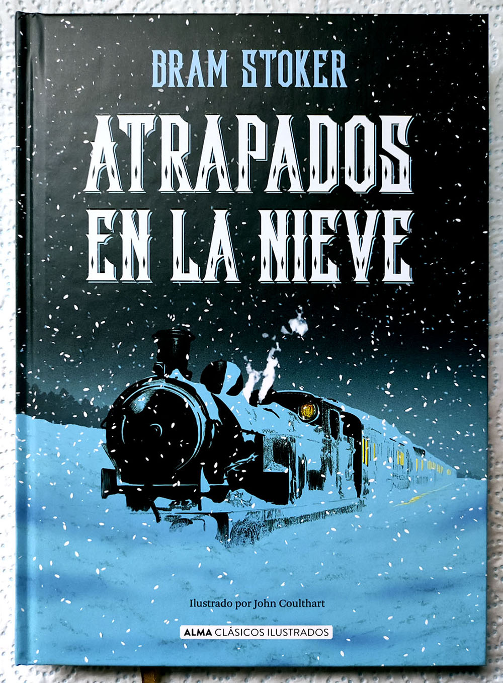
The artwork is mine; the cover design is by Lookatcia.

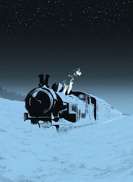
Presenting my latest book for Alma, the Spanish publisher for whom I’ve illustrated several classic novels and story collections. The new volume is my second Bram Stoker title after Dracula in 2018 which, for the sake of convenience, I’ll refer to it by its English title. Snowbound: The Record of a Theatrical Touring Party was a collection of connected stories first published in 1908, 11 years after Dracula had established Stoker’s reputation. I wouldn’t call Snowbound a bad book but if you’ve read Dracula or Stoker’s more popular short stories it’s a disappointment, with no supernatural content and little to recommend it elsewhere. The first episode introduces the framing device: a group of travelling players are marooned by heavy snow while travelling on a train through the wilds of Scotland. To pass a dark and freezing night the troupe entertain themselves by relating memorable anecdotes from their careers, anecdotes which I imagine Stoker either heard from others or experienced himself during his years working for actor-manager Henry Irving. In place of the spooky tales one might expect from such a premise we’re offered a succession of vaguely comic episodes mixed with more serious drama, with a couple of the pieces being related in very broad “Oirish” and Cockney accents. The Irish episode is especially bizarre considering that Stoker was Irish himself; it reads like the kind of thing you’d get from an English writer trotting out lazy stereotypes.

endpapers.jpg

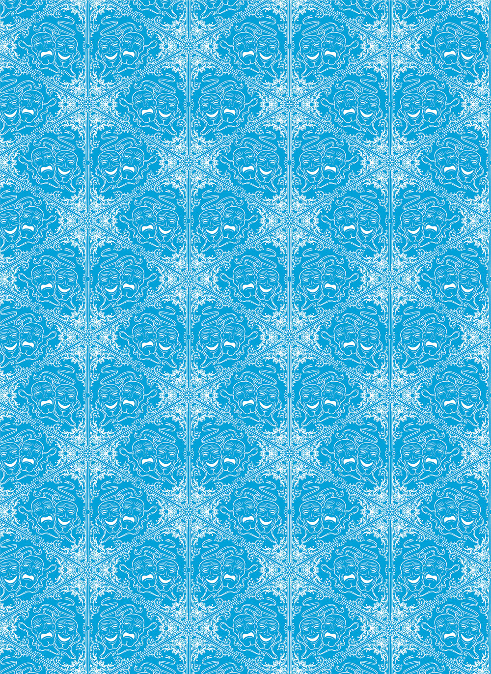
My endpapers design.

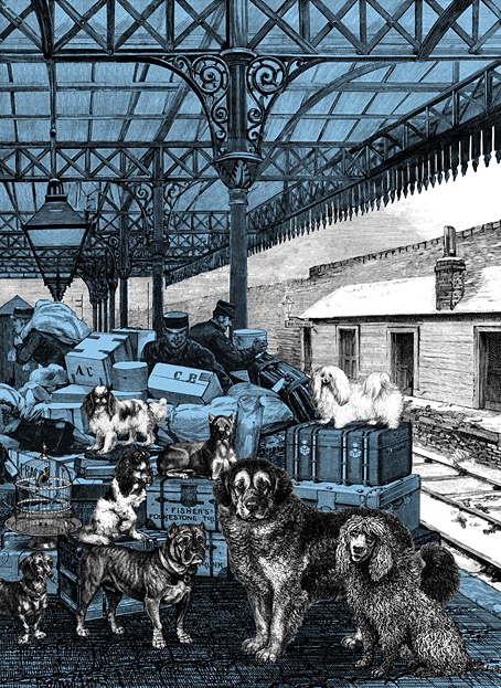
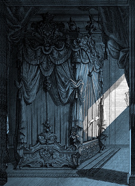
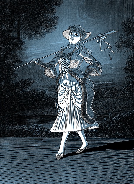
There are other flaws I could mention but I’ve undersold the book enough as it is. Snowbound has never received much attention in the past, it wasn’t even reprinted in English until 2000. In my previous books for Alma I utilised a style which combined collaged backgrounds with hand-drawn elements in order to create illustrations whose engraved appearance made them seem like products of the period in which the stories were written. More recently I’ve been moving away from this style but the success of the previous Alma editions, Frankenstein in particular, obliged me to maintain some continuity with the look I’d created for Dracula. As it turned out, several of the Snowbound illustrations are entirely hand-drawn, with engraving-like textures used in the shading. The biggest departure from the previous books is the addition of an extra ink colour to the artwork, an effect that was fun to play with when creating different lighting effects. As to the pictorial details, several of the anedotes take place in the United States, hence the presence of an American steam train with an elevated smokestack, the spelling of the word “theater” on a poster, and so on.

snowbound01.jpg

Having mentioned Frankenstein I ought to also mention the recent Polish edition of the novel which reprints my Alma illustrations. This is a large-format hardback from Materia, a pubisher who don’t seem to have a proper web presence outside those Meta plague sites that I never link to. The book is on sale anyway. Meanwhile, I’m currently working on another new book for Alma which will feature ten full-colour double-page illustrations. More about this later.

snowbound02.jpg

snowbound03.jpg

snowbound04.jpg

Continue reading “Snowbound by Bram Stoker”

Raffles, the gentleman thief

raffles1.jpg

The Raffles that concerns us here is the television incarnation as seen in a series of adventures made by Yorkshire TV in 1977. I recently bought a cheap DVD set of the series, not for reasons of nostalgia (a wretched condition) but out of curiosity and whim. I had a vague recollection of enjoying the few episodes I’d seen, and was hoping for another decent Victorian adventure series along the lines of The Rivals of Sherlock Holmes (1971/1973). Raffles proved to be better than I expected; not quite up to the standards of Granada TV’s peerless adaptations of the Sherlock Holmes stories but thoroughly enjoyable. The production values are better than those in The Rivals of Sherlock Holmes, a well-written series with an impressive cast that was nevertheless compromised by a restricted budget. I’m not really reviewing the Raffles series here, this piece is intended to note a couple of points of interest which, for me, added to its pleasures.

raffles2.jpg

Raffles and Bunny as they were originally. An illustration by FC Yohn from Raffles: Further Adventures of the Amateur Cracksman (1901).

Arthur J. Raffles was invented by EW Hornung, a writer who was, among other things, Arthur Conan Doyle’s brother-in-law. Raffles, like Sherlock Holmes, is a resolute bachelor with a devoted friend and accomplice, but the two men share few other characteristics beyond a talent for outwitting the dogged inhabitants of Scotland Yard. Raffles’ indulgent lifestyle in the bachelor enclave of (the) Albany, Piccadilly, is financed by his burglaries which invariably target aristocrats and the homes of the wealthy. To the general public he’s known as one of the nation’s leading cricket players, a position which gives him access to upper-class social circles from which he would otherwise by excluded. His former school-friend, “Bunny” Manders, is also his partner-in-crime, a position that Bunny is happy to fill after Raffles saves him from bankruptcy and suicide. Conan Doyle disapproved of the immoral nature of the Raffles stories but they were very popular in their day, and they’ve been revived in a number of adaptations for film, TV and radio. George Orwell admired the stories, and writes about them with his usual perceptiveness here, noting the importance of cricket to Raffles’ gentlemanly philosophy of criminal behaviour. I’ve not read any of the stories myself, and I’m not sure that I want now, not when the television adaptations succeed so well on their own terms.

raffles3.jpg

Anthony Valentine and Christopher Strauli.

The TV series was preceded by a pilot episode made in 1975 which saw the first appearances of Anthony Valentine as the dashing Raffles and Christopher Strauli as the fresh-faced Bunny. Valentine and Strauli fit their roles so well it’s difficult to imagine anyone else improving on them, Valentine especially. In the series the pair are supported by many familiar faces from British drama: Graham Crowden, Charles Dance, Brian Glover, Robert Hardy, Alfred Marks, and, in a rare piece of TV acting, Bruce Robinson. Pilot and series were all written by Philip Mackie, and here we have the first noteworthy element since Mackie had earlier adapted six stories for The Rivals of Sherlock Holmes, including the one that features Donald Pleasence as William Hope Hodgson’s occult detective, Thomas Carnacki. Raffles is another rival of Sherlock Holmes, of course, albeit a criminal one, and much more of a mirror image of Holmes than the thoroughly villainous Professor Moriarty. Raffles only breaks the law to improve his bank balance, or as an occasional, daring challenge; he regards theft and evasion from the police as a form of sport, and generally deplores other types of crime. Some of his thefts are intended to punish the victim following an infraction, as with the belligerent South African diamond miner who causes a scene at Raffles’ club, and the Home Secretary who makes a speech in Parliament demanding stiffer penalties for burglary. In one conversation about the morality of their activities Bunny suggests to Raffles that his friend is a kind of Robin Hood figure; Raffles agrees before admitting that he never gives his spoils to the poor.

Continue reading “Raffles, the gentleman thief”

Weekend links 790

firebird.jpg

Set design by Vladimir Pleshakov for the Ballets Russes’ The Firebird (1923).

• The latest book from Swan River Press is A Mystery of Remnant and Other Absences, a collection of fictions by the late B. Catling. Copies include postcards with accompanying texts by Alan Moore and Catling’s friend and regular collaborator, Iain Sinclair.

• New music: The Loneliness Of The Hollow Earth Explorer Vol. 1 by Arrowounds; The Eraserhead: Music Inspired By The Film Of David Lynch by Various Artists.

• Among the new titles at Standard Ebooks, the home of free, high-quality, public-domain texts: The Purple Cloud by MP Shiel.

• A catalogue of lots at another After Dark: Gay Art and Culture online auction. Homoerotic art, photos, historic porn. etc.

• At Colossal: Laser-cut steel forms radiate ornate patterns in Anila Quayyum Agha’s immersive installations.

• Photographs by Man Ray and Max Dupain showing at the Heide Museum of Modern Art, Melbourne.

• Mix of the week: Isolatedmix 134 by Artefakt.

• At Dennis Cooper’s it’s Anna Karina’s Day.

• Three Imposters

• Purple Haze (1967) by The Jimi Hendrix Experience | Pilots Of Purple Twilight (1981) by Tangerine Dream | Purple Rain (live, 1985) by Prince & The Revolution