Led Zeppelin IV: Jimmy Page versus Little Bo-Peep

lz4.jpg

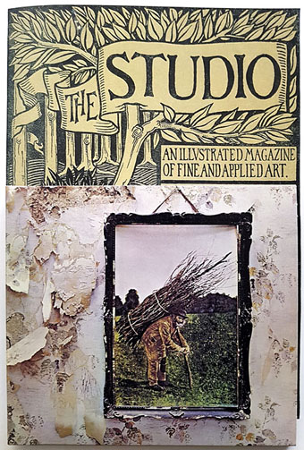
Background graphics by Aubrey Beardsley, 1893.

You’d think by now that everything would be known about an album with a Godzilla-sized cultural footprint like Led Zeppelin IV. I certainly thought so until last week when I turned up the source of something that the more obsessive Zepp-heads have been pondering for years. If this puts a bustle in your hedgerow then read on.

symbols.jpg

Led Zeppelin’s fourth album has been around now for half a century which means there really is a lot known about every detail of its production. Mysteries that used to confound friends of mine when we were teenagers have long been solved, questions such as what the hell the four symbols assigned to each member of the group actually signified; not only do we know the origin and meaning of those symbols, the enigmatic “Zoso” sigil chosen by Jimmy Page has an entire website dedicated to its various manifestations. We know where the photo on the cover was taken (Birmingham), and why the sleeve is devoid of identification (Page was annoyed with the press reaction to the previous album); we know that the hermit painting inside the gatefold is based on the Tarot card by Pamela Colman Smith, and we also know a great deal about the writing and recording of Stairway To Heaven. Erik Davis logged much of this in his 33 1/3 study of the album, and while he examines the band symbols in some detail he doesn’t say much about the rest of the hand-written inner sleeve beyond this comment:

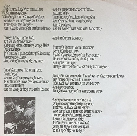
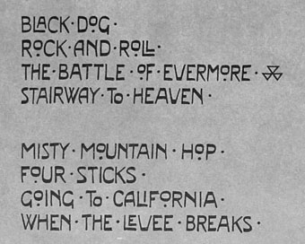
Is there a meaning to the nifty Arts and Crafts typeface that Page lifted for the Stairway To Heaven lyrics on the other side of the sleeve? Or just a vibe?

The source, if not the meaning, of this script has been intriguing Zeppelin fans for many years, but I wasn’t aware of this until I happened to be reading the Wikipedia entry about the album and found myself equally intrigued. The game was afoot, Watson.

soh1.jpg

It makes them wonder: the hand-lettered lyrics.

A persistent question you see in fan circles is “What font was used to create X?” People will ask this question even when the design is a one-off, like Syd Mead’s logo for Tron, or something that’s obviously been lettered by hand. Led Zeppelin IV is an album guaranteed to raise the “What font?” question because the lyrics of the group’s most famous song, Stairway To Heaven, cover an entire side of the inner sleeve. On one of the fan forums I was reading someone was eager to identify “the font” because they wanted to apply the words to a bedroom wall. Many more people must have copied out those lyrics since 1971; I once had to do this myself for a female friend who was so besotted with Jimmy Page that she wanted the lyrics in a frame on her own bedroom wall.

tracks.jpg

According to the Wikipedia entry, Page revealed the source of the lettering to be an issue of The Studio, the British art and design magazine which helped launch Aubrey Beardsley’s career and did much to develop and promote the Art Nouveau style in the 1890s. I’m very familiar with The Studio, many posts here refer to it, and I happen to have a complete collection of issues downloaded from the journal archive at Heidelberg University. Seeing the magazine mentioned in this context immediately made me want to find the design that Page had adopted, but before I started flicking through thousands of pages I looked around to see if any of the Zepp-heads had tried searching for the magazine themselves. Evidently not; all the discussion I’ve seen about the inner sleeve tends to recycle the Wikipedia entry, nobody seems to have bothered looking for copies of the magazine. Okay then…

Continue reading “Led Zeppelin IV: Jimmy Page versus Little Bo-Peep”

Weekend links 610

durer.jpg

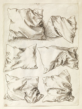
Pillow Studies (1493) by Albrecht Dürer.

• “Without ever writing a song, without ever fronting a group, Khan changed the face of British music.” Michael Hann talks to Morgan Khan about bringing New York Electro to the UK with his Streets Sounds label.

James Balmont offers “an introduction to Japan’s visceral cyberpunk cinema in five cult films”. This reminds me that I’ve not seen Shinya Tsukamoto’s Tetsuo films for years. Time to reacquaint myself.

• At Aquarium Drunkard: 15-minutes of Alice Coltrane from 1970, talking about her music and performing with Pharoah Sanders et al. Amazing.

Clive Hicks-Jenkins presents Beauty & Beast, an animated fairy tale made to showcase his toy theatre design.

• Carl Dreyer’s horror masterpiece, Vampyr (1932), is released on blu-ray by Eureka in May.

• At Wormwoodiana: Mark Valentine explores the mysteries of the Egg Language.

• DJ Food unearths paintings by Syd Mead for a Celcon Steel brochure, 1965.

• Jamie Sutcliffe enters The Strange World of Junji Ito.

• Mix of the week: Isolatedmix 117 by Refracted.

Keeley Forsyth‘s favourite music.

Electrocharge (1980) by Blackbeard | Electrodub1 (1980) by Chris Carter | Ano Electro (Andante) (1993) by The Sabres Of Paradise

Motorway cities

motorway.jpg

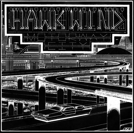
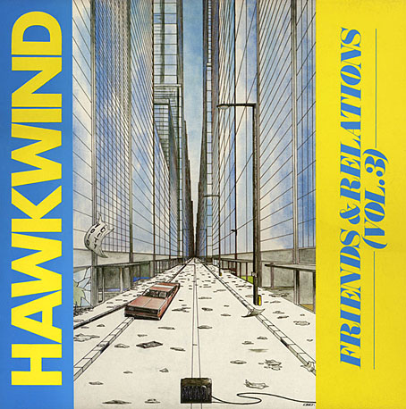
The process of updating the main website meant I had to check (and double-check, etc) every single page, so I’ve been looking at more of my old artwork than usual. This 7-inch single sleeve from 1983 made me belatedly realise that the wheel-less levitating car I put on the back of Joe Banks’ Hawkwind book has an ancestor here and on the cover of the third Friends and Relations compilation that Flicknife released in 1985. The continuity was accidental but Motorway City (the song) dates from the end of the period discussed in Joe’s book so it’s good to think that a vague reference to the Levitation era can be found on the cover art.

This odd drawing dates from 1980, a year when my life was in such turmoil I’m amazed I had time to do any drawing at all. I was 18 and had already burned my way through three dead-end jobs after leaving school the year before, by which point I was agreeing with Dave Brock’s Brainstorm ad lib on the Live Seventy Nine album, “I don’t want to be employed!” This attitude led to increasing rows with my mother which in turn led me to spend more time than usual in Blackpool library. Part of the inking on the drawing was done during one of these stress-free afternoons in the library reading room. I’d guess this was shortly after I’d met the group for the first time at their Preston concert on 20th October since most of the drawings I took with me were generic space art rather than pieces derived from Hawkwind songs. They’d played Motorway City that evening (the second song according to Setlist.fm) so I’m sure I would have made a point of showing it off. I say this is an odd drawing because I’ve no idea why I made it look so obviously like a single sleeve, but it’s possible that a single release of the song from the new Levitation album had been rumoured. Whatever the explanation, this was one of the first drawings I made using my new Rotring Variant pen which I used throughout the ensuing decade; one advantage of the dead-end jobs was they at least gave you enough money to afford expensive German technology. A year later, looking through a friend’s copy of Centigrade 232 by Robert Calvert, I was amused to discover a poetic complaint about the tendency of fine-nibbed Rapidograph pens to become blocked with ink. You have to treat them with care and respect, Bob.

void.jpg

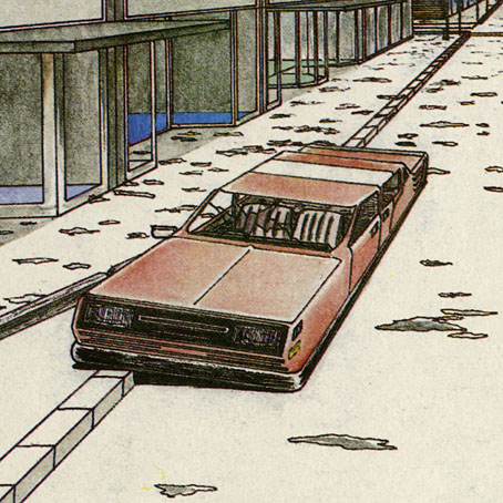
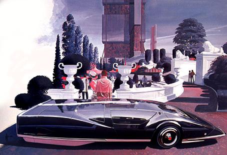
The car on the Friends & Relations cover wasn’t intended to be a reference to the earlier vehicle but removing the wheels was the easiest way of indicating a futuristic scene without any other overt signifiers. A shame, then, that the TV in the foreground is a cathode-ray tube in a wooden case. (And while I’m being critical, the careless use of perspective makes the car much too long.) Both these vehicles look rather graceless, as did cars in general in the late 1970s/early 1980s when there was a trend for boxy design. I’m usually indifferent to the automotive world but I could at least have borrowed some of the carapace sleekness you see in paintings by Syd Mead or Peter Jones.

void2.jpg

The Friends & Relations album was reissued on CD in 2014 in one of the Atomhenge CD box sets: The Flicknife Years, 1981–1988. The set includes two other albums with covers of mine: Zones and Out And Intake. Zones was a compilation of recent live recordings and a few studio outtakes that includes the version of Motorway City released as a single, together with a Michael Moorcock song that’s unique to this album (and sung by the man himself), Running Through The Back Brain.

Previously on { feuilleton }
Reality you can rely on
Hardy art
Silver machines
Notes from the Underground
Hawkwind: Days of the Underground
The artists of Future Life
Science Fiction Monthly
The Chronicle of the Cursed Sleeve
Rock shirts
The Cosmic Grill
Void City
Hawk things
The Sonic Assassins
New things for July
Barney Bubbles: artist and designer

Weekend links 498

mead.jpg

The Sentinel 280, a car design by Syd Mead from 1964.

• “Boris Dolgov did not exist. The man who bore that name may have existed, but there never was a man in the United States with that name until 1956, too late for Weird Tales.” Teller of Weird Tales on the mysterious identity of a magazine artist.

• Saying goodbye to 2019 also meant saying farewell to Vaughan Oliver, Neil Innes and Syd Mead. Related: Vaughan Oliver at Discogs; I’m The Urban Spaceman; a look back at Syd Mead’s vehicle designs.

Lanre Bakare on how ambient music became cool. (Again. This begs the question of when it became uncool, especially when a ten-year-old Brian Eno piece about “the death of uncool” is being quoted.)

Westerners interpreted the peyote experience very differently from the practitioners of the peyote religion, where the focus was “ritual, song and prayer, and to dissect one’s private sensations was to miss the point”. Writers such as Havelock Ellis, who published an essay on his peyote experiences in the Lancet in 1897 (it’s likely that he also administered the substance to his friends W.B. Yeats and Arthur Symons), instead tended to focus on its visual effects. Ellis described “the brilliance, delicacy and variety of the colours” and “their lovely and various textures”. Peyote reached Europe in tandem with the X-ray, cinema and electric lights, Jay notes, and “nothing delighted the eye of the mescal eater so much as the new electrical sublime”.

Emily Witt reviewing Mescaline: A Global History of the First Psychedelic by Mike Jay

Peter Bradshaw takes on the thankless task of ranking Federico Fellini’s feature films.

Geoff Manaugh on when Russia and America coöperated to avert a Y2K apocalypse.

• “Music is an ideal medium for interstellar communication,” says Daniel Oberhaus.

Keith Allison on Karel Zeman, a creator of remarkable cinematic fantasies.

•  Japanese Designer New Year’s Cards of 2020.

• At Dennis Cooper’s: Vera Chytilová Day.

2020 in public domain.

Sentinel (1992) by Mike Oldfield | Sentinels (2001) by Cyclobe | Sentinel (2004) by Transglobal Underground

Weekend links 493

gaycomix.jpg

Art by Rand Holmes for Gay Comix No. 1, September 1980.

• In the universe next door, Los Angeles in November, 2019 looks like the drawings in the Blade Runner Sketchbook (1982). The book has been out of print for many years but available online for a while, although seldom in a downloadable form. A recent upload at the Internet Archive remedies this. In addition to the familiar Syd Mead designs for flying cars and street furniture there are some Moebius-like doodles by Ridley Scott, and Mead’s design for Tyrell’s cryogenic crypt, a detail that would have formed part of an unfilmed sub-plot.

• RIP Howard Cruse, comic artist and pioneering editor of the first few issues of Gay Comix in the 1980s. Cruse produced work outside the gay sphere (I first encountered his strips in Heavy Metal) but the stories that he and other artists created for Gay Comix (later Gay Comics) were some of the first by lesbians and gay men chronicling their own lives, as opposed to porn fantasies or the more recent trend of bolting a token sexuality to a superhero. John Seven talked to Cruse about his career in 2007.

• “On the eve of the First World War Stefan George had started recruiting his own twink army…” Well, if you really must have an army… Strange Flowers presents part one of a guide to the city of Vienna.

In Wild Air, 2016–2018: all 72 of Heath Killen’s requests for a list of six interesting things from artists, writers, scientists, ecologists, musicians, historians and others. My answers are at number 55.

• “Satan is a friend of mine”: Sander Bink on a forgotten occult novel, Goetia (1893) by Frits Lapidoth.

• Picturing a voice: Rob Mullender-Ross on Margaret Watts-Hughes and the Eidophone.

• “They broke the rules”: Killian Fox on the film posters of the French New Wave.

• At Dennis Cooper’s: Jan Svankmajer Day.

Ogi No Mato (1976) by Ensemble Nipponia | Rêve (1979) by Vangelis | Blade Runner Esper “Retirement” Edition, Part III (1982)