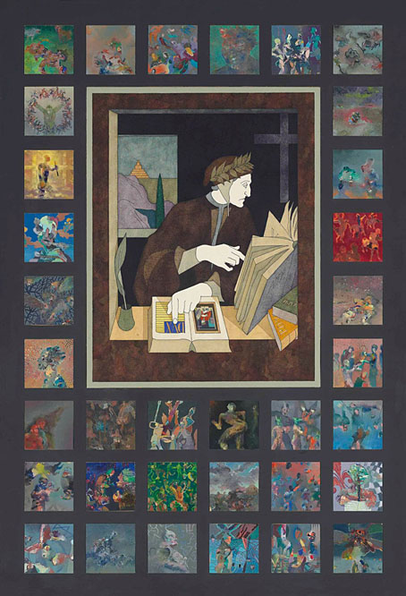
Beautiful and macabre: two books from Century Guild

posters.jpg

Arriving in the mail last week, a pair of beautifully-produced volumes which Thomas Negovan very generously sent to me. Negovan’s Century Guild publishes the kind of art I’ve been writing about here for the past twenty years: Symbolist painting, Art Nouveau graphics, Decadent illustration and more. There’s some intersection between the publisher’s backlist and earlier titles from Dover Publications, but where Dover have mostly concentrated on mass-produced paperbacks Century Guild deploy the full range of finishings available to a publisher of high-quality art books: foil embossing, faux leather finishes, spot-varnished boards, edges sprayed in metallic ink, and ribbon place-markers. Beautiful Macabre is Negovan’s own selection of rare poster art from 1868 to 1981, rare enough for most of the material to be new to me: theatre posters, Expressionist film posters, exhibition posters, etc, with an emphasis on Decadence through the ages. This is another of those books that show how the morbid preoccupations of the 1890s became codified in the 20th century into generic horror.

seder.jpg

Cover design by Jack Hargreaves.

The Anton Seder book is a more singular study, reprinting the intricate plates from Das Thier in der Decorativen Kunst (The Animal in Decorative Art) and Moderne Malereien, a collection of Seder’s interior designs in the Art Nouveau style. Seder’s book of animal designs has its own Dover reprint (which may explain how Murray Tinkelman was able to incorporate some of the creatures into his Lovecraftian cover art) but the Century Guild collection includes much more than this, with biographical notes, and pages that place Seder’s books in the context of previous guides and templates for use by artists and craftspeople. This type of book was a common thing around 1900 (Alphonse Mucha produced three of them), while similar examples abound in previous centuries. The fragmentation of art and craft in the 20th century, and the turn against exuberant decoration, put an end to a form whose spirit survives today in reprints such as this. And it happens to have arrived at a time when its contents will be very useful reference for my current commission. Thanks, Thomas!

Previously on { feuilleton }
Eldritch Art Nouveau: Lovecraft at Ballantine
Moderne Malereien, 1903
Das Thier in der Decorativen Kunst

The return of The Thing: Artbook

thing-artbook.jpg

The most notable feature of the alien organism in John W. Campbell’s “Who Goes There?” is its physical mutability, a quality memorably expressed in John Carpenter’s film adaptation of the story, The Thing. Fitting, then, that The Thing: Artbook is due to be republished later this year in a new edition which adds fresh material to the original volume. I was one of over 350 artists asked to create personal responses to Carpenter’s film in 2016, the results of which were published by Printed In Blood as a heavyweight, large-format hardback. The new book will divide the original into a more manageable two-volume paperback set to which a third volume of fresh material will be added, with all three volumes being contained in a slipcase. The third volume will also be available as a standalone book. Pre-orders may be placed here.

For the reprint there’s the possibility of original contributors doing a new piece, a tempting idea but not something I have the time for at the moment. Last month I started work on a new series of book illustrations which I need to concentrate on even though I wouldn’t mind doing something new based on the film. Before the book was published I guessed that many of the artists would be working variations on favourite scenes or characters, an accurate prediction as it turned out. My own contribution was an attempt to depict some of the moments we don’t see, when transformations are taking place offscreen, but I also had a more complicated, poster-style design in mind which I never managed to work out to my own satisfaction. For now the idea will have to remain frozen in the conceptual ice.

thing-bantam.jpg

Before starting work on my own drawing I also read John W. Campbell’s story and looked for earlier depictions of his alien. One of the book covers that turned up was the Bantam paperback of Alan Dean Foster’s novelisation (above), a book with a better cover than the UK editions which recycled elements from the film posters. I couldn’t find an artist credit at the time but the cover art is by Jim Burns, a British illustrator best known for his depictions of spacecraft and futuristic technology. Looking for confirmation of his credit turned up a picture of the original painting which has a husky looking at the frozen alien. I can see why the art director wanted the dog removed—the cover is better with all the viewer’s attention drawn to those insectile legs—but Burns’ colour scheme is spoiled by the greenish tinge of the printed version. Ice is a difficult substance to paint well. If I was Burns I would have been a little annoyed that all those icy details had been lost.

Previously on { feuilleton }
The Thing: Artbook
The Thing Group Art Show
Things

Weekend links 810

luminet.jpg

Image of a Spherical Black Hole with Thin Accretion Disk (1979) by Jean-Pierre Luminet. Via.

• “I would be willing to bet that every student of fantastic fiction has at some point in his or her career read a book with the name EF Bleiler printed on its cover.” Brian J. Showers of Swan River Press talked to EF Bleiler in 2005.

• “James Webb Space Telescope confirms 1st ‘runaway’ supermassive black hole rocketing through ‘Cosmic Owl’ galaxies at 2.2 million mph.”

• “You have to be ready to see it”: Abel Ferrara and Catherine Breillat on why Pasolini’s Salò is a gift that keeps giving.

• At Dennis Cooper’s: Kosten Koper presents…Bill Nelson: Acquitted By Mirrors (1982–1987).

• At Skurrilsteer: Ongoing research into the life, work and legacy of Edward James.

• At The Daily Heller: All that jazzy record cover design.

Cygnus X-1 (1977) by Rush | Blackhole Dropout (1979) by Tod Dockstader | The Competition Of Supermassive Black Holes And Galactic Spheroids In The Destruction of Globular Clusters (1999) by Jah Wobble

Illustrating Hyperborea

hyperborea00.jpg

The Book of Hyperborea (1996). Cover art by Robert H. Knox.

“My Hyperborean tales, it seems to me, with their primordial, prehuman and sometimes premundane background and figures, are the closest to the Cthulhu Mythos, but most of them are written in a vein of grotesque humor that differentiates them vastly.” — Clark Ashton Smith

Since re-reading Clark Ashton Smith’s The Tale of Satampra Zeiros I’ve been revisiting more of Smith’s stories set in the lost world of Hyperborea. And having put together a post some years ago that gathered all the original illustrations for Smith’s Zothique cycle, I thought I’d try and do the same for another of his story series. As I noted in the earlier post, we’re fortunate today that it’s so easy to see illustrations that in the past would have been impossible to find unless you owned (or had access to) a huge collection of pulp magazines. Pulp illustrations aren’t always very good—in the case of the early issues of Weird Tales, they’re frequently amateurish—but those that illustrate new fiction for the first time are historically important if nothing else.

pennington1.jpg

Lost Worlds: Volume 1 (1974). Cover art by Bruce Pennington. Lost Worlds was a single-volume collection published by Arkham House (USA) and Neville Spearman (UK). The Panther paperback covers by Bruce Pennington could easily be used on other books but these were the first Smith volumes I owned.  

The first Hyperborea stories were among Smith’s earliest prose fantasies, owing something to Lord Dunsany on the one hand (HP Lovecraft detected a Dunsanian quality), and the writers of antiquity on the other, the name “Hyperborea” (“Behind the North Wind”) being borrowed from the Greeks. The northern location is about the only feature of the continent that the Greek writers would recognise, Smith’s world being a temperate pre-Ice Age realm of mountains and verdant jungles. Dinosaurs and megafauna share the lands with human inhabitants for whom sorcery is a common practice. As with Zothique, the cycle was an influential one. Lin Carter in the introduction to his Ballantine collection, Hyperborea (1971), suggests that the name of the continent might have prompted Robert E. Howard to set his Conan stories in “the Hyborean Age”. This could be the case: Howard and Smith were writing for the same publications, and the first Conan story was published in Weird Tales shortly after The Tale of Satampra Zeiros; but Howard was also reading the Greeks as well. A more substantial influence may be found in Fritz Leiber’s Nehwon, a world in which aspects of Hyperborea and Zothique are combined. Sword and sorcery begins “behind the North Wind”, in other words, although there’s very little sword-play in Smith’s fiction, that was Leiber and Howard’s department.

pennington2.jpg

Lost Worlds: Volume 2 (1974). Cover art by Bruce Pennington.

The original Hyperborea illustrations are fewer than those for Zothique. As with the later cycle, several of the stories are unillustrated, while others were given lacklustre artwork. In the earlier post I followed the story order chosen by Lin Carter which attempted to contrive an internal chronology for the cycle. Carter did the same with his Hyperborea collection so I’ve followed his example once again. Later collections, like Will Murray’s Book of Hyperborea, tend to order the stories by publication date.

hyperborea01.jpg

The Seven Geases, Weird Tales, October 1934.

An illustration of Tsathoggua by Smith himself. The toad-god turns up in person in this story.

hyperborea02.jpg

The Weird of Avoosl Wuthoqquan, Weird Tales, June 1932.

Continue reading “Illustrating Hyperborea”

Tsathoggua rising

tsathoggua.jpg

I said last week that I’d almost finished reworking my portrait of Tsathoggua for the Lovecraft book, and here it is. Tsathoggua first came into the world in a Hyperborea story by Clark Ashton Smith, The Tale of Satampra Zeiros, before being incorporated into the Cthulhu Mythos by HP Lovecraft who refers to the god-creature in several of his stories. Where Smith describes a hideous toad-like being, Lovecraft avoids being too closely bound by material specifics, referring to an “amorphous” entity which suggests a range of possibilities for illustration. To be fair to Smith, there is an amorphous and very deadly creature lurking in the temple of Tsathoggua in The Tale of Satampra Zeiros but we never learn whether this is Tsathoggua itself or some other being.

The amorphousness of Lovecraftian entities is a factor which is too often ignored in the world of weird illustration. Cosmic horror thrives on the fluidity of physics and physical matter but many illustrators seem content to copy one another instead of inventing new teratisms, a process that results in the accretion of stereotypes. Cthulhu, as I’m always reminding people, explodes into pieces after being struck by a ship at the end of The Call of Cthulhu, the remnants then recombining when the ship sails away from the scene. Lovecraft never intended his “spawn from the stars” to resemble the accreted stereotype we see today, a kind of Jolly Green Giant with squid mask and bat wings, reaching a brawny and very human arm towards the viewer. The ultimate expression of cosmic amorphousness may be found in the Shoggoths, those alien entities whose default condition is a mass of shapeless, iridescent protoplasm.

It was the amorphous nature of Tsathoggua that I wanted to honour with my original Photoshop creation in 1999. The starting point was a photograph of a cephalopod (I forget now whether it was an octopus or a squid) torn from an old issue of National Geographic. My initial experiments with the picture weren’t intended to develop into Tsathoggua; I didn’t have anything specific in mind when I started but at some point during the production of The Great Old Ones I decided to turn the picture into Smith’s entity with the addition of a toad-like head. Rather than mould the rest of the picture into more recognisable organic shapes it was left in a largely amorphous state. The eye-like shape at the top is a complete mystery to me now, I can’t say why it was there but it felt right so there it stayed. Alan Moore’s text for Tsathoggua identifies the creature with the Kabbalistic sphere of Geburah, “Strength”, a zone imbued with the martial qualities of the planet Mars. This is one of the more arbitrary assignations in The Great Old Ones—there’s nothing especially warlike about the toad-god—but something had to occupy the space, and I’d already finished the picture before Alan started writing his pieces. For the new version I’ve redrawn some areas of the original, but most of the work has been a case of sharpening edges and improving the contrast and modelling. The spiky, crown-like upper half has been emphasised a little in order to complement the martial aspect. And the bulging, convex appearance of the original has been slightly enhanced, giving the impression that the creature’s gravitational mass is of a sufficient density to bend the light around it. None of this should be taken as a negation of Smith’s description of a squatting, pot-bellied toad-god. The icons of the Great Old Ones created by human beings are exactly this: human attempts to represent alien monstrosity. Some acolyte who happens to envision the real Tsathoggua might stammer that “It looked like…a giant toad!” thereby giving a form to the subsequent iconography. But the map is not the territory. Cthulhu doesn’t, and shouldn’t look like the statues either. The Jolly Green Giant needs to ditch the mask and wings and get back to selling canned vegetables.

Elsewhere on { feuilleton }
The Lovecraft archive

Previously on { feuilleton }
H.P.L.
The Return of the Crawling Chaos
Lettering Lovecraft
Weird ekphrasis and the Dunwich Horrors
Kadath and Yog-Sothoth
Another view over Yuggoth