
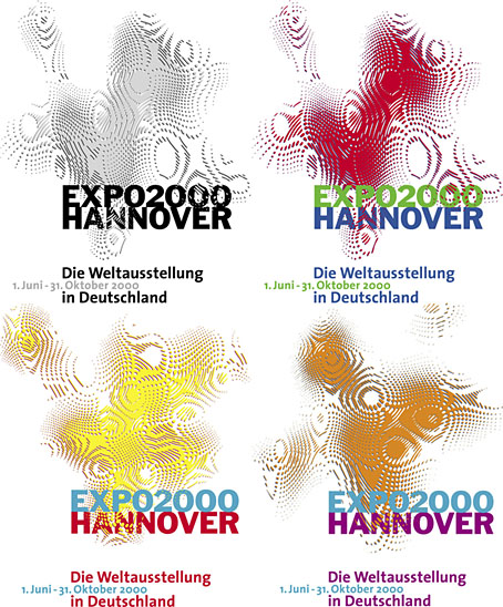
Logos designed by QWER, Iris Utikal and Michael Gais.
Hannover’s Expo 2000 wasn’t very successful as expositions go but it had an attractive logo, a combination of bold sans-serif type with a moiré background pattern which ideally had to be seen in its animated form. World expositions tend to be concerned with technical innovations and novelties, and this animated design was certainly novel, if impossible to replicate in print. All the static versions of the logo are essentially screenshots of the moving version, with the moiré image frozen at a various places to generate many shape and colour variations. Not all of these are satisfactory. I think it was Matisse who said that anyone can put two colours together; the real challenge is putting three together in a harmonious manner.
![]() The pattern was a little more animated on the original exposition website, albeit reduced to this tiny gif. The site is mostly intact and browsable at the Internet Archive, a primitive thing by today’s standards but Expo 2000 was the first world exposition with a dedicated website, something which really did set it apart from its predecessors. Many of the exposition’s buildings and exhibits would have seemed bizarre or alarmingly ugly to the people who attended the Paris Exposition Universelle in 1900 but much that was on display in Hannover would at least have been comprehensible to a visitor from the past. Trying to explain what “a website” was to someone in 1900, even a futurologist like HG Wells, would have required considerable effort.
The pattern was a little more animated on the original exposition website, albeit reduced to this tiny gif. The site is mostly intact and browsable at the Internet Archive, a primitive thing by today’s standards but Expo 2000 was the first world exposition with a dedicated website, something which really did set it apart from its predecessors. Many of the exposition’s buildings and exhibits would have seemed bizarre or alarmingly ugly to the people who attended the Paris Exposition Universelle in 1900 but much that was on display in Hannover would at least have been comprehensible to a visitor from the past. Trying to explain what “a website” was to someone in 1900, even a futurologist like HG Wells, would have required considerable effort.
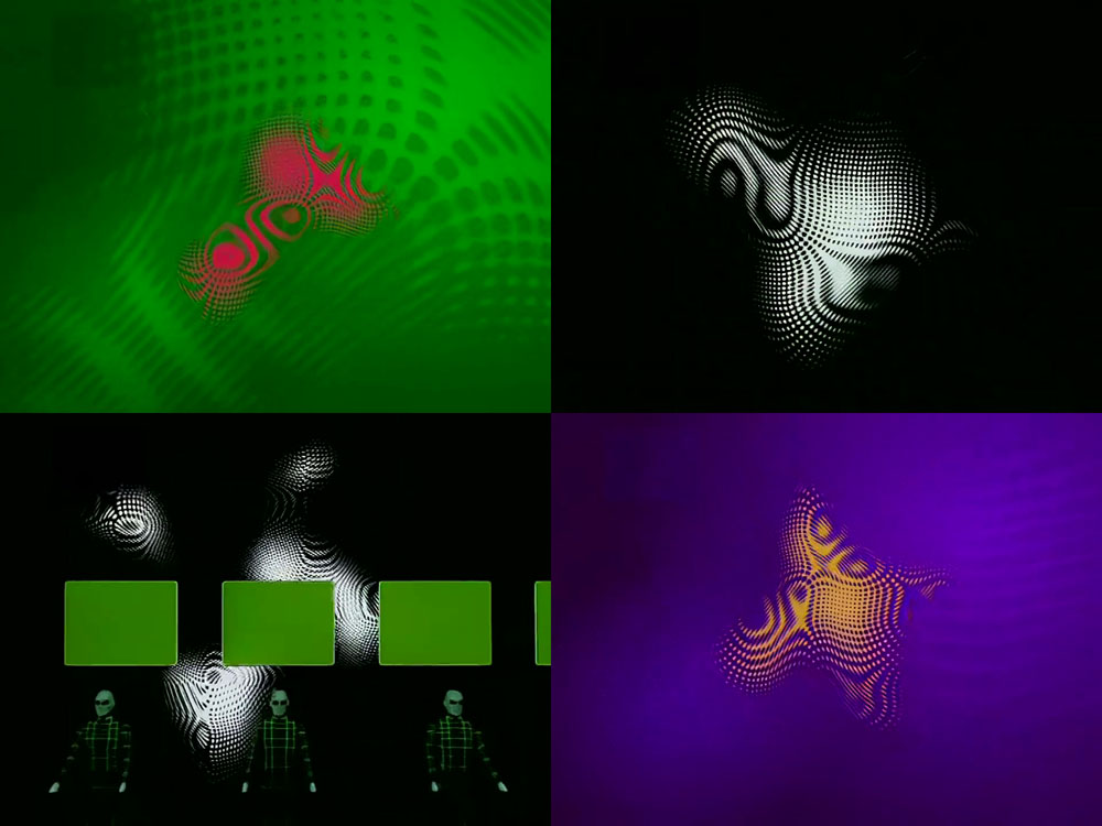
Video for Expo 2000 by Kraftwerk.
Ephemerality is a distinguishing characteristic of world expositions, all those splendid pavilions and eye-catching constructions don’t last very long even though the events themselves involve years of planning. A list of exposition features that have managed to survive would be a disparate collection, taking in well-known landmarks like the Eiffel Tower, Seattle’s Space Needle and the Atomium in Brussels, architectural projects such as the Grand Palais in Paris and the Biosphere in Montreal, and one-off oddities like the Unisphere in Queens and the cement dinosaurs in Crystal Palace Park. If Expo 2000 is remembered for anything today it’s the one-off song that Kraftwerk wrote for the occasion, Expo 2000, which arrived with graphics and visuals based on the expo logo. Kraftwerk had been hired at great cost to create the jingles in different languages that accompany the animated logo. This is turn led to the song, the group’s first new studio composition in 14 years.
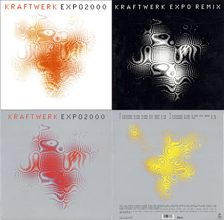
I thought these abstract images were a good match for Kraftwerk, I prefer them to the other designs for the single which show the four computer-generated figures that later appeared on the cover of Minimum-Maximum. The CD case at the top left was made with lenticular plastic which imitated the moiré effect of the animated logo. I didn’t buy this one when I had the chance, choosing instead the “enhanced” version which came with a minuscule copy of the video in a CD-ROM section. Like most CD-ROM singles, the audio tracks still play but the enhanced section no longer works. Welcome to the future.