
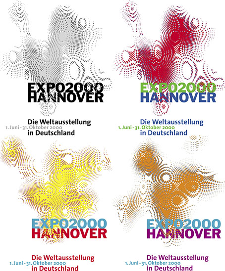
Logos designed by QWER, Iris Utikal and Michael Gais.
Hannover’s Expo 2000 wasn’t very successful as expositions go but it had an attractive logo, a combination of bold sans-serif type with a moiré background pattern which ideally had to be seen in its animated form. World expositions tend to be concerned with technical innovations and novelties, and this animated design was certainly novel, if impossible to replicate in print. All the static versions of the logo are essentially screenshots of the moving version, with the moiré image frozen at a various places to generate many shape and colour variations. Not all of these are satisfactory. I think it was Matisse who said that anyone can put two colours together; the real challenge is putting three together in a harmonious manner.
![]() The pattern was a little more animated on the original exposition website, albeit reduced to this tiny gif. The site is mostly intact and browsable at the Internet Archive, a primitive thing by today’s standards but Expo 2000 was the first world exposition with a dedicated website, something which really did set it apart from its predecessors. Many of the exposition’s buildings and exhibits would have seemed bizarre or alarmingly ugly to the people who attended the Paris Exposition Universelle in 1900 but much that was on display in Hannover would at least have been comprehensible to a visitor from the past. Trying to explain what “a website” was to someone in 1900, even a futurologist like HG Wells, would have required considerable effort.
The pattern was a little more animated on the original exposition website, albeit reduced to this tiny gif. The site is mostly intact and browsable at the Internet Archive, a primitive thing by today’s standards but Expo 2000 was the first world exposition with a dedicated website, something which really did set it apart from its predecessors. Many of the exposition’s buildings and exhibits would have seemed bizarre or alarmingly ugly to the people who attended the Paris Exposition Universelle in 1900 but much that was on display in Hannover would at least have been comprehensible to a visitor from the past. Trying to explain what “a website” was to someone in 1900, even a futurologist like HG Wells, would have required considerable effort.
Video for Expo 2000 by Kraftwerk.
Ephemerality is a distinguishing characteristic of world expositions, all those splendid pavilions and eye-catching constructions don’t last very long even though the events themselves involve years of planning. A list of exposition features that have managed to survive would be a disparate collection, taking in well-known landmarks like the Eiffel Tower, Seattle’s Space Needle and the Atomium in Brussels, architectural projects such as the Grand Palais in Paris and the Biosphere in Montreal, and one-off oddities like the Unisphere in Queens and the cement dinosaurs in Crystal Palace Park. If Expo 2000 is remembered for anything today it’s the one-off song that Kraftwerk wrote for the occasion, Expo 2000, which arrived with graphics and visuals based on the expo logo. Kraftwerk had been hired at great cost to create the jingles in different languages that accompany the animated logo. This is turn led to the song, the group’s first new studio composition in 14 years.
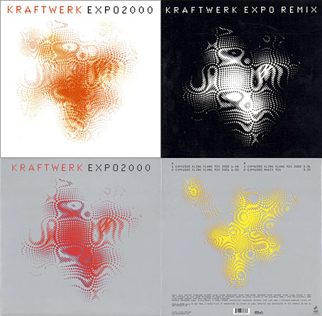
I thought these abstract images were a good match for Kraftwerk, I prefer them to the other designs for the single which show the four computer-generated figures that later appeared on the cover of Minimum-Maximum. The CD case at the top left was made with lenticular plastic which imitated the moiré effect of the animated logo. I didn’t buy this one when I had the chance, choosing instead the “enhanced” version which came with a minuscule copy of the video in a CD-ROM section. Like most CD-ROM singles, the audio tracks still play but the enhanced section no longer works. Welcome to the future.
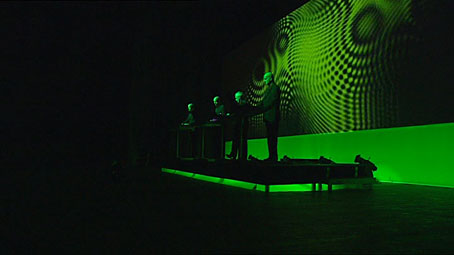
Kraftwerk performing Planet Of Visions from the Minimum-Maximum DVD, 2005.
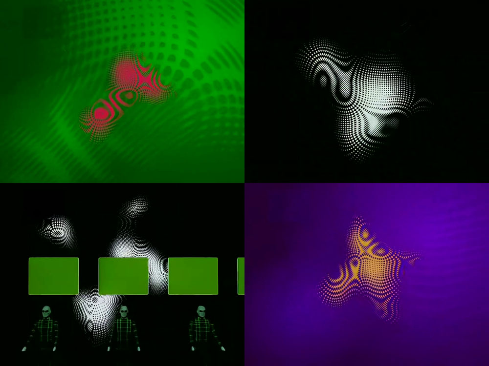
The song has since been reworked for live performances as Planet Of Visions, a number which drops the Expo 2000 references but retains the exposition’s very Kraftwerk-like slogan—”Mensch – Natur – Technik”—while also incorporating the now-familiar moiré pattern into the group’s visual library. For the tour documented on the Minimum-Maximum DVD the expo pattern appeared in a vivid green which, when combined with the morphing shape, always makes me think of the extraterrestrial organism from The Andromeda Strain.
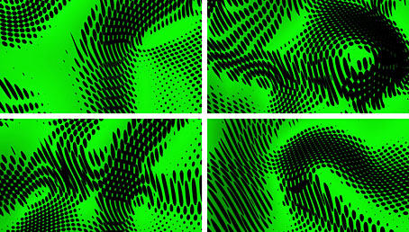
The green moiré mutated again for the version that appears in the more recent 3-D concerts. Since these events required 3-D projections for the group’s video backdrops all the earlier concert visuals had to be reworked into new versions. The vivid green is now a permanent fixture while the new pattern returns to the vector sharpness of the original logo.
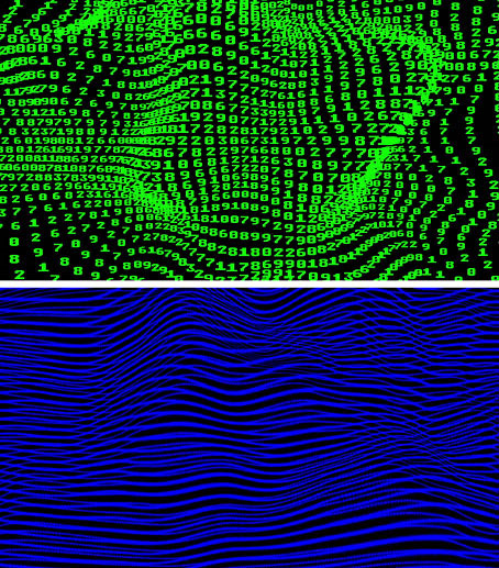
Kraftwerk enthusiasts don’t miss much but I’ve yet to see any mention of the degree to which the moiré might have influenced the group’s other visuals for the 3-D concerts. A similar morphing is evident in the numerical field that fills the screen during Numbers, while the visuals for La Forme begin with a contour pattern of dark blue lines which gradually combine with similar contours to create further moiré effects. This could be coincidence or simple expediency (all of the songs required graphics with a depth of field) but the Expo 2000 design is now an established part of the group’s iconography, at least where Planet Of Visions is concerned. Kraftwerk may no longer acknowledge their first three albums but this kind of symbolic appropriation is as old as the group itself, beginning with the traffic cones that appeared on the covers of those albums. The borrowings continued with Autobahn’s traffic sign, Radio-Activity’s hazard symbol, the El Lissitzky-style graphics of The Man-Machine, and Computer World’s Hazeltine 1500 computer terminal. Even the cyclists on the Tour de France single have their origins elsewhere, being based on a design for a Hungarian postage stamp. The reinvention of the record covers, the paring away of the human elements in favour of ever-simpler symbols, is a process I often feel could be continued. And it has continued in one respect, with the visual representations of the group that evolved through the quartet of showroom dummies and the various robotic incarnations finally arriving at a point where each musician is now a stack of pixels. Back in the year 2000 it was never clear what that exposition pattern was supposed to signify, but in its graphic simplicity and fluid abstraction it was pointing towards Kraftwerk’s future if nothing else.
Previously on { feuilleton }
• Evoluon
• Kling Klang rundfunk
• Reworking Kraftwerk (again)
• Leitkegel
• German gear
• Autobahnen
• Ralf and Florian
• Reworking Kraftwerk
• Autobahn animated
• Sleeve craft
• Who designed Vertigo #6360 620?
• Old music and old technology
• Aerodynamik by Kraftwerk
Re: …the enhanced section no longer works.
Someday our media saturated culture might be a historical Dark Age to curious researchers simply because no one bothered to maintain all the environments, formats and applications, much less transfer content to updated software!
Yes, it’s a problem that’s going to get worse. Ideally there should be open-source emulators for everything but people get proprietorial about old software. I can play old Spectrum computer games that date from 1982 on my Android tablet using an emulator (one of those games was even called Android…) but this activity still exists in a grey area of legality despite the games being 40 years old.
Re: CD-ROMs, I have a couple of really good ones created by Chris Marker and Morton Subotnik, the latter being a kind of interactive composition, but they haven’t worked for years. The Marker one was updated to run on Mac OS X (mine needs OS 9) but I don’t know whether this will work now on recent versions of the Mac OS.
Thank you for this insight, I hadn’t made the connection between the Expo graphic and its variants thereafter. I love the original mixes more than Planet of Visions and own the lenticular CD, which I still find pleasing, as well as the 12″ record. That Kraftwerk should have been commissioned for such a millennial moment, whatever the expense, was great and that it woke them from hibernation and thence to the Tour De France Soundtracks was all the better.
In referring to the inability to play CD-ROM content, you could also have mentioned the Kling Klang Machine, the peculiarly ephemeral Kraftwerk iPhone app produced in I think 2011 – I very much doubt it would play on a modern phone: https://www.wired.co.uk/article/kraftwerk-app.
You say that the paring down could go further – in light of the 3-D Catalogue reducing to the one pixel group image against colour variants, I wonder how that could be achieved.
Yes, the pixels are irreducible. I was thinking more of things like the computer terminal which is now as much of an antique as the Deutscher Kleinempfänger radio on the sleeve of Radio-Activity. So too with the heads on Techno Pop and the Tour De France cyclists. I don’t know what you’d do with the heads but the cyclists have been rendered as simpler versions on some of the graphics elsewhere, like the figures on the Aerodynamik single. The more that Ralf has reduced the other covers to basic shapes and symbols, the more these things seem retrograde by comparison.
I’ve only owned a succession of secondhand Android phones so I didn’t even know there was an iPhone app. Apps are definitely another ephemeral medium, I remember thinking this when they first appeared.
A key aspect of the richness of the Kraftwerk project has been the use of nascent, or defunct, technologies to illustrate or question so-called progress – doing away altogether with these aspects would be a loss I think. I treasure my Catalogue box with all the albums in their pocket cardboard sleeves, updated designs without, original versions within. I intended to document it as a pinnacle of design as the last post on Hard Format, but life intervened.
You can find recordings of the Kling Klang Machine app here: https://www.youtube.com/results?search_query=kling+klang+machine. I did have it on my iPhone, but no longer do. With its basic sequencer I guess it may have been viewed as an updated version of the ‘I’m the operator with my pocket calculator’ motif, but I didn’t find it very convincing.