Harry Clarke’s illustrated Swinburne

clarke30.jpg

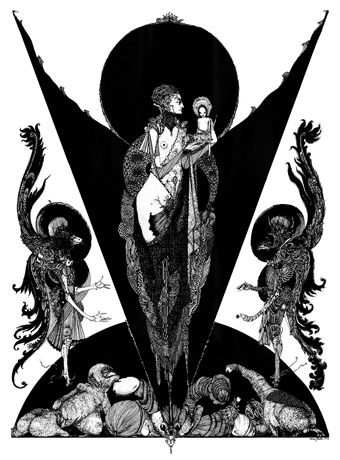
Aholibah (1928).

You won’t find Harry Clarke’s illustration for Swinburne’s Aholibah in Selected Poems of Algernon Charles Swinburne even though it was intended for the book, and was the illustration that Clarke deemed his favourite of the series. The erotic nature of the drawing was too much for the publisher so Clarke had to content himself by pasting a reproduction in his own copy. The copy above has been scanned from Nicola Gordon Bowe’s Harry Clarke: His Graphic Art; everything below is from the published Swinburne collection which turned up recently at the Internet Archive.

clarke01.jpg

Selected Poems of Algernon Charles Swinburne was Clarke’s last illustrated book, published in 1928, three years before his untimely death. Of all the major Clarke books that appeared during the artist’s lifetime it’s always been the most difficult to find. Some of the drawings have been reprinted in recent collections but never the book itself. As with Clarke’s Faust, the erotic and morbid qualities of the illustrations generated disquiet outside the publisher’s office, with Humbert Wolfe in the book’s introduction stating that Clarke’s interpretations were completely opposed to his own. Given the erotic and morbid preoccupations of the poet and his work this surprises me; Swinburne’s poetry was admired by Aleister Crowley and HP Lovecraft, among others. They weren’t reading him because he was writing paeans to daffodills.

clarke02.jpg

My earlier mention of this volume included a link to a defunct blog with a collection of the illustrations separated from the text. This was unavoidable at the time, there wasn’t anywhere else that you could see all of them in one place. But seeing the illustrations with the poems benefits the drawings as well as the verse, especially when the poems themselves aren’t so familiar. For my part it’s also good to see all of the illustrations, being the owner of a first edition which I bought many years ago only to discover that a couple of the best pictures had been carefully removed with a razor. This is a common problem with old illustrated books. Caveat emptor as always.

clarke29.jpg

Clarke didn’t do many double-page illustrations. This is one of his best.

clarke05.jpg

Continue reading “Harry Clarke’s illustrated Swinburne”

The art of Nikolai Petrovich Theophilaktoff, 1878–1941

theophilaktoff07.jpg

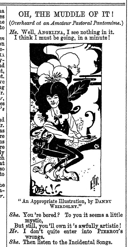
I’m taking the biographical details about this Russian artist from a Christie’s listing, accuracy being of particular importance to auction houses. The trouble with searching for information about Nikolai Theophilaktoff is that he’s one of those Russians whose name isn’t common enough to exist in a settled non-Russian form, so you may find his drawings credited to “Nikolai Feofilaktov” or even “Nikolai Theophylactus”. Whatever the spelling of his surname, Theophilaktoff is remembered today for illustrations with a distinct Beardsley influence, which is how he came to my attention. Aubrey Beardsley only had a few years for his art to impress itself on the world but he was known in Russia during his lifetime; Sergei Diaghilev was especially enthusiastic, using his position as editor of arts journal Mir Iskusstva (World of Art) to promote Beardsley’s work after the artist’s death. A later Russian arts journal, Libra, maintained the enthusiasm, devoting an entire issue to Beardsley in 1905. It was reading about Libra that led me to Nikolai Theophilaktoff, an artist who was sufficiently beguiled by Beardsley’s drawings to embark on his own variations on the Beardsley style.

theophilaktoff06.jpg

Theophilaktoff’s cover art for the Beardsley issue of Libra, November, 1905.

You can usually divide Beardsley’s followers into two groups: those who pick up on the striking contrasts that Beardsley created using areas of solid black against the white of the paper—Harry Clarke, Will Bradley and John Austen are good examples of this type. A second class would be those who favour the delicate, filigree style of Beardsley’s illustrations for The Rape of the Lock—Alastair (Hans Henning Voigt) and Nikolai Theophilaktoff are in this category. (Harry Clarke was also an expert filigree-ist but Clarke is really in a class of his own.) If you accept this artistic division it’s notable that the weaker artists are in the latter class. It’s easier to disguise deficiencies of figure drawing, say, with abundant stippling and decoration than it is when using nothing more than fine lines and masses of black ink. Theophilaktoff’s accomplishments are very uneven but they’re also rare examples of Beardsley’s style of Decadent art in a country that would soon have no time for such a thing at all.

theophilaktoff05.jpg

Most of the pictures here are from a book, 66 Dessins (1909), which collected many of the Theophilaktoff drawings published in Libra. The pornographic drawing at the very end is a swipe from an auction listing. Also near the end are drawings for Wings (1906), a novel by Mikhail Kuzmin which is one of the first literary works to openly deal with same-sex relationships. As for Libra, I thought copies of the magazine might be impossible to find but the trusty Internet Archive has what seems to be a complete run here. Mir Iskusstva, which seems rather staid by comparison, may also be found at the Internet Archive in a series of bound volumes.

theophilaktoff04.jpg

theophilaktoff08.jpg

Continue reading “The art of Nikolai Petrovich Theophilaktoff, 1878–1941”

The art of Wallace Smith, 1888–1937

smith14.jpg

Fantazius Mallare (1922).

One of the links this past weekend was to a lengthy essay about Ben Hecht’s censor-baiting novel, Fantazius Mallare: A Mysterious Oath (1922), a book illustrated by Hecht’s friend, Wallace Smith. I wrote a piece of my own about the novel in 2007, at a time when information about Hecht’s early fiction was much harder to find. Also hard to find was any other work by Wallace Smith, an artist of considerable accomplishment whose fine black-and-white illustration I hadn’t seen elsewhere. We now know that Smith devoted most of his energies to writing, working initially as a journalist. He later followed Hecht to Hollywood where he spent his remaining years writing novels and screenplays.

smith13.jpg

Illustration by “Vulgus” from the Chicago Literary Times.

There were a few other illustrations, however, including more ink drawings in the same flat style he used for Fantazius Mallare. Given the state of the US economy in the 1930s one can hardly blame Smith for going after the money but his painted work proves that he could easily have made a living as a book and magazine illustrator. What you see here is some of his other black-and-white art. There are no doubt more examples to be found in the back issues of the Hecht-edited Chicago Literary Times where Smith was a contributor of small illustrations under the name “Vulgus”. Also worthy of note is Smith’s facility with lettering design, something he shared with J. Allen St John who created many stylish title designs for his Edgar Rice Burroughs’ books.


The Florentine Dagger: A Novel for Amateur Detectives (1923) by Ben Hecht.

smith05.jpg

smith06.jpg

smith07.jpg

Continue reading “The art of Wallace Smith, 1888–1937”

The Golden Hind: A Quarterly Magazine of Art and Literature

golden01.jpg

Well, here we are at last… After years of waiting for scanned copies of The Golden Hind to turn up, now that they have done I’m still frustrated. The magazine was one of the many small arts periodicals being published in Britain during the 1920s. It had an erratic, eight-issue run from 1922 to 1924, and remains notable for being the second (and last) magazine to be co-edited by Austin Osman Spare. The artist’s first magazine venture, Form, had been edited by Spare and “Francis Marsden” (Frederick Carter), with the pair publishing two issues before the outbreak of the First World War, followed by a final issue in 1921. Spare co-edited The Golden Hind with writer Clifford Bax, creating a publication whose contents were less mystical than Form had been, while also providing more of a showcase for artists other than Spare himself.

golden02.jpg

Inevitably, it’s the artists that interest me the most in The Golden Hind, even though the magazine was running pieces by writers like Aldous Huxley and Edith Sitwell. Many of the artists have been featured here before, some of them on many occasions: Alastair (Hans Henning Voigt), John Austen, Harry Clarke, Garth Jones, Henry Keen, and Allan Odle. Spare’s own drawings have since been recycled in various books but most of the other drawings, woodcuts, linocuts and prints remain exclusive to the magazine. The John Austen contributions are especially fine, further examples of his decorated style which borrows heavily from Aubrey Beardsley and Harry Clarke, and which he used so well in his illustrated Hamlet. The spirit of Beardsley’s 1890s is very much in evidence in The Golden Hind, a demonstration, perhaps, that Spare was once again looking back to The Savoy magazine as an example to be followed; one of the essays concerns the poety of The Savoy‘s literary editor, Arthur Symons.

golden03.jpg

In addition to artists whose popular works are still reprinted today there are less well-known figures like Sidney Hunt whose drawings owed more to contemporary trends than many of the other contributors. Hunt later edited an avant-garde magazine of his own, Ray, while producing his own brand of homoerotic prints like the Ganymede with Zeus which may be seen in The Golden Hind’s final issue.

golden04.jpg

The frustration I referred to above is my usual complaint about image quality. All the copies of the magazine have been taken from microfilm archives which means the pages aren’t grey enough to be illegible but their general murkiness is enough to destroy a lot of the artwork, especially the lithographs and other prints. The samples you see here have been brightened a little which does improve some of the line art but can do nothing for the rest. But I’m not going to complain too much. It’s taken a long time to be able to browse a complete run of this magazine, and I feel fortunate to do so even in this compromised manner. Better copies may still surface eventually. Fingers crossed.

golden05.jpg

Continue reading “The Golden Hind: A Quarterly Magazine of Art and Literature”

Destiny, A Novel in Pictures by Otto Nückel

destiny01.jpg

Frans Masereel and Lynd Ward are the two names most commonly associated with the “wordless novel” of the 1920s and 30s, but there was another significant contributor to the form, Otto Nückel (1888–1955), a German artist whose Schicksal, Eine Geschicte in Bildern was one of the spurs for Ward to try something similar. I hadn’t seen Nückel’s book before, the pictures here being taken from an American reprint from 1930. The general tone is very similar to Masereel’s The City (1925), with the difference that Destiny depicts a single, tragic life in a nameless European metropolis where Masereel presents a tapesty of city-wide lives and events. The artistic styles differ but all three artists used engraving to create their pictures, a technique that no doubt helped sustain an aura of seriousness about these projects, keeping at bay any association with disreputable comic strips. Masereel and Ward used wood for their medium while Nückel preferred to engrave on lead plates. His book is still in print today via Dover Publications.

destiny02.jpg

destiny03.jpg

destiny04.jpg

destiny05.jpg

Continue reading “Destiny, A Novel in Pictures by Otto Nückel”