Elliott Dold’s Night

dold01.jpg

Looking for artwork by Elliott Dold turned up this remarkable set of illustrations for an unremarkable collection of poetry, Night, by a friend of the artist, Harold Hersey. Elliott Dold (1889–1957) was an American illustrator during the early days of the pulp magazines, best known today for drawings of huge machines which are a match for those by his more prolific contemporary, Frank R. Paul. The pulp magazines are so often filled with mediocre illustration that it’s a pleasure to find another talent lurking in their pages. But Dold was more than an illustrator of big science, as these illustrations for Hersey’s dubious poetry demonstrate.

dold02.jpg

Night is a collection of vaguely erotic poems, all of which Hersey labels “Nocturnes”. The collection was published in 1923 in a privately-printed subscriber-only edition, and every description I’ve read of it agrees that the illustrations are the best thing about it. The drawings are also radically different to Dold’s science-fiction art, to a degree that they could easily be taken for the work of a different illustrator. “What a pity the artist has to waste his time grinding out art for the pulps,” said HP Lovecraft, in a letter to Clark Ashton Smith. A pity, indeed. Dold’s illustrations are on a par with those that Wallace Smith was producing in the same year, and are close enough to Smith’s style that’s it’s tempting to accuse him of imitation. Smith’s style wasn’t unique, however; Ray Frederick Coyle was another American artist at work in the 1920s who favoured the same combination of strict black-and-white, careful linework and stylised figures. It’s curious that three books with somewhat controversial contents should have been published in the USA in 1922/23, all of them illustrated in a very similar manner: Ben Hecht’s Fantazius Malare (illustrated by Wallace Smith), James Branch Cabell’s new edition of Jurgen (illustrated by Ray Frederick Coyle), and Hersey’s Night. Rather than look for spurious influence I’d guess that this was a combination of coincidence and American literature acquiring a belated taste for Decadence which required suitably Beardsleyesque illustration. Similar trends were evident in cinema, especially in Alla Nazimova’s 1923 film adaptation of Oscar Wilde’s Salomé, where the costumes and settings were all based on Beardsley’s illustrations.

dold03.jpg

The images here are from a copy of the book at HathiTrust that’s another poor Google scan. The Hathi website isn’t as convenient for reading as the Internet Archive so I’ve downloaded all of the illustrations and, when necessary, cleaned the grey tone left by the scanner’s camera.

dold04.jpg

dold05.jpg

Continue reading “Elliott Dold’s Night”

Steven Arnold: Heavenly Bodies

arnold01.jpg

One consequence of writing posts like this for the past 19 years is the blossoming into familiarity of previously unknown subjects. Such has been the case with the work of Steven Arnold (1943–1994), an American artist/photographer/film-maker whose photographs I hadn’t seen until I was pointed towards the Steven Arnold Archive by a reader in 2009. (Hi Thom, if you’re out there!) Since that brief post I’ve logged the occasional appearance of Arnold exhibitions and, more recently, the blu-ray release of Arnold’s sole feature film, Luminous Procuress.

arnold02.jpg

Steven Arnold: Heavenly Bodies is a feature-length documentary by Vishnu Dass about Arnold and the circle of friends and collaborators who helped create his films and photographic tableaux. The documentary was released by the Steven Arnold Archive in 2019, and is now freely available for viewing at Vimeo. (The “Mature” tag means you need to either log in or create an account to watch it.) Dass presents a collection of video interviews with Arnold and his associates, together with more recent interviews with surviving friends and enthusiasts, to supply the biographical detail behind Arnold’s extraordinary endeavours. Angelica Huston narrates the film which also includes poignant testimony from Arnold’s close friend, Ellen Burstyn.

arnold03.jpg

The interviews chart the artist’s progress: education in Oakland and San Francisco; his early experiments with film; his experience as a member of Salvador Dalí’s circle of hippy acolytes; the creation of all those beautiful black-and-white photographs in his Los Angeles studio. Arnold is revealed to have been a pioneer even by the elevated standards of San Francisco in the 1960s; he was taking acid in 1964, and at the height of the psychedelic era was cultivating with his friends an attitude of glamorous, polymorphous sexuality and gender play that went beyond the out-gay status of the Beats. In one of the interviews he talks eloquently about his concept of androgyny, which he regarded as an almost spiritual state, an attitude the alchemists of old would have endorsed. Arnold was the founder of San Francisco’s midnight movie shows in 1967, the same shows which saw the birth of the Cockettes, an anything-goes performing troupe who turn up later in Luminous Procuress. I didn’t know that Arnold’s midnight shows (for which he designed the posters) were taking place three years before the screening of El Topo in New York, the event which is usually cited as the origin of the nationwide Midnight Movie trend.

arnold04.jpg

Luminous Procuress was the culmination of his time in San Francisco, and the film that caught the attention of Salvador Dalí when it too was screened in New York. The film is a rare example of Arnold arranging his tableaux in full colour. When he moved to Los Angeles he was living among vividly coloured fabrics and decorations yet all his photographs are high-contrast black-and-white creations. I was hoping we might hear more about the reason for this. Arnold does refer at one point to enjoying the directness of the black-and-white image, and monochrome no doubt made his tableaux arrangement easier if he didn’t have to worry about harmonising colours. But he doesn’t explain the choice in any detail.

arnold05.jpg

This is an inspiring documentary, and a valuable record of a thread of San Francisco’s cultural history which is seldom acknowledged in recountings of the psychedelic era. It’s also a dispiriting portrait when you’re watching another creative life cut short by the AIDS pandemic. When considering histories like these it’s easy to fret over the loss of unrealised works. Better, I think, to appreciate anew the work that remains. (Thanks to Larry for the tip!)

arnold06.jpg

arnold07.jpg

arnold08.jpg

Previously on { feuilleton }
• The Liberation of Mannique Mechanique
• Luminous Procuress
• Flamboyant excess: the art of Steven Arnold

Edward Wadsworth woodcuts

wadsworth00.jpg

Englische Graphik (1923).

More art that caught my attention this week. Edward Wadsworth (1889–1949) is one of those artists with a single work that turns up regularly in social media, prompting a “Wow!” response before everyone moves onto something else. Dazzle Ships in Dry Dock at Liverpool (1919) is the Wadsworth that everyone likes, a painting that combines the artist’s persistent theme of ships and shipping with his experience as a member of the Vorticists, and a designer of “dazzle” camouflage for marine vessels. The dazzle fad didn’t last very long, and was of doubtful utility in any case, but it did give us many pictures of destroyers and batteships painted like floating masses of abstract art.

wadsworth01.jpg

Platelayers’ Sheds (1914/1918).

Wadsworth’s prints, which include a few dazzle ships, are the kind of bold black-and-white art I always enjoy seeing, pictures that push their representations to the edge of abstraction. The woodcuts differ so much from his later paintings—quasi-Surrealist accumulations of tidal flotsam and other objects arranged against views of the seashore—they might be the work of a different artist altogether.

wadsworth02.jpg

Liverpool Shipping (1918).

wadsworth03.jpg

Dock Scene (c.1918).

wadsworth04.jpg

Townscape (1920).

Continue reading “Edward Wadsworth woodcuts”

Harry Clarke’s illustrated Swinburne

clarke30.jpg

Aholibah (1928).

You won’t find Harry Clarke’s illustration for Swinburne’s Aholibah in Selected Poems of Algernon Charles Swinburne even though it was intended for the book, and was the illustration that Clarke deemed his favourite of the series. The erotic nature of the drawing was too much for the publisher so Clarke had to content himself by pasting a reproduction in his own copy. The copy above has been scanned from Nicola Gordon Bowe’s Harry Clarke: His Graphic Art; everything below is from the published Swinburne collection which turned up recently at the Internet Archive.

clarke01.jpg

Selected Poems of Algernon Charles Swinburne was Clarke’s last illustrated book, published in 1928, three years before his untimely death. Of all the major Clarke books that appeared during the artist’s lifetime it’s always been the most difficult to find. Some of the drawings have been reprinted in recent collections but never the book itself. As with Clarke’s Faust, the erotic and morbid qualities of the illustrations generated disquiet outside the publisher’s office, with Humbert Wolfe in the book’s introduction stating that Clarke’s interpretations were completely opposed to his own. Given the erotic and morbid preoccupations of the poet and his work this surprises me; Swinburne’s poetry was admired by Aleister Crowley and HP Lovecraft, among others. They weren’t reading him because he was writing paeans to daffodills.

clarke02.jpg

My earlier mention of this volume included a link to a defunct blog with a collection of the illustrations separated from the text. This was unavoidable at the time, there wasn’t anywhere else that you could see all of them in one place. But seeing the illustrations with the poems benefits the drawings as well as the verse, especially when the poems themselves aren’t so familiar. For my part it’s also good to see all of the illustrations, being the owner of a first edition which I bought many years ago only to discover that a couple of the best pictures had been carefully removed with a razor. This is a common problem with old illustrated books. Caveat emptor as always.

clarke29.jpg

Clarke didn’t do many double-page illustrations. This is one of his best.

clarke05.jpg

Continue reading “Harry Clarke’s illustrated Swinburne”

The art of Nikolai Petrovich Theophilaktoff, 1878–1941

theophilaktoff07.jpg

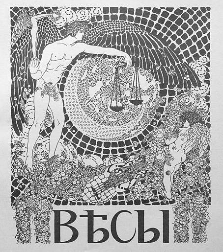
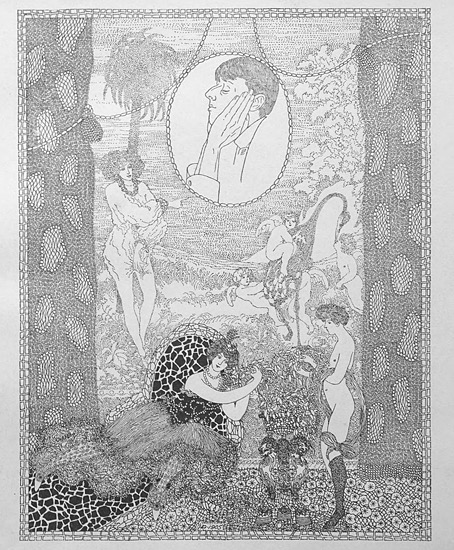
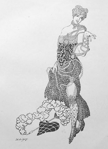
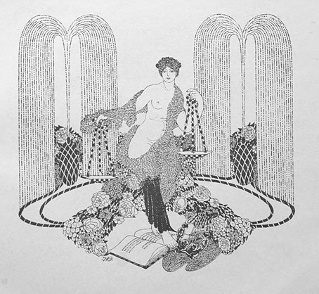
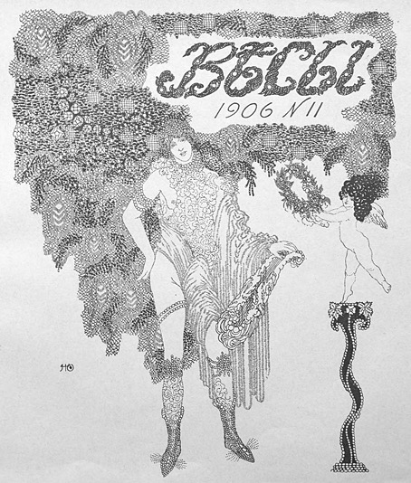
I’m taking the biographical details about this Russian artist from a Christie’s listing, accuracy being of particular importance to auction houses. The trouble with searching for information about Nikolai Theophilaktoff is that he’s one of those Russians whose name isn’t common enough to exist in a settled non-Russian form, so you may find his drawings credited to “Nikolai Feofilaktov” or even “Nikolai Theophylactus”. Whatever the spelling of his surname, Theophilaktoff is remembered today for illustrations with a distinct Beardsley influence, which is how he came to my attention. Aubrey Beardsley only had a few years for his art to impress itself on the world but he was known in Russia during his lifetime; Sergei Diaghilev was especially enthusiastic, using his position as editor of arts journal Mir Iskusstva (World of Art) to promote Beardsley’s work after the artist’s death. A later Russian arts journal, Libra, maintained the enthusiasm, devoting an entire issue to Beardsley in 1905. It was reading about Libra that led me to Nikolai Theophilaktoff, an artist who was sufficiently beguiled by Beardsley’s drawings to embark on his own variations on the Beardsley style.

theophilaktoff06.jpg

Theophilaktoff’s cover art for the Beardsley issue of Libra, November, 1905.

You can usually divide Beardsley’s followers into two groups: those who pick up on the striking contrasts that Beardsley created using areas of solid black against the white of the paper—Harry Clarke, Will Bradley and John Austen are good examples of this type. A second class would be those who favour the delicate, filigree style of Beardsley’s illustrations for The Rape of the Lock—Alastair (Hans Henning Voigt) and Nikolai Theophilaktoff are in this category. (Harry Clarke was also an expert filigree-ist but Clarke is really in a class of his own.) If you accept this artistic division it’s notable that the weaker artists are in the latter class. It’s easier to disguise deficiencies of figure drawing, say, with abundant stippling and decoration than it is when using nothing more than fine lines and masses of black ink. Theophilaktoff’s accomplishments are very uneven but they’re also rare examples of Beardsley’s style of Decadent art in a country that would soon have no time for such a thing at all.

theophilaktoff05.jpg

Most of the pictures here are from a book, 66 Dessins (1909), which collected many of the Theophilaktoff drawings published in Libra. The pornographic drawing at the very end is a swipe from an auction listing. Also near the end are drawings for Wings (1906), a novel by Mikhail Kuzmin which is one of the first literary works to openly deal with same-sex relationships. As for Libra, I thought copies of the magazine might be impossible to find but the trusty Internet Archive has what seems to be a complete run here. Mir Iskusstva, which seems rather staid by comparison, may also be found at the Internet Archive in a series of bound volumes.

theophilaktoff04.jpg

theophilaktoff08.jpg

Continue reading “The art of Nikolai Petrovich Theophilaktoff, 1878–1941”