Well, here we are at last… After years of waiting for scanned copies of The Golden Hind to turn up, now that they have done I’m still frustrated. The magazine was one of the many small arts periodicals being published in Britain during the 1920s. It had an erratic, eight-issue run from 1922 to 1924, and remains notable for being the second (and last) magazine to be co-edited by Austin Osman Spare. The artist’s first magazine venture, Form, had been edited by Spare and “Francis Marsden” (Frederick Carter), with the pair publishing two issues before the outbreak of the First World War, followed by a final issue in 1921. Spare co-edited The Golden Hind with writer Clifford Bax, creating a publication whose contents were less mystical than Form had been, while also providing more of a showcase for artists other than Spare himself.

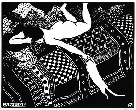
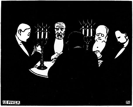
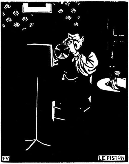
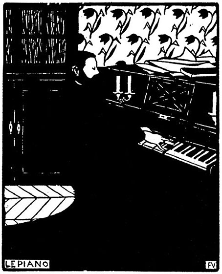
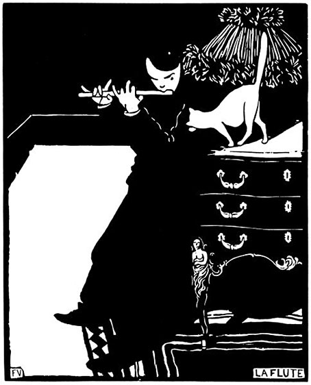
Inevitably, it’s the artists that interest me the most in The Golden Hind, even though the magazine was running pieces by writers like Aldous Huxley and Edith Sitwell. Many of the artists have been featured here before, some of them on many occasions: Alastair (Hans Henning Voigt), John Austen, Harry Clarke, Garth Jones, Henry Keen, and Allan Odle. Spare’s own drawings have since been recycled in various books but most of the other drawings, woodcuts, linocuts and prints remain exclusive to the magazine. The John Austen contributions are especially fine, further examples of his decorated style which borrows heavily from Aubrey Beardsley and Harry Clarke, and which he used so well in his illustrated Hamlet. The spirit of Beardsley’s 1890s is very much in evidence in The Golden Hind, a demonstration, perhaps, that Spare was once again looking back to The Savoy magazine as an example to be followed; one of the essays concerns the poety of The Savoy‘s literary editor, Arthur Symons.

In addition to artists whose popular works are still reprinted today there are less well-known figures like Sidney Hunt whose drawings owed more to contemporary trends than many of the other contributors. Hunt later edited an avant-garde magazine of his own, Ray, while producing his own brand of homoerotic prints like the Ganymede with Zeus which may be seen in The Golden Hind’s final issue.

The frustration I referred to above is my usual complaint about image quality. All the copies of the magazine have been taken from microfilm archives which means the pages aren’t grey enough to be illegible but their general murkiness is enough to destroy a lot of the artwork, especially the lithographs and other prints. The samples you see here have been brightened a little which does improve some of the line art but can do nothing for the rest. But I’m not going to complain too much. It’s taken a long time to be able to browse a complete run of this magazine, and I feel fortunate to do so even in this compromised manner. Better copies may still surface eventually. Fingers crossed.

Continue reading “The Golden Hind: A Quarterly Magazine of Art and Literature”