
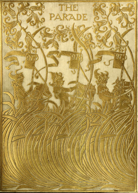
Design by Paul Woodroffe.
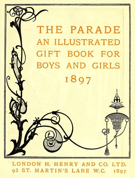
The Parade, subtitled An Illustrated Gift Book for Boys and Girls, is something that children with wealthy parents or relatives might have received as a Christmas present in December 1897. The contents are an unusual mix of fairy tales, frivolous seasonal fare—A Christmas Mummery, complete with songs and music—and adventure stories set in other parts of the world. The collection was edited by Gleeson White, an art critic whose former position as editor of The Studio magazine explains the very Studio-friendly choice of illustrators.
The design on the title page is a curious piece by Aubrey Beardsley, one with less authority than the most of the other drawings he was producing in his penultimate year. Those dots filling out the arabesque plant forms are the kinds of things that amateurs do when they’re uncertain about whether or not to decorate a design. The tendril which terminates in a tasselled confection is, however, a typical example of the artist’s bizarre invention, the kind of caprice that used to infuriate the critics who disliked his work. Beardsley’s career had been launched four years earlier with a profile in The Studio, but by 1897 he was often struggling for money after being fired from The Yellow Book in the wake of the Oscar Wilde scandal. Gleeson White is to be commended for supporting him at a time when many others refused to do so.
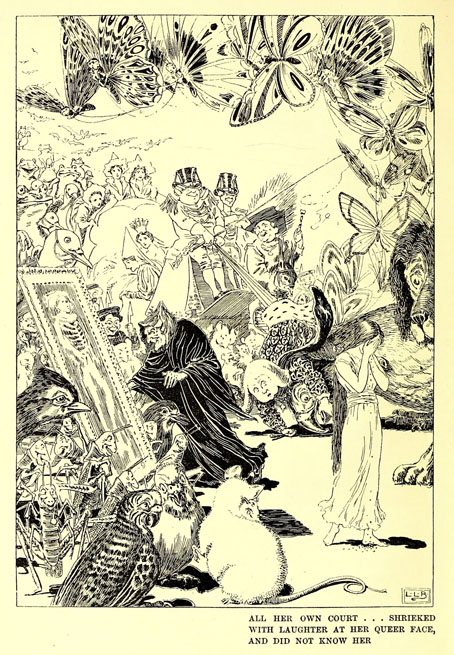
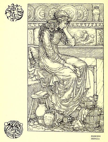
L. Leslie Brooke.
Elsewhere in The Parade there are contributions both written and pictorial from Beardsley’s friend, Max Beerbohm; also a story by Richard Burton, a writer you wouldn’t usually expect to find in a book aimed at children. The list of illustrators includes Charles Robinson, Laurence Housman and Manchester’s own Alfred Garth Jones. Beardsley didn’t draw anything else for The Parade but he’s mentioned again in a list of titles advertised in the book’s final pages as having provided a frontispiece for Baron Verdigris, “A Romance of the Reversed Direction” by one Jocelyn Quilp. The title was unfamiliar, and I wasn’t sure at first whether I’d seen the illustration, but the drawing shown below appears in two of my Beardsley books—albeit at small sizes—including the copious Brian Reade collection from 1967.
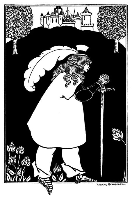
“Baron Verdigris” sounds like a minor character from Michael Moorcock’s Dancers at the End of Time trilogy, while the improbable “Jocelyn Quilp” turns out to be a nom de plume of Halliwell Sutcliffe whose book is described as a “singular novella, a curious amalgam of parodies based on a time-travelling theme“; shades of the Dancers again. It’s tempting to think that this may be the sole example of Aubrey Beardsley illustrating science fiction (or something like it)—the book is generic enough to be listed at ISFDB—but Brian Reade describes the story as “pseudo-mediaeval and facetious”, “dedicated to ‘Fin-de-Siécle-ism, the Sensational Novel, and the Conventional Drawing-Room Ballad'”. That does at least explain the peculiarities of the drawing. Maybe the Moorcock comparison is an apt one after all.
More illustrations from The Parade:
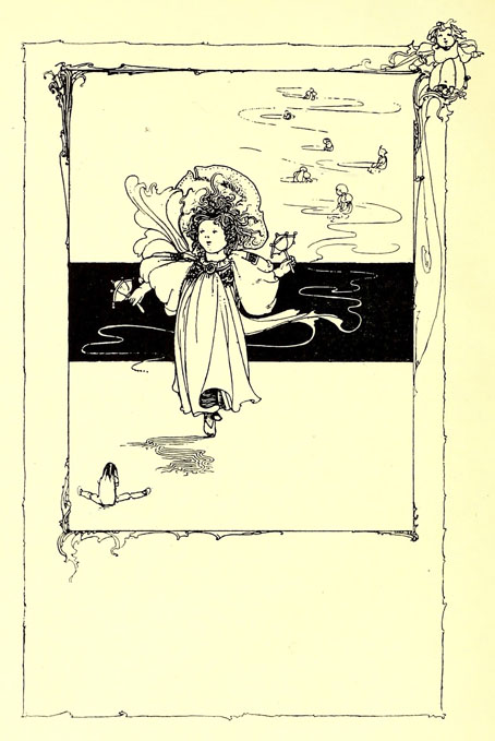
Charles Robinson.
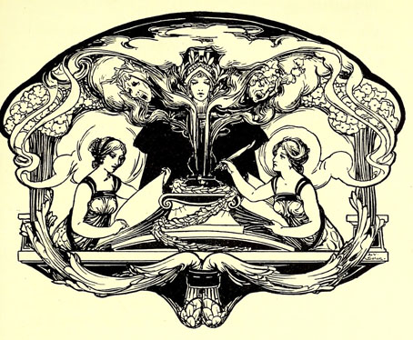
Léon V. Solon.
Léon V. Solon.
Laurence Housman.
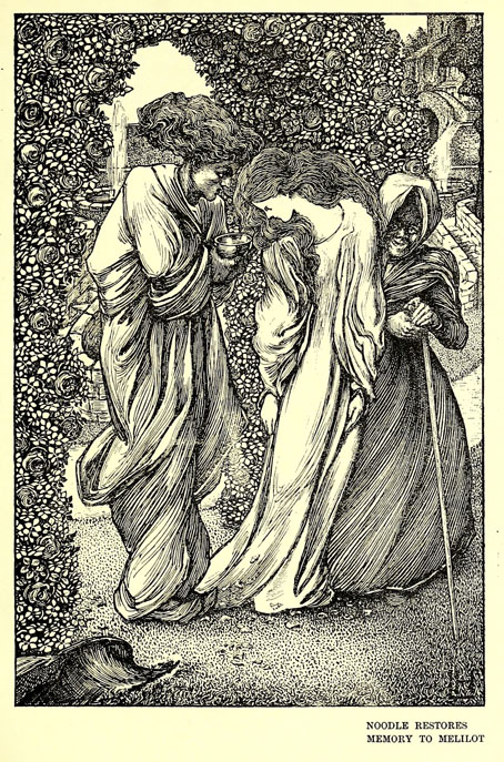
L. de Montmorency.
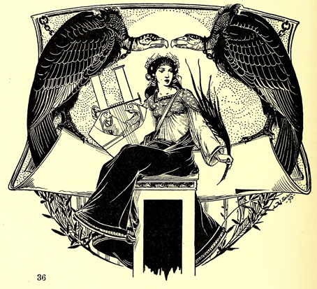
Alfred Garth Jones.
Elsewhere on { feuilleton }
• The Aubrey Beardsley archive
• The illustrators archive
Interesting analysis of the Beardsley work. Perhaps he felt the design needed some additional “weight” on the left side. There is no logic to the dotted infill; other closed loops in the tendril are empty. The tendril itself is peak Art Nouveau. This work reminds me of those fake Beardsley drawings you discussed recently.
I can’t find much written about the title page but it’s possible it may have been a doodle or one-off piece he had lying around. Everything else he was doing at this time is very different and a lot more confident: the cover design for Volpone, for example, which might be by a different artist altogether. The design is definitely plugged into the Art Nouveau trend, however, even though his drawings were increasingly Neo-Classical by this point.
Ah! Thanks for leaving the best piece (imo) to be discover’d by those that followed your link:
Charles Robinson’s full page 220 for “Dear Little Bird”–
which looks akin to SIME doing a sketch on a Clark Ashton Smith interplanetary nature walk…
“From below the crown issued a long, sinuous arm, scaled like the main stem, and serpentining downward and outward to terminate in the huge upright bowl of a bizarre blossom — as if the arm, in sardonic fashion, should hold out a hellish beggar’s cup.”—The Demon of The Flower, CAS
Yes, that’s a good one. There’s a similar bird in the uniquely strange King Longbeard: https://www.johncoulthart.com/feuilleton/2010/10/14/charles-robinsons-king-longbeard/
years ago i tracked down “baron verdigris” in a college library (this was before the internet made everything easy). i don’t remember it now except for concluding that the name (& the author’s name) was the best thing about it…
https://digitalarchiveontario.ca/objects/376144/baron-verdigris-a-romance-of-the-reversed-direction#