
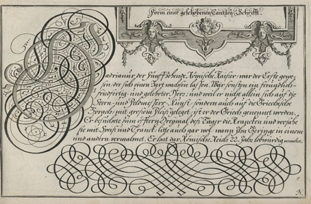
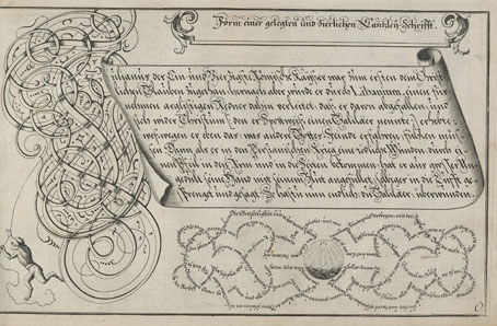
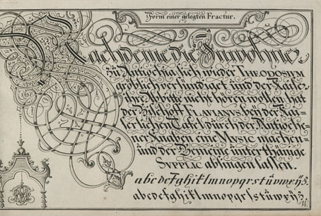
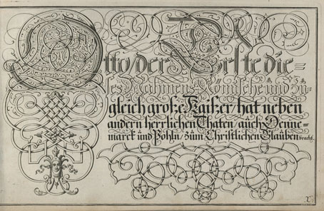
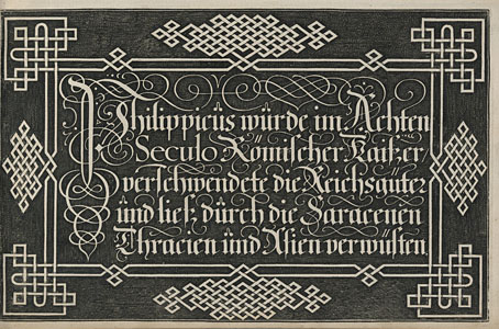
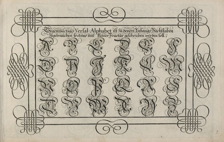
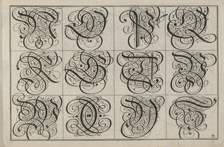
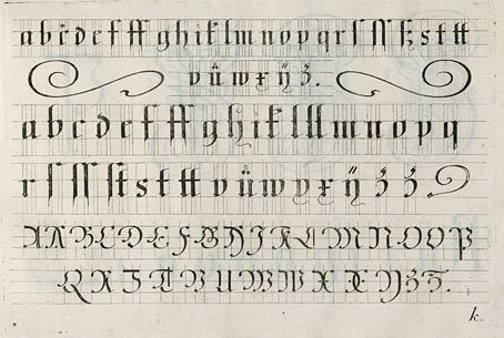
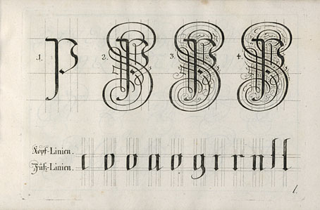
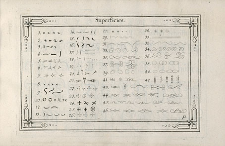
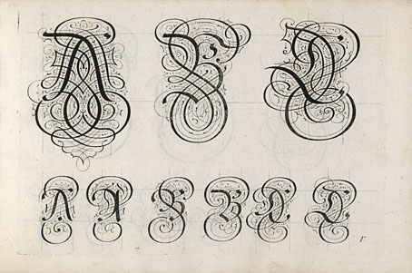
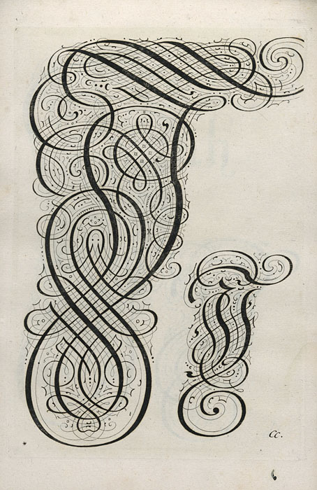
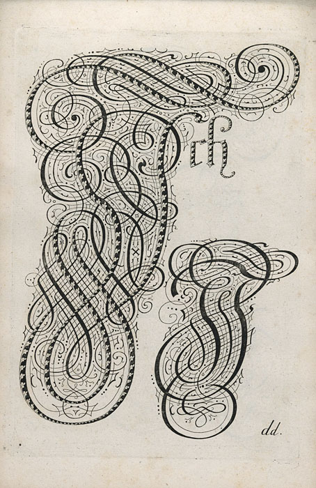
I like extravagant calligraphy, the more extravagant the better, as with these examples from Schreib-Kunst (1716) by Michael Baurenfeind (1680–1753). The book is a recent scan by the Getty Research Institute whose art and design collection includes many similar volumes, although finding the good ones usually means clicking hopefully on blank covers with promising titles. Baurenfeind’s book was published in the middle of the period that extends from the mid-1600s to the mid-1700s when this kind of maximal elaboration of lettering was at its height. Books published later in the 18th century are more devoted to the mastery of careful penmanship, although you still find depictions of calligraphic excess mixed with baroque decoration. These later studies can be very impressive but I prefer the books like Baurenfeind’s which is a demonstration of the calligraphic art pushed to extremes of elaboration and ornamentation. Some of the capitals in this volume are the most excessive examples I’ve seen outside Paul Franck’s Kunstrichtige Schreibart (1655), a book filled with elaborate letterforms which yet seems crude in comparison to many of Baurenfeind’s pages. Baurenfeind goes beyond Franck’s solid black curves to create shaded interlacings that are less examples of calligraphic formation than intricate knotworks that just happen to resemble capital letters.
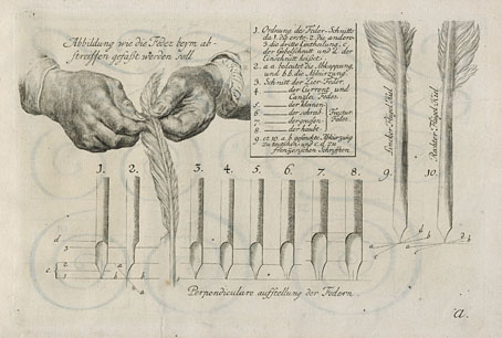
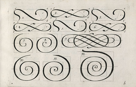
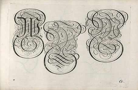
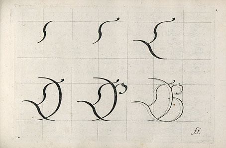
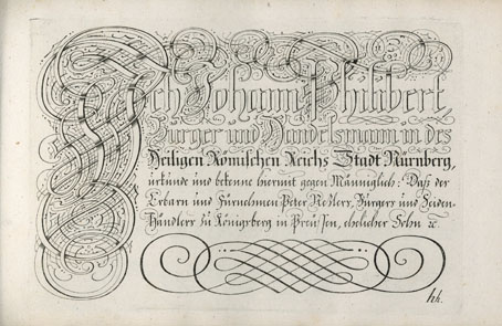
There’s more of the same in a Baurenfeind book from 1736, also called Schreib-Kunst, which includes several plates that show the construction of the letterforms. Volumes like these are usually showcases rather than instruction guides so this is unusual; Baurenfeind even has a guide to cutting your goose quill before you begin. Having tried writing with a bird’s feather once or twice I wouldn’t recommend it unless you have no other choice. Metal nibs are always better.
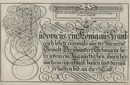
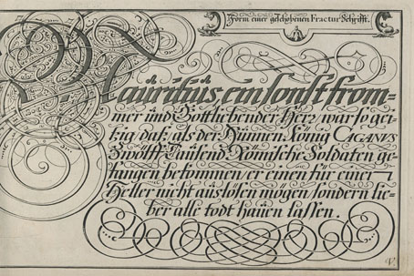
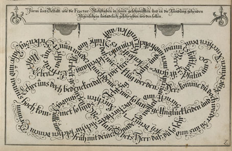
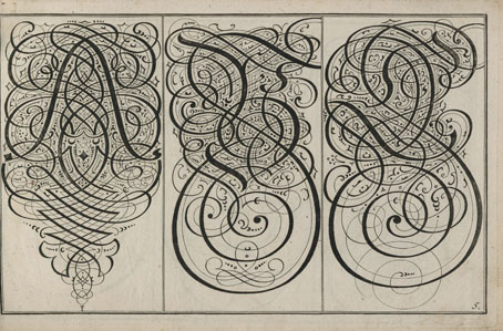
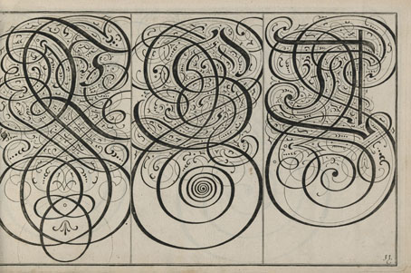
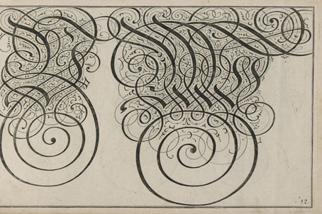
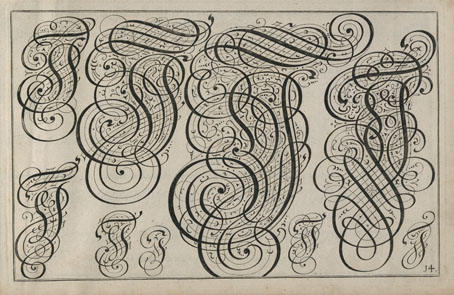
Schreib-Kunst (1736)
Previously on { feuilleton }
• Bergling’s Art Alphabets
• Grand capitals
• Costume capitals
• Paulini’s mythological alphabet
• Joseph Balthazar Silvestre’s Alphabet-album
• Johann Theodor de Bry’s Neiw Kunstliches Alphabet
• The Book of Ornamental Alphabets
• Paul Franck’s calligraphy
• Gramato-graphices
• John Bickham’s Fables and other short poems
• Letters and Lettering
• Studies in Pen Art
• Flourishes
Impressive decorative lettering. Some of those examples approach an Islamic/Arabic calligraphic quality.
I actually used to do calligraphy in a corporate setting. This was long ago. The old commercial artist/calligrapher who taught me the art used to criticize me if I fell into a florid style. He’d say “keep the letters straight and masculine. Too much curve is feminine”. Still, he was a very good teacher.
Arabic calligraphy always comes to mind for me as well with these designs. I wonder which came first? I’d guess the elaborations evolved side-by-side, since there’s so much cross-pollination in these areas.
I’ve done a lot of hand-drawn lettering but never any proper calligraphy although I still have a few pens that could be used for it. If I’m doing things like this today I always use Adobe Illustrator. Some of the flourishes in these books may be useful in future if I convert them to vector shapes.