
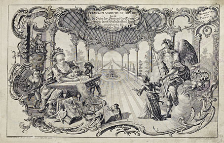
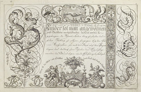
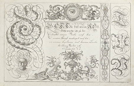
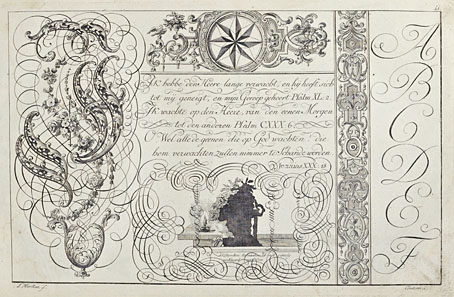
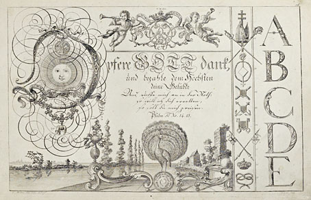
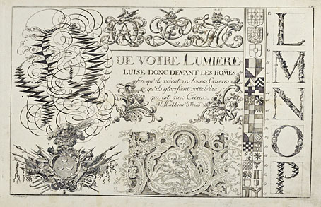
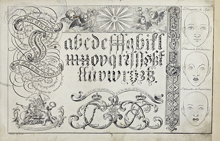
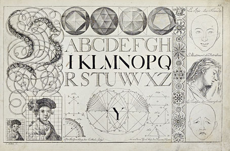
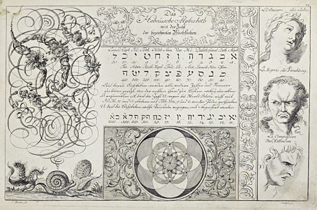
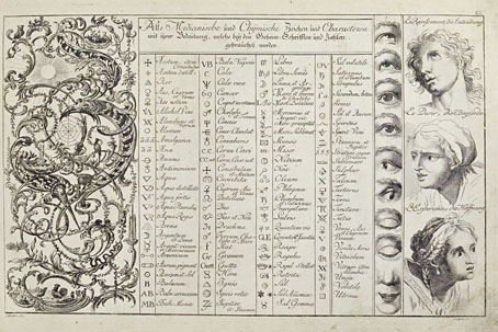
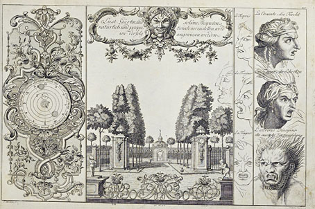
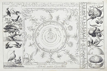
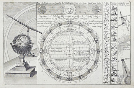
The previous post reminded me of this, one of my favourite examples of ornamented alphabets from the 18th century. Liber Artificiosus Alphabeti Maioris (“Artistic Book of the Major Alphabet”, 1782) was written and designed by Johann Merken, with the book’s 56 plates being engraved on copper by Heinrich H. Coentgen. I first saw these in a post at the now-defunct (and much missed) BibliOdyssey where Mr Peacay had found copies of the alphabet plates at some library archive or other. Happily, the Getty Research Institute made a scan of their own copy of the book a few years ago which includes all of the plates plus the accompanying German text.
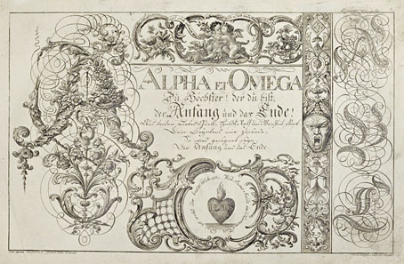
The first part of Merken’s volume is unique in its combination of abecedarium with a variety of objects, emblems, symbols and other designs: silhouette figures, plants and flowers, ornamental gardens, coats of arms, calligraphic doodles, trophies (those accumulations of military paraphernalia), birds and animals (eg: a pair of monkeys playing the drums), monograms, mathematical figures, etc, etc, all festooned with the familiar swags and foliage of baroque decoration. In the second part of the book there’s more emphasis on science and technology, with plates devoted to astronomy, alchemy/chemistry, the orders of Classical architecture, and so on. The later pages are interesting but it’s those in the first section that really stand out. Many of the alphabet designs push their elaboration and embellishments to such a degree that the letters appear to be mutating to resemble their own decorations. The book as a whole is a curious blend of the 18th-century enthusiasm for taxonomy and categorisation combined with the baroque love of the grotesque and the arabesque. I wish there was more like it.
Elsewhere on { feuilleton }
• The etching and engraving archive
Previously on { feuilleton }
• Wendel Dietterlin’s Architectura
• Abeceda
• Liénard’s grotesques
• Le style Louis XV
loving these! sort-of makes me wish i’d stuck with my mother’s attempts to train me at calligraphy… but then i remember the nightmares that came with pen maintenance. (the only thing worse than a scabby calligraphy pen is a pumice-encrusted rapidograph)
very off-topic:
yesterday made a long, flailing attempt to find out who designed the trade dress for those delightful ‘Pantheon Modern Writers’ books in the 80s. no dice. would you have any insight?
I did okay with Rotring pens, I used to clean mine regularly.
I’ve only got one Pantheon edition in the series with the cream covers (a Julio Cortázar collection) but the design is credited to Louise Fili so I’d guess she did the whole line. Her own books look very interesting, in fact I have one of those as well, the Euro Deco one: https://www.louisefili.com/publications