The World’s Greatest Detective

sh1.jpg

Coralie at Penguin Books sent through these cover designs today, a splendid “collect the set” republication of the Sherlock Holmes stories which should be on the shelves early next month. This follows last year’s collection of similarly repackaged Edwardian thrillers which included Conan Doyle’s dinosaur tale, The Lost World. Having recently watched the Granada TV adaptations of the Holmes stories now would be a good time to go back to the books, especially since I only recall ever having read The Sign of Four and a couple of the stories.

sh2.jpg

And on the technical side, I’ll note that my typeface mania identifies the font used for the titles of these books as Gable Antique Condensed, a contemporary design by Jim Spiece based on a Bauer typeface from around 1900. Unless it’s one of the variants mentioned by Identifont….

Elsewhere on { feuilleton }
The book covers archive

Previously on { feuilleton }
“The game is afoot!”
Boys Own Books

Street Sounds Electro

electro.jpg

I spent much of the summer of 1983 playing games on a very primitive ZX Spectrum computer while listening to the first couple of Street Sounds Electro compilations. Those mix albums were among the best releases that year and remain highly sought after, seeing as they’ve never been reissued on CD.

face.jpg

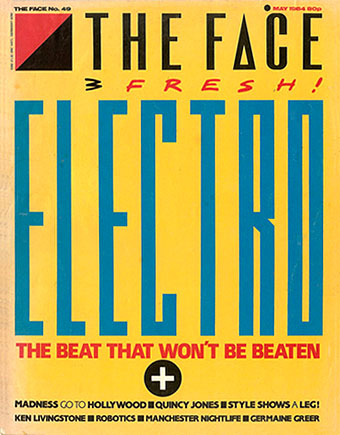
The musical reputation of the compilations has overshadowed the sleeve design which was very distinctive for the time and undoubtedly a factor in their success. The vertical ELECTRO type was inspired by Neville Brody’s design for The Face which had turned the magazine’s title through ninety degrees the year before. Also very Brodyish was the use of photocopier-processed graphics and narrow typography although it should be pointed out that Brody hand-drew nearly all his headlines which left his imitators searching through type catalogues for approximations. The sleeve designs are credited to “Red Ranch for Carver’s” about whom I can find no information whatever. Things came full-circle when The Face ran a feature on the electro scene in 1984 giving Brody the opportunity to do a cover with his own variant on the sleeve layouts.

essential.jpg

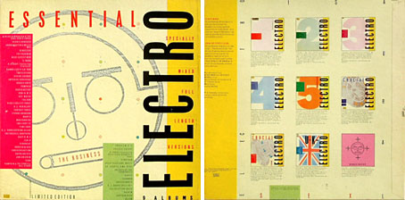
Essential Electro 9-album box, HBOX 1 (1984).

One of the big attractions of these albums for me was the new directions they were opening up for electronic music. Outside the mainstream pop world electronica in the early Eighties meant either the polite fare of Tangerine Dream or the dreary sludge of minor industrial acts such as Portion Control. Cabaret Voltaire were still vital in the early 1980s: their thundering Crackdown single (with sleeve design by Neville Brody) was remixed for its 12-inch incarnation by dance producer John Luongo while electro producer John Robie (whose production is featured on Electro 1) remixed their Yashar single for Factory Records. But nothing matched the excitement of a bunch of NYC kids lifting Kraftwerk riffs and playing in a very unselfconscious manner with new and relatively cheap equipment, especially the Roland TR-808 drum machine which provides the backbone for many of these recordings.

Continue reading “Street Sounds Electro”

Ghubar

ghubar.jpg

Ghubar calligraphy by Hassan Massoudy.

Ghubar (or “dust” in Arabic) is the name of a special kind of calligraphic script. As its name implies, ghubar can be as delicate as particles of dust on a piece of paper. Words written in this script can be as fine as a single hair.

Originally designed for messages being sent by carrier pigeon, ghubar script compresses information into the smallest possible space. The technique involves writing minuscule inscriptions that usually measure about 1.3 millimeters in height, and rarely exceed 3 millimeters. Apart from its postal function, ghubar was used by calligraphers in three ways: for the production of scrolls; for esoteric, talismanic and magical writings; and for copies of the Qur’an.

More here.

Previously on { feuilleton }
Calligraphy by Mouneer Al-Shaárani
The Journal of Ottoman Calligraphy
Word into Art: Artists of the Modern Middle East

The Darjeeling Limited

darjeeling.jpg

There aren’t many directors whose next films I await with impatience but Wes Anderson is one of them. I still haven’t seen his debut, Bottle Rocket (1996), but Rushmore (1998) was good, The Royal Tenenbaums (2001) was great and The Life Aquatic with Steve Zissou (2004) was a masterpiece. The Darjeeling Limited will be out later this year and stars Owen Wilson (who’s been in all of Anderson’s films apart from Rushmore but he did co-write that one) Adrien Brody, and Jason Schwartzman who made his debut in Rushmore and can be seen in another odd and inventive comedy, I Heart Huckabees. Schwartzman also co-writes this new opus. I have an unproven theory that Anderson is responsible for an annoying trend in recent American independent cinema—the “quirky comedy” which features multiple shots of charmingly flawed characters standing motionless centre-screen while staring at the camera. With groovy music playing on the soundtrack. Anderson does (or did) enough of this but he does a lot more besides. His films are better written and a lot more inventive than those of his imitators.

The most striking thing about the Darjeeling Limited trailers and poster (although it’s not something most people would notice) is the complete absence of Futura. Anderson is possibly unique among filmmakers in having what amounts to an obsession with a single typeface; Futura appears in different weights and styles throughout Rushmore, The Royal Tenenbaums and The Life Aquatic. I’m not quite sure which typeface is used on the poster (and neither are the people at Typophile); Proxima Sans is the closest match I can find but it may be a grotesk variant created specially for the film. I ask you: how many filmmakers are there that can get people talking about their work simply by changing a font?

Previously on { feuilleton }
Masonic fonts and the designer’s dark materials
Helvetica: the film