The Crackdown by Cabaret Voltaire

crackdown1.jpg

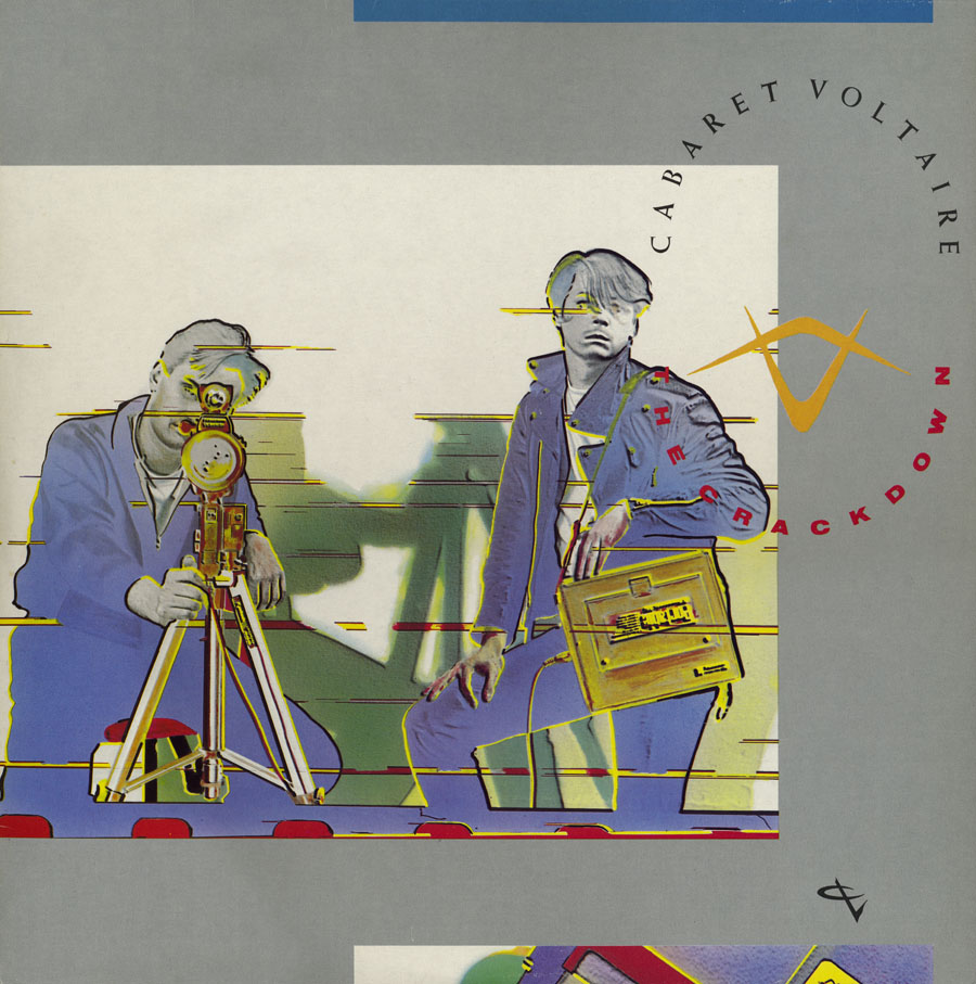
I mentioned yesterday Richard H. Kirk’s announcement that Cabaret Voltaire’s albums on the Virgin label are to be reissued next year by Mute Records. The news gives me a topical excuse to write something about the first album in that series, The Crackdown, which happens to be my favourite of all their releases. Cabaret Voltaire, like 23 Skidoo, benefited a great deal from their association with designer Neville Brody in the early 1980s, and this post mostly concerns Brody’s design for The Crackdown and its accompanying singles. The Crackdown was released in 1983 with the advance from Virgin having allowed them to buy new equipment and add a degree of polish to their recordings which earlier albums had lacked. Brody had been designing their covers for the past two years, and continued to do so for the next few releases before leaving the music business to concentrate on magazine and other design work.

crackdown2.jpg

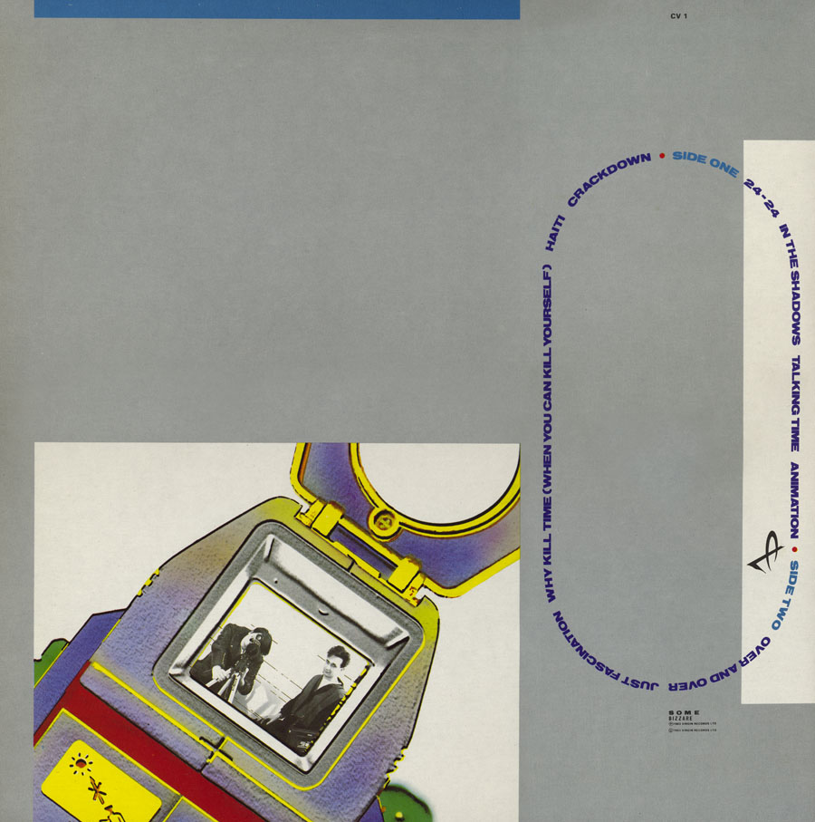
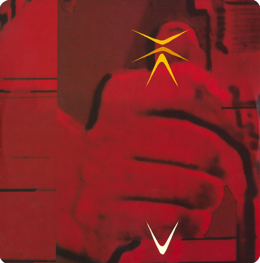
What I liked about this sleeve was the way it gets the most out of the careful arrangement of a few simple elements. The front photo showing Stephen Mallinder and Richard Kirk posing with video equipment (monitoring the viewer) is enlarged and cropped to provide backgrounds elsewhere. The sleeve photos wrap around front and back while the shape made by the titles determines the layout of track titles and credits. (The various CV graphics are credited to Phil Barnes.) The type wasn’t set digitally but was applied by hand using Letraset rub-down lettering which makes me wonder how much planning was required to get the track titles to perfectly fit their intended shape.

crackdown3.jpg

Continue reading “The Crackdown by Cabaret Voltaire”

Street Sounds Electro

electro.jpg

I spent much of the summer of 1983 playing games on a very primitive ZX Spectrum computer while listening to the first couple of Street Sounds Electro compilations. Those mix albums were among the best releases that year and remain highly sought after, seeing as they’ve never been reissued on CD.

face.jpg

The musical reputation of the compilations has overshadowed the sleeve design which was very distinctive for the time and undoubtedly a factor in their success. The vertical ELECTRO type was inspired by Neville Brody’s design for The Face which had turned the magazine’s title through ninety degrees the year before. Also very Brodyish was the use of photocopier-processed graphics and narrow typography although it should be pointed out that Brody hand-drew nearly all his headlines which left his imitators searching through type catalogues for approximations. The sleeve designs are credited to “Red Ranch for Carver’s” about whom I can find no information whatever. Things came full-circle when The Face ran a feature on the electro scene in 1984 giving Brody the opportunity to do a cover with his own variant on the sleeve layouts.

essential.jpg

Essential Electro 9-album box, HBOX 1 (1984).

One of the big attractions of these albums for me was the new directions they were opening up for electronic music. Outside the mainstream pop world electronica in the early Eighties meant either the polite fare of Tangerine Dream or the dreary sludge of minor industrial acts such as Portion Control. Cabaret Voltaire were still vital in the early 1980s: their thundering Crackdown single (with sleeve design by Neville Brody) was remixed for its 12-inch incarnation by dance producer John Luongo while electro producer John Robie (whose production is featured on Electro 1) remixed their Yashar single for Factory Records. But nothing matched the excitement of a bunch of NYC kids lifting Kraftwerk riffs and playing in a very unselfconscious manner with new and relatively cheap equipment, especially the Roland TR-808 drum machine which provides the backbone for many of these recordings.

Continue reading “Street Sounds Electro”