Weekend links 846

borges.jpg

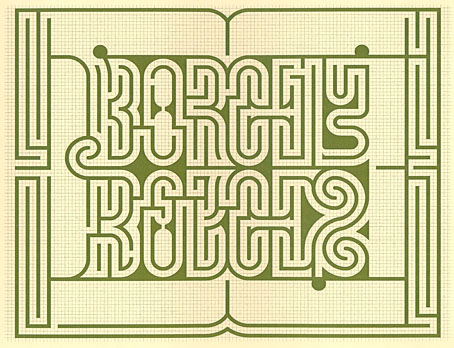
Design by Randoll Coate for the Labirinto Borges, a hedge maze at the Giorgio Cini Foundation, Venice, which was renovated earlier this year.

• “Code was probably our most overtly political record, which is interesting, touring and playing it in these very different but scary political times.”​ Stephen Mallinder of Cabaret Voltaire talking about the experience of touring America again.

• At The Daily Heller: A look at the work of designer/illustrator George Hardie whose five-decade career is to be celebrated in a retrospective exhibition in London. There’s more George Hardie here.

• “Almost as soon as weird began circulating outside of Macbeth, its meaning broadened too, from ‘eerie’ and ‘uncanny’ to ‘odd’ or ‘unusual’.” Colin Gorrie on the weird history of the word “weird”.

• At The Quietus: Toby Manning on 40 years of Gone To Earth by David Sylvian. A minor nitpick: the album’s art and design was by Russell Mills, not Vaughan Oliver.

• New music: Burning Song by Kali Malone; Obsessive Surrealism by Parallel Worlds.

• At Door Of Perception: The radical architectural designs of Eugene Tssui.

• DJ Food’s latest accumulation of psychedelic graphics from the desktop.

• Old music: When The Music’s Over (Live, 1970) by The Doors.

Arthur Brown‘s favourite songs.

Weird Dream (1976) by Harmonia | It’s So Weird (1983) by Bush Tetras | Ballad Of The Weird Sisters (2013) by Blood Ceremony

New Worlds 224

NW-224-1.jpg
Illustration by Mark Reeve.

New issues of New Worlds magazine have been rare things in recent years so the announcement last week of issue number 224 was a special moment:

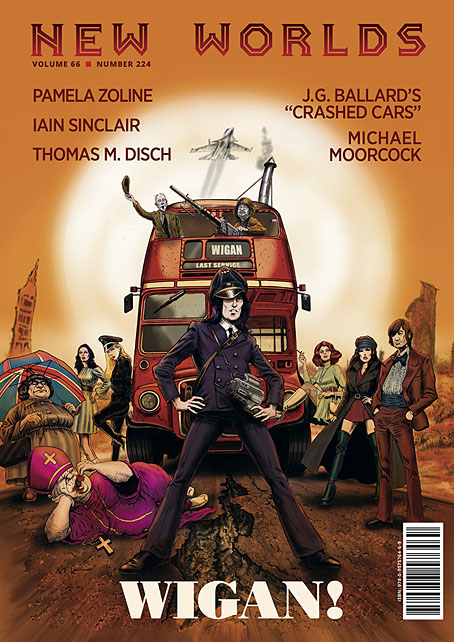
New Worlds Vol. 66 No. 224, ed. Michael Moorcock (to commemorate the sixtieth anniversary of his taking over editorship of the title), 09/’24, 978-0-9575764-6-9, a new full-colour A4 stapled outsized paperback/magazine, 72pp., illustrated by John Coulthart, Mal Dean, Herbert Sydney Foxwell, Allan Kausch, Mark Reeve, Julius Stafford-Baker; fiction/non-fiction anthology, contributors: John Clute, Coulthart, John Davey, Thomas M. Disch, Kausch, Roz Kaveney, Moorcock (a brand-new Cornelius story), Iain Sinclair, John Sladek, Pamela Zoline; first edition: £20.00 (for pre-ordered signed copies [while stocks last]).

N.B. This title is published on 30th September, 2024. Pre-ordered copies will be signed by Michael Moorcock and the magazine’s publisher.

See: https://jaydedesign.com/products_new.php

Copies in the U.S.A. will soon be available via www.ziesings.com @ $25 (for pre-ordered signed copies [while stocks last]).

If you’re in the mood for a spoilerish review you can see the entire issue leafed through and described here. In addition there’s also the New Worlds Annex which I’m hosting on these pages, a small repository of supplementary material.

There’s no need for me to recount the history of New Worlds, you can read about it in detail here. If you do know the history then you’ll know that the magazine under Michael Moorcock’s editorship acquired a considerable reputation in the late 1960s, upsetting politicians, the proprietors of WH Smiths, and the more conservative readers and writers of science fiction while publishing many important stories. In the 1970s New Worlds became a paperback series for a few years, managing ten numbers before resuming magazine format and increasingly sporadic publication.
NW-224-3.jpg

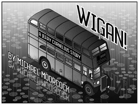
Mike Moorcock’s Jerry Cornelius story is a Holiday on the Buses scenario set in the usual Cornelius landscape of geo-political chaos. Mark Reeve and Allan Kausch also illustrated this one. I think my piece may be the first time I’ve ever had reason to draw a bus despite being a regular user of public transport. In order to create a contrast with the other illustrations I opted for something in the isometric manner of George Hardie. Not as severely styled as Hardie’s drawings often are but it’s heading in that direction.

The last Moorcock-edited number prior to the present one was in 1996, an issue which included a drawing of mine from the Reverbstorm comic series. The new issue sees Moorcock returning to the editor’s chair for what he insists will be the final time so I feel fortunate to be able to contribute more substantially to this issue than I did in 1996. As well as designing the magazine I’ve illustrated four of the stories, and also wrote a page about the hundredth anniversary of Surrealism which provides a loose theme for the issue as a whole. In a reversal of the usual state of affairs the writing was commissioned first, the design having been offered to other parties earlier this year. This didn’t work out, however, so Mike asked if I could take over, something I was more than happy to do. Rather than follow any pre-existing layouts I started with a blank slate, something I prefer in these situations. The erratic nature of the magazine schedule has meant that many of the recent issues have been standalone items even though each one bears an issue and volume number. The issues that followed the paperback series in the 1970s differed widely from one another, a trend that continued up to 1996; consequently I didn’t have to worry about retaining any attributes of the previous issues.

Continue reading “New Worlds 224”

Covering Ishiguro

ishiguro1.jpg

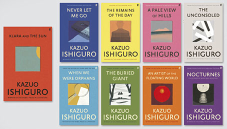
I like seeing an author’s works designed as a set, and so do the bigger publishers for whom redesigns are a useful way to freshen their back catalogue. This month the Faber edition of Klara and the Sun by Kazuo Ishiguro provides the template for a redesign of the author’s previous works, with new editions of the seven other novels plus a story collection, Nocturnes. I’ve not read any of these books so I’ll leave it to Ishiguro’s readers to gauge the suitability of the minimal illustrations, although the one for Nocturnes is the kind of visual pun that designers today often search for. The image is explained by the book’s subtitle, “Five Stories of Music and Nightfall”. I’d have been tempted to go the George Hardie route with the illustrations, flattening the colours, adding outlines, and placing that cassette and shadow at forty-five-degree angles. But Hardie’s bold isometrics might seem a little too cartoony for Ishiguro. Faber designer Pete Adlington recounts the thinking behind his covers here.

ishiguro2.jpg

ishiguro3.jpg

ishiguro4.jpg

ishiguro5.jpg

Continue reading “Covering Ishiguro”

Moorcock: Faith, Hope and Anxiety

moorcock.jpg

Photo of the author by Linda Moorcock.

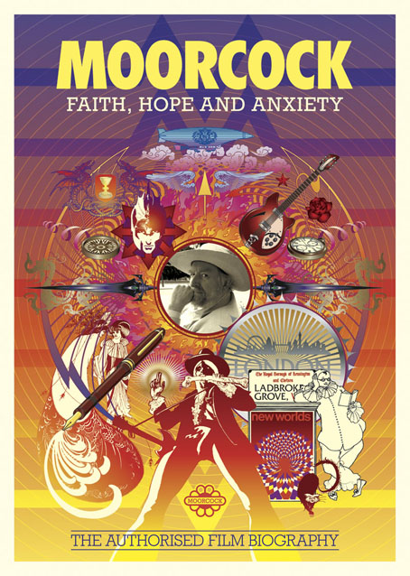
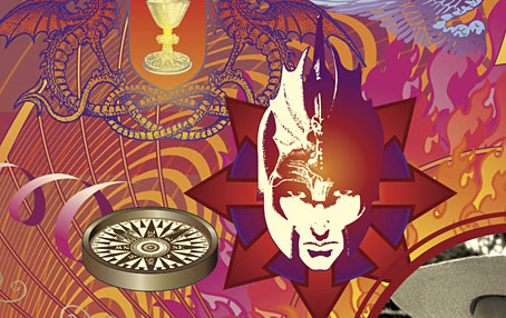
I mentioned a few days ago that I had another new piece of work to reveal, and this is it, a poster/promotional piece for Russell Wall’s forthcoming documentary about Michael Moorcock. The main challenge with one was to create something that would give a sense of Moorcock’s extensive career and the genre-spanning content of his many books.

mm1.jpg

I took the 1970s as the starting point, since this was the period when his reputation as a writer was established worldwide. The decade began with Britain’s bookshelves being colonised by Moorcock’s SF and fantasy novels published by Mayflower with vivid covers; it saw a cult feature film—The Final Programme—made from his first Jerry Cornelius novel, and it ended with the fourth Jerry Cornelius novel, The Condition of Muzak, winning a serious literary award, the Guardian Fiction Prize.

mm2.jpg

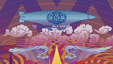
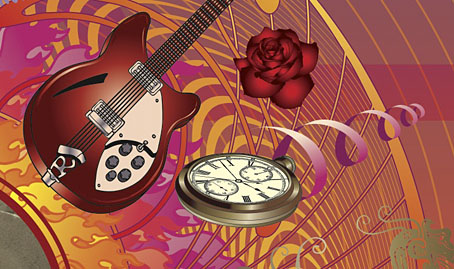
So the general appearance of the design, the headline typography, and the colour scheme are a nod to the Mayflower covers and especially to Bob Haberfield’s artwork which often used a similar style of Tibetan flames and clouds. The rest of the type is set in Rockwell, a preferred typeface of the Hipgnosis design team for much of the 1970s. Early on I had the idea of filling the design with stylised graphics like those used by some of the Hipgnosis illustrators, chiefly George Hardie, but that idea receded once the composition began to arrange itself. The fountain pen is the main hangover from this, a hard-edged graphic tilted at an angle like many of Hardie’s illustrations. The pen is a little inappropriate given that Moorcock is famous for knocking out novels at speed on a typewriter but it made a good visual rhyme with the guitar, a Rickenbacker like the one the author played in his Deep Fix band.

mm3.jpg

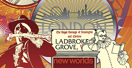
Elsewhere there are many specific references competing for attention: the Elric head is Jim Cawthorn’s illustration from the first edition of Stormbringer (1965); the Jerry Cornelius figure (straddling a repurposed Mayflower logo) is one of Mal Dean’s best, as seen on the cover of issue 191 of New Worlds magazine; the sorcerous blades are my own designs from 1985 as seen on the sleeve of Hawkwind’s Chronicle of the Black Sword album; the Beardsley figures from Salomé were a vague gesture to the 1890s but the Pierrot figure happens to be one Moorcock used for a while as a bookplate, something I didn’t know until I’d placed it in the design; the cat at Pierrot’s feet is another Beardsley from one of the Bon-Mots books; the London skyline is a contemporary one, London past and present having been a continual feature of Moorcock’s writing throughout his career. Lastly, all these details are contained by a graphic based on Abram Games’ BBC TV ident from the 1950s. When Russell and I began talking about this project the words “television biography” were being used so this would have connected to that idea, and to the decade when Moorcock’s career began.

mm4.jpg

I don’t know when the documentary will be released but any news will be posted here in due course. There’s also talk of making copies of the poster available for purchase but nothing concrete has been decided yet.

Previously on { feuilleton }
Eduardo Paolozzi at New Worlds
Elric 1: Le trône de rubis
Into the Media Web by Michael Moorcock
The Best of Michael Moorcock
Revenant volumes: Bob Haberfield, New Worlds and others

A tabled question

bps1.jpg

Work-related research this week had me wondering who it was that first thought of turning Battersea Power Station into a table. For the past few days I’ve been looking at a lot of the illustration work that George Hardie produced for the Hipgnosis album covers in the 70s and 80s; I’ll explain why in due course but the quest led me to seek out the songbook for Pink Floyd’s Animals album, two pages of which can be seen in the first Hipgnosis book.

Hipgnosis would often extend their album design into promotional areas, producing related posters, stickers, and so on. Pink Floyd’s popularity meant there was demand for songbooks, and the one for Animals is a treat for the use it makes of additional photos from the flying-pig sessions at Battersea Power Station. The idea of using the power station for the cover came from Roger Waters, incidentally; a shame he didn’t apply the same invention to his lyrics. But I digress…

bps2.jpg

From the Animals songbook (1977). By George Hardie?

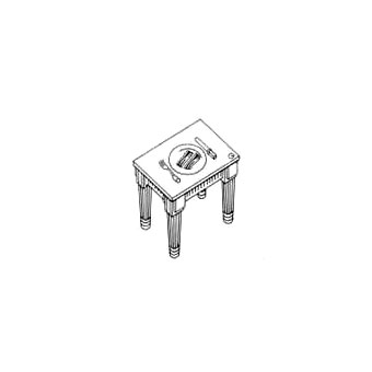
Between the photos (and, er, the songs) there are several pages of graphics by (I’m guessing) Bush Hollyhead and George Hardie; the former depicts a pig, dog and sheep in various stylised arrangements while Hardie provided a vignette of bacon rashers on a Battersea table. This was 1977 so I’m assuming it’s the earliest example of the power-station-as-table, unless, of course, somebody out there knows better.

bps5.jpg

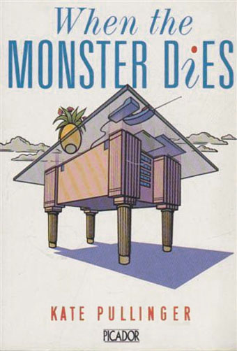
When the Monster Dies (1990) by Kate Pullinger. Illustration by Willie Ryan.

And sure enough… Thanks to herr doktor bimler for suggesting this one.

table.jpg

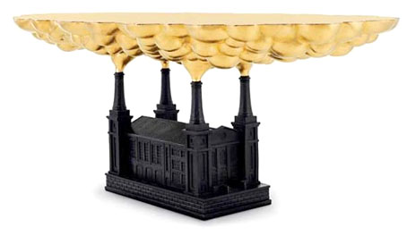
Robber Baron Table (2006) by Studio Job.

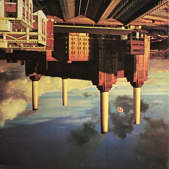
Artist David Mach took up the table idea in the 1990s to produce a series of collages showing an enormous chimney-legged chair sitting beside the power station. There’s no explanation as to why the table should be upside down but then artists often don’t think things through as well as designers. A better idea is the Battersea-like Robber Baron Table (2006) by Studio Job, part of a series of furniture concepts suitable for oligarchs and those who work in the City of London.

bps3.jpg

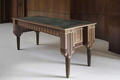
And so to the inevitable, one of a number of stylish tables currently being manufactured by the Battersea Table company.

bps4.jpg

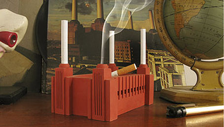
Not a table but another clever repurposing of Giles Gilbert Scott’s architecture. Atypyk makes concrete ashtrays for those who still smoke, with the chimneys formed from unsmoked cigarettes. Battersea Power Station when it was in use did much to contribute to London’s polluted air so this seems a fitting by-product. Are there any more examples out there?

Previously on { feuilleton }
Design as virus 16: Prisms
Labels
Storm Thorgerson, 1944–2013
Hipgnosis turkeys
Peter Christopherson, 1955–2010
Storm Thorgerson: Right But Wrong
Battersea Power Station