Weekend links 255

farneti.jpg

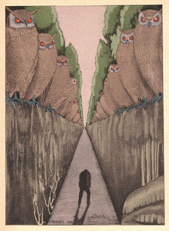
The Owls by Carlo Farneti for a 1935 edition of Les Fleurs du Mal. Via Beautiful Century although the scans probably came originally from 50 Watts.

• “…a project that seemed under a curse comprising greed, peculiar French copyright laws, jealousies and grudges, bad judgment, complicated ownership disagreements, a messy estate, and a list of individuals who believed they had some legal, financial, moral, or artistic right to the film itself.” Josh Karp on the tangled history of The Other Side of the Wind, always the most interesting of Orson Welles’ unfinished feature films.

• Producer Conny Plank is remembered for his work with a host of German artists but he also recorded a session with Duke Ellington and His Orchestra in 1970. Grönland Records is releasing the session in July, and they’ve posted Afrique (take 3 vocal) as a taster.

• “And that’s what a lot of social media by authors is starting to look like, to feel like: being smacked in the face, repeatedly, by hundreds of fish.” Delilah S. Dawson wants authors to leave off the incessant self-promotion.

“In everybody, there is an inner bestiary,” she claimed, and her pictures are overrun with animals and animal-headed creatures; sometimes sinister, sometimes acting as guides to the unconscious, as in The Pomps of the Subsoil (1947). As her interests grew more hermetic her paintings abandoned all trace of the world beyond. If the figures occupy any sort of space it’s rarely more than the planes of a room in muted browns or greys, and in many the surface is overlaid with geometric patterns that seem to imply some mystical framework.

Alice Spawls on the art and life of Leonora Carrington

• “How a pro-domme, a Russian diplomat, US intelligence and Mary Tyler Moore’s landscaper conspired to create a dance classic.” Dave Tompkins on The Dominatrix Sleeps Tonight.

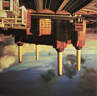
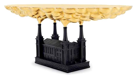
• “Battersea, in fact, is a fairly simple climb, made ready by the builders who are destroying it.” Katherine Rundell on climbing Battersea Power Station at night.

• Mixes of the week: Secret Thirteen Mix 148 by Mlada Fronta, and The Ivy-Strangled Path, Volume V, by David Colohan.

Erté illustrates a gay romance in Lytton Strachey’s Ermyntrude and Esmeralda (1913 but not published until 1969).

• Dangerous Minds looks back at “The most unusual magazine ever published”, Man, Myth & Magic.

David Chase on the writing, directing and editing of the final scene of The Sopranos.

Magic Man (1969) by Caravan | The Myth (1982) by Giorgio Moroder | Magick Power (1987) by Opal

A tabled question

bps1.jpg

Work-related research this week had me wondering who it was that first thought of turning Battersea Power Station into a table. For the past few days I’ve been looking at a lot of the illustration work that George Hardie produced for the Hipgnosis album covers in the 70s and 80s; I’ll explain why in due course but the quest led me to seek out the songbook for Pink Floyd’s Animals album, two pages of which can be seen in the first Hipgnosis book.

Hipgnosis would often extend their album design into promotional areas, producing related posters, stickers, and so on. Pink Floyd’s popularity meant there was demand for songbooks, and the one for Animals is a treat for the use it makes of additional photos from the flying-pig sessions at Battersea Power Station. The idea of using the power station for the cover came from Roger Waters, incidentally; a shame he didn’t apply the same invention to his lyrics. But I digress…

bps2.jpg

From the Animals songbook (1977). By George Hardie?

Between the photos (and, er, the songs) there are several pages of graphics by (I’m guessing) Bush Hollyhead and George Hardie; the former depicts a pig, dog and sheep in various stylised arrangements while Hardie provided a vignette of bacon rashers on a Battersea table. This was 1977 so I’m assuming it’s the earliest example of the power-station-as-table, unless, of course, somebody out there knows better.

bps5.jpg

When the Monster Dies (1990) by Kate Pullinger. Illustration by Willie Ryan.

And sure enough… Thanks to herr doktor bimler for suggesting this one.

table.jpg

Robber Baron Table (2006) by Studio Job.

Artist David Mach took up the table idea in the 1990s to produce a series of collages showing an enormous chimney-legged chair sitting beside the power station. There’s no explanation as to why the table should be upside down but then artists often don’t think things through as well as designers. A better idea is the Battersea-like Robber Baron Table (2006) by Studio Job, part of a series of furniture concepts suitable for oligarchs and those who work in the City of London.

bps3.jpg

And so to the inevitable, one of a number of stylish tables currently being manufactured by the Battersea Table company.

bps4.jpg

Not a table but another clever repurposing of Giles Gilbert Scott’s architecture. Atypyk makes concrete ashtrays for those who still smoke, with the chimneys formed from unsmoked cigarettes. Battersea Power Station when it was in use did much to contribute to London’s polluted air so this seems a fitting by-product. Are there any more examples out there?

Previously on { feuilleton }
Design as virus 16: Prisms
Labels
Storm Thorgerson, 1944–2013
Hipgnosis turkeys
Peter Christopherson, 1955–2010
Storm Thorgerson: Right But Wrong
Battersea Power Station

Labels

label01.jpg

A post for Record Store Day, and a slight return to the work of Hipgnosis and the late Storm Thorgerson. One of the many things which impressed about Hipgnosis album designs was the way they gradually came to approach each album as a distinct package for which every component deserved special attention. The very early Hipgnosis designs were little more than photos or photo-collage with some typography applied; a few years down the line and in addition to creating elaborate pictorial sleeves they were also designing logos or special typography for each release, with the design frequently extending to the labels of the vinyl records themselves.

label03.jpg

This last feature has since become so commonplace that it’s surprising now to find albums with a simple generic label. The Beatles Sgt. Pepper album is famous for its own elaborate package which included a special inner sleeve, but the label on the disc was the regular Parlophone design which had been used on all the earlier Beatles releases. Hipgnosis were in the vanguard of designing special labels, and I’m tempted to say they began the practice although it’s likely there were prior examples. The earliest Hipgnosis example seems to be the prism design for The Dark Side of the Moon (1973); prior to this Pink Floyd were using the same label as other artists on Harvest Records. A few more Hipgnosis examples follow below. I especially like the ones for Wings Over America (1976), a triple-live set which extended the passenger plane sleeve design by using artwork based on different aircraft instrument dials.

label04.jpg

label05.jpg

Continue reading “Labels”

Storm Thorgerson, 1944–2013

hipgnosis1.jpg

Wish You Were Here (outer and inner sleeve, 1975) by Pink Floyd.

Whenever people ask questions about your work, at some point the subject of influences always turns up. Influences for me are usually few, they’re those things which skew your perception to such a degree—or which enlarge the range of possibilities—that they make you follow a path you might otherwise have never pursued. I’ve said on many occasions that the window of our local record shop in the 1970s was an art gallery whose contents changed every week, with gatefold sleeves offering an endless variety of fantastic visions and smart designs. I was often indifferent to the music the sleeves were intended to advertise, if a favourite band happened to have a great record sleeve then so much the better. It wasn’t that I wanted to be a record sleeve designer as such, more that the views (as Roger Dean called his first book) were incredibly stimulating, and they excited me enough that I wanted to have the creation of images like that in my future.

hipgnosis2.jpg

Wish You Were Here shrinkwrap and George Hardie’s sticker design.

I’ve written at some length about Roger Dean and Barney Bubbles but it was Hipgnosis that dominated those window displays during the golden age of record sleeve design. Obituaries of Storm Thorgerson have rightly been acknowledging the contributions of his Hipgnosis design partners Aubrey Powell and Peter Christopherson, but Thorgerson always came across as the driving force, a position reinforced by his text for the group’s first book collection, An ABC of the Work of Hipgnosis: Walk Away René (1978), and by his post-Hipgnosis career which continued to generate even more startling images. Walk Away René is like the designs of Hipgnosis themselves: witty, clever, and beautifully produced, while Thorgerson’s commentary is refreshingly honest both about the details of album production, and in its lack of the affectation which afflicts many design books. Working in the music business probably helped maintain a no-bullshit attitude; it’s difficult to imagine many other designers cheerfully announcing in their first public showcase that their studio is so primitive that everyone has to piss in the sink. Or, as I noted in December, drawing attention to your least favourite covers in an even more lavish showcase.

hipgnosis3.jpg

The Dark Side Of The Moon (1973) by Pink Floyd.

The cover examples here have been chosen via the essays in For the Love of Vinyl: The Album Art of Hipgnosis (2008) where several people were asked to choose their favourite sleeves. I’d find it impossible to choose a favourite, although at a push I’d probably go for Wish You Were Here. With its absence/four elements concept, in its original package—the postcard insert, the unlabelled sleeve shrink-wrapped in black cellophane then stickered with a George Hardie drawing which I once laboriously copied—it comes close to perfection when you’re discussing album designs as works of art.

hipgnosis4.jpg

Presence (1976) by Led Zeppelin.

The Hipgnosis Covers site is the place to see more work by Storm Thorgerson and company.

Storm Thorgerson, Pink Floyd and the final secret of the world’s greatest record sleeve designer
The Guardian: “The best album designer in the world”
Storm Thorgerson remembered by Aubrey Powell
Adrian Shaughnessy at Creative Review
Mark Blake at MOJO
Telegraph obituary

hipgnosis5.jpg

Go 2 (1978) by XTC.

Elsewhere on { feuilleton }
The record covers archive

Previously on { feuilleton }
Hipgnosis turkeys
Peter Christopherson, 1955–2010
Storm Thorgerson: Right But Wrong
Battersea Power Station

Hipgnosis turkeys

turkeys.jpg

Here in Britain there’s no Thanksgiving so turkey as a seasonal meal is a Christmas dish. Turkey also has another meaning which the OED can supply:

6.6 U.S. slang. a.6.a An inferior or unsuccessful cinematographic or theatrical production, a flop; hence, anything disappointing or of little value.

This post concerns the latter—turkeys for the turkey season—being a series of bad or merely lacklustre album covers produced by the Hipgnosis design partnership throughout the 1970s. If the label seems unfair it should be emphasised that “turkey” is the designation applied by Storm Thorgerson himself in the appendix to the third Hipgnosis book, For the Love of Vinyl: The Album Art of Hipgnosis (2008). The following are all covers that he says Hipgnosis disliked, although not necessarily because they were bad designs:

There are some designs we would rather like to forget altogether and have been awarded turkeys to denote — no disrespect is intended for the blame lies mostly with us, save for the twin spectres of release schedules and rock egoism — “That’s a jolly interesting idea chaps but… hmm… actually we’d rather have a picture of our good selves.”

A consistent feature of the Hipgnosis books is a refusal to adopt the Olympian attitude that radiates from many design monographs. Thorgerson has always been happy to describe the history of Hipgnosis, and the practice of album cover design, in warts-and-all anecdotal detail, so it’s no surprise if he also admits to failings. You’d be hard-pressed to find other designers who would draw attention to poor work in this manner, especially in a book dedicated to the highlights of a lauded career. Most designers are self-conscious types who can be relied upon to bury their mistakes as thoroughly as possible.

I wrote a brief post years ago about bad cover design but I usually try to avoid such things, there’s already enough junk in the world without compiling lists of it. But this post is instructive for showing that not everyone gets things right however good they might be, and also that everyone has to start somewhere. Most of my early album covers are various degrees of terrible so I try to spare others the accusatory finger. That said, you have to wonder what on earth Thorgerson and partner Aubrey Powell were thinking of with some of these designs.

01gods.jpg

Genesis (1968) by The Gods.

Thorgerson’s introduction to For the Love of Vinyl explains the haphazard beginnings of Hipgnosis, pretty much two guys and a couple of cameras. They had no design training but a lot of luck (not least having Pink Floyd as friends), and were learning on the fly, something you can see happening with these early covers. It’s unfair to compare a design like the Gods sleeve to work they were producing a few years later when they had access to a range of professional illustrators, retouchers and models, and also budgets from record companies that paid for flights to exotic locations.

02gun.jpg

Gun Sight (1969) by Gun.

This was Gun’s second album. The cover for the first happened to feature the first album cover art by Roger Dean whose career in the music business would run parallel with that of Hipgnosis. Most of the early Hipgnosis covers are simple photos that are occasionally processed in some way. This one didn’t really work out, however, the Roger Dean cover is better.

03prettythings.jpg

Parachute (1970) by The Pretty Things.

But at least the Gun cover doesn’t look like this bizarre attempt at Surrealist collage. Hipgnosis often tried to illustrate the album title but I can’t see how you get “parachute” from this one. The collage approach worked a lot better on the Quatermass album produced the same year.

04pepejaramillo.jpg

Till There Was You (1970) by Pepe Jaramillo.

This was the only cover singled out in the first Hipgnosis book, Walk Away René (1978), as something they didn’t like:

…straight down the line and utterly tasteless as a result — it doesn’t even work as a genteel piece of middle class tweeness.

Continue reading “Hipgnosis turkeys”