Chimère du soir (1961) by Leonor Fini. Réalisme irréel is an exhibition of Fini’s work currently running at the Weinstein Gallery, San Francisco.
• ” ‘Paris invented the flâneur,’ he notes, ‘and continues to press all leisurely and attentive walkers into exercising that pursuit, which is an active and engaged form of interaction with the city, one that sharpens concentration and enlarges imaginative empathy and overrides mere tourism.’ ” David L. Ulin reviewing The Other Paris by Luc Sante.
• “A lot of posters promise so much that how can they ever deliver?” Nicolas Winding Refn talking to Mat Colegate about his book, The Act Of Seeing, a collection of posters for exploitation films.
• “Sexuality is present throughout and often subverts a narrative we might read entirely differently from a straight poet.” Callum James reviews Physical by Andrew McMillan.
This movie will lose a lot of people along the way, but then again, as far back as 1962, Ballard wrote a manifesto for a new form of science fiction, Which Way to Inner Space?, in which he insisted that “from now on, most of the hard work will fall, not on the writer, but on the readers. The onus is on them to accept a more oblique narrative style, understated themes, private symbols and vocabularies.” This is exactly what Wheatley wants from his audience.
Mike Holliday comparing Ben Wheatley’s forthcoming film of High-Rise with JG Ballard’s novel. Ballard’s suggestion for a new SF now seems increasingly like a road not taken. But that’s another discussion entirely…
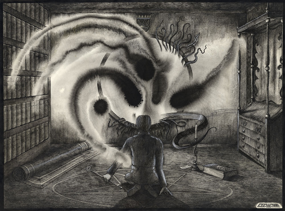
• The Lost Library of John Dee, an exhibition of books owned by the Elizabethan magus, opens at the Royal College of Physicians museum, London, in January.
• Clive Hicks-Jenkins has been writing about his illustration heroes including Alexander Alexeieff.
• Cameron: Cinderella of the Wastelands. The exhibition has just finished but the art is still online.
• Mixes of the week: FACT Mix 518 by Fis, and Secret Thirteen Mix 165 by Damien Dubrovnik.
• At Dirge Magazine: Tenebrous Kate on Fantômas, the French King of Crime.
• Suitably seasonal: Polish Night Music by David Lynch & Marek Zebrowski.
• Kickin’ In, a previously unreleased EP of music by Patrick Cowley.
• Jean-Michel Jarre‘s favourite albums.
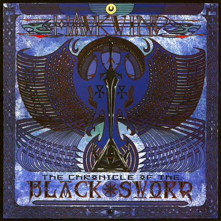
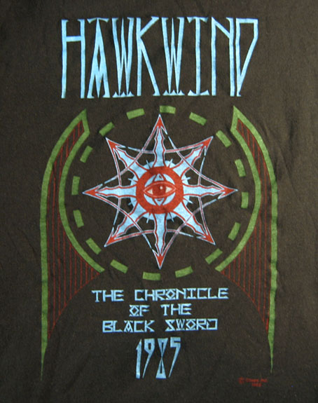
• Seeing It As You Really Are (1970) by Hawkwind | Seeing Out The Angel (1981) by Simple Minds | Seeing Red (1998) by Red Snapper