More Things to Come

things01.jpg

The organisers of the Things to Come exhibition at the Petach Tikva Museum of Art, Israel, sent me their photos of the show earlier this week. As with the other recent exhibitions that I haven’t managed to attend it’s good to see how everything looks in situ, and also see some of the other exhibits.

things02.jpg

The art pieces are all related to science fiction old and new, with my airship illustration (as seen in The Steampunk Bible) and a couple of other works representing the old (or new-as-old) side of things. I’m not used to seeing my work enlarged to such a huge size so this was a treat. The only larger reproductions have been a window display for one of the Cradle of Filth album covers which filled a whole window of Tower Records, London, in 2001, and stage backdrops for Cradle of Filth and Melechesh. I can’t identify any of the other exhibits until the catalogue arrives but I really like the iridescent metal construction that’s lying on the gallery floor. All the photos are by Elad Sarig, and are shown courtesy of the Petach Tikva Museum of Art. My thanks again to Doreet LeVitte Harten for selecting my work, and to Avshalom Suliman for dealing with the printing and other details.

things14.jpg

Continue reading “More Things to Come”

Christopher Dresser’s Studies in Design

dresser28.jpg

The previous post about Christopher Dresser’s design studies proved popular so here’s another discovery from the same source. A surprise this time was seeing the middle motif on the page above; I have this separated from its neighbours in a collection of Art Nouveau graphics, and used it on the slipcase of a Cradle of Filth CD in 2002. Studies in Design (1876) is a collection of colour plates of Dresser’s design work. Some of these emulate medieval or Arabian/Persian decoration but the most interesting examples for me are Dresser’s more personal pieces. Once you’ve seen a few of these his style is easy to recognise. Thanks to some searching by Mr TjZ I now know that a number of collections of Dresser’s designs are available from (who else?) Dover Publications. More for the shopping list.

dresser18.jpg

dresser19.jpg

Continue reading “Christopher Dresser’s Studies in Design”

Weekend links 272

sage.jpg

No Passing (1954) by Kay Sage.

• More Lovecraftiana: She Walks In Shadows, an illustrated all-woman Lovecraftian anthology, will be published in October. Related: “The octopus genome and the evolution of cephalopod neural and morphological novelties“, a study that’s been filtering through the press as “Do octopuses have alien DNA?”

• “The right to ‘subject each others’ fundamental beliefs to criticism’ is the bedrock of an open, diverse society,” says Kenan Malik in his TB Davie Memorial Lecture.

Sunn O))) with Attila Csihar at the Berlin Heimathafen. Related: Here’s what you missed at Sunn O)))’s sold out Berlin gig.

Caillois is fascinated by these “beveled buildings,” truly abundant in the Fifteenth, along with an unusually high incidence of blind walls, false façades, and merely ornamental windows, each beloved of his phantoms. In the parts of the arrondissement developed during the postwar period, Caillois’s attention is drawn instead to the ventilator shafts and drainage grates that dot the streets. These structures, built to clear away rainwater or aerate underground garages, have a secret function, according to him. Noting their uncanny similarity to some of the settings in the Weird Tales of HP Lovecraft, he speculates that they may have been constructed to provide the entry points for an extraterrestrial invasion of our planet.

Ryan Ruby on Roger Callois and the phantoms of the Fifteenth Arrondissement

• “I’m really into big moments,” says Julia Holter whose new album, Have You In My Wilderness, is released next month.

Adrian Utley talks to Peter Zinovieff, co-inventor of the EMS synthesizer. Related: What the Future Sounded Like.

• “Tarkovsky’s Solaris is the anti-2001: A Space Odyssey,” says Marissa Visci.

• Mix of the week: Gizehcast #17 by Rutger Zuydervelt.

Modernist architecture on film.

Thaumaturgy at Tumblr

The Call of Ktulu (1984) by Metallica | Cthulhu Dawn (2000) by Cradle of Filth | Cthulhu: A Cryo Chamber Collaboration (2014) by Various Artists

Rock shirts

shirt1.jpg

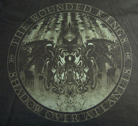
Arriving in the post at the end of last week was this T-shirt for British Doom band The Wounded Kings. The Shadow Over Atlantis (2010) was the band’s second album, and they asked permission a while ago to use my Cthulhuesque De Profundis piece on this limited edition shirt. Permission was granted happily enough, my only concern was that the fine detail and dark tones might not reproduce well on black fabric. The printing is remarkably good, however, and the circular design and type layout works very well. The shirts are on sale here.

shirt2.jpg

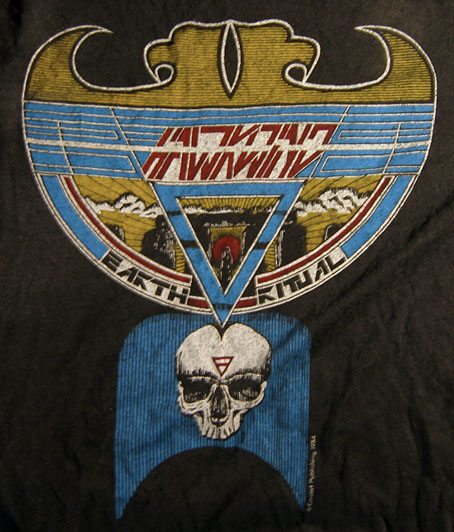
All of which reminded me that I have a couple of shirts from the Hawkwind era in the 1980s. I’ve not aired these designs before, mainly because the Earth Ritual design is one of my many pieces of Hawk-art that I find amateurish. I used to put considerable effort into the cover designs (some of them, anyway; a few were pieces of art sent to Dave Brock as samples that were later used as official covers); but much of the art I produced for the tour programs and merchandise was done in haste, and should have been a lot better considering it was being used for costly souvenirs.

Earth Ritual was the title of an EP released in 1984 that was notable for having Lemmy as guest bassist, his first appearance on a Hawkwind record after being sacked from the band in 1975. I did the cover for that one but I don’t like it very much. The 1984 tour was named after the EP, hence the shirt, although the show was nothing remotely like the elaborate Space Ritual concept. The triangle with a bar on the skull is the alchemical symbol for Earth, a detail the band used in their stage set. I’ve never liked that skull which is very badly drawn, I’d have been better off using a photocopy of the skull on this drawing from the same year. The design was drawn in black ink on white paper; I had no say in the colouring which was done by the merchandise company. From the same drawing they also made small enamel badges (where the skull looks even worse!), and a sew-on patch which looks much better since they dispensed with the skull.

shirt3.jpg

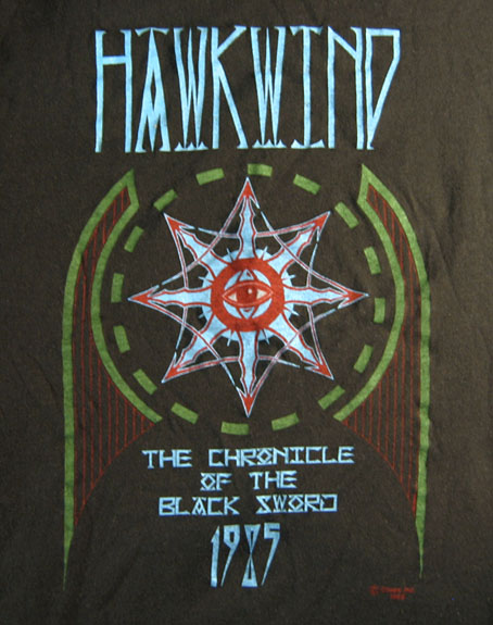
This was the shirt design for the 1985 tour, one of the final designs for the Chronicle of the Black Sword project, and one of the very last pieces I did for Hawkwind. The design of this one is a little more successful although once again the colours weren’t my choice.

These aren’t the only shirts I’ve done for the music world, in addition to other occasional work for metal bands I produced many exclusive designs for Cradle of Filth from 2001–2005 but they never sent me any of those. To return to De Profundis, I ought to note that the artwork is available as a print from CafePress.

Previously on { feuilleton }
The Cosmic Grill
Void City
Hawk things
The Sonic Assassins
New things for July
Barney Bubbles: artist and designer

The Art of Gothic by Natasha Scharf

goth01.jpg

This weekend I was at the Louder Than Words music conference in Manchester to meet Peter Bebergal, author of Season of the Witch: How the Occult Saved Rock and Roll, and Mark Pilkington of Strange Attractor. By coincidence the event was hosting a discussion about goth music and culture based around The Art of Gothic, a new art book by Natasha Scharf. As mentioned last month, this book features some of my work but I hadn’t seen a copy until now.

goth02.jpg

I’ve been fortunate recently to have my work appear in some impressive volumes but this outsize hardback takes some beating. It’s a very lavish production, 224 colour pages on heavy paper with gorgeous design by Paul Palmer-Edwards. Goth has been subject from the outset to mocking stereotypes, to a degree that many people would imagine they know exactly what a study such as this would contain. A recurrent theme of the Louder Than Words discussion was the growth of the goth subculture beyond its clichéd boundaries which is one reason my work is featured in the book. When Natasha was first in touch I thought it might be for the Cradle of Filth album covers but I’m in the chapter that examines the increasingly tangled goth/steampunk crossover. This is one development that’s come to seem almost inevitable given the roots of so much of the goth aesthetic in Victorian nightmares. Many steampunk novels tend towards the dark in their blend of science fiction and horror so the traffic goes in both directions.

goth03.jpg

Elsewhere in the book there are chapters on Futuristic Goth, Japanese Goth, and Cybergoth, all of which maintain the requisite darkness while evolving away from the top hats, lace and veils (the latter are all present and correct elsewhere, of course). It’s a beautiful book, out now in the UK from Omnibus Press, and in the US from Backbeat Books. A few more page samples follow. There’s more at Amazon UK.

• See also: 13 Things That Prove Gothic Art Is Enchanting And Beautiful

goth04.jpg

left: The Amazing Screw-On Head by Mike Mignola (2002); centre: the full-colour version of the ever-popular Steampunk Equation (2009), words by Jeff VanderMeer, graphics by John Coulthart; right: Dr Geof’s Medicine Lady, aka Steampunk Pinup #2.

goth05.jpg

The mighty Giger again. I’ve got a framed print of that picture on the wall, a fact that will surprise nobody.

Continue reading “The Art of Gothic by Natasha Scharf”