

UK, 2009.
Newton leaned forward, putting his elbows carefully on the table. “Nathan. Nathan. I was afraid of you then. I am afraid now. I have been afraid of all manner of things every moment I have spent on this planet, on this monstrous, beautiful, terrifying planet with all its strange creatures and its abundant water, and all of its human people. I am afraid now. I will be afraid to die here.”
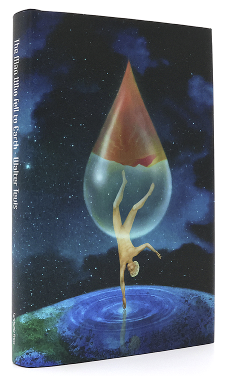
Before my recent rewatch of The Man Who Fell to Earth I decided to read the novel in order to spice up yet another viewing by comparing the film with its source. And as is often the case when reading books of a certain vintage, curiosity had me wondering how the book has been cover-designed over the years.
The Man Who Fell to Earth was published in 1963. Prior to this Walter Tevis had only published one other book, The Hustler, his first novel about pool-player “Fast Eddie” Felson. Such a debut wouldn’t have marked Tevis as a putative writer of science fiction although he had written a handful of stories for SF magazines before attempting anything at novel length. The Man Who Fell to Earth is artistically satisfying science fiction, and a good novel in a literary sense, something you can’t always expect from those writers of Tevis’s generation who seemed to read nothing but technical reports and fiction by other SF writers.
The story opens in 1985, presenting a future which isn’t too different to the 1985 that many of us lived through. Speculation is minor and mostly relegated to the background, with occasional mentions of monorails, food shortages and warring African nations who threaten each other with nuclear weapons. Into this world there arrives the alien who calls himself Thomas Jerome Newton (we never learn his original name), a clandestine emissary from the dying planet his people know as Anthea. Newton has been sent to Earth with plans to build a financial empire using his advanced technical knowledge. This will, he hopes, enable him to build a craft in order to ferry the remaining Antheans to a world where they can survive. Once they’re secure, the Antheans also plan to rescue the inhabitants of Earth from imminent nuclear destruction.

The US one-sheet of Vic Fair’s poster. After decades of illustrators and designers working with both the book and the film, Fair’s poster is still the most successful condensation of the story into a single, memorable image.
If you’ve seen the film then the broad strokes are all very familiar. Nicolas Roeg’s direction and Paul Mayersberg’s script treat the material elliptically but the film stays closer to the novel than you might expect, with Mayersberg even reusing some of Tevis’s dialogue. Both novel and film are very much concerned with portraying the Earth itself as an alien planet. For the first half of the novel, “1985: Icarus Descending”, we see our world through Newton’s eyes while he makes his way among the clever but dangerous primates. The second half, “1988: Rumpelstiltskin”, concentrates equally on Newton’s attempts to retain his sanity in a world that must never discover his real intentions or his true nature; and on the curiosity of Nathan Bryce, the chemist helping to construct Newton’s spacecraft, whose suspicions about his employer are eventually confirmed. Bryce believes that Anthea must be the planet Mars, but when asked about this directly Newton simply replies “Does it matter?”
Roeg and Mayersberg’s film received mixed reviews in 1976 but its cult status has grown thanks to its connection with David Bowie’s person and career. Bowie’s Newton has become a dominant motif for book covers even though Tevis’s Newton is a negative inversion of the screen alien, being six-and-a-half feet tall, with tanned skin and pure white hair. For art directors and illustrators the challenge since 1976 has been to present the novel in a manner which does more than merely repeat the imagery of the film. Not everyone succeeds in doing so.
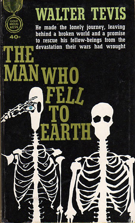
USA, 1963. Cover art by Leo and Diane Dillon.
The first printing was as a paperback original with untypical cover art by Leo & Diane Dillon. Without reading the novel it’s hard to tell what this is about at first glance, but the figure on the left is supposed to represent Newton’s unusual lightweight skeleton whose height and shape are contrasted with its human counterpart. The eye presumably refers to the contact lenses that Newton wears to disguise his cat-like pupils.

Italy, 1964. Cover art by Karel Thole.
The few covers that pre-date the film are what you might call the innocent ones, free of David Bowie’s face or Bowie-like figures. Here the prolific Karel Thole also favours Newton’s diguises over any other imagery.
USA, 1970. Cover art by Howard Winters.

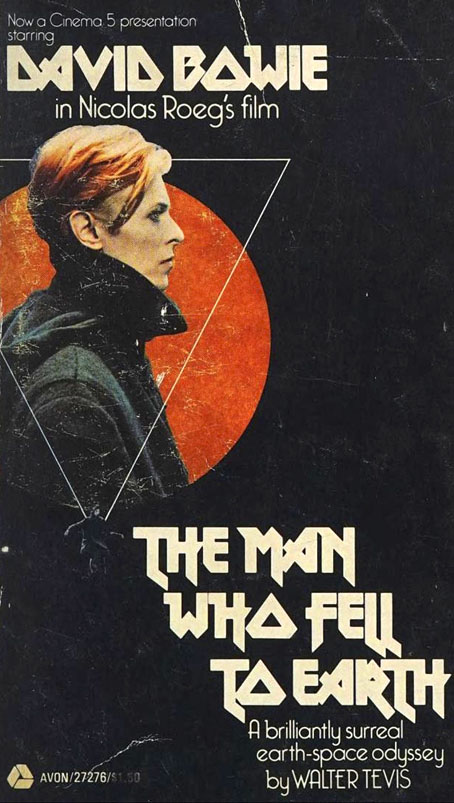
UK, 1976. Cover art by George Underwood.
Pan offered George Underwood the task of depicting Bowie/Newton for the first UK paperback, no doubt in the knowledge that Underwood was a friend of Bowie’s who also happened to have given Bowie his mismatched eyes when they had a fight as teenagers. I like this simple cover (it’s also a copy of the book I own), which shows Newton caught between the sky from which he’s descended and the Earth’s water which he covets. The profile also anticipates the cover of Low, the album that Bowie released the following year with an Underwood-designed sleeve and a similar profile shot from the film’s production.

Italy, 1976. Cover art by Karel Thole.
A reprint which contained the text of the novel plus an essay and screenplay by Paul Mayersberg.
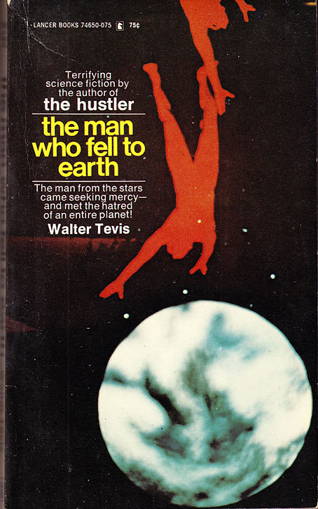
USA, 1976.
The US film tie-in, reworking the UK poster with the still of Bowie that appeared on the cover of Low.

Yugoslavia, 1979. Cover art by Miodrag Knežević.
This one gets the vote for the most bizarre edition. The cover art might easily be applied to many other books but it makes a change from the Bowie clones that follow.
UK, 1981. Cover art by Jim Burns.
In the film Newton’s spacecraft splashes down in a lake, but in the novel he leaves the wreckage in a Kentucky field. Jim Burns must surely know there aren’t any deserts in Kentucky so I’ll give him the benefit of the doubt by taking those dunes as emblems of Newton’s waterless planet.

Italy, 1982. Cover art by Karel Thole.
Karel Thole’s third cover for the same novel. That hat may look like yet another reference to the film but at the end of the novel Bryce is surprised to find a morose Newton wearing a “ridiculous fedora”.
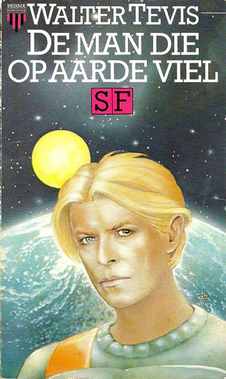
Netherlands, 1984. Cover art by Hans Pieko.
Out come the Bowie clones.

Germany, 1986. Cover art by Eckhardt Rocholl.
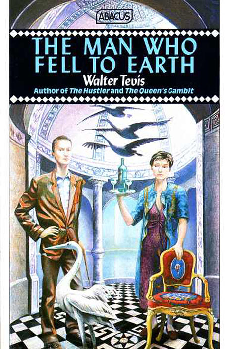
UK, 1988. Artist unknown.
I’ve not been able to find a credit for this Abacus edition which is a shame because the artist was paying attention to the text. Newton in the novel establishes himself in a palatial mansion with only a single housekeeper, Betty Joe (not Mary Lou as she is in the film), to keep him company. Betty Joe’s gin habit leads to one of Newton’s several “falls” when he succumbs to alcoholism in an attempt to keep at bay the pressures of life on Earth and the urgency of his mission. This doesn’t look anything like a science-fiction cover but Newton’s falling to Earth is also a descent from a precarious yet elevated alien existence into the trappings (and traps) of a mundane humanity.
France, 1989. Cover art by Valter Unfer.
Twenty-six years after the book’s publication, an artist finally notices the Icarus theme which was always begging to be illustrated.
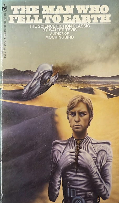
USA, 1990. Cover art by Tim O’Brien.

Italy, 2002. Cover art by Pierluigi Longo.
Urania finally falls for a Bowie clone with the fourth edition of the novel.

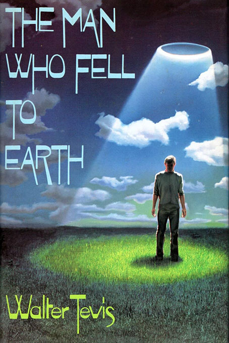
USA, 2014. Artist unknown.
A cover for an ebook. A little vague, perhaps, but one of the better recent covers, conveying the contrast between Earth and Anthea with Newton caught between the two.

UK, 2016. Cover art by Christopher Gibbs.
The covers for the Gollancz SF Masterworks series have generally tried to do some justice to the books they’re promoting. This one, unfortunately, is another that could easily be applied to many other novels.

UK, 2022. Cover art by Autun Purser.
While this one is like all those minimal redesigns for film posters that take it for granted that everyone has already seen the film so they try to summarise a complex story with a single detail. Newton’s cat-like eyes confirm that his human-like appearance isn’t actually human at all. If he also had turquoise skin then his eyes would be of minor consequence.
USA, 2023. Cover art by Lisa Desimini.
When I was taking a similar look at the covers for Nightmare Alley one of the most successful covers was an illustrated edition from Centipede Press. The same happens to be the case here, with illustrations inside and out by Lisa Desimini. It’s a shame that Centipede’s books are expensive limited editions with a very small readership when they improve so easily on the products of the big publishers.
Elsewhere on { feuilleton }
• The book covers archive
Previously on { feuilleton }
• The Sound of Claudia Schiffer
• Roeg abroad
• Landscape with the Fall of Icarus
• The Nicolas Roeg Guardian Lecture, 1983
• Beyond the Fragile Geometry of Space
• Canal view
Another excellent look at differing visions for the same text. I still insist that you could do a book of these, with each chapter examining one movie/book. The book is half-finished right now with all the relevant posts on your website ready to hand. As a designer you are uniquely qualified to make the judgements; and if you were feeling especially ambitious, you could offer up your own interpretations as a hypothetical, showing how you would handle the commission of those in which you found all existing versions sorely lacking.
Coincidence?
https://www.imdb.com/title/tt0091214/mediaviewer/rm3241891328/?ref_=tt_ph_2
Jim: Thanks, I appreciate the suggestion but one of the things that keeps me writing things like this is a lack of the pressure I’d feel doing the same for book publication. There are many other factors mitigating against the idea, such as having to do a lot more work, the idea itself turning into a job of work, having to find more suitable candidates, and so on. This post came about by chance, simply because I’d happened to read the book recently, it wasn’t something I went hunting for. And one crucial thing that would have to be addressed in producing a print version would be the need to find 300 dpi copies of all the covers. Many of the covers above have been enlarged from much smaller images that aren’t remotely print-ready. In some cases you might also have to get permission to reproduce the artwork in print. If someone offered me a reasonable advance and a scheme to solve these issues I might consider it but for now I’m happy to continue working very slowly in what passes here for spare time on the new edition of my Lovecraft book.
Eric: I think any similarity there is merely a result of the similarities between the two stories. Generic situations tend to breed images that repeat themselves down through the years.
Good morning John,
first of all, congratulations on your wonderful blog and your newsletter, always full of interesting ideas. I’m a journalist/writer, primarily covering music, but I’m also a huge fan of the visual arts.
I’m writing to you from Italy.
One of my favorite SF cover artists is Karel Thole; I think he’s brilliant. And I was wondering when you’d dedicate a post to him. To my pleasant surprise, he’s mentioned in the article about Walter Tevis’s novel. However, I must correct you: the cover of the 1976 Urania volume isn’t by Thole, but a promotional photo from the film. After all—no offense!—the style is evident.
I met Thole at Italcon (in the early 1990s, I’d say), the Italian science fiction convention that I don’t think is held anymore. And several years after his death, I met one of his daughters because I was planning to make a documentary. Then everything fell (not the Earth but) apart because I couldn’t find enough money to make it happen. (The same old story).
It’s a shame, Thole deserves this and greater general recognition. I feel he’s under-remembered, as well as under-respected.
It was a pleasure to connect with you, as it will be to continue reading you.
Thank you for your attention,
Best regards,
Andrea
Hi Andrea. I did a post about Thole’s Lovecraft-related art several years ago:
https://www.johncoulthart.com/feuilleton/2015/08/05/the-art-of-karel-thole-1914-2000/
The cover from 1976 certainly includes a photo of David Bowie’s head but I think this has been applied to a painted background. There isn’t a shot in the film that matches that image, and I’ve not seen any production stills like it either.