Lovecraft: Démons et Merveilles

hpl-pd01.jpg

UK publisher Titan Books announced earlier this year that they’d be reprinting the first volume of Glénat’s excellent comic-strip adaptation of Michael Moorcock’s Elric novels in an English edition, a book that should be out in September. This was a surprise to me when I’ve complained for years that Titan seldom showed any interest at all in Continental comics, despite France and Belgium being over-burdened by world-class creators. I’ve been surprised again this week by the news that Titan will also be reprinting the English edition of Philippe Druillet’s The Six Journeys of Lone Sloane in March next year. Druillet’s books have been unavailable in English editions for decades so this is good news indeed, even if the attention is scandalously late.

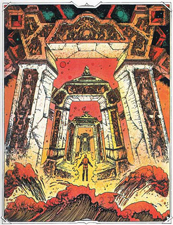
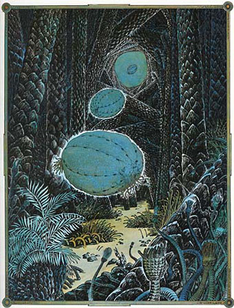
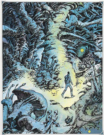
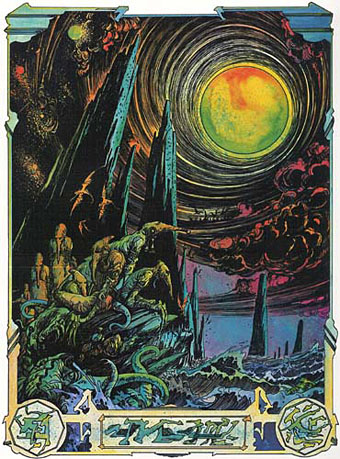
As I noted in the post about Glénat’s Elric, Druillet illustrated Moorcock’s albino anti-hero in 1973. The artist is better known for his Lovecraftian depictions, however, even when—as in the adventures of Lone Sloane—the story could easily sustain itself without all those sinister temples, fish people, Cyclopean architecture and the menace of nameless gods. The Lovecraft influence, which can be found in some of his earliest illustrations, comes to the fore in Lovecraft: Démons et Merveilles, an HP Lovecraft story collection published in an expensive limited edition by Éditions Opta/André Sauret in 1976. Druillet provided ten colour illustrations plus a design for the boards. Some of these illustrations have since been used on paperback editions of Lovecraft in France, although many of them crop the artwork. Tentacles have become a perennial cliché in Lovecraftian art (I should know, I’ve drawn enough of them) so it’s worth noting how few there are in Druillet’s drawings.

hpl-pd02.jpg

hpl-pd03.jpg

hpl-pd04.jpg

Continue reading “Lovecraft: Démons et Merveilles”

Weekend links 201

kettelwell.jpg

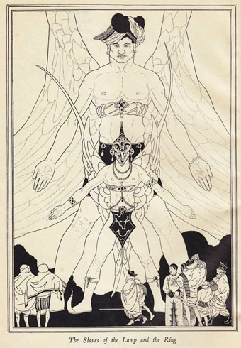
An illustration by John Kettelwell for The Story of Aladdin and the Wonderful Lamp (1928).

• “The strain in everything I write, of not being taken with the bounteousness of humankind, was also the attitude of both my parents.” Jonathan Meades talking to James Kidd about his forthcoming memoirs.

• 7 Trumps From the Tarot Cards and Pinions (1969), and album of electronic music by Ruth White, is being given a limited vinyl reissue. Related: Ruth White—An American Composer.

• 82 minutes of Michael Moorcock talking in 1972 to Jean-Pierre Turmel, co-founder of the Sordide Sentimental record label.

If Verne’s protagonists often seem to stop short of revelation, it’s because the revelation is not meant to be known. Revelation has a way of putting man back at the front of the evolution chart, moving neatly toward a happily progressing future, out of the darkness and into the light. The characters who embark upon the Voyages Extraordinares move backward and forward and all about, spun around like blindfolded children trying to pin the tail on the donkey. The point of the adventure, after all, is not to have a conclusion; it is to get knocked off your feet.

Stefany Anne Golberg on Journey to the Center of the Earth at 150.

• Photographs of pre-Haussmann Paris by Charles Marville, and photographs by Amy Heiden of industrial ruins.

• Mixes of the week: FACT Mix 427 by Wild Beasts, and Secret Thirteen Mix 108 by Kangding Ray.

• Hear Italo Calvino read selections from Invisible Cities, Mr Palomar and others.

• William S. Burroughs in Dub conducted by Dub Spencer & Trance Hill.

• Cycles, Returns & Rebirth: Alexander Tucker on Derek Jarman.

• Harold Budd: the composer with no urge to make music.

• The Museum of Imaginary Musical Instruments.

• 80 minutes of Monolake playing live in 1999.

• At 50 Watts: Dyl’s Dance.

• Owls And Flowers (2006) by Belbury Poly | Learning Owl Reappears (2011) by The Advisory Circle | The Owls (2013) by Félicia Atkinson

Planète magazine covers

planete01.jpg

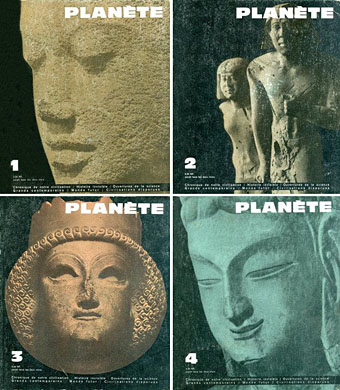
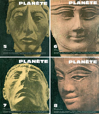
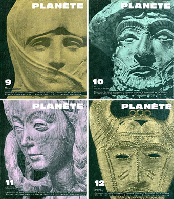
Planète was a French magazine of “Fantastic realism” which ran throughout the 1960s. I’ve never seen a copy but sight of the immediately recognisable covers has always fascinated because this was the magazine established in the wake of the huge success of The Morning of the Magicians (1960), a unique “Introduction to Fantastic Realism” by Louis Pauwels and Jacques Bergier. Rather than enthuse at length about The Morning of the Magicians I’ll simply point you to this piece by the late RT Gault from his now-defunct website.

Pauwels and Bergier’s book was oft-imitated but never equalled during the 1970s. Where later authors such as Erich von Däniken tended to plough a single, narrow furrow, Pauwels and Bergier leapt breathlessly from one subject to another: alchemy in the 20th century, Forteana, a lengthy examination of the occult preoccupations of the Third Reich, speculations about nuclear physics, speculations about biological mutation, Hollow Earth theories, etc, etc, all the time dropping quotes from HP Lovecraft, Arthur Machen and Albert Einstein. It’s a very heady mix which is great fun to read even though there’s nothing like a solid argument that comes out of it all.

planete02.jpg

Planète continued the blend of Futurology and fringe philosophy while using the magazine format to print translations of science fiction and fantasy stories; among other things it was notable for bringing the stories of Jorge Luis Borges to a wider audience in France. The magazine’s name may have been science fictional but the magazine as a whole is closer to the kind of borderline sf/art magazine that New Worlds became under Michael Moorcock’s editorship in the late 1960s. I’ve never seen Moorcock or anyone connected with New Worlds mention Planète but the covers at least pre-empt the style adopted by New Worlds during its large-format run: consistently bold typography and imagery that only obliquely relates to the contents.

planete03.jpg

All these covers are from Noosfere where the story contents for each issue are also listed. No credits for the designer, unfortunately. If anyone knows who was responsible for the magazine design then please leave a comment.

Continue reading “Planète magazine covers”

Eduardo Paolozzi at New Worlds

paolozzi00.jpg

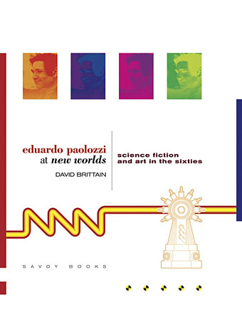
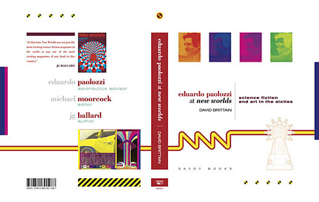
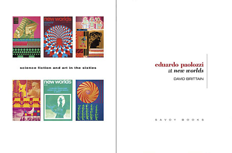
I was working on this book throughout the autumn, and it could hardly be more different to some of the visual extravagance that came before and after. Eduardo Paolozzi at New Worlds is published by Savoy Books this month. Predominantly an examination by David Brittain (no relation to David Britton) of the connections between artists such as Paolozzi and Richard Hamilton with New Worlds magazine in the 1960s, the book is also a rare study of the science fiction magazine when it was making its greatest impact in the late 60s and early 70s.

Brittain highlights many examples of Paolozzi’s sf-influenced art of the period, and examines the development of the magazine under Michael Moorcock’s editorship during which time New Worlds evolved from being a slightly moribund sf title in the early 60s to what JG Ballard later called “one of the most exciting magazines of any kind in this country”. An appendix features interviews with some of the key creators and contributors: editor Moorcock, designer Charles Platt, art editor Christopher Finch, contributor Michael Butterworth, and critic John Clute. Writer and illustrator Pamela Zoline created some original artwork for the endpapers. The introduction is by Rick Poynor.
paolozzi01.jpg

Despite being pressured for time I was very pleased to be designing this book. I’d liked Paolozzi’s work since I first encountered it in the Tate Gallery in the 1970s; a couple of years later I was buying up anthologies featuring New Worlds stories (I was too young for the 60s magazine), so discovering that Moorcock had made Paolozzi the magazine’s “Aeronautics Advisor” made perfect sense. In the past I’ve said that New Worlds ruined my taste for hard sf but that’s not really true since I never really liked the stuff beyond a few Arthur C. Clarke books. Too much bad writing, too many cardboard characters shuffling around between chunks of explanation about made-up technology. The discovery of New Worlds merely demonstrated that there were other ways of approaching sf, and you didn’t have to put up with the rubbish.

I also enjoyed the magazine’s bolshy attitude, a quality shared by Harlan Ellison in his Dangerous Visions anthologies. Moorcock says in Brittain’s interview that NW sympathised with the Underground of the late 60s but also tried to be more disciplined in its approach, especially where the design was concerned. You couldn’t have treated fiction to the semi-legible printing that Oz and Frendz often deployed. But the radical attitudes of the Underground can be discerned in the stance NW adopted. Some of the reviews and polemical articles by Moorcock (often under his “James Colvin” pseudonym), M. John Harrison and John Clute are bracingly vitriolic to a degree which if delivered today would probably see them ostracised for life.
paolozzi02.jpg

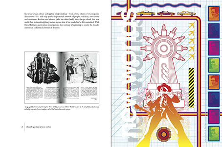
With the design the main intention was to present the information clearly and let the visuals speak for themselves. The book is heavily illustrated throughout, with many examples of Paolozzi’s marvellous prints. The layout nods obliquely to the period; before getting started I spent some time looking at the work of Erik Nitsche. I like the way Nitsche laid out the books he designed in the 1960s, and there’s also a connection in his work as a designer for the General Dynamics corporation: one of Paolozzi’s print series of the period is entitled General Dynamics F.U.N.

Being full-colour throughout, the print run for this book is smaller than usual so anyone interested is advised to move swiftly. Official publication is December 16th but it’s on sale now at Savoy and at Amazon.
paolozzi03.jpg

Continue reading “Eduardo Paolozzi at New Worlds”

Tornadoes

tornado1.jpg

A gust, a storme, a spoute, a loume gaile, an eddy wind, a flake of wind, a Turnado.

Captain John Smith from An Accidence, or the Pathway to Experience Necessary for all Young Seamen (1626).

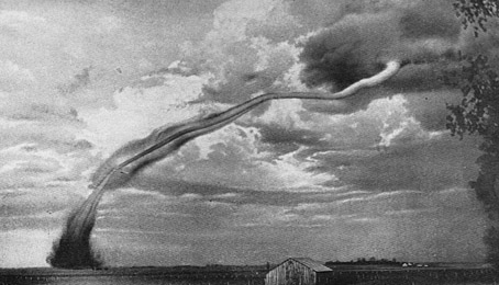
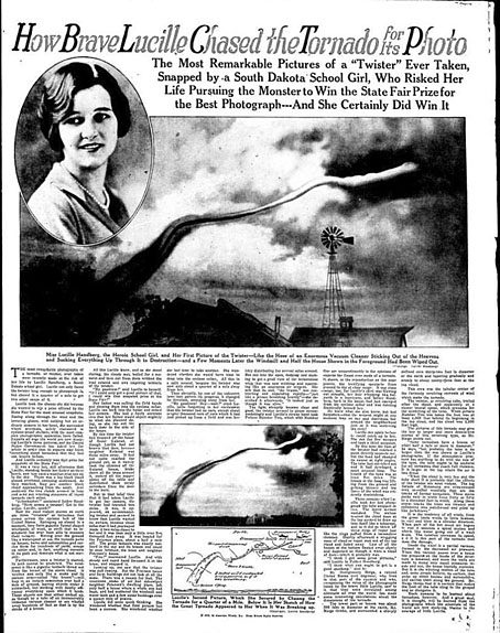
In an age of storm chasers and increasingly spectacular photos, Lucille Handberg’s celebrated picture may seem undramatic, but for the moment this is still the most celebrated tornado photo to date. I knew the picture from an early age thanks to its appearance in a children’s encyclopedia. When Deep Purple’s Stormbringer album appeared in 1974 (below) that imperilled barn, and the shape of the twister, was immediately recognisable.

tornado4.jpg

Lucille Handberg took her famous photo on 8th July, 1927 as the tornado passed by Jasper, Minnesota. It’s a surprise to see from the account in The Milwaukee Sentinel that there’s at least one other picture. I tried searching for a larger image of the second photo but photo libraries still control its reproduction. The copy above is from an account of the tornado here.

Continue reading “Tornadoes”