Snaps: The Studio tour, 1979

snaps3.jpg

I’d been hoping that Malcolm Whitehead’s Snaps might be made public eventually, and here it is, a 25-minute film documenting the northern end of a British book-signing tour undertaken by three artists and their publisher in October 1979. Not only that, there’s also this shorter compilation of footage that didn’t make the final cut.
studio.jpg

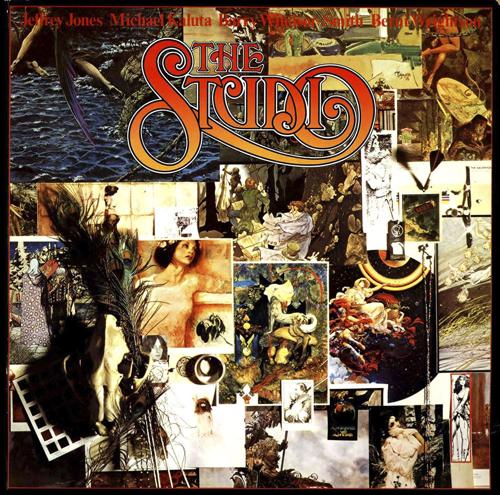
The artists were three of the four whose work is showcased in the book known as The Studio: Jeffrey Catherine Jones, Mike Kaluta and Bernie Wrightson. The other member of the quartet, Barry Windsor-Smith, either missed the jaunt to Leeds and Manchester or avoided the tour altogether. The publisher was fellow artist Roger Dean whose success in 1975 with his own art book, Views, prompted him to turn his self-publishing imprint, Dragon’s Dream, into a bona fide publishing company. Views was followed by a short run of art books by prominent fantasy and science-fiction illustrators including Chris Foss, Ian Miller, Bruce Pennington and Syd Mead. The Studio was one of these titles, a collection of the art produced by the quartet working in the communal loft (“The Studio”) they established in Manhattan in the mid-1970s, a space intended for the production of more personal work than the comic art for which they were all known. Malcolm Whitehead’s film is unusual for documenting an event in sound and vision that usually wouldn’t be documented at all beyond a handful of photographs.
mb-db-1979.jpg

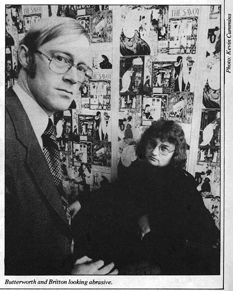
New Manchester Review, 1979: Michael Butterworth and David Britton in the Beardsley-papered Savoy office. Photo by Kevin Cummins.

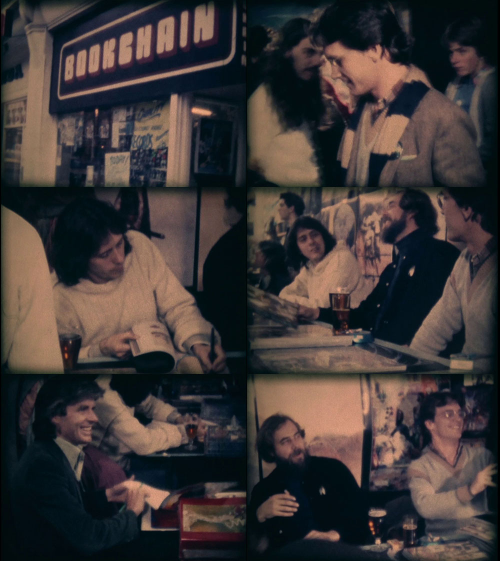
The trail of circumstance that led to the creation of Snaps goes something like this: David Britton and Michael Butterworth were setting up Savoy Books in Manchester at around the same time that Roger Dean was expanding Dragon’s Dream. Both publishers had established co-production deals with Big O, a poster company, distributor and publisher of many pop-culture art books, notably the British edition of HR Giger’s Necronomicon. One of the first Savoy books in 1978 was James Cawthorn’s The Jewel in the Skull, an 80-page comic-strip adaptation of the novel by Michael Moorcock, which was a one-off co-production between Savoy and Big O. In addition to being a fledgling publisher, Savoy at this time also had a chain of bookshops in Manchester, Leeds and Liverpool, selling the usual 70s blend of genre and “cult” paperbacks, posters, comics (mainstream and underground), magazines, and so on. The main outlet was Bookchain on Peter Street, Manchester, which is where much of Snaps was filmed. Given the connection between Dragon’s Dream and Savoy I’d guess that Big O suggested the Savoy shops as venues for the Studio signing tour. Dave Britton would have been keen on this even without the extra business the signings generated for the shops. He’d bought some of the posters produced by Barry Smith’s Gorblimey Press, and always spoke highly of Smith’s Studio-era work. As for the film, Mike Butterworth was good friends with local film-maker Malcolm Whitehead, and it was he that commissioned “Malc” to document the signing. Whitehead is best known today for his subsequent involvement with Ikon, the video division of Factory Records. In addition to making Snaps, in 1979 he was also filming some of the live footage of Joy Division that’s been circulating ever since. He later directed a couple of the early New Order videos, and helped with the direction and editing of many video productions by other Factory artists and affiliated groups like The Fall and Cabaret Voltaire.
snaps1.jpg

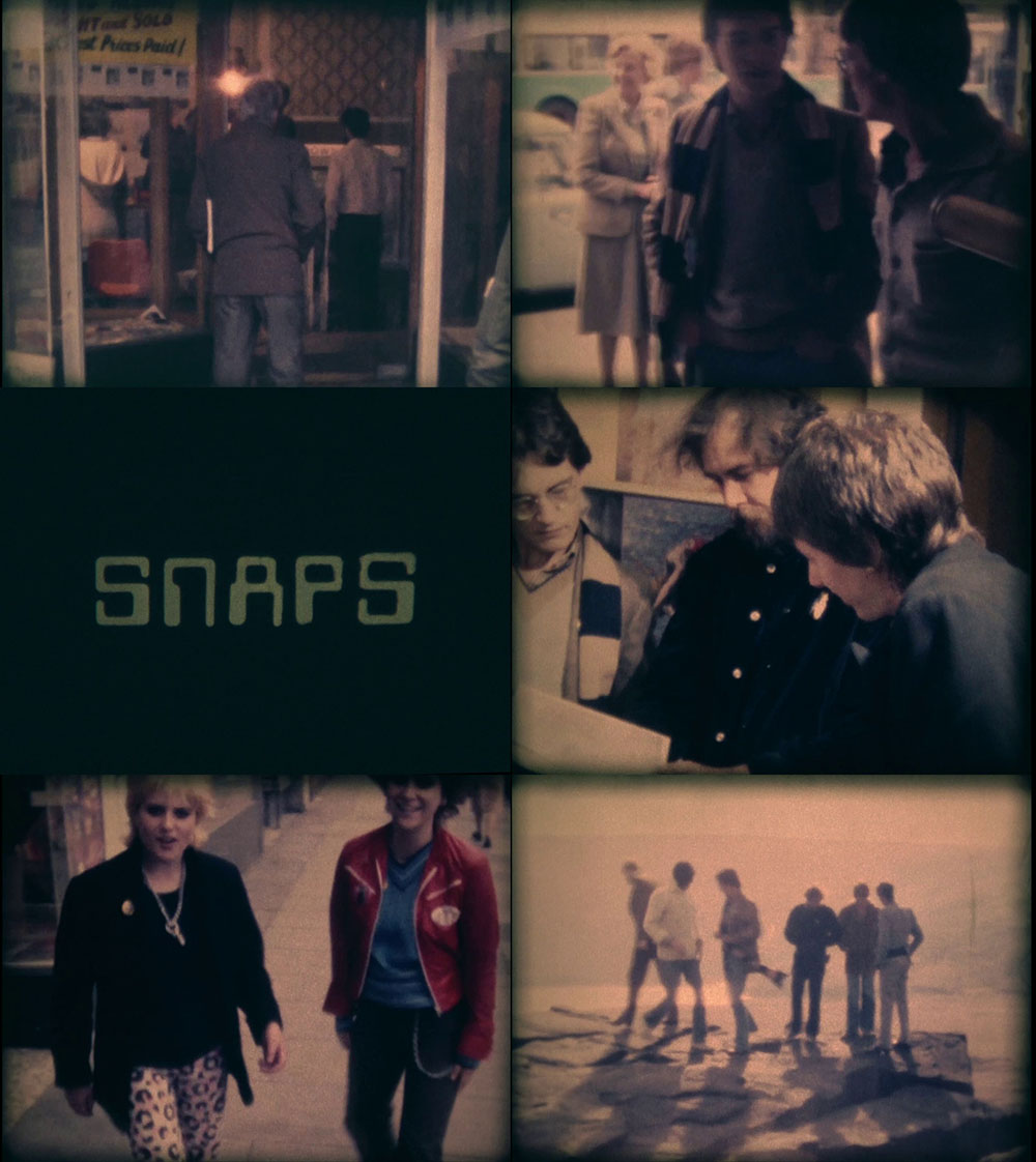
Snaps is a short and somewhat amateurish film but it’s a valuable record all the same. Anyone today can pull out their phone and record an event like this in high-definition and stereo sound; in the 1980s and 1990s you would have needed video equipment, but in the 1970s you had to have film, and 16mm film was an expensive professional product. Whitehead was using the cheaper option of Super-8 but he did at least manage to organise synchronised sound, something you don’t get on Pirate Tape, Derek Jarman’s Super-8 record of a William Burroughs signing. Mike Butterworth provides the stentorian voiceover for Snaps which he says he now regrets. Equally regrettable is his mispronunciation of the names “Paolo and Francesca” when he’s talking about Barry Smith’s art.
snaps2.jpg

The film opens in Leeds for the first of the day’s two signings, a sequence I can’t say much about since I never visited the Leeds shop. The participants then pile into cars and drive across the Pennines where they pause for a brief Kraftwerk-soundtracked inspection of the landscape. The three Studio artists were Americans so all of this activity must have been very novel and interesting despite the drabness of the cities. The shots in Manchester are the ones I like to see since they capture Bookchain when the place was at its height of popularity. In 1979 I was still living in Blackpool and didn’t visit the shop until early in 1980 when I made a daytrip with friends to explore Manchester. By the time I moved to the city in 1982 Bookchain was set on its gradual decline although it managed to survive until the block of buildings it was part of was demolished in 1999. The basement area looks quite salubrious in the signing footage but I only knew it as a dank and unlit storage area with a toilet that belonged in a horror film. One thing that Whitehead didn’t capture was Dave Britton asking all the artists to sign the wall of the shop near the counter. I was in the place every Saturday when we were working on the Reverbstorm comics in the 1990s, and it was always a strange thing to see Roger Dean’s signature (plus dragon doodle) peeping out from behind rows of dusty shrinkwrapped books and magazines. You never see much discussion of this side of the city’s cultural history in writing about Manchester’s musical output. Yet without the Savoy shops, and other outlets like Percival’s and Grass Roots, Ian Curtis, Mark E. Smith, Howard Devoto and others would have had a harder time finding the fuel for their imaginations.

In addition to being a record of a lost place, Snaps is also a record of lost people: Jones, Wrightson, and Britton are all no longer with us, while Malcolm Whitehead died in 2019. Whitehead’s involvement with Factory Records is documented in a scattering of posts at Cerysmatic. This one seems like a good place to start.

Previously on { feuilleton }
David Britton, 1945–2020
Jeffrey Catherine Jones, 1944–2011
Roger Dean: artist and designer
Berni Wrightson’s Frankenstein
Kris Guidio, 1953–2023

kris.jpg

A self-portrait, 2011.

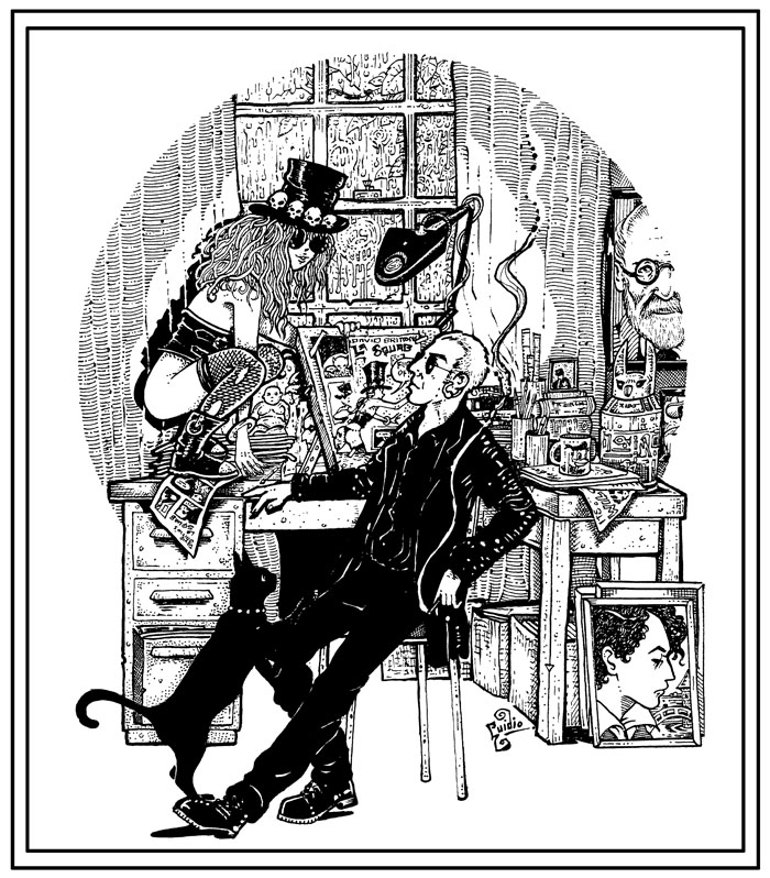
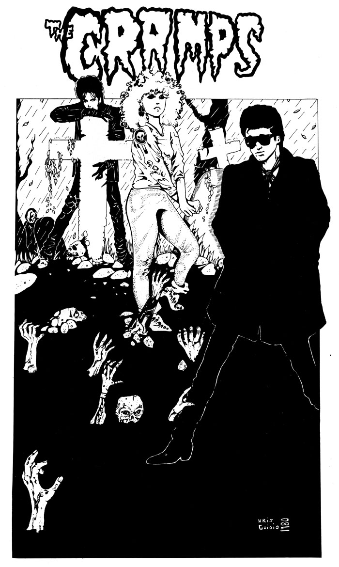
Farewell to the artist I used to refer to as my partner in art-crime. We weren’t really criminals but in the 1990s we’d both seen our published works for Savoy Books condemned as obscene in British courts of law, a farcical set of circumstances looking back, although it all seemed serious enough while it was happening. Kris and I began working for Savoy in the late 1980s, during which time our creative confederacy might be characterised as familiarity at a distance. He lived in Liverpool, and generally remained there, while the rest of us were in Manchester, so I saw his drawings much more than I saw him in person. I don’t think I ever met him more than 10 times in 30 years, yet his art was as familiar as my own, especially when I was being called upon to add backgrounds to some of his figures. I even ended up making a font based on the lettering he used in his comic strips in order to standardise the captions in the later books.

cramps1.jpg

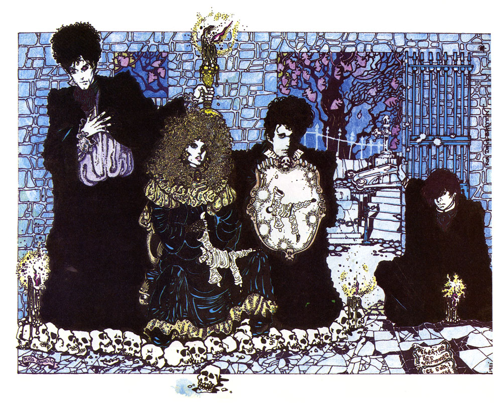
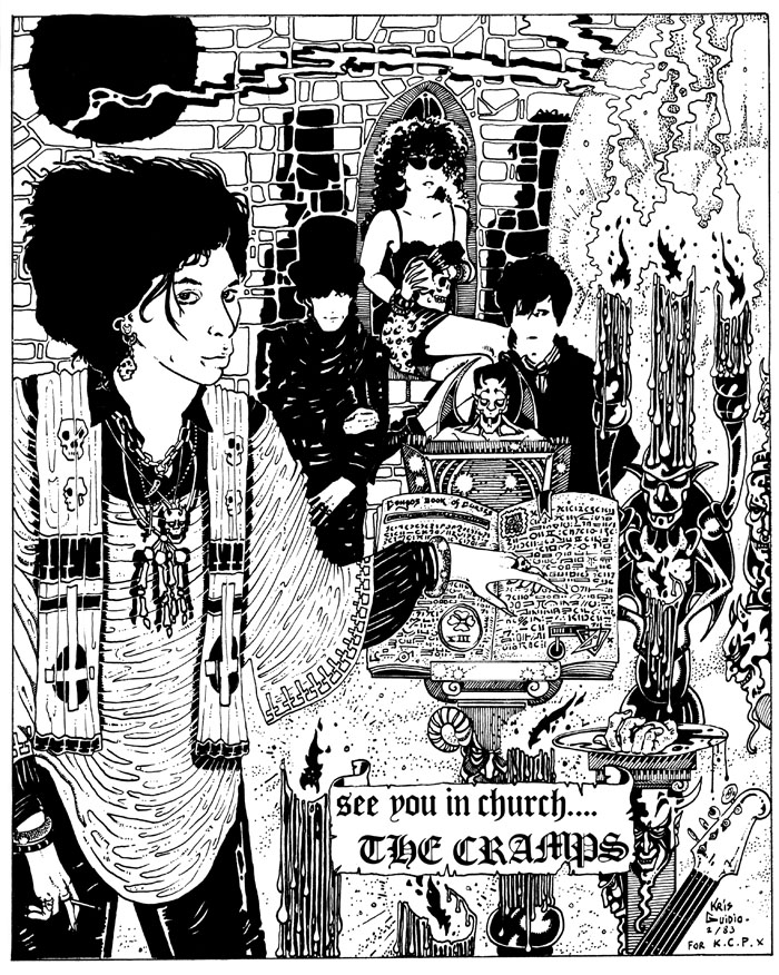
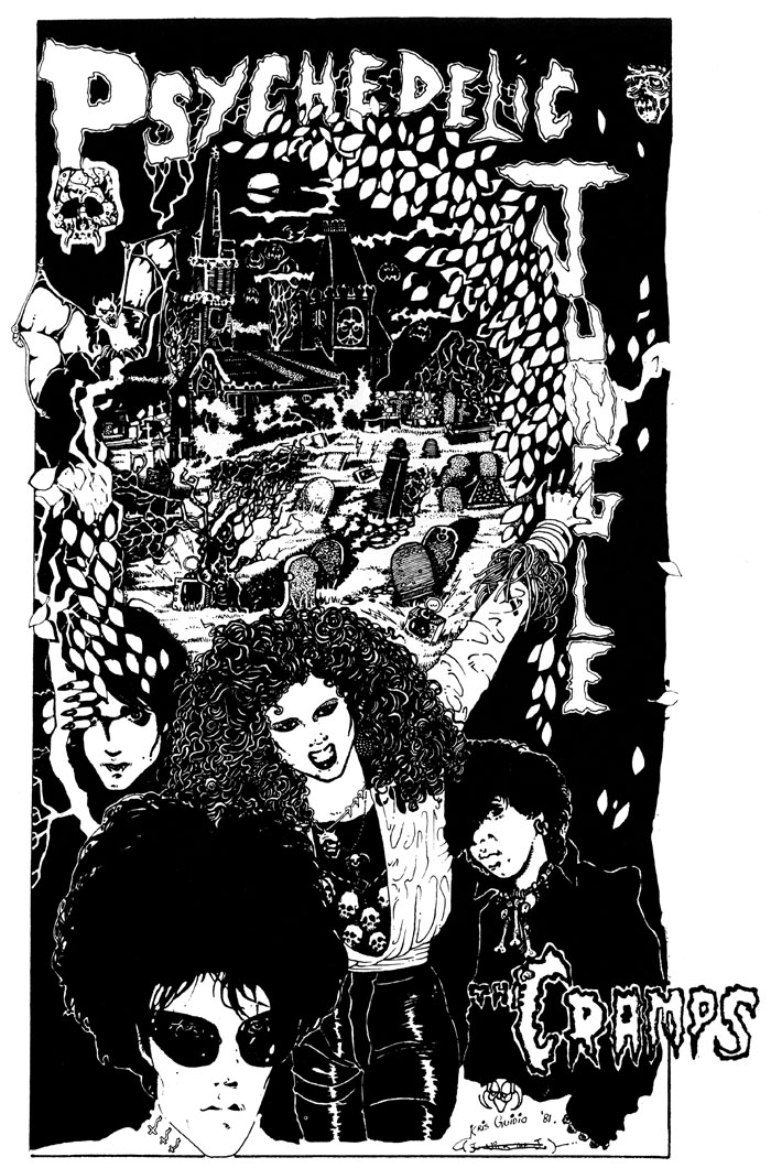
Kris and I shared a symbiotic relationship with writer David Britton, who pushed the pair of us to take our art into places we might otherwise have avoided, while we opened up artistic possibilities for Dave’s characters and the settings they occupied. We were an ideal team in this respect, each of us having strengths in different areas that suited the titles on which we worked. I brought a greater sense of realism to the Lord Horror comics, while Kris developed a hitherto unexplored flair for satire and caricature in the Meng & Ecker series. Kris was a natural cartoonist, as well as a natural humorist to a degree you wouldn’t have predicted looking at his early strips and illustrations featuring The Cramps.

cramps2.jpg

The Meng & Ecker comics provoked the ire of the authorities, thanks in part to Dave’s frequent digs at the Greater Manchester Police, but there was a lot more to Kris’s art than outrage, a quality which is always easy to generate if you push the right buttons. His Cramps strips are gems of that minor form, the rock’n’roll comic, while his later illustrations for the La Squab character had a lightness of touch that suited Dave’s conception of a world where fairy tales and childhood fantasies collide with adult themes and sensibilities. Kris’s art was analogue to the last (I don’t think he ever owned a computer), drawn with whatever pens he had to hand; watercolour-hued, and fuelled by endless cigarettes. Kris in person was generous, witty, and erudite in the autodidactic manner common to all at Savoy. Remote or not, we’ll miss him here.

Further reading:
Sinister Legends (1988)
The Adventures of Meng & Ecker (1997)
Fuck Off and Die (2005)
La Squab: The Black Rose of Auschwitz (2012)

cramps3.jpg

cramps4.jpg

Continue reading “Kris Guidio, 1953–2023”

Hipgnosis interview

hipgnosis1.jpg

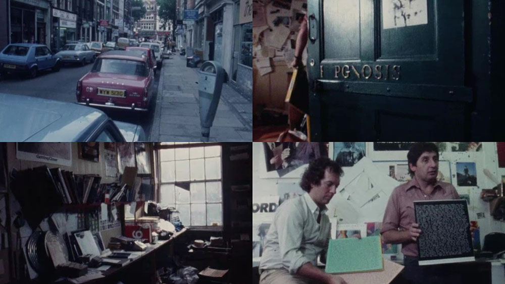
This is a frustratingly short piece of film—a mere 16 minutes—but it’s fascinating all the same for the brief views it gives inside the London studio of the Hipgnosis design partnership at the tail end of their golden decade, the 1970s. Being an occasional album cover designer as well as a minor Hipgnosis obsessive I like to see where so many of the team’s album covers originated. The two Hipgnosis founders, Aubrey Powell and Storm Thorgerson are both interviewed; the third member of the partnership, Peter Christopherson, is absent. The film is also undated but the discussion of the cover photo for Look Hear? by 10cc puts the year at around 1980. The views of the studio aren’t much different from the rather murky shots of the place in the first Hipgnosis book, An ABC of the Work of Hipgnosis: Walk Away René (1978), but the film gives a better sense of the dishevelled actuality: those stairs that Thorgerson runs up at the opening are the same ones that form the background to the melting Peter Gabriel photo used on the cover of Gabriel’s third album. Powell and Thorgerson are such engaging interviewees they really ought to have been profiled at greater length by the BBC or ITV, not given a few minutes to discuss some of their more notable creations by a small French film crew.

hipgnosis2.jpg

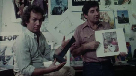
Aubrey Powell shows off the mystery object from the Presence album by Led Zeppelin.

The Hipgnosis studio occupied two floors of a building in Denmark Street, a minor thoroughfare off the Charing Cross Road that used to be a home to music publishers, rehearsal rooms and many of London’s musical instrument vendors. For a few years it was also home to the original and equally dishevelled Forbidden Planet book and comic shop, a place I first visited shortly after it opened in 1978. I always used to visit Forbidden Planet when I was in the capital but the Hipgnosis team had gone their separate ways by the time I found out they’d been based in the same street. Had I known about this earlier I probably would have wandered around for a while wondering which door led to their rooms. With its clutter and blithe disregard for client-flattering furnishings (the reception room, said Thorgerson, had nowhere to sit down) the studio was a long way from anybody’s idea of a well-appointed design business. The place reminds me of the offices occupied for many years by Savoy Books in Deansgate, Manchester: ancient, first-floor rooms whose better days were long past, with tools of the trade littering every surface, recent works-in-progress on the walls and old stickers peeling off the door. In Walk Away René, Thorgerson also admits that the studio lacked a toilet so they had to resort to pissing in a sink, a disgraceful expediency also shared by the Savoy office. In such places was art once made.

Previously on { feuilleton }
Design as virus 16: Prisms
Storm Thorgerson, 1944–2013
Hipgnosis turkeys
Peter Christopherson, 1955–2010
Storm Thorgerson: Right But Wrong

Resurrecting R’lyeh

rlyeh-2021.jpg

Then, driven ahead by curiosity in their captured yacht under Johansen’s command, the men sight a great stone pillar sticking out of the sea, and in S. Latitude 47°9′, W. Longitude 126°43′, come upon a coastline of mingled mud, ooze, and weedy Cyclopean masonry which can be nothing less than the tangible substance of earth’s supreme terror—the nightmare corpse-city of R’lyeh, that was built in measureless aeons behind history by the vast, loathsome shapes that seeped down from the dark stars. There lay great Cthulhu and his hordes, hidden in green slimy vaults and sending out at last, after cycles incalculable, the thoughts that spread fear to the dreams of the sensitive and called imperiously to the faithful to come on a pilgrimage of liberation and restoration.

HP Lovecraft, The Call of Cthulhu (1928)

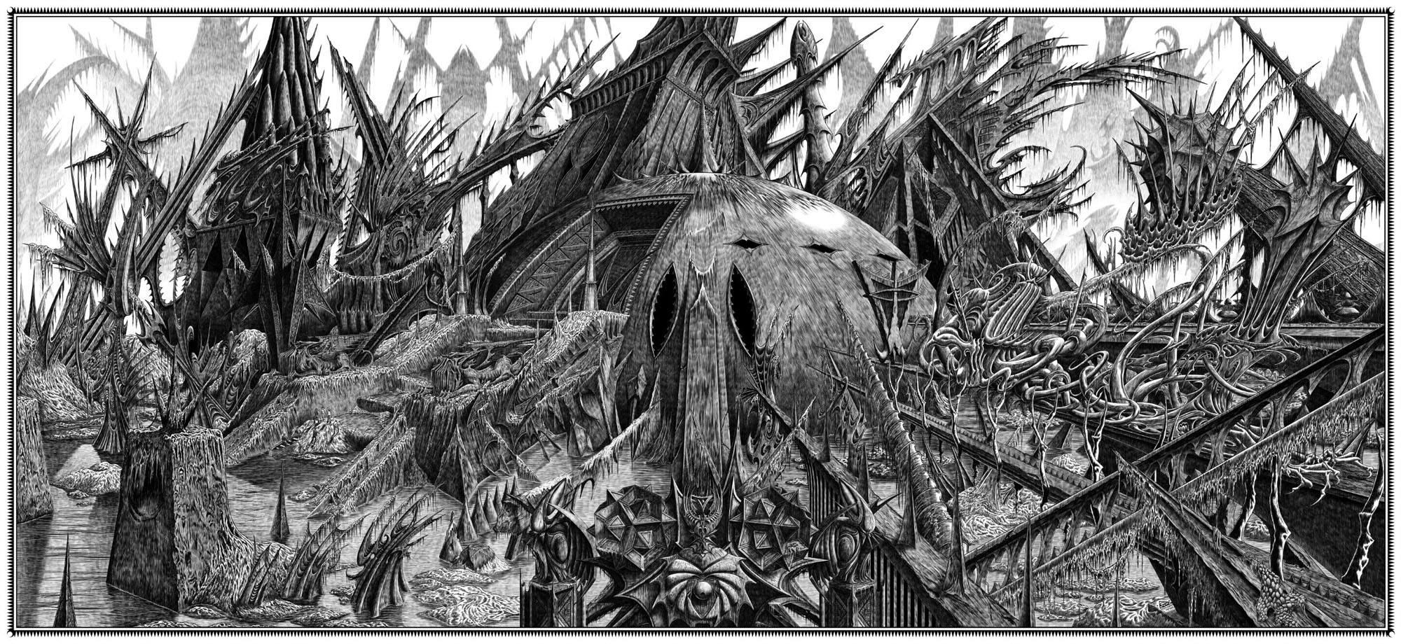
Behold the fruits of a more benevolent pilgrimage of liberation and restoration. It was just over a year ago that I decided to draw an exact replica of the R’lyeh triple-spread from my comic-strip adaptation of The Call of Cthulhu, the intention being to make the picture available as a poster-sized print once I had a print-ordering system in place. The picture may now be purchased here as a giclée print on Hahnemüle Pearl art paper. This is a big picture (870.46 x 401.15 mm or 34.27 x 15.793 ins), and unlike my other Etsy prints I’m afraid there won’t be a half-size version which means the price will remain relatively high. I’m also keeping it as a black-and-white piece despite the temptation to create a tinted version.

And so to the obvious question: why did I want to redraw a large and very detailed piece of art in the first place? Pull up a weed-festooned Cyclopean bollard and I’ll explain…

starrywisdom.jpg

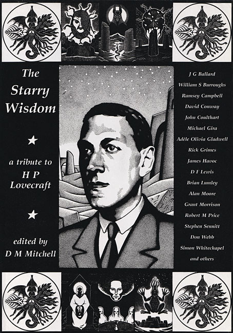
Creation Books, 1994. Cover art by Peter Smith.

I spent 17 months drawing The Call of Cthulhu, from January 1987 to May 1988, using my preferred media of the time, a 0.2 mm Rotring Variant pen on A3 sheets of Daler cartridge paper. The story took its time getting into print but it was eventually published in 1994 by Creation Books as part of The Starry Wisdom, a collection of Lovecraftian fiction edited by DM Mitchell. I was very pleased to be represented in the book but the pleasure turned to dismay when it transpired that all the artwork had vanished after the printing was done. Or almost all the artwork… To this day I don’t know whether the drawings by other artists suffered the same fate, but my Cthulhu pages disappeared along with the anatomical cross-section and the Yuggoth collage that I created specially for the collection. I still don’t know what really happened either, whether the drawings were stolen (possible), thrown away deliberately (unlikely), or thrown away accidentally (also possible). The lack of resolution to the whole business is partly my fault. Losing all that art was a painful thing to consider, and I couldn’t accuse the printer of anything when nobody could say what had happened (I was in the Creation office during one of the phone conversations between publisher and printer). The printer was also located in the middle of a rural county somewhere so journeying there would have been difficult for this non-driver, as well as being pointless if they could only tell me what I knew already. Time passed and I did my best to put the whole episode behind me.

pens.jpg

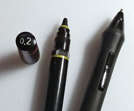
Drawing technology then and now: the Variant pen I used throughout the 1980s and the Wacom stylus I use today. That Variant nib is so fine that I have a faint ink dot tattooed on one of my knuckles from where I accidentally stabbed it into my hand. The Wacom pen looks stubby in comparison but is capable of drawing equally fine lines and much more besides.

On the plus side (there was one), the printer had done a good job of half-toning the artwork, so even though the Starry Wisdom pages are rather small the detail in the drawings is still evident. And I also had a complete set of photocopies of the A3-sized originals. I’d been working for Savoy Books since 1989 during which time making photocopies of new drawings had become second nature. Since 1994 this set of copies has become the original art for the Call of Cthulhu strip, rather like the surviving prints of Murnau’s Nosferatu which are all that anyone can see of his film today. The analogy is an apt one since it also extends to picture quality. Just as silent films always look their best when they’ve been restored from the camera negative, my Rotring drawings really need to be reproduced from the originals. The 0.2 mm pen that I insisted on using throughout the 1980s was too fine for the photocopy machines of the time, especially when my shading was so densely rendered that I might as well have been using a pencil. This isn’t so much of a problem if the pages are being reduced in size but it became one last year when I had the idea of making a print of the R’lyeh panorama that would be the same size as the original drawings. Giclée printing is an ink-jet process that reproduces fine detail with great accuracy, so while I could make full-size prints of the Cthulhu pages they’d never look better than what they were, photocopies that hadn’t fully captured the fine lines of the drawings. This wasn’t the only problem.

Continue reading “Resurrecting R’lyeh”

Weekend links 588

br.jpg

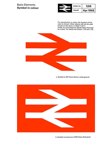
Gerry Barney’s logo for British Rail. A page from the British Rail Corporate Identity Manual (1965).

• RIP Russ Kick, writer, editor, and founder of many websites/blogs such as Rare Erotica, Books Are People Too and (notoriously) the several iterations of The Memory Hole, a space dedicated to keeping visible information that successive US governments would have preferred to remain unseen. I’d known Russ remotely for many years, initially as a reviewer of the Savoy comics in Outposts. Savoy Books later helped find him a publisher for Psychotropedia: A Guide to Publications on the Periphery, a wide-ranging overview of alternative/underground print culture in the late 1990s. In 2004 his information activism gave him a fleeting taste of world-wide attention when he forced the Bush administration to make public the photos of flag-draped coffins returning from Iraq. The scandal put his name on the front pages of newspapers that should have been finding those photos for themselves instead of cheerleading the war. A run of books for Disinformation presented his archival researches for the general reader, then in 2012 he edited The Graphic Canon, a massive three-volume collection of comics and illustrations based on classic works of literature. I was among the many contributors to the latter with an adaptation of The Picture of Dorian Gray, and would have worked on the follow-up collection of crime stories if I hadn’t been busy with other things. I had hoped that we might work together again in the future.

• “‘The new mainstream has attempted to erase the innovations of the avant-garde from jazz history,’ the film declares.” Geeta Dayal reviews Fire Music, a documentary about the jazz innovations of the 1960s.

• I don’t have the hardware to play this but Sable is a new computer game from Raw Fury whose design owes much to the desert landscapes seen in comics by Moebius.

• New/old music: Stealing Sheep and The Radiophonic Workshop reimagine the score for René Laloux’s animated science-fiction film La Planète Sauvage.

• At Spine: Savannah Cordova on how to perfect your book cover’s typography. Having recently designed an all-type cover design this is timely.

• Mixes of the week: Isolatedmix 113 by Sunju Hargun, XLR8R Podcast 714 by Soela, and Holograficzne Widmo ze Bart De Paepe by David Colohan.

• “If it ain’t broke, don’t fix it.” Gerry Barney, designer of the British Rail logo, doesn’t like the green reworking of his design.

• Scottish lord goes blood simple: a teaser for The Tragedy of Macbeth by Joel Cohen and some bloke called William Shakespeare.

• “It’s unmanageable.” Ellen Peirson-Hagger on how the vinyl industry reached breaking point.

Macbeth (1973) by John Cale | Rail (1994) by Main | Logotone (2013) by Steve Moore