Snaps: The Studio tour, 1979

snaps3.jpg

I’d been hoping that Malcolm Whitehead’s Snaps might be made public eventually, and here it is, a 25-minute film documenting the northern end of a British book-signing tour undertaken by three artists and their publisher in October 1979. Not only that, there’s also this shorter compilation of footage that didn’t make the final cut.

studio.jpg

The artists were three of the four whose work is showcased in the book known as The Studio: Jeffrey Catherine Jones, Mike Kaluta and Bernie Wrightson. The other member of the quartet, Barry Windsor-Smith, either missed the jaunt to Leeds and Manchester or avoided the tour altogether. The publisher was fellow artist Roger Dean whose success in 1975 with his own art book, Views, prompted him to turn his self-publishing imprint, Dragon’s Dream, into a bona fide publishing company. Views was followed by a short run of art books by prominent fantasy and science-fiction illustrators including Chris Foss, Ian Miller, Bruce Pennington and Syd Mead. The Studio was one of these titles, a collection of the art produced by the quartet working in the communal loft (“The Studio”) they established in Manhattan in the mid-1970s, a space intended for the production of more personal work than the comic art for which they were all known. Malcolm Whitehead’s film is unusual for documenting an event in sound and vision that usually wouldn’t be documented at all beyond a handful of photographs.

mb-db-1979.jpg

New Manchester Review, 1979: Michael Butterworth and David Britton in the Beardsley-papered Savoy office. Photo by Kevin Cummins.

The trail of circumstance that led to the creation of Snaps goes something like this: David Britton and Michael Butterworth were setting up Savoy Books in Manchester at around the same time that Roger Dean was expanding Dragon’s Dream. Both publishers had established co-production deals with Big O, a poster company, distributor and publisher of many pop-culture art books, notably the British edition of HR Giger’s Necronomicon. One of the first Savoy books in 1978 was James Cawthorn’s The Jewel in the Skull, an 80-page comic-strip adaptation of the novel by Michael Moorcock, which was a one-off co-production between Savoy and Big O. In addition to being a fledgling publisher, Savoy at this time also had a chain of bookshops in Manchester, Leeds and Liverpool, selling the usual 70s blend of genre and “cult” paperbacks, posters, comics (mainstream and underground), magazines, and so on. The main outlet was Bookchain on Peter Street, Manchester, which is where much of Snaps was filmed. Given the connection between Dragon’s Dream and Savoy I’d guess that Big O suggested the Savoy shops as venues for the Studio signing tour. Dave Britton would have been keen on this even without the extra business the signings generated for the shops. He’d bought some of the posters produced by Barry Smith’s Gorblimey Press, and always spoke highly of Smith’s Studio-era work. As for the film, Mike Butterworth was good friends with local film-maker Malcolm Whitehead, and it was he that commissioned “Malc” to document the signing. Whitehead is best known today for his subsequent involvement with Ikon, the video division of Factory Records. In addition to making Snaps, in 1979 he was also filming some of the live footage of Joy Division that’s been circulating ever since. He later directed a couple of the early New Order videos, and helped with the direction and editing of many video productions by other Factory artists and affiliated groups like The Fall and Cabaret Voltaire.

snaps1.jpg

Snaps is a short and somewhat amateurish film but it’s a valuable record all the same. Anyone today can pull out their phone and record an event like this in high-definition and stereo sound; in the 1980s and 1990s you would have needed video equipment, but in the 1970s you had to have film, and 16mm film was an expensive professional product. Whitehead was using the cheaper option of Super-8 but he did at least manage to organise synchronised sound, something you don’t get on Pirate Tape, Derek Jarman’s Super-8 record of a William Burroughs signing. Mike Butterworth provides the stentorian voiceover for Snaps which he says he now regrets. Equally regrettable is his mispronunciation of the names “Paolo and Francesca” when he’s talking about Barry Smith’s art.

snaps2.jpg

The film opens in Leeds for the first of the day’s two signings, a sequence I can’t say much about since I never visited the Leeds shop. The participants then pile into cars and drive across the Pennines where they pause for a brief Kraftwerk-soundtracked inspection of the landscape. The three Studio artists were Americans so all of this activity must have been very novel and interesting despite the drabness of the cities. The shots in Manchester are the ones I like to see since they capture Bookchain when the place was at its height of popularity. In 1979 I was still living in Blackpool and didn’t visit the shop until early in 1980 when I made a daytrip with friends to explore Manchester. By the time I moved to the city in 1982 Bookchain was set on its gradual decline although it managed to survive until the block of buildings it was part of was demolished in 1999. The basement area looks quite salubrious in the signing footage but I only knew it as a dank and unlit storage area with a toilet that belonged in a horror film. One thing that Whitehead didn’t capture was Dave Britton asking all the artists to sign the wall of the shop near the counter. I was in the place every Saturday when we were working on the Reverbstorm comics in the 1990s, and it was always a strange thing to see Roger Dean’s signature (plus dragon doodle) peeping out from behind rows of dusty shrinkwrapped books and magazines. You never see much discussion of this side of the city’s cultural history in writing about Manchester’s musical output. Yet without the Savoy shops, and other outlets like Percival’s and Grass Roots, Ian Curtis, Mark E. Smith, Howard Devoto and others would have had a harder time finding the fuel for their imaginations.

In addition to being a record of a lost place, Snaps is also a record of lost people: Jones, Wrightson, and Britton are all no longer with us, while Malcolm Whitehead died in 2019. Whitehead’s involvement with Factory Records is documented in a scattering of posts at Cerysmatic. This one seems like a good place to start.

Previously on { feuilleton }
David Britton, 1945–2020
Jeffrey Catherine Jones, 1944–2011
Roger Dean: artist and designer
Berni Wrightson’s Frankenstein

M-A-N-C-H-E-S-T-E-R

manchester.jpg

Presenting a new item for sale at Redbubble. I was intending to upload this quickly then get on with other things, but after examining the artwork it became apparent that the piece would benefit from an overhaul in order to make something that worked well at poster size. The original design dates from 2004 when I was asked by friends at the Manchester District Music Archive to contribute to a limited run of postcards they were putting together based on Manchester’s music history. Since I was working for postcard size I didn’t finesse the artwork as much as I would have done had I been working for a larger printing. What you see here is a replication of the original design at a much larger size, with a couple of details adjusted and a more substantial change in the substitution of the black-and-white photo (see below).

The original postcard set appeared two years before I began writing these posts so I’ve never had the chance to compile a list of all the references. Some of these will be familiar to Mancunians (and many Britons) of a certain age but I was trying to be allusive rather than obvious while also following three simple rules:
1) Ten panels, each one of which contains a different letter of the city’s name in a different typeface.
2) Each panel referring to a different musical trend, a notable group or venue.
3) The whole design to proceed chronologically, from the 1960s to the present day.

M.jpg

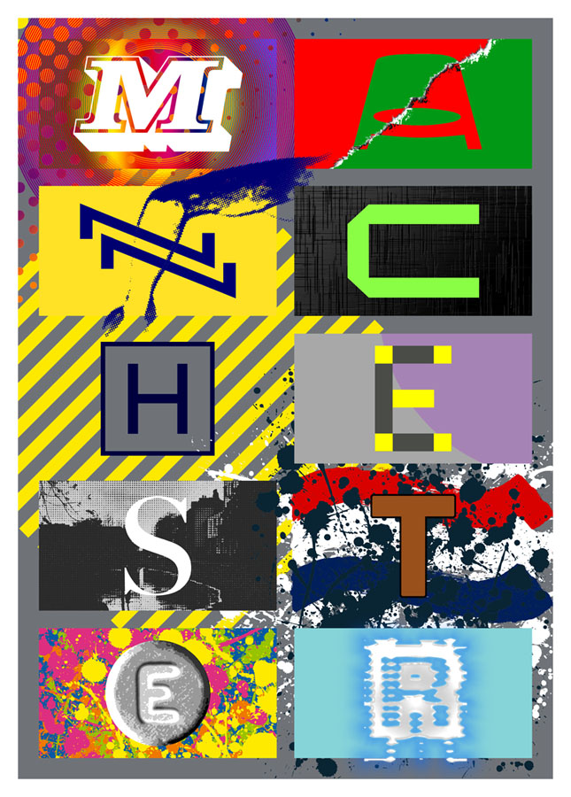
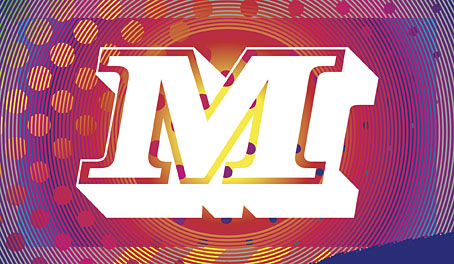
The music: Psychedelia.
The type design: Decorated 035.

The first two letters are rather vague attributions since the city didn’t have much of a national musical profile until the late 1970s. Popular Manchester groups of the 1960s included The Hollies, Herman’s Hermits, and The Mind Benders but there wasn’t a discernible Manchester scene the way there was with post-Beatles Liverpool. So “M” stands for the psychedelic era in general, while Decorated 035 is one of the typical mid-century sign fonts that you would have seen around the city.

A.jpg

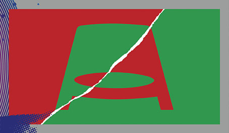
The venue/music: The Apollo Theatre/Punk.
The type design: Jackson.

“A” is for the Apollo Theatre in Ardwick Green, the city’s most prominent music venue in the 1970s, although I doubt that anyone would guess the attribution. The Art Deco building is a good venue but here’s never been anything distinctive about its signage, hence the choice of Jackson, another very decade-specific font which has conveniently wide letterforms. The rip refers to torn posters and punk graphics while the opposed green/red colour scheme is borrowed from one of the Virgin label designs of the late 70s, something that might also be taken as a very tenuous reference to the Virgin Megastore in Market Street.

N.jpg

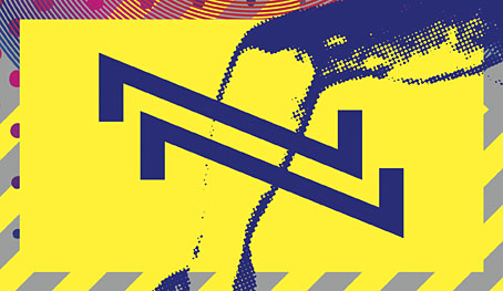
The music: Buzzcocks.
The type design: A pair of Zs from the cover of Orgasm Addict.

The first Buzzcocks single featured a striking sleeve by Malcolm Garrett (design) and Linder (collage) which provide the graphics here, with the “N” being formed by two letters from the band’s name which was printed vertically on the cover.
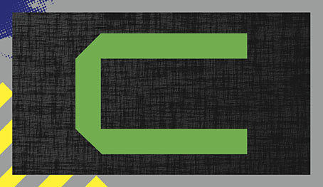

C.jpg

The music: Joy Division.
The type design: A letter from the cover of Substance.

Substance
, the first Joy Division compilation, was released in 1988 so this is a little anachronistic but Brett Wickens’ letter is a more recognisable detail than one from the cover of Closer. The textured sleeve of the group’s debut album, Unknown Pleasures, is referred to by the panel background.
Continue reading “M-A-N-C-H-E-S-T-E-R”

Fat of the Land: selected British short films, 1984–1987

fat1.jpg

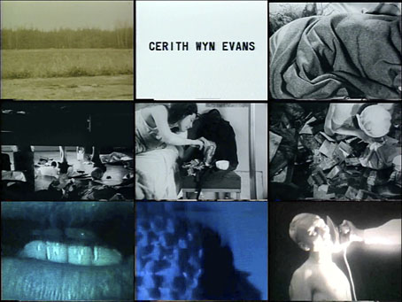
Here’s another of those film/video anthologies released on VHS in the UK in the 1980s that I never got to see at the time. Fat of the Land is a collection of student films, short video experiments and two video pieces related to the early Industrial music scene featuring 23 Skidoo and Last Few Days. The anthology appeared in 1988 as Ikon 25 on Factory Records’ video label packaged with an approving quote by Derek Jarman. Two Jarman collaborators appear within—Cerith Wyn Evans and Tilda Swinton—while director Richard Heslop (who hosts this at Vimeo) is featured in front and behind the camera in many of the pieces. Heslop is responsible for Language, the 23 Skidoo video, and dons angel wings for Maggie Jailler’s A Nosegay, a homoerotic homage to Genet and Lautréamont. Jailler’s film is my favourite but then I’m biased towards the content.

fat2.jpg

Previously on { feuilleton }
The Dream Machine
Seven Songs by 23 Skidoo

El Lissitzky record covers

genx.jpg

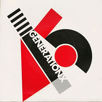
Your Generation (1977) by Generation X. Design by Barney Bubbles.

Continuing an occasional series about the work of particular artists or designers being used on record sleeves. El Lissitzky (1890–1941) is an interesting candidate in this area since his pioneering abstractions have greatly influenced subsequent generations of graphic designers. As a result of this you’re just as likely to find his Suprematist style being pastiched on an album cover as find one of his paintings decorating the sleeve. Pastiches are difficult to locate unless you already know they exist—or unless the album credits acknowledge the style they’re imitating—so this list will no doubt be incomplete.

Barney Bubbles’ design for the debut single by Generation X is the earliest example I’m aware of that makes use of the El Lissitzky style. It was also one of Bubbles’ first sleeves for a punk band, and a significant break with his often florid hippy designs.

kraftwerk1.jpg

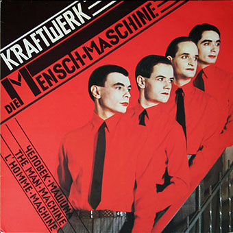
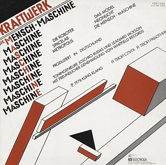
Die Mensch Maschine (1978) by Kraftwerk. Design by Karl Klefisch, “inspired by El Lissitzky”.

Kraftwerk’s seventh album uses Lissitzkian typography and graphics on its front and back covers. A very popular album with the post-punk crowd that would have been the first introduction for many people to El Lissitzky’s name. Kraftwerk still use that vibrant arrangement of black, red and white in their stage shows.

kraftwerk2.jpg

sakamoto1.jpg

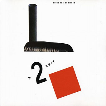
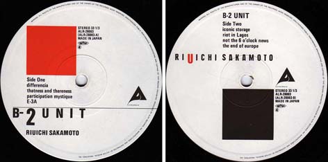
B-2 Unit (1980) by Riuichi Sakamoto. Design by Tsuguya Inoue.

More pastiche, this time borrowing from El Lissitzky’s Suprematist book for children: About Two Squares: In 6 Constructions: A Suprematist Tale (1922). The book’s two characters of a red square and a black square appear on the vinyl labels. This is a great album, incidentally, still my favourite by Sakamoto.

sakamoto2.jpg

Continue reading “El Lissitzky record covers”

Tuxedomoon designs by Patrick Roques

roques01.jpg

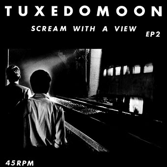
Scream With A View 12″ EP (1979) by Tuxedomoon. Design credited to Belfer/Roques.

I’m pursuing a Tuxedomoon obsession at the moment so this gives me the opportunity to examine some of the group’s early record sleeves, all of which are designed by Patrick Roques. Tuxedomoon are an American group, and their early releases were on The Residents’ Ralph Records label which is where they first encountered Roques. When the group later decamped to Europe and began releasing material on a variety of European labels they still commissioned Roques for their cover designs.

Many of the independent labels of the late 70s and early 80s have been over-examined when it comes to graphic design but I’ve yet to see anything written about Ralph Records. On the Residents albums in particular the label established their own very distinctive brand of bold graphics and cartoony illustration (Gary Panter worked on some of the sleeves). Patrick Roques’ designs are less eccentric than those on The Residents’ covers, such an approach wouldn’t have suited Tuxedomoon’s music. His designs for the group are closer to the styles seen among the independent labels in the UK which is one reason I find them attractive. The following represents a small and very selective fraction of Roques’ work as a designer.

roques02.jpg

Half-Mute (1980) by Tuxedomoon.

The first Tuxedomoon album.

roques03.jpg

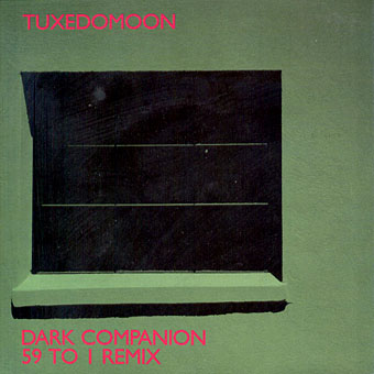
Dark Companion / 59 To 1 Remix (1980) by Tuxedomoon. Photography by Mark Sangerman.

roques04.jpg

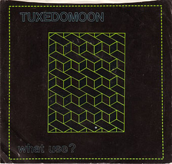
What Use? (front, 1980) by Tuxedomoon.

roques05.jpg

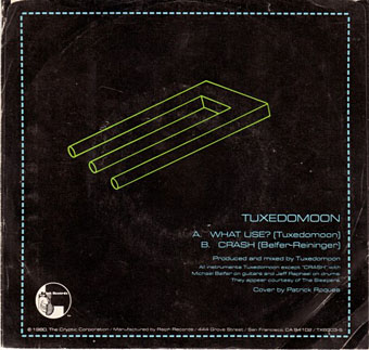
What Use? (back, 1980) by Tuxedomoon.

Continue reading “Tuxedomoon designs by Patrick Roques”