
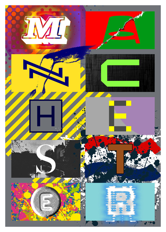
Presenting a new item for sale at Redbubble. I was intending to upload this quickly then get on with other things, but after examining the artwork it became apparent that the piece would benefit from an overhaul in order to make something that worked well at poster size. The original design dates from 2004 when I was asked by friends at the Manchester District Music Archive to contribute to a limited run of postcards they were putting together based on Manchester’s music history. Since I was working for postcard size I didn’t finesse the artwork as much as I would have done had I been working for a larger printing. What you see here is a replication of the original design at a much larger size, with a couple of details adjusted and a more substantial change in the substitution of the black-and-white photo (see below).
The original postcard set appeared two years before I began writing these posts so I’ve never had the chance to compile a list of all the references. Some of these will be familiar to Mancunians (and many Britons) of a certain age but I was trying to be allusive rather than obvious while also following three simple rules:
1) Ten panels, each one of which contains a different letter of the city’s name in a different typeface.
2) Each panel referring to a different musical trend, a notable group or venue.
3) The whole design to proceed chronologically, from the 1960s to the present day.
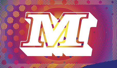
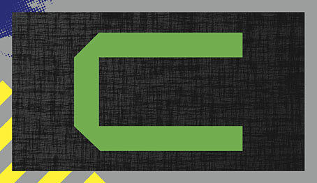
The music: Psychedelia.
The type design: Decorated 035.
The first two letters are rather vague attributions since the city didn’t have much of a national musical profile until the late 1970s. Popular Manchester groups of the 1960s included The Hollies, Herman’s Hermits, and The Mind Benders but there wasn’t a discernible Manchester scene the way there was with post-Beatles Liverpool. So “M” stands for the psychedelic era in general, while Decorated 035 is one of the typical mid-century sign fonts that you would have seen around the city.
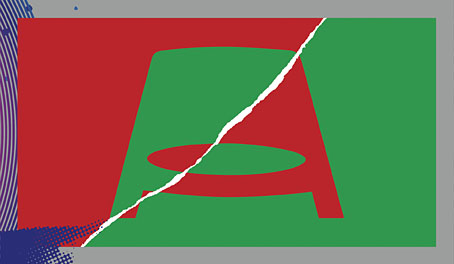
The venue/music: The Apollo Theatre/Punk.
The type design: Jackson.
“A” is for the Apollo Theatre in Ardwick Green, the city’s most prominent music venue in the 1970s, although I doubt that anyone would guess the attribution. The Art Deco building is a good venue but here’s never been anything distinctive about its signage, hence the choice of Jackson, another very decade-specific font which has conveniently wide letterforms. The rip refers to torn posters and punk graphics while the opposed green/red colour scheme is borrowed from one of the Virgin label designs of the late 70s, something that might also be taken as a very tenuous reference to the Virgin Megastore in Market Street.
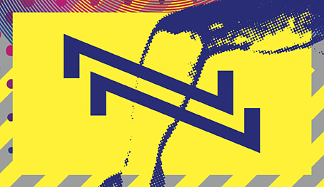
The music: Buzzcocks.
The type design: A pair of Zs from the cover of Orgasm Addict.
The first Buzzcocks single featured a striking sleeve by Malcolm Garrett (design) and Linder (collage) which provide the graphics here, with the “N” being formed by two letters from the band’s name which was printed vertically on the cover.
The music: Joy Division.
The type design: A letter from the cover of Substance.
Substance, the first Joy Division compilation, was released in 1988 so this is a little anachronistic but Brett Wickens’ letter is a more recognisable detail than one from the cover of Closer. The textured sleeve of the group’s debut album, Unknown Pleasures, is referred to by the panel background.

The venue: The Haçienda.
The type design: Gill Sans Regular.
The graphics here are based on the Peter Saville-designed Haçienda membership card, something you needed in the early days of the club in order to gain entry. Seeing the “H” isolated in this way always makes me think of a helicopter landing pad.

The music: New Order.
The type design: A letter from the cover of the Confusion single.
Peter Saville’s graphics signified “confusion” by overlaying the name of the single on the name of the group. The letter here has been de-confused by being isolated from the rest of the design.

The music: The Smiths.
The type design: Bodoni Regular.
All the Smiths’ albums and singles feature type designs applied to a borrowed photo. The Bodoni is a reference to the cover of The Queen Is Dead, while the photo is a view of the River Irwell, the narrow waterway that snakes through the centre of Manchester. (My original design used a photo of Chiswick in London which wasn’t appropriate at all). “S” can also stand for Salford, since the Irwell marks the division between Manchester and Salford. Manchester’s sister-city is referred to inside The Queen Is Dead with the famous photo of the group standing outside the Salford Lads’ Club.

The music: The Stone Roses.
The type design: Helvetica Black.
The letter, the paint splatter and the colour bars all refer to the sleeve of the Stone Roses’ self-titled debut album.

The music: Madchester/Dance.
The type design: An Ecstasy tablet.
“Madchester”, a kind of rock/dance reworking of psychedelic motifs, was typified by the garish graphics of Central Station Design, appalling fashion choices (bucket hats, big T-shirts, baggy jeans), and lots of drugs. Ecstasy was the dominant drug of the period, also for the burgeoning dance culture of the late 80s and early 90s.

The music: Ambient/IDM.
The type design: Unidentified font.
I dislike the term “IDM”—and a lot of the music classed as “ambient” is nothing of the sort—but the labels are used here for convenience. The background colour is a reference to the early Boards Of Canada releases on Manchester’s Skam label, while the bevelled, glowing letterform relates to the Photoshop-heavy artwork of the 1990s. Glitchy lettering to signify computers and their screens, glitch music, sound samples, and so on. Rather annoyingly, I can’t identify the font which is an obscure design whose name I’ve forgotten. If anyone recognises it, please leave a comment.
Previously on { feuilleton }
• Haçienda ephemera
• 1 Top Class Manager
The amount of thought and references you put into these is amazing!
Thanks, Jim. It was a lot of fun and actually very easy since I’m so familiar with the subject. I’ve lived in the city for over 40 years, it’s been difficult to avoid all this stuff when the city isn’t so big.