Painting with Light

paintbox.jpg

The Quantel Paintbox was one of the first computer systems designed to create and manipulate digital graphics in a manner that was much closer to painting and drawing than computer programming. The technology was launched in 1981, and was essentially Photoshop ten years before Adobe Inc. announced its own image-editing system. Rather like the Fairlight CMI, being a pioneer had its disadvantages for Quantel, one of them being the enormous expense of the Paintbox system. Photoshop was never really cheap if you were buying it new but it was still only a software package; with the Fairlight and the Paintbox you also had to buy the computer and all the peripherals that ran the software. Consequently, Paintbox systems were mostly used by TV studios for on-screen graphics during throughout the 1980s, although Quantel also created a parallel system for print graphics which was used for image processing and photo collaging until Macintosh and Adobe started to dominate design studios.
pwl1.jpg

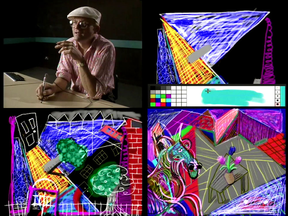
David Hockney.

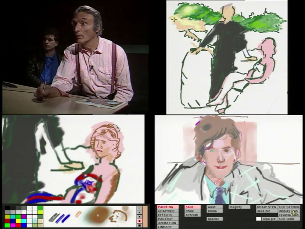
Painting with Light was a BBC series intended to explore Quantel’s technology by inviting six artists to spend a day playing with the Paintbox. It was the recent news about David Hockney that reminded me of this series. I definitely remember watching the first episode when it was broadcast in 1987 but couldn’t recall anything of the rest, which suggests I may not have seen them all. Each episode is narrated by Leslie Megahey who also receives a credit as executive producer. Nearly everything that Megahey was involved with at the BBC had some connection with art or painting which suggests the series may have been his idea.
pwl2.jpg

Larry Rivers.

It’s been fascinating watching these programmes after 40 years of technological development. In 1987 I was working with pens and sheets of paper most of the time, and didn’t give much thought to the idea of creating computer art since all the most interesting gear was prohibitively expensive. How things change… I now find myself watching the reactions of these artists as they struggle with a rudimentary version of the kind of technology I use every day. I also sympathise with their frustrations. The Paintbox was a magical device for the time but the brush settings are very limited when compared to the endless variety that Photoshop offers. The drawing table and stylus of the Paintbox are also big and bulky in comparison to one of today’s small and very precise Wacom tablets.
pwl3.jpg

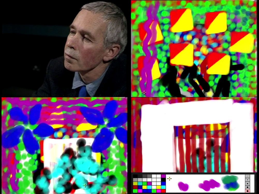
Howard Hodgkin.

David Hockney was an obvious choice to open the series when he was often described as “Britain’s favourite artist”. Popularity aside, he was a good choice for his restless curiosity and interest in all forms of pictorial representation. That curiosity prompted his famous and controversial theories about the use of optical devices in the creation of paintings from the Renaissance on; it also kept him experimenting with different media, leading eventually to the iPad paintings he was making in the last years of his life. Of the other contributors we have an American Pop artist (Larry Rivers), a British abstract painter (Howard Hodgkin), an Australian painter (Sidney Nolan), an American painter (Jennifer Bartlett), and a British Pop artist (Richard Hamilton).
pwl4.jpg

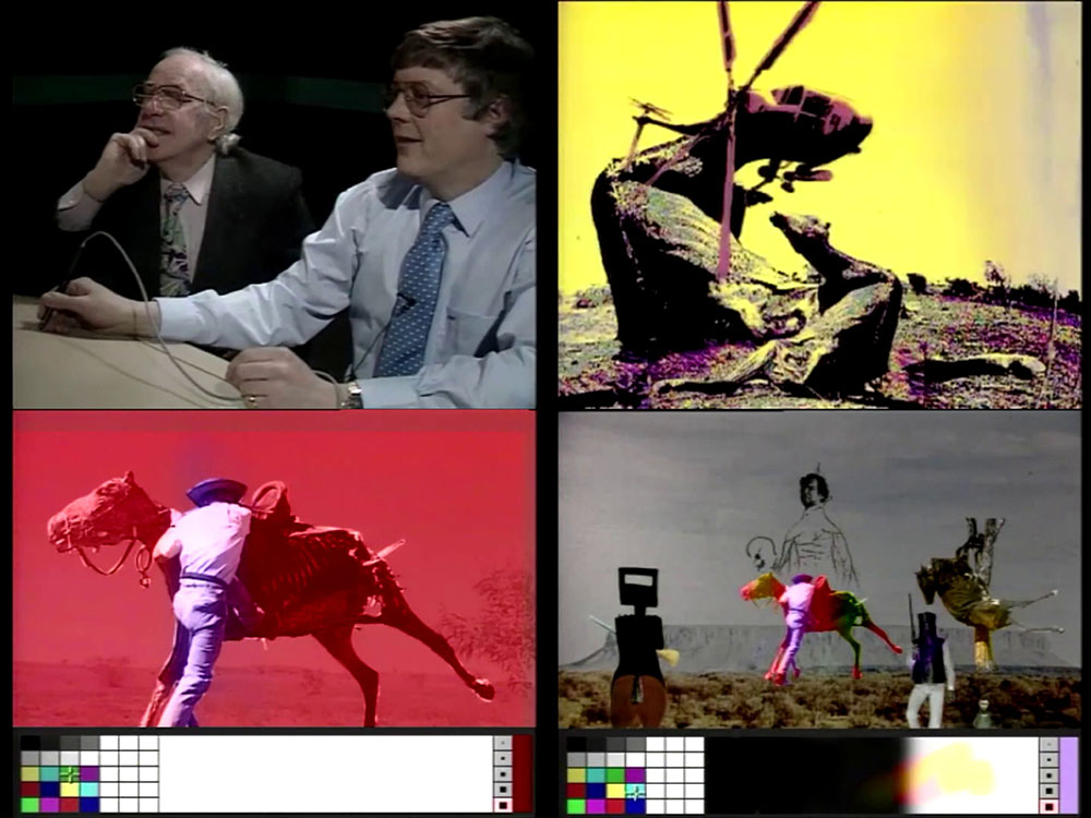
Sidney Nolan.

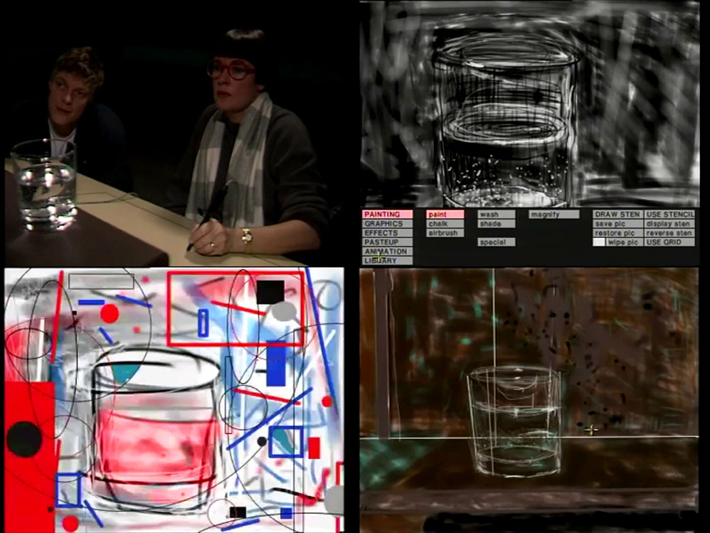
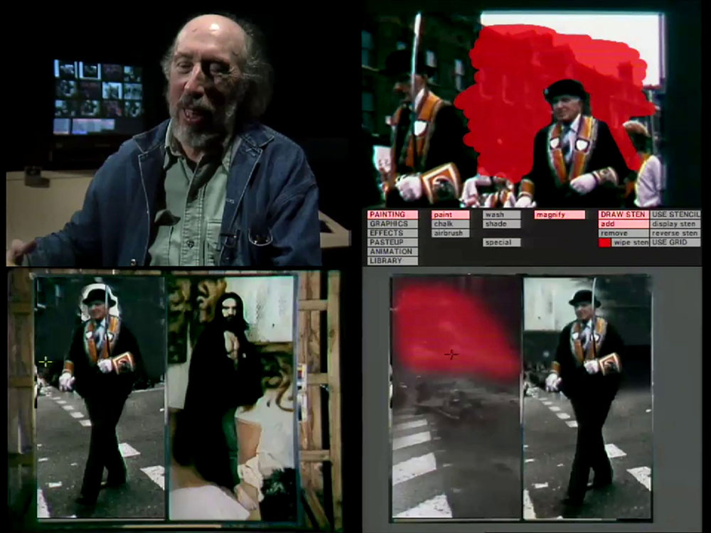
Hockney and Bartlett both use the technology for painterly improvisation, with Hockney drawing continually over the same piece, while Bartlett draws different versions of a glass of water. The latter sounds boring but her curiosity about the new medium makes her the only artist of the six to try out all the available drawing tools. Rivers, Nolan and Hamilton all begin with scanned photographs which they manipulate in various ways, Rivers by painting over his, Nolan (via a Quantel assistant) creating photographic collages that are forerunners of the familar Photoshop style.
pwl5.jpg

Jennifer Bartlett.

Hamilton does something similar but also takes over from the Quantel assistant in order to paint onto the image in a much more careful manner than the rest. Of the six artists he’s the only one who attempts to create something that might be exported as a properly finished piece. He also notices how the cut-and-paste concept which was becoming widespread in word processing was now applicable to digital graphics. As for Hodgkin, I’ve always regarded him as a limited and not very interesting abstractionist, so it was no surprise to see him creating a pixel imitation of the same lines and blobs he was always doing in his paintings. Hodgkin’s film is the least interesting one to watch but his encounter with the technology is just as revealing about his character as an artist as the other films are for the individuals involved.
pwl6.jpg

Richard Hamilton.

• Further reading: The Quantel Paintbox
Rebel Ready-Made

duchamp1.jpg

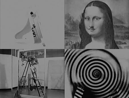
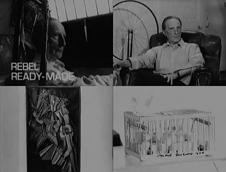
I think I spotted across this one while searching for more Robert Hughes, in which case I offer grudging thanks to the algorithms of the Great Panopticon. If you’ve ever seen Marcel Duchamp talking about his work in an arts documentary then it’s probable that the clip will have been taken from this film. (The Shock of the New is no exception.) Rebel Ready-Made was directed by Tristram Powell for a short-lived BBC arts series, New Release, and broadcast in June 1966 to coincide with a major Duchamp retrospective at the Tate Gallery, London. It’s fascinating for number of reasons, mostly the way that Duchamp is happy to talk about his sporadic art career, an occupation that in its mature phase consisted of spasms of invention followed by increasing boredom and a wandering off to do something else. The ease with which he did all this—the inventions which in other hands would have fuelled entire careers, and then the eventual abandonment of the whole art game—always made a sly mockery of the self-importance that sustained the art world in the 20th century.

duchamp2.jpg

Elsewhere in the film you get praise for Duchamp from Robert Rauschenberg and John Cage, plus the artist’s friend Richard Hamilton, seen briefly painting the replica of The Large Glass that appeared in the Tate exhibition as a substitute for the fragile original. This has been my favourite of Duchamp’s works since I saw the replica in the Tate a decade later. Having a duplicate stand in for the original isn’t such an unusual thing for Duchamp when most of his ready-made sculptures are also copies, the “originals” having been lost or destroyed shortly after their first exhibitions. From the 1930s on, Duchamp had also been making multiple copies of all his works in miniature for the various iterations of the Boîte-en-valise, or portable museum.

Tristram Powell was lucky to capture the artist being so talkative at such a late date. Two years after this Duchamp was dead, although there was one last surprise in store. Jasper Johns referred to Étant donné as “the strangest work of art in any museum”. Duchamp never acknowledged the existence of this life-size peepshow while he was alive, preferring it to be announced to the public only after his death, which is what happened in 1969. There are no replicas of this one; if you want to see it (or the parts of it the artist allows you to see) you have to go to Philadelphia and peer through the holes in the door.

Previously on { feuilleton }
Televisual art
Chance encounters on the dissecting table
The Witch’s Cradle by Maya Deren
Audio Arts
8 x 8: A Chess Sonata in 8 Movements
Anémic Cinéma
Dreams That Money Can Buy
Entr’acte by René Clair
View: The Modern Magazine

Dubliners

clarke.jpg

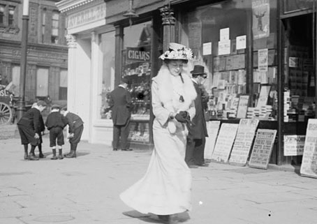
Woman walking past a stationery shop on O’Connell (Sackville) Street. Photo by JJ Clarke.

This year is the centenary of James Joyce’s short-story collection, Dubliners, so the book provides a predominant theme for this year’s Bloomsday. Not a great departure when both Dubliners and Ulysses concern the inhabitants of the same city. Dubliners would have been published before 1914 but the book was refused by several publishers and printers who objected to Joyce’s brand of realism.

The picture above is from a selection of photos of Dublin’s citizens by JJ Clarke, all of which were taken during the time depicted in Dubliners and Ulysses. Elsewhere:

• In honour of the Dubliners centenary 15 writers were asked to create new stories as a response to Joyce’s originals. Eimear McBride is one of the contributors. The Guardian posted her response to Ivy Day in the Committee Room, and she writes about Dubliners here.

• An introduction to Dubliners by Anthony Burgess, written in 1986 then never published, with illustrations by Louis le Brocquy.

James Longenbach reviews The Most Dangerous Book: The Battle for James Joyce’s ‘Ulysses’ by Kevin Birmingham.

Richard Hamilton‘s series of drawings and prints based on Ulysses are on display at the British Museum.

• Stefany Anne Golberg on the old people, young people, and priests of Dubliners.

• Illustrations by Robert Berry for Dubliners‘ final story, The Dead.

Previously on { feuilleton }
Covering Joyce
James Joyce in Reverbstorm
Joyce in Time
Happy Bloomsday
Passages from James Joyce’s Finnegans Wake
Books for Bloomsday

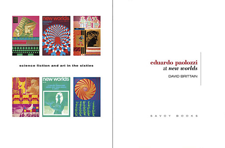
Eduardo Paolozzi at New Worlds

paolozzi00.jpg

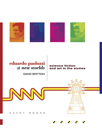
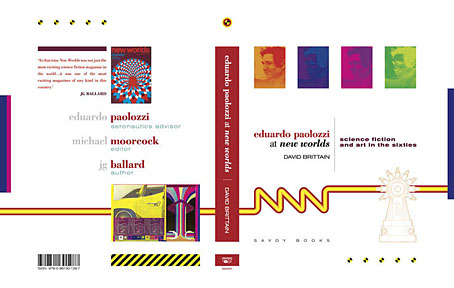
I was working on this book throughout the autumn, and it could hardly be more different to some of the visual extravagance that came before and after. Eduardo Paolozzi at New Worlds is published by Savoy Books this month. Predominantly an examination by David Brittain (no relation to David Britton) of the connections between artists such as Paolozzi and Richard Hamilton with New Worlds magazine in the 1960s, the book is also a rare study of the science fiction magazine when it was making its greatest impact in the late 60s and early 70s.

Brittain highlights many examples of Paolozzi’s sf-influenced art of the period, and examines the development of the magazine under Michael Moorcock’s editorship during which time New Worlds evolved from being a slightly moribund sf title in the early 60s to what JG Ballard later called “one of the most exciting magazines of any kind in this country”. An appendix features interviews with some of the key creators and contributors: editor Moorcock, designer Charles Platt, art editor Christopher Finch, contributor Michael Butterworth, and critic John Clute. Writer and illustrator Pamela Zoline created some original artwork for the endpapers. The introduction is by Rick Poynor.

paolozzi01.jpg

Despite being pressured for time I was very pleased to be designing this book. I’d liked Paolozzi’s work since I first encountered it in the Tate Gallery in the 1970s; a couple of years later I was buying up anthologies featuring New Worlds stories (I was too young for the 60s magazine), so discovering that Moorcock had made Paolozzi the magazine’s “Aeronautics Advisor” made perfect sense. In the past I’ve said that New Worlds ruined my taste for hard sf but that’s not really true since I never really liked the stuff beyond a few Arthur C. Clarke books. Too much bad writing, too many cardboard characters shuffling around between chunks of explanation about made-up technology. The discovery of New Worlds merely demonstrated that there were other ways of approaching sf, and you didn’t have to put up with the rubbish.

I also enjoyed the magazine’s bolshy attitude, a quality shared by Harlan Ellison in his Dangerous Visions anthologies. Moorcock says in Brittain’s interview that NW sympathised with the Underground of the late 60s but also tried to be more disciplined in its approach, especially where the design was concerned. You couldn’t have treated fiction to the semi-legible printing that Oz and Frendz often deployed. But the radical attitudes of the Underground can be discerned in the stance NW adopted. Some of the reviews and polemical articles by Moorcock (often under his “James Colvin” pseudonym), M. John Harrison and John Clute are bracingly vitriolic to a degree which if delivered today would probably see them ostracised for life.

paolozzi02.jpg

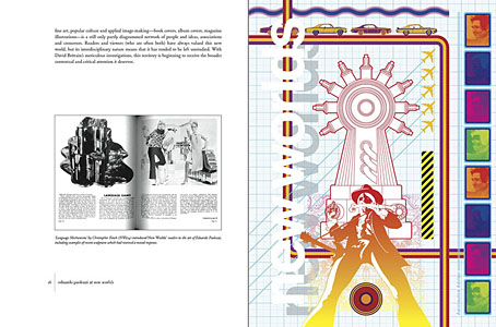
With the design the main intention was to present the information clearly and let the visuals speak for themselves. The book is heavily illustrated throughout, with many examples of Paolozzi’s marvellous prints. The layout nods obliquely to the period; before getting started I spent some time looking at the work of Erik Nitsche. I like the way Nitsche laid out the books he designed in the 1960s, and there’s also a connection in his work as a designer for the General Dynamics corporation: one of Paolozzi’s print series of the period is entitled General Dynamics F.U.N.

Being full-colour throughout, the print run for this book is smaller than usual so anyone interested is advised to move swiftly. Official publication is December 16th but it’s on sale now at Savoy and at Amazon.

paolozzi03.jpg

Continue reading “Eduardo Paolozzi at New Worlds”

Richard Hamilton, 1922–2011

whitealbum.jpg

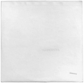
The Beatles aka The White Album (1968) by The Beatles. Design by Richard Hamilton.

Hamilton admires Hunger but he has little time for the other Young British Artists. He can’t imagine a conversation with Tracey Emin lasting more than five minutes – too tedious! – and though he was quite interested in Hirst’s sharks, his paintings bore him half to death. He believes that this generation is “ignorant… they have no understanding of art history. [Their work] is a waste of time. So much of what they’re doing has already been done, and not only by Duchamp, even. You think: you’re 50 years too late, mate.” Don’t even get him started on Sarah Lucas and her antics with cigarettes.

Richard Hamilton: A masterclass from the father of pop art

A few words to note the passing of British artist Richard Hamilton whose death was announced this week. I’ve retained an affection for Hamilton’s work over the years for a couple of reasons. As the creator of the 1956 collage Just What is it that Makes Today’s Homes So Different, So Appealing? he inadvertently gave a name to the emerging Pop Art movement with which he was to be indelibly connected, and I’ve written a few times here about my teenage enthusiasm for Pop Art and Surrealism. Hamilton’s work was more familiar to me at the age of 13 than that of many other artists. I responded to the immediacy of Pop Art even though it was over by the 1970s, just as I responded to the inherent weirdness of Surrealism which at that time was back in fashion. On my first visit to London in the mid-70s I rushed to the Tate Gallery (as Tate Britain was then known) to see some of the paintings and sculptures I’d been reading about in art books, and it was one of Hamilton’s works that stood out on that first visit, Swingeing London 67 (f), his painting of Mick Jagger’s drug arrest which I knew from photos although I hadn’t seen it in colour before. Most surprising—and something which reproductions still don’t quite convey—was seeing the pieces of metal stuck onto the canvas to form the handcuffs on the wrists of Jagger and Robert Fraser. It was already a shock that day being in one of the world’s major art galleries; it was even more of a shock to see this painting whose metal elements gave it a vivid presence beyond the pictorial surface as though it was caught halfway between painting and sculpture. It’s a presence which brings to the fore the “aura” which Walter Benjamin discusses in The Work of Art in the Age of Mechanical Reproduction (1936), an atmosphere possessed by an original work which will always be absent from a reproduction.

Another work I was fascinated by that day was the 1966 version of Marcel Duchamp’s The Bride Stripped Bare by Her Bachelors, Even (aka The Large Glass) which Hamilton had meticulously copied from the original at the Philadelphia Museum of Art. Hamilton made copies of a number of Duchamp’s works with the artist’s permission, and while his painting of Mick Jagger may have its own substantial aura, his Duchamp copy also has an aura of its own despite being a reproduction. What would Walter have made of that, I wonder? Duchamp is the first conceptual artist, and some trace of his inspiration can be found in Hamilton’s design two years later for The White Album, the 1968 release by The Beatles whose blank sleeve with its embossed name and unique serial number made it the first conceptual album cover. Hamilton has never received the same credit for this as Peter Blake receives for his Sgt. Pepper sleeve. On the packaging for the recent White Album CD acknowledgement was given to the designers who put the reissue together but the only mention of Hamilton was in the tiny list of thanks from the original printing. It’s a small detail from a long career but we can at least remember his contribution to music history today.

Guardian obituary | Richard Hamilton in pictures | Richard Hamilton’s altered images