
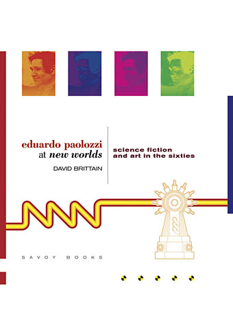
I was working on this book throughout the autumn, and it could hardly be more different to some of the visual extravagance that came before and after. Eduardo Paolozzi at New Worlds is published by Savoy Books this month. Predominantly an examination by David Brittain (no relation to David Britton) of the connections between artists such as Paolozzi and Richard Hamilton with New Worlds magazine in the 1960s, the book is also a rare study of the science fiction magazine when it was making its greatest impact in the late 60s and early 70s.
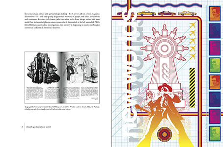
Brittain highlights many examples of Paolozzi’s sf-influenced art of the period, and examines the development of the magazine under Michael Moorcock’s editorship during which time New Worlds evolved from being a slightly moribund sf title in the early 60s to what JG Ballard later called “one of the most exciting magazines of any kind in this country”. An appendix features interviews with some of the key creators and contributors: editor Moorcock, designer Charles Platt, art editor Christopher Finch, contributor Michael Butterworth, and critic John Clute. Writer and illustrator Pamela Zoline created some original artwork for the endpapers. The introduction is by Rick Poynor.
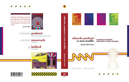
Despite being pressured for time I was very pleased to be designing this book. I’d liked Paolozzi’s work since I first encountered it in the Tate Gallery in the 1970s; a couple of years later I was buying up anthologies featuring New Worlds stories (I was too young for the 60s magazine), so discovering that Moorcock had made Paolozzi the magazine’s “Aeronautics Advisor” made perfect sense. In the past I’ve said that New Worlds ruined my taste for hard sf but that’s not really true since I never really liked the stuff beyond a few Arthur C. Clarke books. Too much bad writing, too many cardboard characters shuffling around between chunks of explanation about made-up technology. The discovery of New Worlds merely demonstrated that there were other ways of approaching sf, and you didn’t have to put up with the rubbish.
I also enjoyed the magazine’s bolshy attitude, a quality shared by Harlan Ellison in his Dangerous Visions anthologies. Moorcock says in Brittain’s interview that NW sympathised with the Underground of the late 60s but also tried to be more disciplined in its approach, especially where the design was concerned. You couldn’t have treated fiction to the semi-legible printing that Oz and Frendz often deployed. But the radical attitudes of the Underground can be discerned in the stance NW adopted. Some of the reviews and polemical articles by Moorcock (often under his “James Colvin” pseudonym), M. John Harrison and John Clute are bracingly vitriolic to a degree which if delivered today would probably see them ostracised for life.
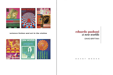
With the design the main intention was to present the information clearly and let the visuals speak for themselves. The book is heavily illustrated throughout, with many examples of Paolozzi’s marvellous prints. The layout nods obliquely to the period; before getting started I spent some time looking at the work of Erik Nitsche. I like the way Nitsche laid out the books he designed in the 1960s, and there’s also a connection in his work as a designer for the General Dynamics corporation: one of Paolozzi’s print series of the period is entitled General Dynamics F.U.N.
Being full-colour throughout, the print run for this book is smaller than usual so anyone interested is advised to move swiftly. Official publication is December 16th but it’s on sale now at Savoy and at Amazon.
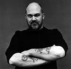 Thomas Disch castigating a science fiction readership which often regarded his work with a disdain born of narrow expectations. Disch (left), who took his own life a few days ago, was one of the
  NEW YORK, city of contrasts! Here we are on Fourteenth Street, walking past The New School Graduate Faculty, a clean modern building. Inside it today there is a fine museum exhibit of surreal landscape photography, but the drapes are permanently closed across the windows because, out here on the stained sidewalk, just the other side of the plate-glass, it’s Filth City, peopled by the usual cast of winos, monte dealers. shopping-bag ladies festooned in rags and mumbling obscenities, addicts nodding out and falling off fire hydrants. Fourteenth Street, clientele from Puerto Rico, merchandise from Taiwan. And what merchandise! In stores as garish and impermanent as sideshows at a cheap carnival, here are plastic dinner-plates and vases, plastic toys, plastic flowers and fruit, plastic statues of Jesus, plastic furniture, plastic pants and jackets-all in Day-Glo colors, naturally. And outside the stores are dark dudes in pimp-hats and shades, peddling leather belts, pink and orange wigs, and afro-combs… itinerant vendors of kebabs cooked over flaming charcoal in aluminium handcarts… crazy old men selling giant balloons.., hustlers of every description. And further on, through the perpetual fanfare of disco music and car horns, past the Banco Populare, here is Union Square, under the shadow of the Klein Sign. Klein’s, a semi-respectable old department store, was driven out of business by the local traders and has lain empty for years. But its falling apart facade still looms over the square, confirming the bankrupt status of the area. While in the square itself—over here, brother, here, my man, I got ’em, loose joints, angel dust, hash, coke. THC, smack, acid, speed, Valium, ludes. Seconal. Elavil!