Weekend links 46

finalprogramme.jpg

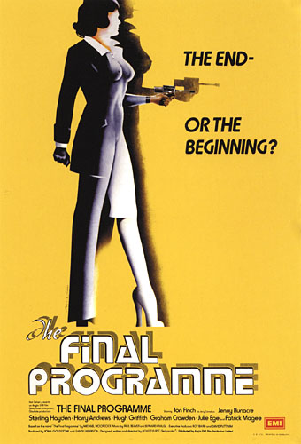
The Final Programme (1973). Philip Castle’s poster art implied the androgynous finale of Moorcock’s novel which the film itself evaded.

They were musty-smelling 10p messages from the futuristic past, complete with cover designs (and content) that were unlike anything I’d seen before. I’m fairly certain that this was how I first came across Michael Moorcock, in an early-70s Mayflower paperback, with a psychedelic cover by Bob Haberfield.

(…)

Moorcock steered New Worlds towards a set of concerns that chimed with the times; this was the period ruled by Marshal McLuhan and RD Laing, and the exploration of “inner space” seemed just as interesting as the “outer space” of satellites and moonshots. This turn was controversial, not just with die-hard pulp fans, but, surprisingly, with people such as the pop artist Richard Hamilton, another denizen of the London scene. “He thought we were turning science fiction into something namby-pamby, losing its roots,” Moorcock says. “He wanted explosions and spaceships and robots.”

When Hari Kunzru met Michael Moorcock, a major feature on a great writer and cultural catalyst. Kunzru posted the full transcript of their conversation here. Jovike’s Moorcock Flickr set has many of the lurid Mayflower covers.

• Moorcock is among the contributors to the forthcoming Thackery T. Lambshead Cabinet of Curiositities. io9 posted a list of contents (and one of my pics) while co-editor Jeff VanderMeer added some detail.

• So long to The White Stripes whose dissolution was announced earlier in the week. We know they’ll be back one day. Jay Babcock gave them their first major interview for the LA Weekly in 2000 which he’s reposted here.

Mister Blues (1962) by Lasry-Baschet aka Structures Sonores, a rare 7″ single showcasing the unique glass-and-metal sounds of the Cristal Baschet. Young Teddy Lasry on clarinet was playing in prog-jazz outfit Magma a few years later. Related: John Payne on Magma and The Mars Volta.

Here’s one thing that changed me: a close reading of Flannery O’Connor’s Mysteries and Manners. In it, she says that, “it is the business of fiction to embody mystery through manners,” manners being those concrete details — depictions of the real — in story. “Mystery through manners…” I had never heard a modern author seeking deep metaphysical mystery through realism before. Well, sure, Robert Musil, Bruno Schulz, Robert Walser, and a handful of other personal faves. By deep mystery I mean, mystery about our relationship with the planet, not anthropocentric mystery. I get sick of thinking about humans quickly, as we only constitute about 1% of what’s happening in our universe, if that much, and it was refreshing to me to hear O’Connor critiquing Henry James’ idea that modern people should aspire to know nothing of mystery, to be completely rooted in humanity. That notion makes me feel like hurling myself off a cliff. In her opinion, great literature seeks to embrace and express mystery through its mimicry of actual mannerisms. Mystery — fantasy — through the real. And with that, the borders between fantasy and realism were completely transgressed in my brain. Suddenly, I saw them as two good means to the same end. This made me excited to write real human situations again.

Trinie Dalton is interviewed here.

• And speaking of mystery through the real, there’s London Intrusion, a sequence of metropolitan adumbrations by China Miéville. Am I the only person to spot an intrusion of a different kind in the presence there of one of Eugène Atget’s Parisian views? There’s a doorway to Viriconium in that curious wedge of buildings but nobody can tell you where.

Rupert Murdoch—A Portrait of Satan. Adam Curtis on top form looking at the Dirty Digger’s career and a reminder of why some of us have always called one of his rags The Scum. A key point for me: Murdoch’s insecure railing against “elites”, a favourite term of aspersion on his Fox News network.

• Rick Poynor asks What Does JG Ballard Look Like? Related: “…only two people in Bucharest are going to read this.” Eduardo Paolozzi in conversation with JG Ballard and Frank Whitford, 1971.

How many days does Bill Murray’s character really spend reliving Groundhog Day?

• Silent Porn Star explores The Translucent Beauty of Androgyny.

Ballets Russes brought back to life on film, and also here.

Dewanatron Electronic Music Instruments.

RIP Tura Satana. Remember her this way.

Warm Leatherette (1978) by The Normal | Warm Leatherette (1982) by Grace Jones | Warm Leatherette (1998) by Chicks On Speed.

The Metamorphoses of Don José

velasquez1.jpg

Las Meninas (1656) by Diego Velázquez.

The sight of one of Picasso’s many versions of Las Meninas (The Maids of Honour) by Velázquez earlier this week prompts this post. An endlessly fascinating painting whose influence runs through three hundred years of art history. That influence isn’t so surprising if you consider this as a painter’s painting; it certainly never seems to figure in the canon of favourite works among the wider public. But artists are beguiled by the games it plays with our ways of seeing: a self-portrait of the artist painting a subject (the royal couple) standing where the viewer would be, with the couple seen in reflection in the mirror on the back wall. We are the watchers and the watched. Wikimedia Commons has a decently large copy of the painting.

velasquez2.jpg

I’ve long been fascinated by the detail of the queen’s chamberlain, Don José Nieto Velázquez, standing on the steps at the back of the picture. Lines of perspective draw our attention to his figure, not only the perspective of the room but also the line which can be drawn across the heads of the three figures in the foreground right. I always look to see how Don José is treated in subsequent variations, some of which appear below.

goya.jpg

Las Meninas, after Velázquez (c. 1778) by Francisco de Goya y Lucientes.

One of the commonplaces of contemporary art is artworks about other artworks. Goya’s etching shows that this idea is by no means a new one. Goya was apparently dissatisfied with his attempt, and its main interest is the degree to which he distorts various parts of the picture.

clarke.jpg

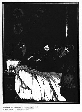
The Facts in the Case of M Valdemar (1919) by Harry Clarke.

Harry Clarke scholar Nicola Gordon Bowe proposed in The Life and Work of Harry Clarke (1989) that the figure in the background of this Poe illustration was a version of Don José. Clarke’s picture also has a similar grouping of foreground figures which adds to the speculation. The division of space in the Velázquez painting would have held considerable appeal for an artist used to dealing with similar divisions in his stained glass window designs. Will at A Journey Round My Skull recently uploaded a set of high-resolution scans of Clarke’s Poe drawings and paintings.

picasso.jpg

Las Meninas (after Velazquez) (1957) by Pablo Picasso.

In the 1950s Picasso took to producing a series of variations on favourite paintings. There are 44 versions of Las Meninas, some more abstract than others. This one reminds me of Guernica and I like the humour of presenting Velázquez’s dog—one of the great dogs of art history—as though it’s been drawn by Nicolas Pertusato, the child who attempts to rouse the animal with his foot. Velázquez here has a head surmounting a spindly body comprised of the Order of Santiago cross.

dali.jpg

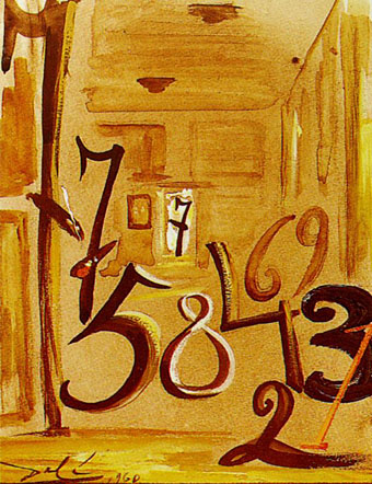
Las Meninas (1960) by Salvador Dalí.

Salvador Dalí venerated Velázquez and he happily quoted other artists throughout his career so it’s no surprise to find variations of Las Meninas. This wins the award for the most eccentric, with the figures reduced to numerals. Closer examination shows it to be quite clever the way each number corresponds to a different figure. The use of the number 7 for the artist and for Don José makes sense when you consider that they share the same surname. Don José turns up alone is another painting the same year, a work entitled Maelstrom: Portrait of Juan de Pareja fixing a string of his mandolin.

hamilton.jpg

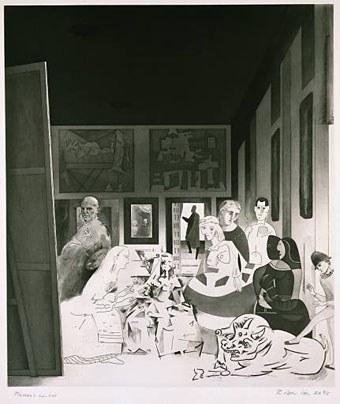
Picasso’s Meninas (1973) by Richard Hamilton.

Richard Hamilton’s aquatint is equally playful, substituting Velázquez with Picasso and his works.

haunter.jpg

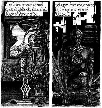
The Haunter of the Dark (1986).

I seem to have referred to my own work quite a lot recently, and here’s some more of it. The panel on the right quotes from Harry Clarke’s Poe illustration and so can be considered as continuing a trace element of the shadowy Don.

witkin.jpg

Las Meninas (Self Portrait) (1987) by Joel-Peter Witkin.

Joel-Peter Witkin has quoted Picasso’s works frequently in his photo-tableaux so the Picasso-esque figure on the right is perhaps inevitable. Witkin also has a considerable fondness for dead things so it’s quite likely that the dog in this photograph isn’t sleeping.

I’ll be surprised if there haven’t been a lot more variations during the past twenty years. If anyone knows of any which are better than this item by Antonio Guijarro Morales, please leave a comment.

Previously on { feuilleton }
Picasso-esque
Reflections of Narcissus
My pastiches
Guernica, seventy years on
The art of Harry Clarke, 1889–1931

Barney Bubbles: artist and designer

barney1.jpg

Image-heavy post! Please be patient.

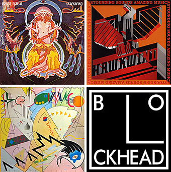
Four designs for three bands, all by the same designer, the versatile and brilliant Barney Bubbles. A recent reference over at Ace Jet 170 to the sleeve for In Search of Space by Hawkwind made me realise that Barney Bubbles receives little posthumous attention outside the histories of his former employers. Since he was a major influence on my career I thought it time to give him at least part of the appraisal he deserves. His work has grown in relevance to my own even though I stopped working for Hawkwind myself in 1985, not least because I’ve made a similar transition away from derivative space art towards pure design. Barney Bubbles was equally adept at design as he was at illustration, unlike contemporaries in the album cover field such as Roger Dean (mainly an illustrator although he did create lettering designs) and Hipgnosis (who were more designers and photographers who drafted in illustrators when required).

Colin Fulcher became Barney Bubbles sometime in the late sixties, probably when he was working either part-time or full-time with the underground magazines such as Oz and later Friends/Frendz. He enjoyed pseudonyms and was still using them in the 1980s; Barney Bubbles must have been one that stuck. The Friends documentary website mentions that he may have worked in San Francisco for a while with Stanley Mouse, something I can easily believe since his early artwork has the same direct, high-impact quality as the best of the American psychedelic posters. Barney brought that sensibility to album cover design. His first work for Hawkwind, In Search of Space, is a classic of inventive packaging.

Update: BB didn’t work with Mouse in SF, I’ve now been told.

in_search_of_space.jpg

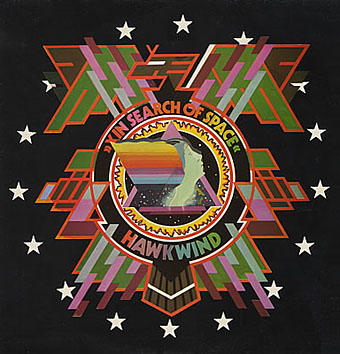
Hawkwind: In Search of Space (1971).

It’s fair to say that Hawkwind were very lucky to find Barney Bubbles, he immediately gave their music—which was often rambling and semi-improvised at the time—a compelling visual dimension that exaggerated their science fiction image while still presenting different aspects of the band’s persona. In Search of Space is an emblematic design that opens out to reveal a poster layout inside. One of the things that distinguishes Barney Bubbles’ designs from other illustrators of this period is a frequent use of hard graphical elements, something that’s here right at the outset of his work for Hawkwind.

This album also included a Bubbles-designed “Hawklog”, a booklet purporting to be the logbook of the crew of the Hawkwind spacecraft. I scanned my copy some time ago and converted it to a PDF; you can download it here.

Continue reading “Barney Bubbles: artist and designer”