Works of Calder

calder1.jpg

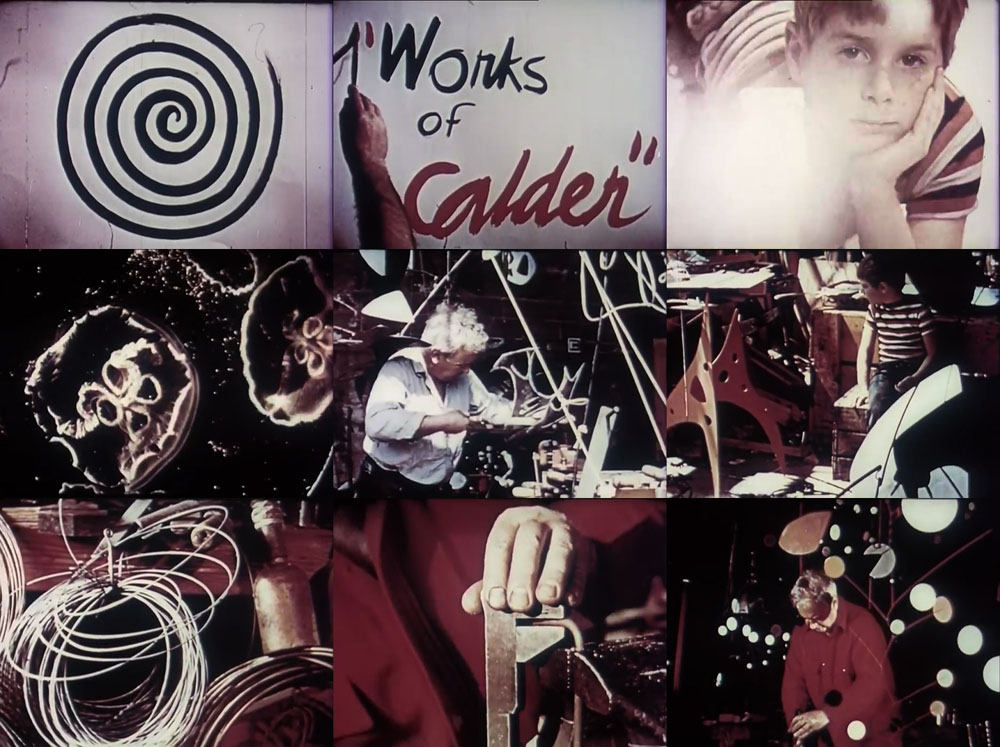
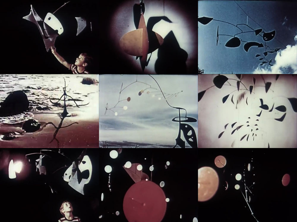
The “Calder” being artist Alexander Calder in a 20-minute portrait by photographer Herbert Matter, with music by John Cage and narration by Burgess Meredith. A small boy (Matter’s son, Alex) wanders along a beach then into a workshop where he finds a man identified in the narration as “Sandy Calder” cutting sheets of metal into shapes for his mobile sculptures. The film aims for the poetic but also happens to show us the mundane labour involved in creating artworks which, 70 years later, you’ll only encounter in a gallery or museum. I’m not a Cage expert but I think the music is from his pieces for prepared piano.

calder2.jpg

I used to wonder what happened to Calder’s reputation in the 1980s, a question I still don’t have an answer for today. In the 1970s, when I started reading books about contemporary art, those mobiles were always mentioned somewhere. The “mobile” concept was an influential one, in the world of home decor as much as the art gallery, easily copied and exploited. When Calder died in 1976 much of the earlier interest in his work seemed to die along with him. This may only be my perception, of course; in the USA all his huge public sculptures have remained unavoidably visible if nothing else. Whatever the answer, the Calder Foundation has more films about the artist and his work at their YouTube channel. This one was brought to my attention by Ace Jet 170, a blog from the 2000s which remains active, and still posts new discoveries now and then.

(A note about the aspect ratio: the film was shot in 4:3, and should look as it does in these screen grabs. The YT copy is another one of those uploads which have been stretched to 16:9.)

Previously on { feuilleton }
8 x 8: A Chess Sonata in 8 Movements
Dreams That Money Can Buy

Weekend links 86

alastair.jpg

Salammbô by Alastair (Hans Henning Voigt) from Harry Crosby‘s Red Skeletons (1927). Dover published a new collection of Alastair’s drawings in September.

A Taste of Honey showed working-class women from a working-class woman’s point of view, had a gay man as a central and sympathetic figure, and a black character who was neither idealised nor a racial stereotype.” RIP Shelagh Delaney. Related: Shelagh Delaney’s Salford (1960), directed by Ken Russell, and all 47 minutes (!) of The White Bus (1967), Lindsay Anderson’s strange, pre-If…. short, written by Shelagh Delaney, filmed in and around Manchester.

Since birth I’ve craved all things psychedelic, the energy and beauty of it. The pleasure… […] But in the US the exploration of consciousness and its powers—or really any curiosity about anything at all—is actively discouraged, because the system is so corrupt that it depends on people being virtually unconscious all the time. Burroughs cracked that code long ago. Spirituality here equals money; no one seems to be able to think, never mind explore their own consciousness.

Laurie Weeks: Making Magic Out of the Real

• Ian Albinson shows us The Title Design of Saul Bass while Ace Jet 170 has a copy of the new Bass monograph.

Kris Kool (1970) at 50 Watts, Philip Caza’s lurid, erotic, psychedelic comic strip.

lilien.jpg

Götz Krafft by EM Lilien from a collection at Flickr.

Serious Listeners: The Strange and Frightening World of Coil.

The Octopus Chronicles, a new blog at Scientific American.

• We now live in a world where there are Ghost Box badges.

Kilian Eng interviewed at Sci-Fi-O-Rama.

Dalí Planet

Bedabbled!

A Taste of Honey (1962) by Acker Bilk | A Taste of Honey (1965) by Herb Alpert’s Tijuana Brass | A Taste of Honey (Moog version) (1969) by Martin Denny.

Penguin Surrealism

genet.jpg

Design by Germano Facetti with a detail from Europe after the Rain by Max Ernst.

Is this the start of a new meme? Ace Jet 170 features a number of posts about the history of Penguin and Pelican book cover design. (I won’t link to any specific page as the site is full of other good stuff which you really ought to go and look at.) Now Dan Hill at City of Sound has followed suit, inspiring me to dig out a few choice volumes connected by theme, in this case the use of Surrealist paintings for cover art.

See also:
The Penguin Collectors’ Society
The Penguin Paperback Spotters’ Guild (Flickr pool)

Continue reading “Penguin Surrealism”

Barney Bubbles: artist and designer

barney1.jpg

Image-heavy post! Please be patient.

Four designs for three bands, all by the same designer, the versatile and brilliant Barney Bubbles. A recent reference over at Ace Jet 170 to the sleeve for In Search of Space by Hawkwind made me realise that Barney Bubbles receives little posthumous attention outside the histories of his former employers. Since he was a major influence on my career I thought it time to give him at least part of the appraisal he deserves. His work has grown in relevance to my own even though I stopped working for Hawkwind myself in 1985, not least because I’ve made a similar transition away from derivative space art towards pure design. Barney Bubbles was equally adept at design as he was at illustration, unlike contemporaries in the album cover field such as Roger Dean (mainly an illustrator although he did create lettering designs) and Hipgnosis (who were more designers and photographers who drafted in illustrators when required).

Colin Fulcher became Barney Bubbles sometime in the late sixties, probably when he was working either part-time or full-time with the underground magazines such as Oz and later Friends/Frendz. He enjoyed pseudonyms and was still using them in the 1980s; Barney Bubbles must have been one that stuck. The Friends documentary website mentions that he may have worked in San Francisco for a while with Stanley Mouse, something I can easily believe since his early artwork has the same direct, high-impact quality as the best of the American psychedelic posters. Barney brought that sensibility to album cover design. His first work for Hawkwind, In Search of Space, is a classic of inventive packaging.

Update: BB didn’t work with Mouse in SF, I’ve now been told.

in_search_of_space.jpg

Hawkwind: In Search of Space (1971).

It’s fair to say that Hawkwind were very lucky to find Barney Bubbles, he immediately gave their music—which was often rambling and semi-improvised at the time—a compelling visual dimension that exaggerated their science fiction image while still presenting different aspects of the band’s persona. In Search of Space is an emblematic design that opens out to reveal a poster layout inside. One of the things that distinguishes Barney Bubbles’ designs from other illustrators of this period is a frequent use of hard graphical elements, something that’s here right at the outset of his work for Hawkwind.

This album also included a Bubbles-designed “Hawklog”, a booklet purporting to be the logbook of the crew of the Hawkwind spacecraft. I scanned my copy some time ago and converted it to a PDF; you can download it here.

Continue reading “Barney Bubbles: artist and designer”