Weekend links 130

teraoka.jpg

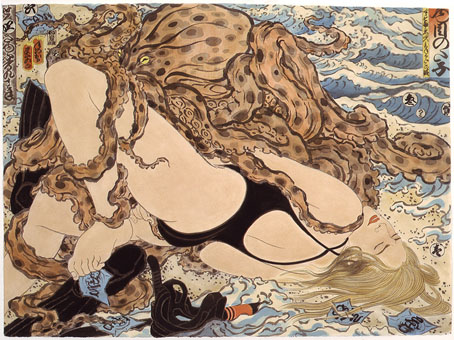
Sarah and Writhing Octopus (New Wave Series, 1992) by Masami Teraoka.

Strange Flowers continues to push all my buttons. For a while now I’d been intent on writing something about the strange (unbuilt) temples designed by German artist/obsessive naturist Fidus (Hugo Höppener) but I reckon James has done a better job than I would have managed. Also last week he wrote about Schloss Schleißheim, a palatial estate outside Munich with connections to Last Year in Marienbad and another eccentric, pseudonymous German artist: Alastair (Hans Henning Voigt).

• The circus poster that inspired John Lennon’s Sgt. Pepper song Being For The Benefit Of Mr. Kite! has been reproduced as a limited edition letterpress print. Related: Wikipedia’s page about Pablo Fanque (1796–1871), “the first black circus proprietor in Britain”.

• The first two volumes of The Graphic Canon, both edited by Russ Kick, are reviewed at Literary Kicks. I’ve not seen either of these yet but volume 2 contains my interpretation of The Picture of Dorian Gray. Related: the second book previewed at Brain Pickings.

You only have to read [Alan Bennett’s] diaries to see that, underneath the wit and humour and sandwich-filled pottering around old churches, there is a deep resentment at what has happened to England in his lifetime and an instinctive distrust, sometimes amounting to deep loathing, of most politicians. Listening, for instance, to Alan Clark and Kenneth Clarke talking on the radio about the arrest of General Pinochet in 1998, he writes: “Both have that built-in shrug characteristic of 80s Conservatism, electrodes on the testicles a small price to pay when economic recovery’s at stake.”

Michael Billington on Alan Bennett: a quiet radical

Hauntologists mine the past for music’s future: Mark Pilkington draws a Venn diagram encompassing Coil, Broadcast, the Ghost Box label, Arthur Machen, MR James, Nigel Kneale, Iain Sinclair and others.

Hell Is a City: the making of a cult classic – in pictures. The mean streets of Manchester given the thriller treatment by Hammer Films in 1959. The film is released on DVD this month.

The Function Room: The Kollection, Matt Leyshon’s debut volume of horror stories, has just been published. The cover painting is one of my pieces from the 1990s.

New Worlds magazine (now apparently known as “Michael Moorcock’s New Worlds“) has been relaunched online.

konahin.jpg

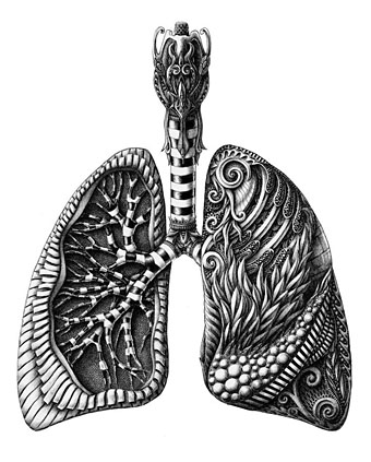
A drawing from Anatomy (part 1), a series by Alex Konahin.

• The forthcoming Scott Walker album, Bish Bosch, will be released on December 3rd. 4AD has a trailer.

Cormac McCarthy Cuts to the Bone: Noah Gallagher Shannon on the early drafts of Blood Meridian.

• The Velvet Underground of English Letters: Simon Sellars Discusses JG Ballard.

• Michelle Dean on The Comfort of Bad Books.

The typewriter repairers of Los Angeles

Cats With Famous People

Marienbad (1987) by Sonoko | Komm Nach Marienbad (2011) by Marienbad | Marienbad (2012) by Julia Holter.

(Thanks to Ian and Pedro for this week’s picture links!)

Design as virus 15: David Pelham’s Clockwork Orange

clockworkbook.jpg

Design by David Pelham (1972).

Continuing an occasional series. Pity the poor designer who has to create a new cover for Anthony Burgess’s novel when David Pelham’s Penguin cover—created in haste forty years ago—is more visible than ever. Pelham’s design is a familiar sight on these pages but it’s also an increasingly familiar sight elsewhere, having become the primary visual signifier not only of the novel itself but also the novel’s entanglement with Stanley Kubrick’s film. Burgess came to resent the cult power of the film and the way it inflated the status of one of his early novels whilst overshadowing the rest of his work. The book still overshadows his other novels but what’s interesting now, fifty years after it was published, and forty years on from Pelham’s cover design, is seeing the novel clawing back some of the territory ceded to the film, in part because of that memorable cog-eyed face. What follows is a look at some of the subsequent reworkings of Pelham’s design.

clockworkposter1.jpg

Artwork by Philip Castle, design by Bill Gold (1971).

It’s necessary to mention the original poster art first since the fat title typography gets reused more than any other part of the film’s publicity. The poster was also indirectly responsible for Pelham’s cover design when Kubrick denied Penguin any use of his promotional material:

Barry Trengove had designed a delightful cover for the Penguin edition of A Clockwork Orange and then the movie came along. While the Penguin marketing department was desperate to tie in with the film graphics, the director of the movie Stanley Kubrick wasn’t at all interested in tying in with the book. Consequently I was given the task of commissioning an illustration that gave the impression of being a movie poster. Sadly I was subsequently let down very badly by an accomplished airbrush artist and designer (whose name I will keep to myself), who kept calling for yet more time and who eventually turned in a very poor job very late. I had to reject it which was a hateful thing to have to do because we were now right out of time.

[…]

Well there I am, late in the day and having to create a cover for A Clockwork Orange under pressure. Already seriously out of time I worked up an idea on tracing paper overnight, ordering front cover repro from the typesetter around 4.00 am. I remember that my type mark-up was collected by a motorcycle messenger around about 5.00 am. Later that morning, in the office, I drew the black line work you see here on a matt plastic acetate sheet, specifying colours to the separator on an overlay while the back cover repro was being pasted up by my loyal assistants who had the scalpel skills of brain surgeons. I had wonderful assistants, absolutely wonderful.

Then more motorcycle messengers roaring around London in large crash helmets; and some days later I would see a proof. In those days, that was quick! Since those times I have often been amused to notice that my hurried nocturnal effort of so long ago appears to have achieved something of iconic status, for I’ve seen this cog-eyed image on fly-posters in Colombia, on t-shirts in Turkey, and put to a variety of uses in Canada, Los Angeles and New York. Because I did it, I spot it. Its like walking into a room where a party’s going on and, although the room is buzzing with conversation, if somebody simply mentions your name in conversation you immediately pick it up because it’s so familiar.

Penguin by Designers: David Pelham

clockworkposter2.jpg

A scarce item, allegedly from 1972 (although it may be from a year later), which surprisingly uses the book design with the film poster titles. According to a film memorabilia site “This rare alternate style R-Rated poster was designed for wild posting exclusively in New York and Los Angeles”. In the US the film was given an X rating on its first release meaning that many theatres wouldn’t have shown it. Following a few edits it was reissued with an R rating. On the back of the 1972 Penguin paperback there’s notice of a copyright restriction against selling that edition in the US so Pelham’s design wouldn’t have been familiar there until much later.

Continue reading “Design as virus 15: David Pelham’s Clockwork Orange”

Weekend links 129

proffer.jpg

Daughters of Maternal Impression by Arabella Proffer.

A genre’s landscape should be littered with used tropes half-visible through their own smoke & surrounded by salvage artists with welding sets, otherwise it isn’t a genre at all.

M. John Harrison, incisive as ever, on what he memorably labels “Pink Slime Fiction”. Elsewhere (and at much greater length) Cowardice, Laziness and Irony: How Science Fiction Lost the Future by Jonathan McCalmont, and a two-part Paul Kincaid interview here and here.

• “Once upon a time, in almost every city, many rivers flowed. Why did they disappear? How? And could we see them again? This documentary tries to find answers by meeting visionary urban thinkers, activists and artists from around the world.” A trailer for Lost Rivers, written and directed by Caroline Bâcle. Related (and mentioned here before), London’s Lost Rivers: A Walker’s Guide by Tom Bolton.

Ghosts in the Machine: “Curated by Massimiliano Gioni and Gary Carrion-Murayari, a recent exhibition was imagined as a Wunderkammer simultaneously tracing and questioning the relationship between people and technology.” And in Istanbul a Wunderkammer of a different kind: Rick Poynor looks at Orhan Pamuk’s Museum of Innocence.

• “There’s a vast territory still to be explored…” Bristol duo Emptyset (James Ginzburg & Paul Purgas), many of whose releases I’ve designed, talk about their music. Tracks from their new EP on the Raster-Noton label can be heard here. You’re going to need bigger speakers.

• “I liked doing it one time but I don’t want to become the gay porn soundtrack guy.” Ben Chasny of Six Organs of Admittance talking to Sir Richard Bishop about one of his more unusual commissions.

durham.jpg

Double Vision (2009) by Bonnie Durham.

FACT mix 349: Silent Servant puts together a great selection of music old and new with the emphasis on the grit of the early Industrial era.

• Read Joyce’s Ulysses line by line, for the next 22 years, with Frank Delaney’s podcast.

Borges and the Plain Sense of Things, an article from 2006 by Gabriel Josipovici.

Clive Hicks-Jenkins on Equus and seeing your inspirations come full circle.

• At Pinterest: A few nice paintings of men

Spunk [arts] magazine

Derelict London

• Ritualistic Bug Use (2009) by Pink Skull | Demiurge Variations (2012) by Emptyset | Utopian Disaster (End) (2012) by Silent Servant.

Golden apples and silver apples

yeats.jpg

The Wind Among the Reeds (1899). Cover design by Althea Gyles.

1: The Song of Wandering Aengus by WB Yeats.

I went out to the hazel wood,
Because a fire was in my head,
And cut and peeled a hazel wand,
And hooked a berry to a thread;
And when white moths were on the wing,
And moth-like stars were flickering out,
I dropped the berry in a stream
And caught a little silver trout.

When I had laid it on the floor
I went to blow the fire a-flame,
But something rustled on the floor,
And someone called me by my name:
It had become a glimmering girl
With apple blossom in her hair
Who called me by my name and ran
And faded through the brightening air.

Though I am old with wandering
Through hollow lands and hilly lands,
I will find out where she has gone,
And kiss her lips and take her hands;
And walk among long dappled grass,
And pluck till time and times are done,
The silver apples of the moon,
The golden apples of the sun.


bradbury.jpg

Illustration by Joe Mugnaini.

2: The Golden Apples of the Sun (1953), a story collection by Ray Bradbury.


judycollins.jpg

Cover design by William S. Harvey.

3: Golden Apples of the Sun (1962), the debut album by Judy Collins. The first track is her setting of The Song of Wandering Aengus.


subotnick.jpg

Cover design by William S. Harvey. Artwork by Anthony Martin.

4: The Silver Apples of the Moon (1967), an album of electronic music by Morton Subotnick.


silverapples.jpg

Artwork by Anonymous Arts.

5: Silver Apples (1968), an album of electronic music by Silver Apples.


donovan.jpg

Art Direction by Sid Maurer. Artwork by Patrick.

6: HMS Donovan (1971), a double album of poems for children set to music by Donovan. The second song on side four is The Song of Wandering Aengus.


goldenapples.jpg

Cover by Devendra Banhart.

7: The Golden Apples of the Sun (2004), a freak folk compilation selected by Devendra Banhart for Arthur magazine‘s Bastet label.

Previously on { feuilleton }
The Golden Apples of the Sun

Weekend links 125

cme.jpg

Coronal Mass Ejection from the surface of the Sun, August 31st, 2012.

• “Most of the main parts were recorded in a single day using Vangelis’s famous technique: try to play as many synths as possible at once.” Simon Drax on the prolific musical output of Zali Krishna. The new Krishna opus is Bremsstrahlung Sommerwind, free to download at the Internet Archive.

• The Northants International Comics Expo (N.I.C.E.) opens on September 22nd. Among the many attendees there will be Mr Alan Moore making his first convention appearance since 1987.

• “Isolated for one night in a boat overlooking the Thames, Geoff Dyer explores representations of reality through the lens of Joseph Conrad’s Heart of Darkness.”

Now seems the right time to revisit this secret archive of public broadcasting. It’s an antidote to the celebrity-led, format-driven nature of so many arts documentaries made today. It shows that it’s possible to produce TV that is both populist and experimental. And it also refutes the cliché that the 1970s was a decade only of crisis and downturn. “Feminism, political theatre, Ways of Seeing: I wasn’t thinking, ‘what a terrible time’. It was very dynamic, activist, political. Creatively it was very exciting. Yet all they show on those television retrospectives are episodes of Top of the Pops.”

Sukhdev Sandhu talks to Mike Dibb, the director of Ways of Seeing.

• From 1999: Colm Tóibín reviews A History of Gay Literature: The Male Tradition by Gregory Woods.

What We See: a song by Julia Holter & Nite Jewel with a film by Delaney Bishop & Jose Wolff.

Rick Poynor on The crash test dummy: from subcultural fringes to pop culture mainstream.

In his 1973 book on Joyce, Joysprick, Burgess made a provocative distinction between what he calls the “A” novelist and the “B” novelist: the A novelist is interested in plot, character and psychological insight, whereas the B novelist is interested, above all, in the play of words. The most famous B novel is Finnegans Wake, which Nabokov aptly described as “a cold pudding of a book, a persistent snore in the next room.” The B novel, as a genre, is now utterly defunct; and A Clockwork Orange may be its only long-term survivor.

Martin Amis on A Clockwork Orange, fifty years on. My old post about the film’s record shop scene continues to be one of the most popular pages here.

• Wild Boys: David Bowie and William Burroughs in 1974, hand-coloured by DB.

Alfred Kubin‘s illustrations for Haschisch (1902) by Oscar AH Schmitz.

• Revolution off: industrial ruins photographed by Thomas Jorion.

• Tetrahedra of Space: 22 pulp illustrations by Frank R. Paul.

The Blue Boy Studiolo: a Tumblr.

Marina Warner visits Hell.

• The art of Casey Weldon.

RainyMood.com

Third Stone From The Sun (1967) by The Jimi Hendrix Experience | Sunrise In The Third System (1971) by Tangerine Dream | 3rd From The Sun (1982) by Chrome.