Can soundtracks

deepend.jpg

Trailer for Deep End (1970). Music: Mother Sky.

I’ve been listening to a lot of Can over the past week, and thinking—not for the first time—about their erratic soundtrack career. Their soundtrack music is very familiar from their second album, Soundtracks, and the recent Lost Tapes collection which unearthed a few pieces that were previously only available in films or TV episodes. Much less familiar is the films and TV episodes themselves so here’s a look at some of the available material. Deep End and Alice in the Cities are both acclaimed (and highly recommended) feature films available on DVD. Everything else in this collection has been less visible outside Germany.

Update: Added Das Millionenspiel.

millionenspiel.jpg

Das Millionenspiel (1970). Music: Millionenspiel.

A film for German television based on a science-fiction story (The Prize of Peril, 1958) by Robert Sheckley about a reality-TV manhunt game. IMDB has Irmin Schmidt listed as the uncredited composer but the theme was a Can production.

madchen.jpg

Trailer for Mädchen mit Gewalt (1970). Music: Soul Desert and Desert.

deadlock.jpg

Trailer for Deadlock (1970). Music: Deadlock and Tango Whiskeyman.

Another of the strange Westerns (or Western-like films) that flourished in the early 70s.

Continue reading “Can soundtracks”

Design as virus 15: David Pelham’s Clockwork Orange

clockworkbook.jpg

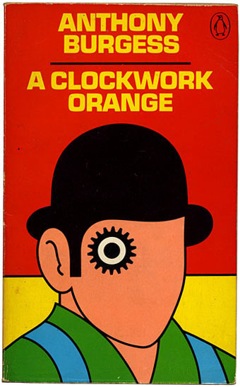
Design by David Pelham (1972).

Continuing an occasional series. Pity the poor designer who has to create a new cover for Anthony Burgess’s novel when David Pelham’s Penguin cover—created in haste forty years ago—is more visible than ever. Pelham’s design is a familiar sight on these pages but it’s also an increasingly familiar sight elsewhere, having become the primary visual signifier not only of the novel itself but also the novel’s entanglement with Stanley Kubrick’s film. Burgess came to resent the cult power of the film and the way it inflated the status of one of his early novels whilst overshadowing the rest of his work. The book still overshadows his other novels but what’s interesting now, fifty years after it was published, and forty years on from Pelham’s cover design, is seeing the novel clawing back some of the territory ceded to the film, in part because of that memorable cog-eyed face. What follows is a look at some of the subsequent reworkings of Pelham’s design.

clockworkposter1.jpg

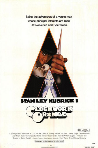
Artwork by Philip Castle, design by Bill Gold (1971).

It’s necessary to mention the original poster art first since the fat title typography gets reused more than any other part of the film’s publicity. The poster was also indirectly responsible for Pelham’s cover design when Kubrick denied Penguin any use of his promotional material:

Barry Trengove had designed a delightful cover for the Penguin edition of A Clockwork Orange and then the movie came along. While the Penguin marketing department was desperate to tie in with the film graphics, the director of the movie Stanley Kubrick wasn’t at all interested in tying in with the book. Consequently I was given the task of commissioning an illustration that gave the impression of being a movie poster. Sadly I was subsequently let down very badly by an accomplished airbrush artist and designer (whose name I will keep to myself), who kept calling for yet more time and who eventually turned in a very poor job very late. I had to reject it which was a hateful thing to have to do because we were now right out of time.

[…]

Well there I am, late in the day and having to create a cover for A Clockwork Orange under pressure. Already seriously out of time I worked up an idea on tracing paper overnight, ordering front cover repro from the typesetter around 4.00 am. I remember that my type mark-up was collected by a motorcycle messenger around about 5.00 am. Later that morning, in the office, I drew the black line work you see here on a matt plastic acetate sheet, specifying colours to the separator on an overlay while the back cover repro was being pasted up by my loyal assistants who had the scalpel skills of brain surgeons. I had wonderful assistants, absolutely wonderful.

Then more motorcycle messengers roaring around London in large crash helmets; and some days later I would see a proof. In those days, that was quick! Since those times I have often been amused to notice that my hurried nocturnal effort of so long ago appears to have achieved something of iconic status, for I’ve seen this cog-eyed image on fly-posters in Colombia, on t-shirts in Turkey, and put to a variety of uses in Canada, Los Angeles and New York. Because I did it, I spot it. Its like walking into a room where a party’s going on and, although the room is buzzing with conversation, if somebody simply mentions your name in conversation you immediately pick it up because it’s so familiar.

Penguin by Designers: David Pelham

clockworkposter2.jpg

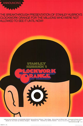
A scarce item, allegedly from 1972 (although it may be from a year later), which surprisingly uses the book design with the film poster titles. According to a film memorabilia site “This rare alternate style R-Rated poster was designed for wild posting exclusively in New York and Los Angeles”. In the US the film was given an X rating on its first release meaning that many theatres wouldn’t have shown it. Following a few edits it was reissued with an R rating. On the back of the 1972 Penguin paperback there’s notice of a copyright restriction against selling that edition in the US so Pelham’s design wouldn’t have been familiar there until much later.

Continue reading “Design as virus 15: David Pelham’s Clockwork Orange”

Max Klinger’s New Salomé

klinger.jpg

The New Salomé (1887–1888) by Max Klinger.

The German Symbolist Max Klinger (1857–1920) is celebrated today for the etchings which comprise his Ein Handschuh (A Glove) series, ten prints that in their curious details and dream-like quality prefigure Surrealism and Giorgio de Chirico’s “metaphysical” paintings. During his life Klinger was highly regarded for his sculpture as well as his etchings: his Beethoven was a centrepiece of the Secession building in Vienna in 1902. His New Salomé is one of the handful of Klinger works at the Google Art Project where I still feel we ought to be able to view sculpture in the round. I’ve seen many photos of this piece before but hadn’t realised until now that the eyes were…what? Rubies? Amber? Whatever they are, their fiery cast ensures that his imperious female sits unequivocally with the Evil Women that proliferated in the late 19th century.

pla.jpg

Salomé (c.1910) by Julio Borrell Pla.

Klinger’s sculpture may have been fashionably misogynist but it was at least a serious piece of art. Twenty years later the Salomé theme had devolved to little more than titillating exotica, as with this vaporous painting by Julio Borrell Pla which I hadn’t come across before. The last gasp of this exhausted trend is William Dieterle’s 1953 film in which Rita Hayworth plays Herod’s daughter as all titillation and little else.

Elsewhere on { feuilleton }
The Salomé archive

Koloman Moser posters

moser2

Secession poster (1899).

Since I’ve been delving over the past year into the fin de siècle culture of Germany and Austria, the name of Koloman Moser (1868–1918) has kept recurring. This is partly because of Moser’s associations with the Viennese Secession and the Wiener Werkstätte, of course, but I’ve made a point of drawing attention to his work since it’s struck me as some of the most remarkable being produced anywhere in Europe during the period 1895–1910. Moser’s poster designs are a good example of his authority as an artist and graphic designer who quickly evolved from Mucha-derived Art Nouveau flourishes to a degree of stylisation that was incredibly advanced for the early 1900s. The graphics of Moser and fellow artist/design Alfred Roller point the way to Art Deco twenty years later, and also to the psychedelic era whose poster artists eagerly borrowed motifs, figures and lettering designs from Moser, Roller, Mucha and others.

moser3

Frommes Kalender poster (1899).

Wikimedia Commons has a generous sampling of Moser’s work that shows his incredible versatility in a variety of media. The Secession designers, and Moser in particular, and memorialised in Paul Shaw’s typeface design, Kolo.

moser8

Illustrierte Zeitung poster (1900).

Continue reading “Koloman Moser posters”

Deutsche Kunst und Dekoration #10: Turin and Vienna

dkd10-18.jpg

Turin exposition poster by Leonardo Bistolfi.

Part two of a two-part skate through the contents of volume 10 of Deutsche Kunst und Dekoration, the German periodical of art and decoration. In addition to the Heinrich Vogeler feature which was the subject of yesterday’s post, this edition includes articles on the Prima Esposizione Internazionale d’Arte Decorativa Moderna in Turin—another international showcase for the Art Nouveau style—and a feature on the Viennese Secession exhibition of the same year. This latter piece was especially fascinating when seeing such a notable event reported for the first time. There’s more about that below. This volume also includes a piece on the Glasgow Arts and Crafts movement but the photos for that piece are poor quality. As before, anyone wishing to see these samples in greater detail is advised to download the entire volume at the Internet Archive. There’ll be more DK&D next week.

dkd10-19.jpg

A feature on dress design shows some rare examples of Art Nouveau style being applied to clothing.

dkd10-20.jpg

Continue reading “Deutsche Kunst und Dekoration #10: Turin and Vienna”