ICA talks archived

ica.jpg

I’ve linked to the British Library’s sound archive before but it was only recently that I had a browse through their collection of talks from the Institute of Contemporary Arts, London. The public discussions cover the period 1981–1994, and while there’s a wide range of contributors the lion’s share of interviewees are writers. Most of the talks run from 60–90 minutes. The following is a selection from some of the contents:

JG Ballard and Matthew Hoffman in conversation, 1984. Ballard discussing his latest novel, Empire of the Sun.

Derek Jarman and Ken Campbell in conversation, 1984. Jarman discussing his autobiography, Dancing Ledge which was also published that year. (A revised edition appeared in 1991.) If Ken Campbell seems an unusual interviewer it should be recalled that he appeared in Jarman’s 1979 film, The Tempest.

Alan Moore and Charles Shaar Murray in conversation, 1987. Mr Moore caught in the year when the world at large became aware of comics in general and his work in particular.

Whose Fantasy? Hosted by Neil Gaiman (uncredited) with M. John Harrison, Terry Pratchett, Geoff Ryman & Diana Wynne Jones, 1988. One of a series of events examining British genre fiction. Neil Gaiman was the host of each discussion but is uncredited on the site for several of the talks. This one concerns fantasy and science fiction.

Whose Fantasy? Hosted by Neil Gaiman (uncredited) with Clive Barker, Ramsey Campbell, Roz Kaveney & Garry Kilworth, 1988. The following day’s discussion was oriented more towards horror.

Laurie Anderson and Sarah Kent in conversation, 1990. Laurie Anderson’s latest album (and one of hers I like a great deal) Strange Angels is discussed.

Weekend links 46

finalprogramme.jpg

The Final Programme (1973). Philip Castle’s poster art implied the androgynous finale of Moorcock’s novel which the film itself evaded.

They were musty-smelling 10p messages from the futuristic past, complete with cover designs (and content) that were unlike anything I’d seen before. I’m fairly certain that this was how I first came across Michael Moorcock, in an early-70s Mayflower paperback, with a psychedelic cover by Bob Haberfield.

(…)

Moorcock steered New Worlds towards a set of concerns that chimed with the times; this was the period ruled by Marshal McLuhan and RD Laing, and the exploration of “inner space” seemed just as interesting as the “outer space” of satellites and moonshots. This turn was controversial, not just with die-hard pulp fans, but, surprisingly, with people such as the pop artist Richard Hamilton, another denizen of the London scene. “He thought we were turning science fiction into something namby-pamby, losing its roots,” Moorcock says. “He wanted explosions and spaceships and robots.”

When Hari Kunzru met Michael Moorcock, a major feature on a great writer and cultural catalyst. Kunzru posted the full transcript of their conversation here. Jovike’s Moorcock Flickr set has many of the lurid Mayflower covers.

• Moorcock is among the contributors to the forthcoming Thackery T. Lambshead Cabinet of Curiositities. io9 posted a list of contents (and one of my pics) while co-editor Jeff VanderMeer added some detail.

• So long to The White Stripes whose dissolution was announced earlier in the week. We know they’ll be back one day. Jay Babcock gave them their first major interview for the LA Weekly in 2000 which he’s reposted here.

Mister Blues (1962) by Lasry-Baschet aka Structures Sonores, a rare 7″ single showcasing the unique glass-and-metal sounds of the Cristal Baschet. Young Teddy Lasry on clarinet was playing in prog-jazz outfit Magma a few years later. Related: John Payne on Magma and The Mars Volta.

Here’s one thing that changed me: a close reading of Flannery O’Connor’s Mysteries and Manners. In it, she says that, “it is the business of fiction to embody mystery through manners,” manners being those concrete details — depictions of the real — in story. “Mystery through manners…” I had never heard a modern author seeking deep metaphysical mystery through realism before. Well, sure, Robert Musil, Bruno Schulz, Robert Walser, and a handful of other personal faves. By deep mystery I mean, mystery about our relationship with the planet, not anthropocentric mystery. I get sick of thinking about humans quickly, as we only constitute about 1% of what’s happening in our universe, if that much, and it was refreshing to me to hear O’Connor critiquing Henry James’ idea that modern people should aspire to know nothing of mystery, to be completely rooted in humanity. That notion makes me feel like hurling myself off a cliff. In her opinion, great literature seeks to embrace and express mystery through its mimicry of actual mannerisms. Mystery — fantasy — through the real. And with that, the borders between fantasy and realism were completely transgressed in my brain. Suddenly, I saw them as two good means to the same end. This made me excited to write real human situations again.

Trinie Dalton is interviewed here.

• And speaking of mystery through the real, there’s London Intrusion, a sequence of metropolitan adumbrations by China Miéville. Am I the only person to spot an intrusion of a different kind in the presence there of one of Eugène Atget’s Parisian views? There’s a doorway to Viriconium in that curious wedge of buildings but nobody can tell you where.

Rupert Murdoch—A Portrait of Satan. Adam Curtis on top form looking at the Dirty Digger’s career and a reminder of why some of us have always called one of his rags The Scum. A key point for me: Murdoch’s insecure railing against “elites”, a favourite term of aspersion on his Fox News network.

• Rick Poynor asks What Does JG Ballard Look Like? Related: “…only two people in Bucharest are going to read this.” Eduardo Paolozzi in conversation with JG Ballard and Frank Whitford, 1971.

How many days does Bill Murray’s character really spend reliving Groundhog Day?

• Silent Porn Star explores The Translucent Beauty of Androgyny.

Ballets Russes brought back to life on film, and also here.

Dewanatron Electronic Music Instruments.

RIP Tura Satana. Remember her this way.

Warm Leatherette (1978) by The Normal | Warm Leatherette (1982) by Grace Jones | Warm Leatherette (1998) by Chicks On Speed.

The psychedelic art of Howard Bernstein

bernstein1.jpg

Lord of Light by Roger Zelazny (1967).

I made a post a while back about the work of Bob Pepper, an artist whose illustrations from the 1960s can also be described as psychedelic and who was equally visible in the music and book publishing worlds. Howard Bernstein (not to be confused with musician Howie B) wasn’t as prolific as Pepper but this post was prompted by the appearance at Sci-Fi-O-Rama of the swirling abstractions of his Roger Zelazny cover. Like Pepper, Bernstein produced album cover art as well as book covers although it’s possible the Zelazny piece may have been a one-off. This was the jacket of the first edition and a rather flagrant attempt by Doubleday to co-opt the trendiness of the psychedelic style for a science fiction readership. They tried something similar with the cover for Harlan Ellison’s landmark anthology Dangerous Visions in the same year, the art in that case being the work of Leo & Diane Dillon. The Zelazny cover caught my attention for another reason, the typography is a variation on the 19th century Kismet typeface by John F Cumming which I used for my two Alice in Wonderland calendars and which turns up regularly in psychedelic design. And while we’re considering conjunctions of music and science fiction, I ought to note that the Hawkwind song Lord of Light lifts its title from Zelazny’s novel.

bernstein4.jpg

The Heliocentric Worlds Of Sun Ra, Vol. I (1965).

As for Bernstein’s music work, most of this appears to have been for Bernard Stollman’s eccentric ESP Disk label where the roster of artists included many free-jazz greats along with The Fugs, William Burroughs, Timothy Leary and fringe psychedelic groups such as Pearls Before Swine, Cromagnon, The Godz and others. Bernstein’s Cromagnon cover (below) exists in both monochrome and coloured versions but the monochrome one seems to be the original. In fact much of his art looks like it was drawn in black-and-white with the colours being created by separations at the print stage. His poster for The Godz is especially striking, so much so I’m surprised to find there isn’t more of his work around. Wolfgang’s Vault has a blacklight poster and there are some other blacklight works here. If anyone knows of other posters, please leave a comment although I suspect if there was much more then Wolfgang’s Vault would have the goods.

Continue reading “The psychedelic art of Howard Bernstein”

Weekend links 41

2001.jpg

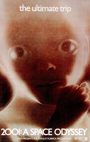
Being an inveterate Kubrickphile I was naturally pleased to hear that some of the excised scenes from 2001: A Space Odyssey have survived in a watchable form, even though I’m often ambivalent about the restoration of such material. While it was good to see at last the missing French compound sequence of Apocalypse Now, for example, that sequence added nothing to the film as a whole and its inclusion was spoiled by music which Coppola used for sentimental reasons. In Kubrick’s case, there’s a longer version of The Shining which the director allowed to be screened on UK TV in the 1980s but, again, most of the unseen material was incidental and added nothing to the film.

• Related: Roger Ebert’s review of 2001 from 1968; Olivier Mourgue, designer of the Djinn chairs seen in the film’s space Hilton scenes; Magnificent obsession, a Vanity Fair piece from 2002 about the search for the missing scenes from The Magnificent Ambersons. Meanwhile, the trailer for Terrence Malick’s new film, The Tree of Life, features some surprising cosmic moments among its scenes of family life.

The separate history [of gay and lesbian artists] has been kind of edited out of art history but in fact art history is very much interwoven with gay or queer history. In a way the two can’t be separated. America doesn’t like anything uncomfortable. I find in my dealings with museums that if I ask a question and the answer is ‘no,’ they don’t answer. If the answer is ‘yes,’ I get these amazingly enthusiastic responses. I find it sort of strange sometimes, not being American myself. In a way what they’re doing is editing out the uncomfortable. David Wojnarowicz’s work can make you uncomfortable — and they’ve edited out that possibility in the show.

Canadian artist AA Bronson (see below).

• More on the Smithsonian versus David Wojnarowicz affair: Frank Rich examined the train of events in a comment piece, Gay Bashing at the Smithsonian, for the NYT; the Andy Warhol Foundation threatened to withdraw their funding for future Smithsonian events unless the work is reinstated, the Robert Mapplethorpe Foundation will be doing the same; another artist featured in the National Portrait Gallery exhibition, AA Bronson, requested that the gallery withdraw his work from the show in protest; the NPG refused, citing a contractual arrangement; among the increasing number of galleries showing support for Wojnarowicz, Tate Modern, London, will host an event in January which will feature a screening of the contentious video; lastly, there’s a protest event in New York City today (Sunday, December 19th) at 1.00pm, details here.

• More censorship in America: Jeffrey Deitch Censors Blu’s Political Street Art Mural. In the book world, writer Selena Kitt finds her erotic incest stories removed from Amazon’s Kindle store. Other authors, Jess C Scott and Esmerelda Green, have had their erotic titles removed from the store. Selena Kitt says:

When some of my readers began checking their Kindle archives for books of mine they’d purchased on Amazon, they found them missing from their archives. When one reader called to get a refund for the book she no longer had access to, she was chastised by the Amazon customer service representative about the “severity” of the book she’d chosen to purchase.

Can you imagine buying a paper book and the bookstore then paying you a visit to forcibly reclaim it? To date no adequate explanation from Amazon has been forthcoming but they’ll be happy to sell you a Kindle edition of the Marquis de Sade’s The 120 Days of Sodom.

m51.jpg

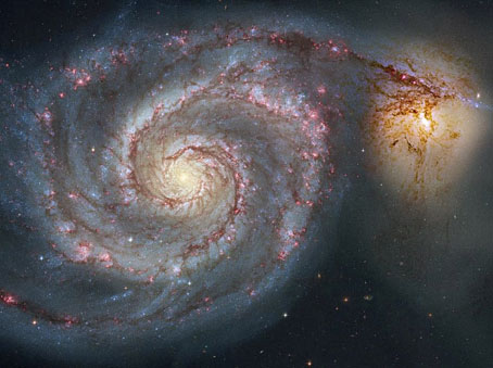
Galaxy M51 aka The Whirlpool. One of the Top Astronomy Pictures of the Year from a selection by Bad Astronomy. Photo by the Hubble Heritage Team & Robert Gendler.

• More cosmic events: there’ll be a total lunar eclipse this coming Monday, visible in much of the Northern Hemisphere.

• “Heterosexuality is the opiate of the masses!” The Raspberry Reich (2004), a film by Bruce LaBruce.

New editions of Borges poetry. Fine so long as you accept that the translations can never truly satisfy.

• Just the thing for the winter weather, illustrations for Pushkin’s Queen of Spades from 1966.

• Another Ghost Box download: Radio Belbury Programme 1: “Holidays & Hintermass”.

Monsters, Inc: Arcimboldo and the Wunderkammer of Rudolf II.

• Silent Porn Star found some burlesque lamps.

Giant airship powered by algae.

Space Oddity (1969) by David Bowie.

Ten titles and a cover

cdlcover.jpg

The Very Best of Charles de Lint. Art by Charles Vess.

Over the weekend I found the time to finally update the book design section of the site, adding new pages for most of the titles I’ve been working on recently. There’s still a couple of things missing but I’ll add those in due course. Many of these design jobs have been for the interiors only so what follows is a comparison of title spreads from books I’ve worked on that have been published this year. Lest it seem that I have an army of clones at my service it should be emphasised that I was working on several of these last year (and Engelbrecht was completed in 2008) but the nature of release schedules means they all carry 2010 publication dates.

sr.jpg

Steampunk II: Steampunk Reloaded, edited by Ann & Jeff VanderMeer.

I invariably make a feature of title pages, usually creating them as a spread in order to heighten their impact. The title page is a kind of gateway to the rest of the book which gives you an opportunity to establish a mood for what follows. It’s also the area where you can be most lavish with your graphic treatment and, where necessary, add illustrative material without worrying too much about intruding on the content. With a number of these designs I was following typographic choices from pre-designed covers so the challenge was to find something that would match the cover and connect to the rest of the interior. The Charles de Lint book was a variation on this process in that the author had chosen a Charles Vess drawing for the cover art. I designed a cover to accommodate the drawing then carried the design inside. The colours were chosen to match Vess’s artwork while the general Art Nouveau style came from an Alphonse Mucha poster he’d placed on the wall. With a different cover picture the entire book would have had a very different design.

pkd.jpg

The Search for Philip K Dick by Anne R Dick.

Continue reading “Ten titles and a cover”