Weekend links 342

zarraga.jpg

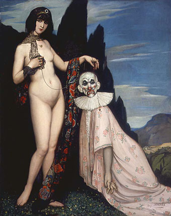
La femme et le pantin (1909) by Ángel Zárraga.

• RIP John Berger. Berger’s essential TV series on art, Ways of Seeing (1972), is at YouTube and Ubuweb; “Such freedom is unthinkable today,” says series director Mike Dibb; the book of the series was designed by Berger and Richard Hollis; ways of seeing Ways of Seeing; Geoff Dyer, Olivia Laing & Ali Smith on Berger; M. John Harrison on Berger.

• The beginning of January means the LRB posting Alan Bennett‘s diary for the previous year. In related news, Network DVD will be releasing Six Plays by Alan Bennett next month, a collection that includes a favourite of mine, Me! I’m Afraid of Virginia Woolf (1978).

• At Dennis Cooper’s: Acid Westerns Day (Restated). Related: Jodorowsky’s El Topo and The Holy Mountain are being released on Blu-ray (Region B) by Gryphon Entertainment.

The acre of suburban lawn surrounding our house became like the Paramount lot for my feverish theatrics. I graduated to building “spook houses” in the family garage out back. Inspired by the ride-through Trimper’s Haunted House in Ocean City, Maryland, designed by Bill Tracy (and it’s still there in operation), I remembered excitedly wheeling through this attraction in these rickety little coffin-shaped cars and dreaming of befriending the crudely built, motorized corpses, cannibals, and skeletons who lived inside. I fantasized the cars breaking down, the panicked, chickenshit children screaming, bolting from their seats, tripping over live wires, and electrocuting themselves. I wanted to take this imagined fear, this frightened happiness, back to my own house where I knew I could preserve, protect, and stylize it on my own adolescent terms.

John Waters on his childhood home

Strange Flowers‘ latest reading recommendations include books on lesbian decadence, occult Paris, flâneurie and the queerness of the Benson family.

Where Evil Dwells (1985), a 28-minute preview of a longer piece of weird cinema (now destroyed) by Tommy Turner and David Wojnarowicz.

Francis Ford Coppola and Brian De Palma having a conversation about Coppola’s The Conversation.

The Edge Question for 2017: “What scientific term or concept ought to be more widely known?”

• Mixes of the week: Drone Theory with Roly Porter, and Secret Thirteen Mix 205 by Stavaris.

Simran Hans suggests where to begin with the films of Todd Haynes.

• More decadence, this time among the Mexican Modernists.

Moon Wiring Club at Bandcamp.

No Name, No Slogan (1989) by Acid Horse | Those Tapes Are Dangerous (1997) by The Bug | Spooky Action At A Distance (2014) by Sqürl

Weekend links 204

somnium.jpg

RIP Steve Moore. We never met, unfortunately, but I was very pleased he asked me to create a cover for his unique occult novel, Somnium, in 2011. Prior to this we’d been connected by shared acquaintances, colleagues, and membership in the informal cabal that was (and maybe still is) The Moon & Serpent Grand Egyptian Theatre of Marvels. Steve’s long friendship with Alan Moore (no relation) is well-documented, not least by Alan himself who made Steve the subject of his Unearthing project. One surprising connection for me was that Steve also had a link to Savoy Books. In the late 1960s he was working for comics publisher Odhams where he was able to copy for David Britton some Ken Reid comic art which Odhams had refused to print. Dave published the forbidden pages in his first magazine, Weird Fantasy, in 1969. In 2011 Steve talked to Pádraig Ó Méalóid about Somnium, and also to Aug Stone at The Quietus. Aug Stone penned a few memorial words here.

• “People love using the word ‘porn’ as long as there’s a partner for it. Pair ‘porn’ with something else and it’s usually a good thing. A celebration of style and culture. But that word on its own? Well.” Porn star Conner Habib asks why people have such a problem with porn actors.

Dave Maier‘s Russian cinema recommendations. Several favourites there including the magical and remarkable Shadows of Our Forgotten Ancestors (1964) which, as Maier notes, isn’t really Russian but should be seen in any case.

Shakespeare uses verbal magic, cantrips and ditties, nonsense songs and verses throughout the plays, but in Othello he gives a glimpse of how powerful a spell becomes when it’s no longer oral, but fixed in material form. The fatal handkerchief is no ordinary hanky; it’s a love spell, and it was made with gruesome and potent ingredients (mummified “maiden’s hearts”) by a two-hundred-year-old sibyl in Egypt—Egypt being the birthplace and pinnacle of magic knowledge.

Marina Warner on magic.

• Mixes of the week: an hour of electro-acoustics and contemporary classical recordings sequenced by Laurel Halo, and (from 2010) 36-minutes of “umbral electronic hypnagogia” by The Wyrding Module.

• “This is the book that, 10 years later, inspired Richard Hollis’s landmark design for John Berger’s Ways of Seeing.” Rick Poynor on Chris Marker’s Commentaires.

• Is the Linweave Tarot the grooviest deck ever made? Dangerous Minds thinks so.

• Bobby Barry talks to Holger Czukay about his 1969 audio collage, Canaxis 5.

• “What Happened to Experimental Writing?” asks Susan Steinberg.

Aldous Huxley‘s lectures on visionary experience at MIT, 1962.

Laura Palmer will see Agent Cooper again in just a few hours.

Callum found a copy of The Gay Coloring Book (1964).

Metal Cats

Moonshake (1973) by Can | Lunar Musick Suite (1976) by Steve Hillage | Dark Moon (1993) by Holger Czukay | Boy In The Moon (2012) by Julia Holter

Ulysses versus Maldoror

covers.jpg

Ulysses (1934), designed by Ernst Reichl; Complete Works of Isidore Ducasse (1967), designed by Pierre Faucheux.

On the design front, that is, not the writing one. Ernst Reichl’s design for the 1934 Random House edition of James Joyce’s Ulysses (the first US edition) has a cover which isn’t so different to the many Art Deco-style bindings from around this time. Inside, however, there’s a significant innovation with his title spread, and the dramatic imposition of a huge capital letter. Random House was presenting Ulysses as a major artistic statement, a quality which Reichl’s design reinforces when the page-filling capitals recur at the openings of each of the novel’s three sections.

ulysses1.jpg

I encountered the huge S on the opening page in a book about Joyce shortly after I’d started reading the novel for the first time, and for years was under the impression that this had been a specific instruction of the author’s, a typographic flourish to add to the rest of the formal manipulations. I’d suggest—insist, even—that all editions of Ulysses should adopt Reichl’s design. Martha Scotford at Design Observer looks at the book in more detail.

ulysses2.jpg

maldoror1.jpg

Les chants de Maldoror-Poésies-Lettres (1950) by Lautréamont. Le club français du livre.

Pierre Faucheux went one further with his grandiose opening for Les chants de Maldoror-Poésies-Lettres by filling the opening of the book with Didot capitals which spell out M-A-L-D-O-R-O-R on each page before the title is reached. This is the design equivalent of shouting in the reader’s face when the book is opened; given the nature of the text I can imagine the author approving. I’ve no idea whether the idea was borrowed from Reichl but Faucheux was a very inventive designer who was quite capable of arriving at such a layout on his own. His cover for a 1967 reprint of the book (above) spells out the title by tearing up the earlier Didot capitals. Rick Poynor at Design Observer (again) looked at more of Faucheux’s covers for the Livre de Poche imprint, while at Eye magazine there’s an essay by Richard Hollis about Faucheux’s innovations.

Continue reading “Ulysses versus Maldoror”

Weekend links 30

woody.jpg

Did someone say “woody”? Plenty more toy antics at TheOneCam.

• And yet more Haeckelisms: Praying in Haeckel’s Garden, recent works by artist Mary O’Malley.

Seasons of the Peacock, the perennial showoff as depicted by a handful of Art Nouveau artists. A couple of examples there I hadn’t seen before.

• Dorian Cope presents On This Deity, “Commemorating culture heroes and excavating world events.”

• At long last, Fantagraphics will be publishing Ah Pook is Here, the comic strip collaboration between William Burroughs and artist Malcolm McNeill. Something to look forward to for next year. Related: Malcolm McNeill’s website.

David Lynch Dark Splendor: “Der große Filmemacher David Lynch als Fotograf, Maler, Zeichner und Grafiker.”

More on the forthcoming album from Brian Eno, Leo Abrahams and Jon Hopkins. With this degree of hype the end result is going to be a disappointment.

Book design by Richard Hollis, including John Berger’s essential Ways of Seeing.

A fistful of Vignellis: the work of Lella and Massimo Vignelli celebrated.

• Berni Wrightson’s Frankenstein at Golden Age Comic Book Stories.

Jimi Hendrix, Philip José Farmer reader.

Imagerie du Chemin de Fer.

El UFO Cayó (2005) by Ry Cooder.

Penguin science fiction

drought.jpg

The Drought, 1968; design by Richard Hollis, photography by Dr. J Comroe.

James Pardey contacted me earlier this week announcing his site devoted to Penguin Books’ science fiction covers. I posted some of my own dishevelled copies a while back and this news gives me an excuse to throw up another Ballard cover. Pardey’s site is just the kind of thing I enjoy seeing, with a comprehensive collection and detailed notes for each design. The front page is especially good since you can see immediately how the look of the titles evolved, from spare layouts and pictorial covers through to bold graphic design which culminates in David Pelham’s great run as designer during the 1970s. Creative Review posted a talk Pelham gave a couple of years ago which explores his work at Penguin and touches on the covers he did for Ballard. A shame they didn’t do a complete set of Ballard’s titles at the time, I’d have loved to see how he treated the other books.

Elsewhere on { feuilleton }
The book covers archive

Previously on { feuilleton }
Penguin Labyrinths and the Thief’s Journal
Penguin Surrealism
Penguin book covers