20 Sites n Years: the documentary

auerbach.jpg

This isn’t the first time I’ve written about Tom Phillips’ indefinite art project but I thought I’d give Jake Auerbach’s documentary some belated promotion after watching it again. The usual form here would be to link to a viewable copy somewhere. There is a copy online, as it happens, but it’s not in any of the obvious places so rather than link to it I’d encourage the interested to invest in one of Auerbach’s DVDs or watch the streaming version.

20_sites.jpg

As before, the project details are as follows:

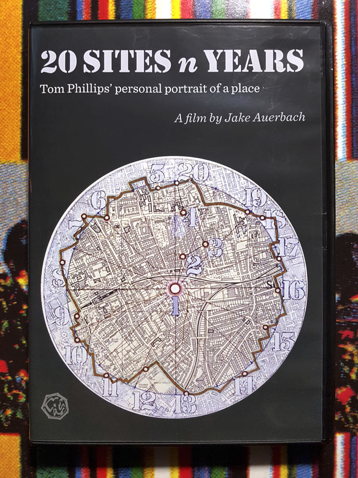
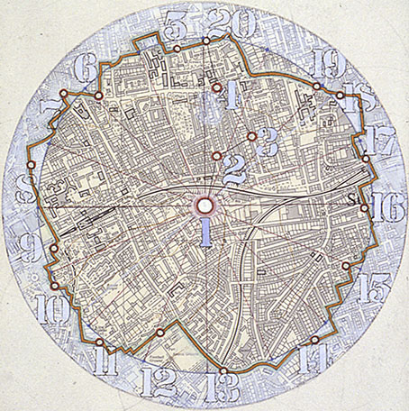
Every year on or around the same day (24th May–2nd June) at the same time of day and from the same position a photograph is taken at each of the twenty locations on this map (above) which is based on a circle of half a mile radius drawn around the place (Site 1: 102 Grove Park SE15) where the project was devised. It is hoped that this process will be carried on into the future and beyond the deviser’s death for as long as the possibility of continuing and the will to undertake the task persist.

The intention is that photographs (35 mm transparencies) be taken at twenty locations each year between May 24 and June 2. The locations are situated on what is (in 1973) the nearest walkable route to a perfect circle a half a mile in radius from the point in the home of Artist 1 (102 Grove Park, London SE5) where the project was devised and where these instructions were written. The circuit is divided into sixteen equal sections in each of which there is a site selected by Artist 1. Four other locations mark the route from the centre to the circumference: these are the former studio of Artist 1, his current home and studio, and the art school where he studied. The project book notes the times of the original photographs of 1973 and these should be adhered to as closely as possible (though all photos need not necessarily be taken on the same day) Artist 1 intends that the pictures should be taken by his family and their descendants, if they are willing, and that the work should thus go on indefinitely: the services of their friends may be enrolled or even from time to time that of professional photographers. Continuity is the most important factor.

auerbach2.jpg

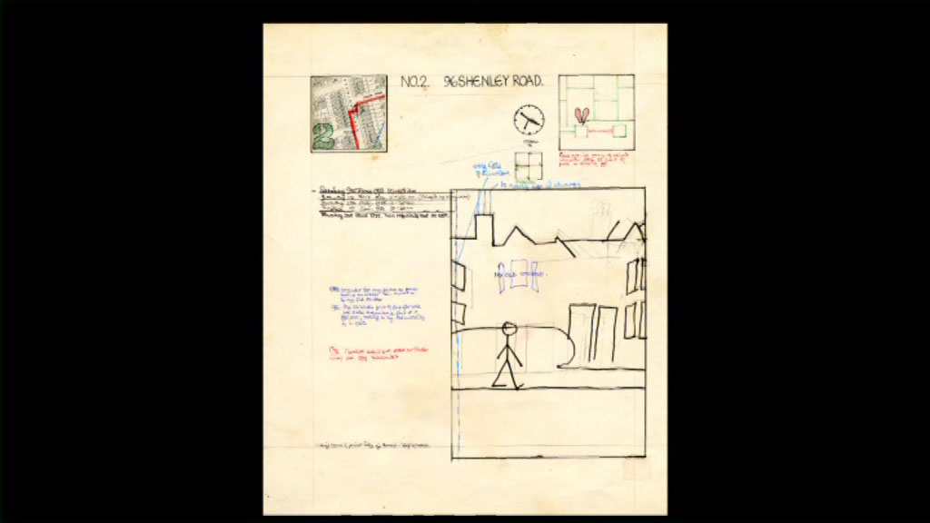
One of the pages from the project manual showing the location of Site 2, the hour of day at which the photo should be taken, where to stand when taking it, and a diagram of the preferred framing.

Auerbach’s 45-minute film begins with a brief description of the piece, after which we follow Phillips in 2012 on his annual excursion around the streets of Camberwell and Peckham in South London. Auerbach juxtaposes the arrival of artist and camera crew at each prescribed location with Phillips’ own description of the changes he’s observed since first commencing the project in 1973. During the narration we get to see many of the photographs, more than the few examples shown in Works and Texts. The film also includes extracts from a couple of earlier documentaries about Phillips, including his appearance on the BBC’s Late Show in 1989 which featured a shorter 20 Sites project report.

auerbach4.jpg

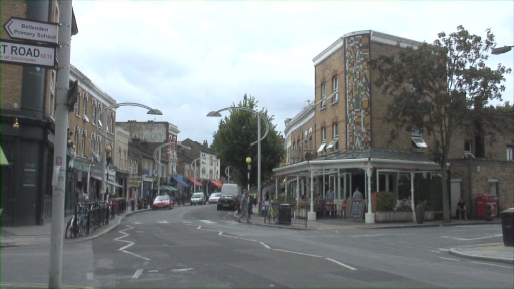
A local street that isn’t part of the project but which does feature street lights and a mural designed by Tom Phillips.

Auerbach’s trailing of the artist shows us aspects of the project that you don’t get in the big Thames & Hudson book or on the Tom Phillips website (where you can see slide-shows of all the views to date), the most prominent being a sense of the space in which each photograph is taken. London south of the river is a vast suburban sprawl that lacks the layered history of the northern quarters of the city. This might seem unpromising material for an art project but Phillips’ photographs remind us that “promise” is a quality dependent on the artist’s point of view, literally in this case with the dogged and very specific attention given to these twenty sites. In place of grand history we have the incremental advance of those changes which often go unnoticed or unremarked in city life: a tree grows, cars (and people) update their styling, a building is repurposed or demolished, street furniture appears then disappears, shops change their appearance and operation, public areas are subject to seemingly arbitrary alterations at the hands of council workers.

auerbach3.jpg

Auerbach shows us further details that we wouldn’t otherwise see, such as the aerosol marks made on the pavement each year showing where the photographer has to stand in order to take a shot that matches the earlier ones. We also get to see Phillips choosing the best shots after they’ve been processed. One of the impromptu conventions of the project has required people to appear at some of the quieter sites, random strangers (or animals) at Site 2, while Site 3 incorporates friends or relatives of the artist. John L. Walters, the editor of Eye magazine, occupies the latter role on the day that Auerbach is present.

auerbach5.jpg

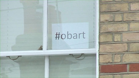
The project becomes self-aware. “Obart” was the name of a mysterious business or organisation that vanished soon after being chosen as Site 15. The name has since been an informal title for the project as a whole. The hashtag is in the window of one of the houses situated next to the original Obart sign.

Now that “Artist 1” is no longer with us, the project moves into a new phase with “Artist 2” (Phillips’ son, Leo) taking charge. Leo Phillips was already on board in 1989 so the annual excursion must be a familiar routine by now. Next year the project will have been running for 50 years which must make it the longest continually-running art project to date unless there’s a more extended one out there. Michael Heizer’s City recently attained completion after 50 years buts it’s debatable whether a work that was a construction site for most of those years should be considered as operating in the same sense as 20 Sites, a project which was functioning as intended from its first year. Meanwhile, I’ve yet to hear about the existence of an “Artist 3” ready to take up the camera after Leo Phillips, but whoever that individual might be they could conceivably take 20 Sites through to its centenary in 2073. Time will tell.

Previously on { feuilleton }
20 Sites n Years revisited
20 Sites n Years by Tom Phillips

Weekend links 463

eye.jpg

Eye 98: Beatrice Display Black, Sharp Type, 2018, and a detail from an original drawing for Lexicon by Bram de Does, 1989.

Issue 98 of Eye, the international design journal, is out this month. The new issue is a typography special but also features my review of Mark Dery’s Born to be Posthumous: The Eccentric Life and Mysterious Genius of Edward Gorey. This is the second time I’ve written about Dery’s book, with the new piece focusing more on Gorey’s work as a designer/book creator, and his place in the history of illustration.

Portal is a new release by Slovakian metal band Doomas, the artwork of which adapts one of my illustrations for Lovecraft’s Monsters. The band also have a suitably Lovecraftian video.

• Reading recommendations by M. John Harrison: the old (the excellent Rogue Moon by Algis Budrys) and the new (Underland et al).

I first started drawing in my Wake to count the number of rivers mentioned in an episode, one page alone counting 85. Gradually, I would be so moved by a line or a character I would colour them in, the most obvious being the 28 Rainbow girls to the more obscure nebulae, railroad tracks, hidden mythical islands and turn of the century lightships. Themes began to emerge which demanded documentation and always the sad, ecstatic relief of finishing a chapter merited some sort of coloured tribute. By the time I finished four years later, I simply drew a leaf to reflect Joyce’s metaphor on the last page: my leaves have drifted from me. All. But one clings still.

Susie Lopez on Finnegans Wake at 80

• Old ghosts at The Paris Review: a preview of The Spectacle of Illusion by Matthew L. Tompkins.

• At Dangerous Minds: Malcolm McDowell and the making of Lindsay Anderson’s O Lucky Man!

Herbie Hancock: “I felt like I stood on the shoulders of giants and now it’s my turn”.

• Mix of the week: XLR8R Podcast 590 by Christian Löffler.

• The discography of Diamanda Galás is now at Bandcamp.

• RIP Quentin Fiore, graphic designer and book creator.

• At Dennis Cooper’s: Haunted dolls.

Antique Doll (1967) by The Electric Prunes | The Doll’s House (1980) by Landscape | Voodoo Dolly (1981) by Siouxsie And The Banshees

Weekend links 250

gebbie.jpg

Untitled artwork by Melinda Gebbie.

• “Johnny Rocket is like a Chaucerian epic retold by David Peace with music by Bruce Haack and The Focus Group for a music hall located in Hell.” John Doran talks to Maxine Peake and the Eccentronic Research Council about their “psychedelic ouija pop”.

Allison Meier looks at a new exhibition of Victor Moscoso’s psychedelic drawings. Related: Julia Bigham writing in Eye magazine in 2001 about London’s psychedelic poster scene.

• “Oh to eye the very enfilade through which that orchidaceous entity would make his stately progress…” Strange Flowers on the eccentric Count Stenbock.

Melinda Gebbie: What Is The Female Gaze? The artist is in conversation next month with Mark Pilkington and Tai Shani at the Horse Hospital, London.

Pamela Colman Smith: She Believes in Fairies. The Tarot artist and illustrator in a rare interview from 1912.

• Minimalist posters: “a lack of nuance disguised as insight,” says John Brownlee.

• Saturday night in the City of the Dead: Richard Metzger on the John Foxx-era Ultravox.

The Will Gregory Moog Ensemble plays the Brandenberg Concerto No. 3.

• “In a weird way”: a brief history of a phrase by Ivan Kreilkamp.

Die Hexe: An installation by Alex Da Corte.

• RIP Daevid Allen

Istaqsinaayok

You Can’t Kill Me (1971) by Gong | Master Builder (1974) by Gong | When (1982) by Daevid Allen

More vapour trails

jeter.jpg

Those covers everyone likes. My designs for KW Jeter’s steampunk novels from Angry Robot and Tor Books.

When I wrote a brief history of steampunk for Eye magazine last year I ended by somewhat provocatively declaring that until something better appeared this was the defining aesthetic of the moment. A year later, the movement (if we can use that term) continues to evolve despite the steady drip of complaints that it’s all reactionary, historically illiterate, and so on. Much of the ire remains nonsensical, and often seems to boil down to a common disdain for people enjoying themselves in some unorthodox manner.

manual.jpg

Design by Galen Smith after the Hetzel editions of Jules Verne’s novels.

If I hadn’t got involved on the art side I would have found it difficult to avoid being attracted by steampunk in one form or another since so much of it originates in areas I was already interested in, not least HG Wells and Victorian science fiction. The rapid evolution of the past few years means we’re currently seeing an aesthetic leaving behind its origins to become an international subculture. What’s striking about this activity—and this is something that doesn’t seem to have been discussed very much—is the way the whole thing has been birthed by genre fiction rather than by pop music, as was the case for the second half of the 20th century. This piece is meant to be a news post, however, not another cultural critique, but if I happen to write any more on the subject there’s something there that’s worth exploring.

manual2.jpg

As to the news: this month finds my steampunk artwork manifesting in three very different locations in one of those odd coincidences of timing that occur now and then. First up there’s the Steampunk User’s Manual edited by Jeff VanderMeer & Desirina Boskovich, a follow-up to 2011’s Steampunk Bible. For the new volume I designed spreads for three entries by Jess Nevins from The Encyclopedia of Fantastic Victoriana: Alternative History Edition.

Continue reading “More vapour trails”

Ulysses versus Maldoror

covers.jpg

Ulysses (1934), designed by Ernst Reichl; Complete Works of Isidore Ducasse (1967), designed by Pierre Faucheux.

On the design front, that is, not the writing one. Ernst Reichl’s design for the 1934 Random House edition of James Joyce’s Ulysses (the first US edition) has a cover which isn’t so different to the many Art Deco-style bindings from around this time. Inside, however, there’s a significant innovation with his title spread, and the dramatic imposition of a huge capital letter. Random House was presenting Ulysses as a major artistic statement, a quality which Reichl’s design reinforces when the page-filling capitals recur at the openings of each of the novel’s three sections.

ulysses1.jpg

I encountered the huge S on the opening page in a book about Joyce shortly after I’d started reading the novel for the first time, and for years was under the impression that this had been a specific instruction of the author’s, a typographic flourish to add to the rest of the formal manipulations. I’d suggest—insist, even—that all editions of Ulysses should adopt Reichl’s design. Martha Scotford at Design Observer looks at the book in more detail.

ulysses2.jpg

maldoror1.jpg

Les chants de Maldoror-Poésies-Lettres (1950) by Lautréamont. Le club français du livre.

Pierre Faucheux went one further with his grandiose opening for Les chants de Maldoror-Poésies-Lettres by filling the opening of the book with Didot capitals which spell out M-A-L-D-O-R-O-R on each page before the title is reached. This is the design equivalent of shouting in the reader’s face when the book is opened; given the nature of the text I can imagine the author approving. I’ve no idea whether the idea was borrowed from Reichl but Faucheux was a very inventive designer who was quite capable of arriving at such a layout on his own. His cover for a 1967 reprint of the book (above) spells out the title by tearing up the earlier Didot capitals. Rick Poynor at Design Observer (again) looked at more of Faucheux’s covers for the Livre de Poche imprint, while at Eye magazine there’s an essay by Richard Hollis about Faucheux’s innovations.

Continue reading “Ulysses versus Maldoror”