Weekend links 220

waliszewska.jpg

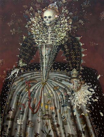
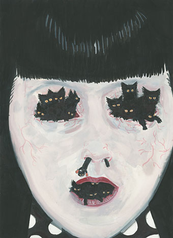
Untitled painting by Aleksandra Waliszewska.

• Ben Wheatley’s forthcoming film of High-Rise by JG Ballard now has its own Tumblr. This will no doubt be spoilerific so I won’t keep on visiting but it’s there if you require it. More Ballardianism: “Worshipping the Crash” at BLDGBLOG.

• “Aickman wandered through the sixties fantasy landscape like some curmudgeonly fetch, returning from the fin de siècle heyday of the ghost story.” Boyd Tonkin profiles Robert Aickman, writer of peerless “strange stories”.

• At Dangerous Minds: “Raise a glass to Cthulhu at the Lovecraft Bar”. Looks more like a Captain Nemo bar to me (not that there’s anything wrong with that) but I appreciate the gesture.

But to demand that a work be “relatable” expresses a different expectation: that the work itself be somehow accommodating to, or reflective of, the experience of the reader or viewer. The reader or viewer remains passive in the face of the book or movie or play: she expects the work to be done for her.

Rebecca Mead on The Scourge of Relatability

• “Space as a paranoid, static rumble featuring: 20jfg, Ben Frost & Daníel Bjarnason, Coil & Eduard Artemiev”. 20 Jazz Funk Greats on the pleasures of the Solaris soundtrack.

• What do Hawkwind, Harry Nilsson, Stereolab and The Supremes have in common? David Stubbs examines the legacy of Neu! and Klaus Dinger’s “Dingerbeat”.

• A reminder that A Year in the Country features a host of worthwhile links and associations for the Hauntologically persuaded.

Rouge Louboutin, an ad by David Lynch. Related: An improptu biscuit ad by the Eccentronic Research Council.

• Mix of the week (a year old but no matter): JG Ballard Zoom Lens Mix by Bernholz.

• At 50 Watts: More illustrated sheet music covers by Einar Nerman.
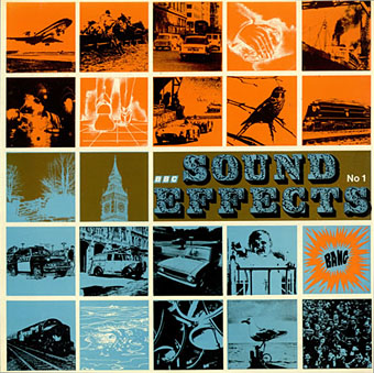
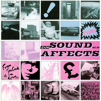
Five book cover designers and the books that inspire them.

Tove Jansson would have been 100 this week.

Pangaea with modern borders

Solaris: Dream (1990) by Edward Artemyev [sic] | Solaris (2000) by Photek | Simulacra I (2011) by Ben Frost & Daníel Bjarnason

Lyrical Substance Deliberated

beatles.jpg

Lucy In The Sky With Diamonds from Yellow Submarine (1968).

The advent of spring invariably gets me listening to favourite psychedelic songs, and this year has been no exception. Earlier this week I was idly wondering how many songs there are that follow the Beatles’ lead in telegraphing their drug metaphors by using the initials L-S-D in their titles. Wikipedia’s page for Lucy In The Sky With Diamonds (1967) relates John Lennon’s oft-repeated claim that the initialism in the title was a coincidence, and the song itself is really a bit of Lewis Carroll-like whimsy. This might be credible if works of art only ever carried one meaning but they don’t, of course, and the song is both a piece of Lewis Carroll-like whimsy as well as being a pretty obvious paean to the drug experience: “Climb in the back with your head in the clouds / And you’re gone”. Jefferson Airplane’s White Rabbit (1967) was similarly ambivalent with mushrooms/pills replacing acid.

Among the many things birthed by the enormous success of the Sgt Pepper album, a small flurry of songs or instrumentals have imitated Lennon’s initialism for their titles. The ones that came immediately to mind are detailed below, and they make a curious group. If anyone knows of any others—there must be others…—then please leave a comment.

hendrix.jpg

Burning Of The Midnight Lamp/The Stars That Play With Laughing Sam’s Dice (Aug, 1967).

The Jimi Hendrix Experience’s B-side not only alludes to LSD but also to STP. The song itself doesn’t go very far before collapsing into freakout mode.

trip.jpg

The Trip (1967).

Not a song but included here for that “Lovely Sort of Death” tag. Written by Jack Nicholson! With Dennis Hopper as the acid dealer! See the trailer here, then watch the whole film here.

power.jpg

Lost Soul In Disillusion (November, 1967).

Hard to imagine anyone in London would have heard this in 1967. The Power of Beckett were a Montreal garage group who only released two singles. Lost Soul In Disillusion turned up years later on compilation albums.

Continue reading “Lyrical Substance Deliberated”

Design as virus 18: Sound Effects

sound1.jpg

BBC Sound Effects No 1 (1969). Design by Roy Curtis-Bramwell.

I used to own this album, the first in a series of sound effects collections from the BBC tape library intended for use by musicians, theatre technicians and anyone else who might need a recording of a thunderstorm, fire alarm or creaking door. Going through my diminished stock of vinyl recently reminded me that I got rid of my rather battered copy some time ago. Now that we can sample any sound we come across these library albums are a lot less useful than they were in the analogue era. One result of their ubiquity was that some of the sounds became distractingly familiar; I still can’t listen to Hawkwind’s Warrior on the Edge of Time album without recognising all the cues (wind, seagulls, etc) borrowed from this collection.

sound2.jpg

Sound Affects (1980) by The Jam. Design by Bill Smith with The Jam. Photography by Martyn Goddard & Andrew Rosen.

And speaking of borrowings, the cover design has proved as durable as the sounds. The Jam purloined the grid design and the title for their fourth album in 1980, although the florid typeface of the original was evidently too circusy for the group’s Mod sensibilities. The music inside also tips into pastiche, this being the album featuring Start!, Paul Weller’s plundering of The Beatles’ Taxman.

sound3.jpg

Good Vibrations (2013). Design by Julian House.

Roy Curtis-Bramwell’s grid of photos and drawings was reworked recently by retro-master Julian House in one of a number of poster designs for Good Vibrations, a BBC feature film. House’s designs for the Ghost Box CDs also feature a similar grid arrangement of enigmatic details in their booklet artwork. I hadn’t considered until now that the Ghost Box details may have their origin in the Sound Effects covers.

sound4.jpg

Detail from the sleeve of Seven Songs (1982) by 23 Skidoo. Design by Neville Brody.

All of which had me trying to think of other examples of this idea. The only one that came to mind was the row of seven symbols on Neville Brody’s sleeve for the first 23 Skidoo album. Brody said these don’t necessarily relate to the seven tracks on the album although it’s possible to view them that way. (The running dog appeared later on Brody’s design for the Throbbing Gristle album box.) As usual, if you know of any further examples then please leave a comment.

There’s more about the BBC albums (and pictures of the rest of the series) here.

Elsewhere on { feuilleton }
The album covers archive

Previously on { feuilleton }
Design as virus 17: Boris and Roger Dean
Design as virus 16: Prisms
Design as virus 15: David Pelham’s Clockwork Orange
Design as virus 14: Curse of the Dead
Design as virus 13: Tsunehisa Kimura
Design as virus 12: Barney’s faces
Design as virus 11: Burne Hogarth
Design as virus 10: Victor Moscoso
Design as virus 9: Mondrian fashions
Design as virus 8: Keep Calm and Carry On
Design as virus 7: eyes and triangles
Design as virus 6: Cassandre
Design as virus 5: Gideon Glaser
Design as virus 4: Metamorphoses
Design as virus 3: the sincerest form of flattery
Design as virus 2: album covers
Design as virus 1: Victorian borders

Weekend links 175

maeda.jpg

Heartbeat of the Death – Queen Elizabeth the First (2013) by Haruko Maeda.

• “The casual mixing of people from across the world at The Garden broke down many barriers. Its rich, beautiful, smart, and successful people were confident enough to exercise the kind of sexual freedom that would land you in jail elsewhere in the country.” Kate Webb on Alla Nazimova’s Hollywood estate, The Garden of Alla.

• “…from 1956 to 1970 Borges taught English literature at the University of Buenos Aires, and now, over half a century later, one of his courses is finally available in English in a slim, delightful volume.” Will Glovinsky on Professor Borges. Related: Jacob Mikanowski says “To Tlön: Let’s Invade Reality”.

• Mixes of the week: Secret Thirteen Mix 084 by Koen Holtkamp—Alice Coltrane, Alan Watts, John Cage, Popol Vuh, Faust and others—and Sequenze E Frequenze, “the rarefied outer limits of ‘stare at the sun, outsider peaked’ Italian music”.

Consider the fate of the concept of ‘futuristic’ music. The ‘futuristic’ in music has long since ceased to refer to any future that we expect to be different; it has become an established style, much like a particular typographical font. Invited to think of the futuristic, we will still come up with something like the music of Kraftwerk, even though this is now as antique as Glenn Miller’s big band jazz was when the German group began experimenting with synthesizers in the early 1970s.

Where is the 21st-century equivalent of Kraftwerk? If Kraftwerk’s music came out of a casual intolerance of the already-established, then the present moment is marked by its extraordinary accommodation towards the past. More than that, the very distinction between past and present is breaking down. In 1981, the 1960s seemed much further away than they do today. Since then, cultural time has folded back on itself, and the impression of linear development has given way to a strange simultaneity.

Mark Fisher on the present cultural moment, and the weirdness of Sapphire and Steel.

• At Front Free Endpaper: A Gay Library Thing and French Line Gay Pulp Cover Designs. Callum is also giving away books by Frederick Rolfe/Baron Corvo to anyone who asks. The proviso is you write a short review for his blog.

• Film director Ben Wheatley on Don’t Look Now: “I felt a great panic come over me”. Elsewhere it was announced this week that Wheatley is planning a film of JG Ballard’s High Rise.

• Brits may remember the wonderful Laurie Pike from the Manhattan Cable TV show in the early 1990s. These days she’s writing an online guide to the city of Paris.

Ben Frost has made three previously unreleased recordings available at Bandcamp.

The Media History Digital Library: 800,000 pages of film and radio periodicals.

• The results of three derives in London by Christina Scholz here, here and here.

• The late Seamus Heaney reads his own translation of Beowulf here and here.

High Rise (1979) by Hawkwind | Pop Sicle (1994) by High Rise | High Rise (2005) by Ladytron

Elric 1: Le trône de rubis

elric1.jpg

The closest I ever got to illustrating Michael Moorcock’s Elric character was the sleeve for The Chronicle of the Black Sword in 1985, a Hawkwind concept album based on the first couple of Elric books. That design favoured a decorative approach over anything illustrative, however. At the time I felt too intimidated by the renderings of Elric’s first illustrator, James Cawthorn, and subsequent depictions by book cover artists such as Michael Whelan, to attempt my own version of the character. These days I pay little attention to heroic fantasy of any kind but I do look out for new depictions of Moorcock’s anti-hero. Earlier this year the French bande dessinée publisher, Glénat, released the first album in a planned series of five comic-strip adaptations of the Elric books. Many creditable Elric comics have appeared since the 1970s, not least the Cawthorn version of Stormbringer, one of the earliest and best, and Philippe Druillet’s own somewhat eccentric production. Mike Moorcock very generously sent me a copy of the Glénat volume this week, and I’d say this is now the one to beat.

elric2.jpg

Writer Julien Blondel has adapted the books with the art duties being taken by Didier Poli and Robin Recht. Jean Bastide is the colourist. I’ve always preferred the French and Belgian approach to comic art over the American style so I’m naturally biased towards a book such as this. That said, the art is marvellous, and so many of the details feel just right. Moorcock portrays the Melnibonéans as decadent and cruel, something that Poli and Recht portray with scenes of naked slaves being bled, butchered, and even used as human torches for the blithe amusement of their masters. The general atmosphere in the opening pages is like something from Flaubert’s Salammbô with its combination of antique depravity and the massing of great armies prior to battle. They don’t slouch with the monstrosities, either, there’s a spot of Lovecraftian weirdness when Elric is rescued by Straasha, the Sea King. I look forward to seeing how they deal with Arioch (who puts in an appearance at the end) and the other Chaos Lords. The dialogue is all in French, of course, but if you know the books it’s easy to follow even with French as limited as mine.

elric3.jpg

The Glénat site has a few more page samples. Moorcock has been watching these books being adapated and re-adapted for decades, and he says this is among the very best. For anyone with more than a passing interest in the brooding albino prince it’s well worth seeking out.

Previously on { feuilleton }
Salammbô illustrated
Jim Cawthorn, 1929–2008